Coming back to the first part of this exercise, in some ways I find it a bit of an odd one. These days I have very few postcards. Those that I do I have either bought myself or have been sent to me by others and are invariably of works of art rather than places. I do not recall ever having been sent many postcards of places that I actually know, rather than places I have not otherwise visited – is that not part of the rationale of the postcard?
I do know at least one person with an extensive collection of cards but these are, so far as I know, nearly all historical views, or at least not contemporary, which rather defeats the object of this exercise.
I have therefore had to go out and buy some that show places I know particularly well in Newcastle and the Tyne Valley area where I live. Not quite as easy a task as I first anticipated as very few places locally – I only had time today to go to Hexham – now sell the things. (I will write a little more about buying postcards in general when I get round to reflecting on “The tourist perspective” that prefaces this exercise – yes, I know, I am doing this section in reverse order! That is just the way it has worked out.)
Here are my chosen views, eight in number which was about the limit of those available and usable for this exercise, all local icons:
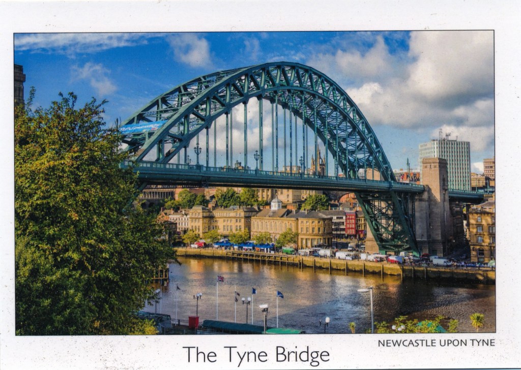
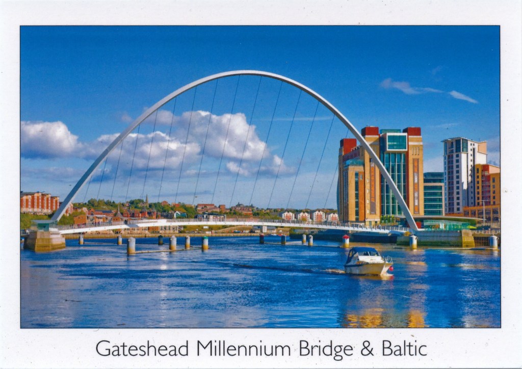
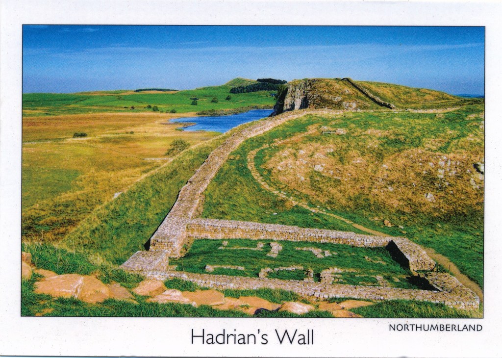
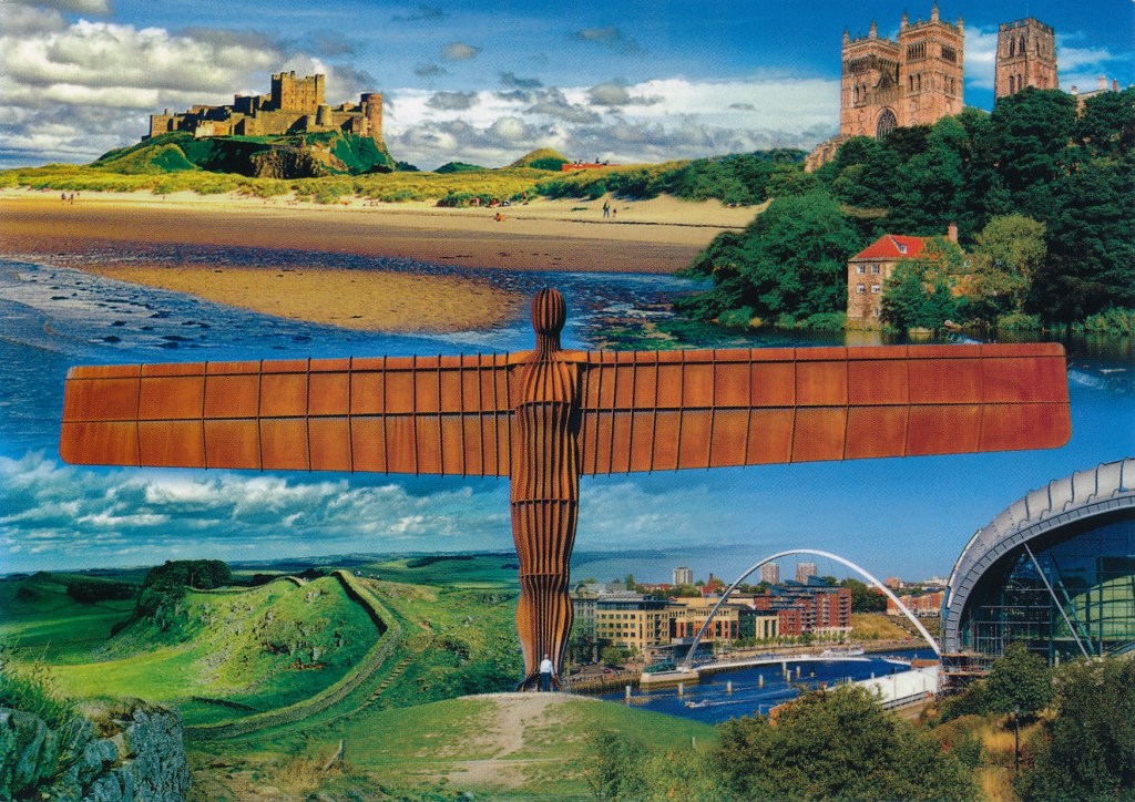
Bamburg Castle, Durham Cathedral, The Angel of the North, Hadrian’s Wall, Gateshead Millennium Bridge and Sage Music Centre
The first thing that strikes me about all of them is the exaggerated colours; the blues are too blue and the greens too green. Yes, we do get blue skies up here but these do not feel at all natural. I cannot remember in thirty or so years of seeing the Tyne quite as blue as it appears in the second picture. (Indeed, in that one, all of the colours are too vivid.)
The next thing I get is a remarkable sense of flatness. It is not just that it looks as if they have deep depths of field but something about the reproduction has flattened everything out. The effect is quite unreal and two-dimensional. Are both of these effects simply the result of the processes of mechanical reproduction rather than choices made by the photographer, I wonder?
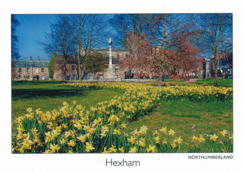
Three of them have what I would regard as odd viewpoints: Hexham, Hexham Abbey, and St. Andrews. The first is simply a bit of an odd view. I can think of plenty of other potentially more ‘picturesque’ views that this one, which is not one that I would expect the average visitor to Hexham to encounter or recognise. Given that the most striking physical presence in Hexham is the Abbey it is odd that in this view it is barely visible through the trees.
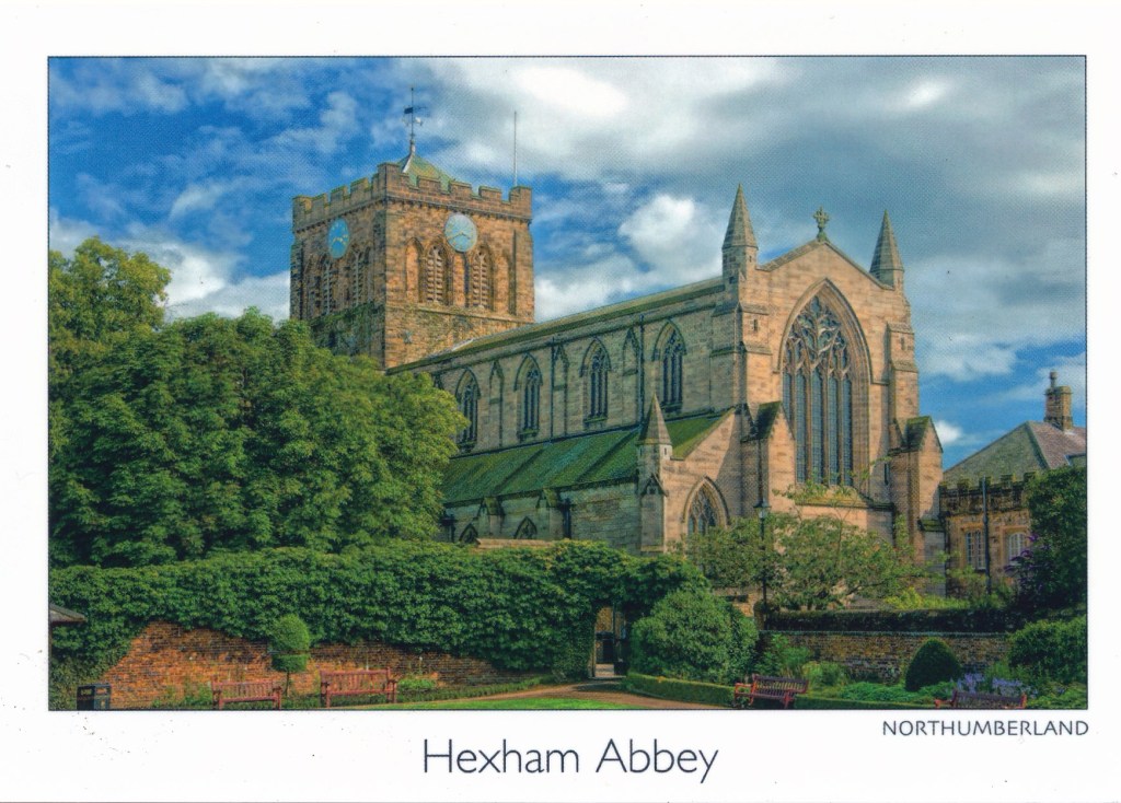
The second does at least focus on the Abbey, an impressive structure dating back in its current form (though much rebuilt in the 19th century) to the 11th century. (The original foundation goes back to 674.) The viewpoint is though not the most obvious or most impressive. The view that most visitors get is of the east facade from the market square, which it tends to dominate. This view is from the west, from the abbey gardens which are attractive enough in their own right, and at least it does show off the fine structure of the nave, but it is not one that your average visitor is likely to see without a bit of effort or help.
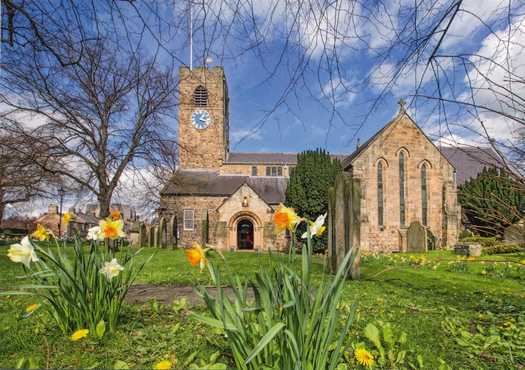
The view of St Andrews, which again is Saxon in origin and is a very fine parish church in its own right, home to a first rate annual chamber music festival, is again odd because of its viewpoint. The photographer must have been lying on the ground to get this. As a result the foreground daffodils are. for my taste, too dominant. This angle has also resulted in a dramatic foreshortening of the building so that its proportions have become strangely distorted: the south transept looks much bigger than it really is and the tower looks further away, and shorter, than again it is in reality. For me a much more satisfying, ‘picturesque’ even, view would have been from ordinary eye level and a few metres to the left which would give a much more natural impression of the church.
Not much more to say about the Hadrian’s Wall picture, which is not bad I think in compositional terms and does give some sense of the nature of the topography and countryside along this stretch of the wall (it is not like this for all of its length!).
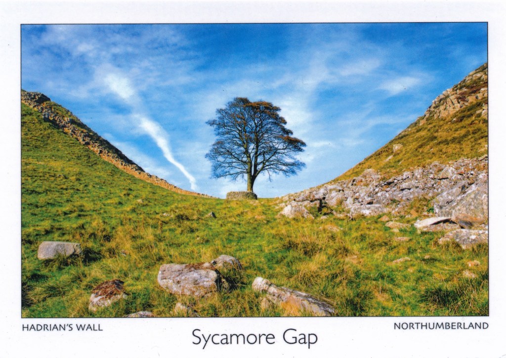
Similarly not a lot to say about the Sycamore Gap picture. Yes, this is the view that I keep on disparaging – nevertheless with apologies to all and sundry who like this sort of thing. What I really do not like about this view in general, not just limited to this postcard, is the way this tree has very much been taken out of context: it is a tree in a dip. That gives no real hint though about the narrowness of the ridge, what, despite the dip in the crest at this point, is quite an impressive natural physical barrier, and why the Wall is built along it I do not even think it is the most ‘dramatic’ view of it, which I think you get from much further back on the road. Again, as an aside, I am struck by the relatively low camera angle, which does at least give more of a sense of the sky, and the openness of the landscape than would, for example, be apparent from a ‘square-on’ view from the road, which is not at quite the same elevation but not much below.
The last one, the collage with the Angel, I have chosen simply because this is not the angle from which I would normally see it. More usually (which is not in fact that often) my view is from below and from the left, either from an East Coast line train heading into Newcastle, or from a car on the A1 which passes just below it. One thing I do like about this view is that there is a person just visible at the Angel’s feet, making this the only card that gives a reliable sense of scale, a reminder of just how big the Angel really is!
None of these cards fully align with my own experience and perception of these places. Nevertheless that does not by any means lead me to conclude that they are good examples of the genre, and they do all contrive to portray this region in a positive and attractive light. It is a beautiful part of the world but not always (often?) quite as brightly coloured as this!
