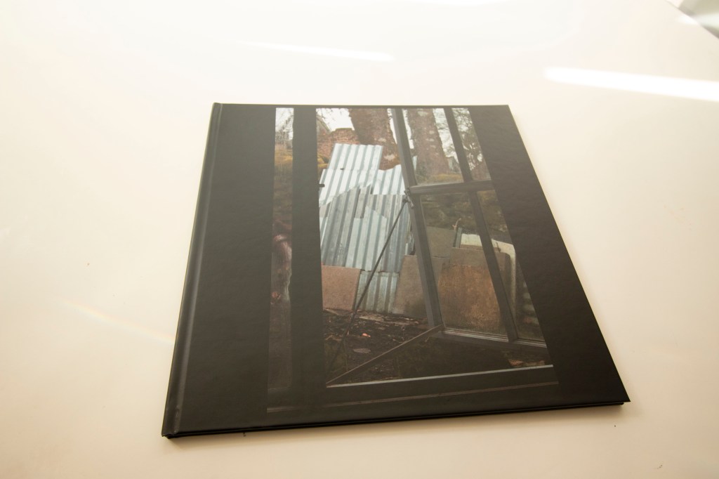
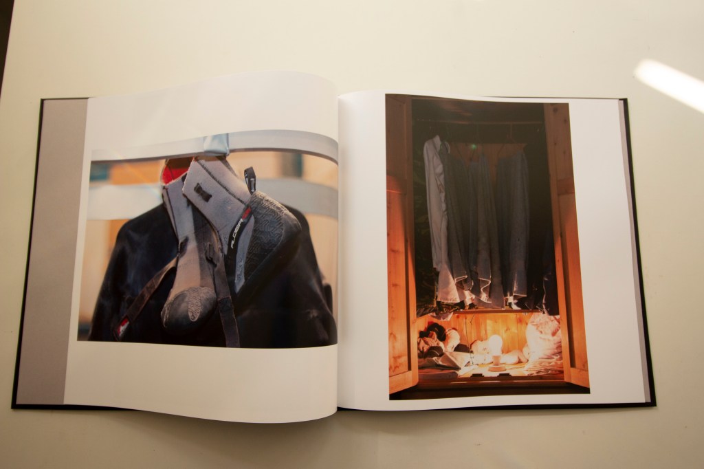
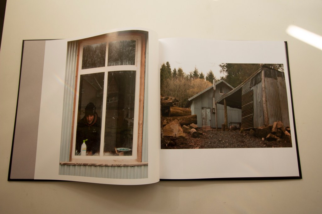
Although this exercise did not call for anything more than making a mock-up and producing a pdf, I nevertheless went ahead and had a couple of books printed up to see how they would look. Blurb have been falling over themselves to offer substantial discounts so I thought I might as well go ahead. One book is the one of which I made the mock-up for the exercise, a development of the work for Assignment 3. The other is a development and expansion of a project that I did for one of the Assignments for I&P.
Both are fairly slight, using no more than the standard layout of twenty pages. For Assignment 3 I have kept the layout of images only on the right-hand page. For the other, I effectively doubled the number of images that formed the final set for the earlier project and put one on each facing page. In both cases I went for image wrapped hardcovers, rather than dust jackets, and premium matte paper. The end results look and feel reassuringly professional, if a little spartan. If I have any issue with them it is the colour balance on a few pictures from the old project is a little off, compared with the original prints. That said, unless you were to compare them with those prints I doubt you realise that they are slightly different. They certainly do not look “wrong” in their own right. I guess some slight differences like this are probably inevitable.
And here is a short video showing the printed version of Assignment 3:
