Having started to think about the strengths and weaknesses of the first final set that I have chosen, as discussed in my last post, and about other ways in which this project might be presented, I have come up with another set.
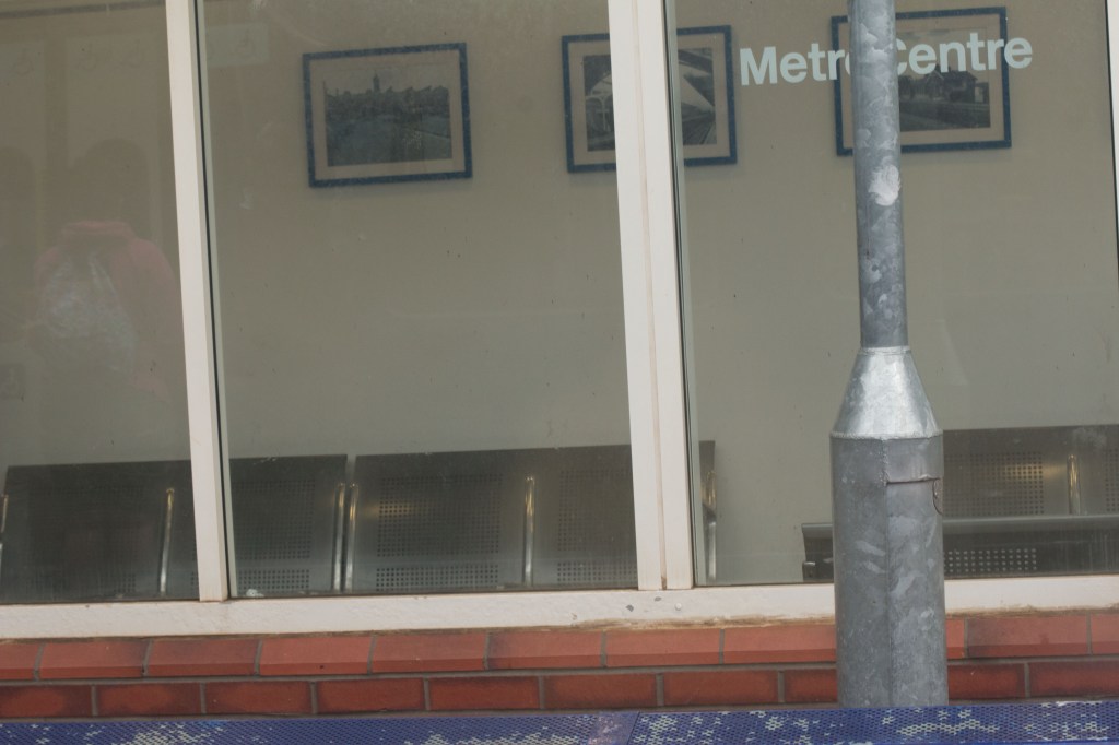
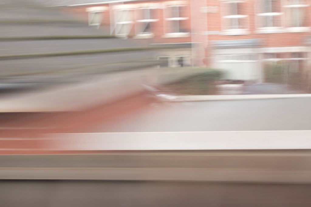
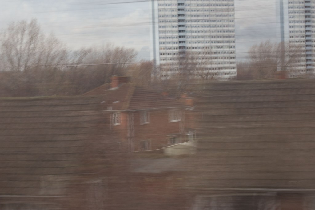
The last set was very much based on the visual experience of being on the train and experiencing the journey through the window, observing the landscape as the train passed through it. For an alternative approach I have put together a more varied set describing the journey itself, from boarding the train to getting off, as a more abstract experience. A number of images have been carried over from the previous set. Some have come from the attempt at a text based set. I have though added a few new ones from the first shoot. Again, I have tried to highlight the contrast between country and town, this time adding a bit more emphasis on the build up of residential areas as the train comes into town. I have also hinted at the presence of other train traffic as one approaches Newcastle: the ante-penultimate image is of another train crossing the King Edward VII bridge into Newcastle.
Whether this is better I am not sure. It is at least more varied from a visual point of view. I can see an almost infinite number of possible combinations of the pictures that I took for this project but this one will do for now and at least I think it works.
Much of what the brief for this assignment calls for by way of interpretation, relationship with cultural aspects covered in this part of the course material, technical choices, and influences, I have already covered in previous posts for this assignment, specifically: First Thoughts; First Contact Sheets; Further Research; and Some Further Thoughts. To that extent I am not sure how useful or productive it would be to go over the same ground again, albeit in perhaps a more condensed form.
What I certainly need to cover is the choice of the final twelve images.
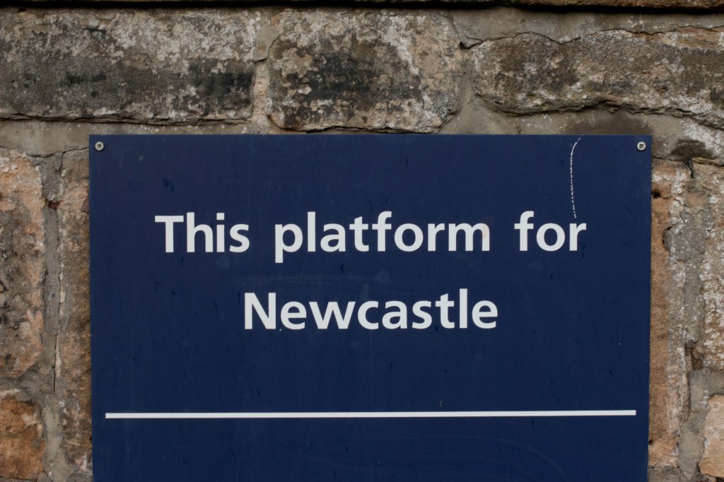
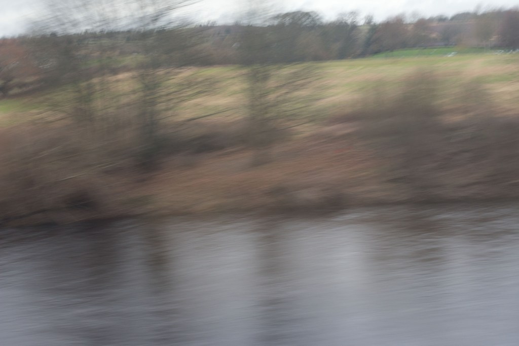
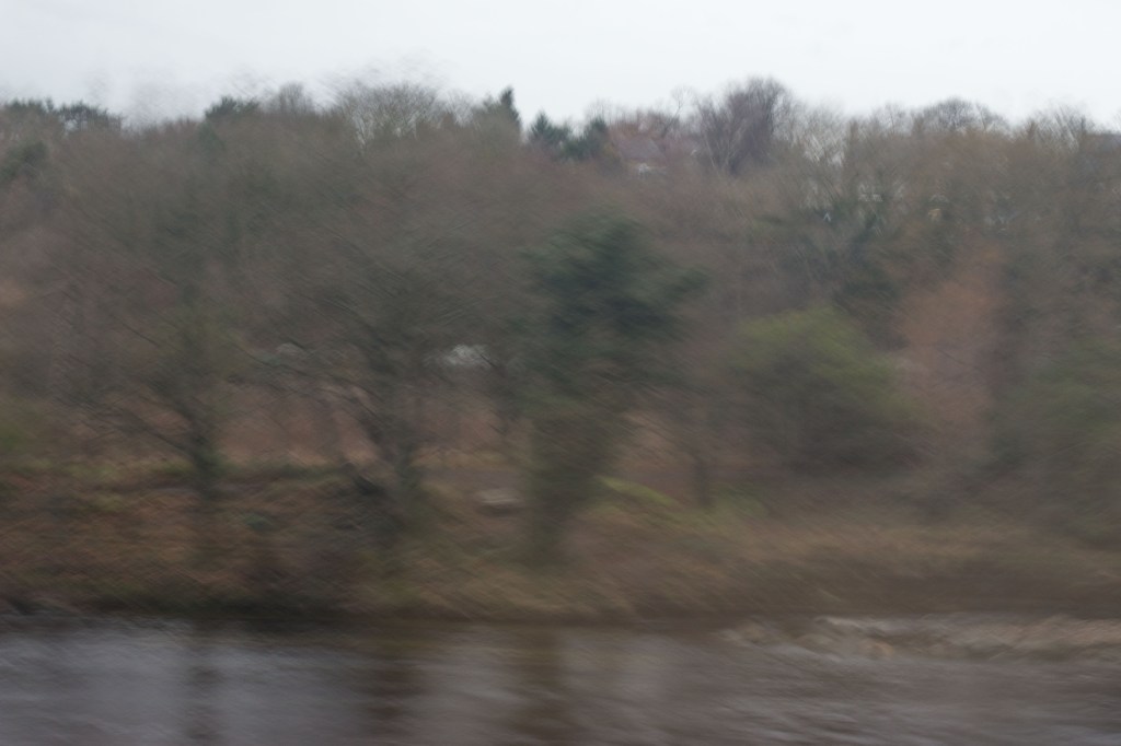
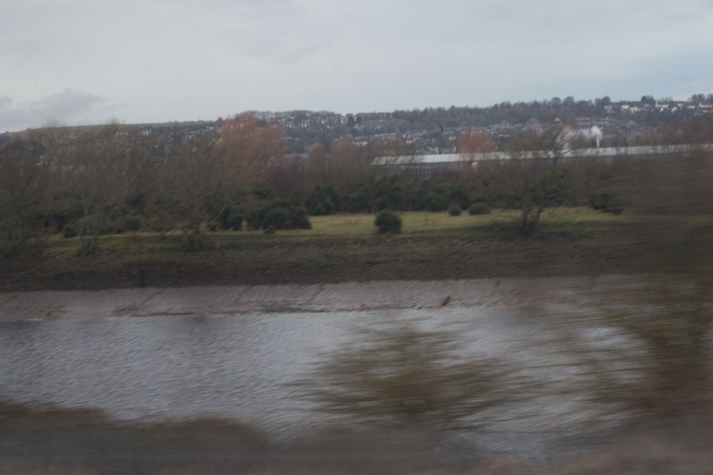
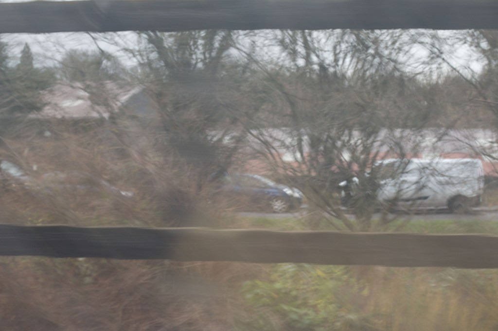
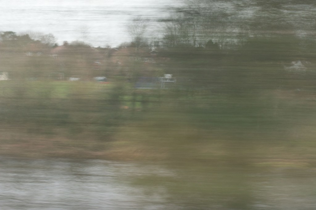
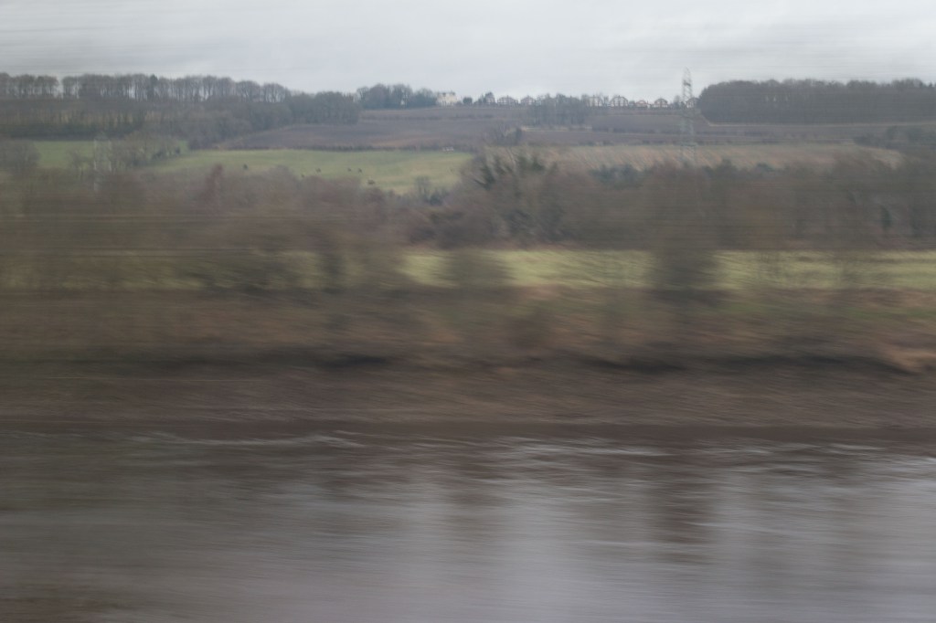
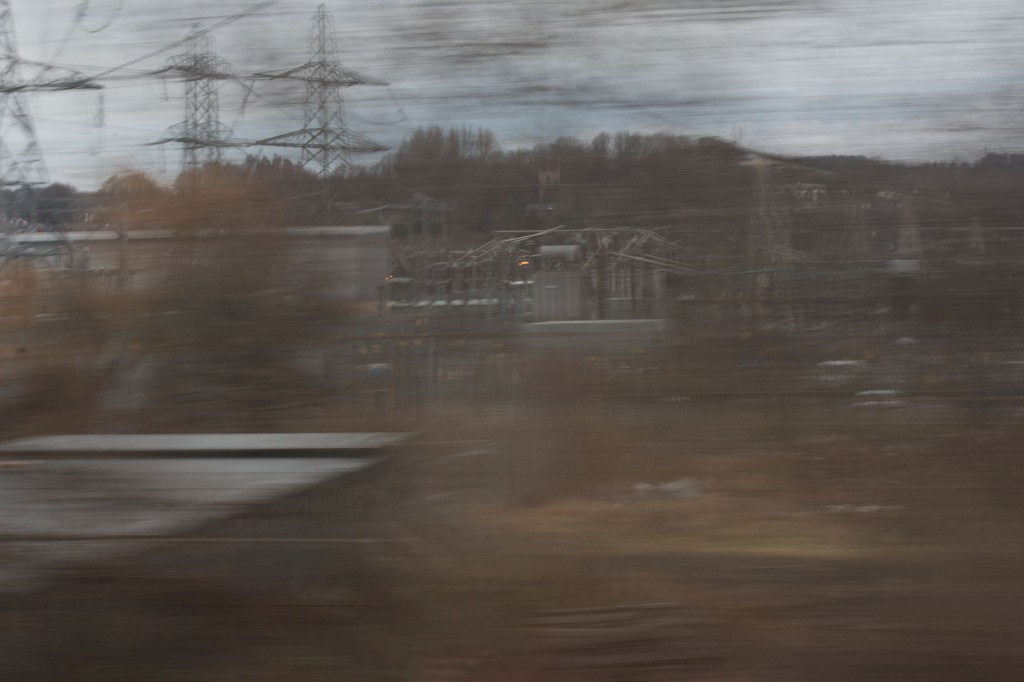
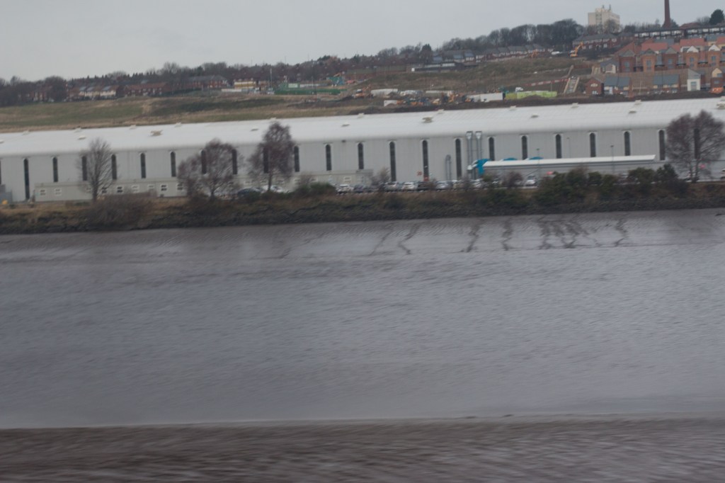
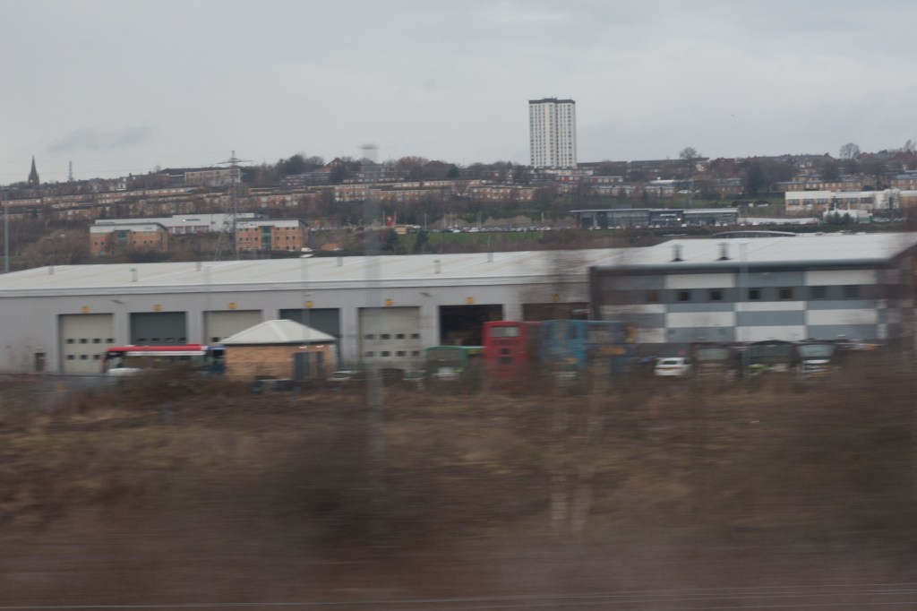
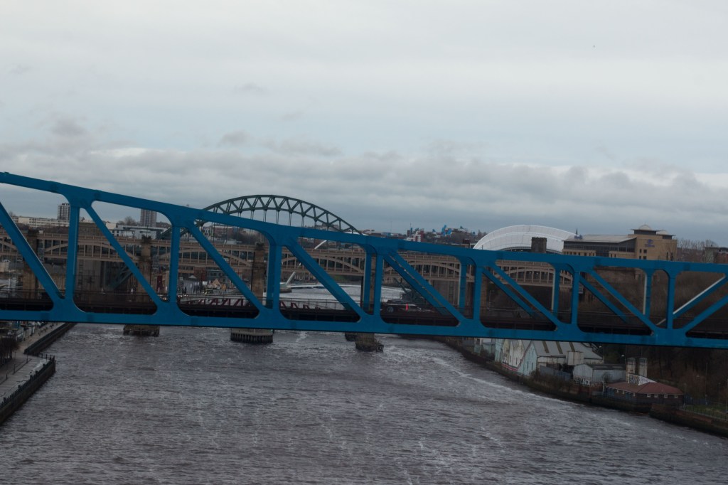
One aspect of the following sequence has inevitably been dictated by the nature of the assignment itself: the final images appear in the order in which they are encountered on the journey: The first image is from where the railway meets and runs alongside the river for the first time just after leaving Stocksfield station; the last is a somewhat out of the ordinary view of the iconic bridges over the River Tyne between Newcastle and Gateshead just before the train enters Newcastle Station.
Those in between I have chosen to give an indication of the way the landscape changes from largely rural, with the only major town before the outskirts of Newcastle are reached being Prudhoe, then becoming increasingly industrial, and briefly residential, before the bridges. In geographical terms, as might just be apparent from the photograph I have included in the Mapping post, the physical distances between the waypoints illustrated by these images become smaller as the urban environment itself becomes denser along the way.
Here is my final set for this particular approach to the assignment:
StocksfieldPrudhoeWylamRytonRyton Power StationLemingtonScotswoodMetro CentreElswickDunstonGatesheadTyne Bridges
Evaluating the strengths and weaknesses of a set is invariably something that I find difficult at this stage because I am still too close to the work to be able to view it wholly impartially. I usually find the critical process easier once I have had some discussion with my tutor. I have though at least been giving some thought, having now followed one particular path, to how I might approach the project differently and I think this will help in pointing up what might need improvement.
I have already tried a wholly text based approach from inside the train and I do not honestly think this works. I think it gives too narrow a view, and not a particularly interesting one, of the journey. I have also found that it is not easy to pull off from a technical point of view. I still remain uncomfortable with the idea of a people-based set, not least because of the practical difficulties, perhaps exacerbated by lack of time on a relatively short journey, of negotiating consent (without which I would not do it anyway). Kazuma Obara did feature people in his Chernobyl train sequences, but in a way his work was more about the local people, and the effect of the disaster on them, then and now, than on the train journey itself. Here I am more concerned with just the process and experience of the journey.
I have though been wondering about the possibility of a more mixed approach, including other elements beyond just the view from the train, combining some of the text based images, and others simply taken outside the train. I am not sure that a limit of twelve or so images is necessarily going to be enough to accommodate such a wider approach (I do feel the recommended limit in the brief is a bit too constraining) but I am going to try another experiment, that I will address in another post.
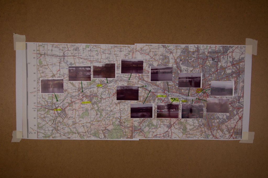
When I first started to think about this assignment I initially rejected the idea of doing anything with maps as unhelpful given the nature of the journey I wanted to depict. Whilst that view has not changed I have nevertheless come back to the role of maps, not as an inspiration or means of arriving at the subject matter for the project, but more as an outcome of the project, as an artefact that is itself the result of working through the assignment.
This has largely been the result of reading an article on the Magnum website about the work of Alec Soth who produced maps, not in order to make his various books, but as a result of having done so. Soth is of course one of the artists that I referred to earlier in connection with photographic depictions of journeys, though explicitly not one who influenced my thinking or choice of subject matter in this case.
What I have done for this is scan an OS map that shows the route between where I live and the city of Newcastle, blown it up, and reprint it. Onto this new copy I have put thumbnails of the images I have chosen for the final set, indicating where on the map they relate to.
As it happens this is the only OS map that I have that covers all of this area and it turns out it is thoroughly out of date, going back to 1971! Most significantly what has changed in the interim, for the purposes of this project, is the line of the railway itself, though that is admittedly hard to see in the photo below. It now runs along the south side of the river as far as Gateshead and then crosses the river over the second up-stream bridge marked on the map into Newcastle. Back in 1971 the line crossed the river at Blaydon and ran along the north side of the river, following the route of an otherwise long disused line that ran along that side from Wylam, where there is still a very fine bridge that now serves only pedestrians and cyclists. (There are plenty of other differences, such as the absence of the current dual-carriageway version of the A69, and of the Metro Centre, which has its own dedicated train station. These are though not really relevant for the purposes of this assignment and would really only mean something to anyone who knows the area now.) I like this map though because it has a distinctive style that the OS no longer uses which is much sharper than the modern versions.
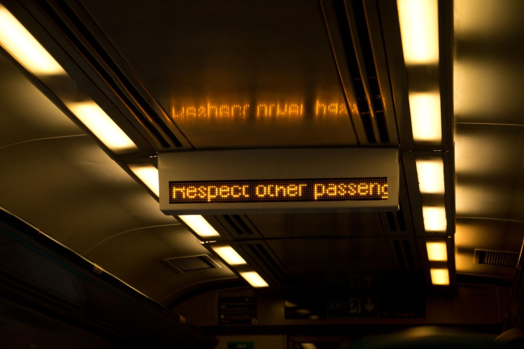
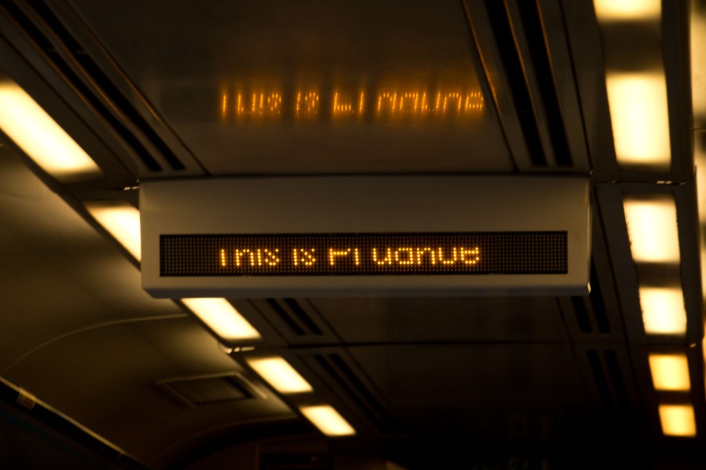
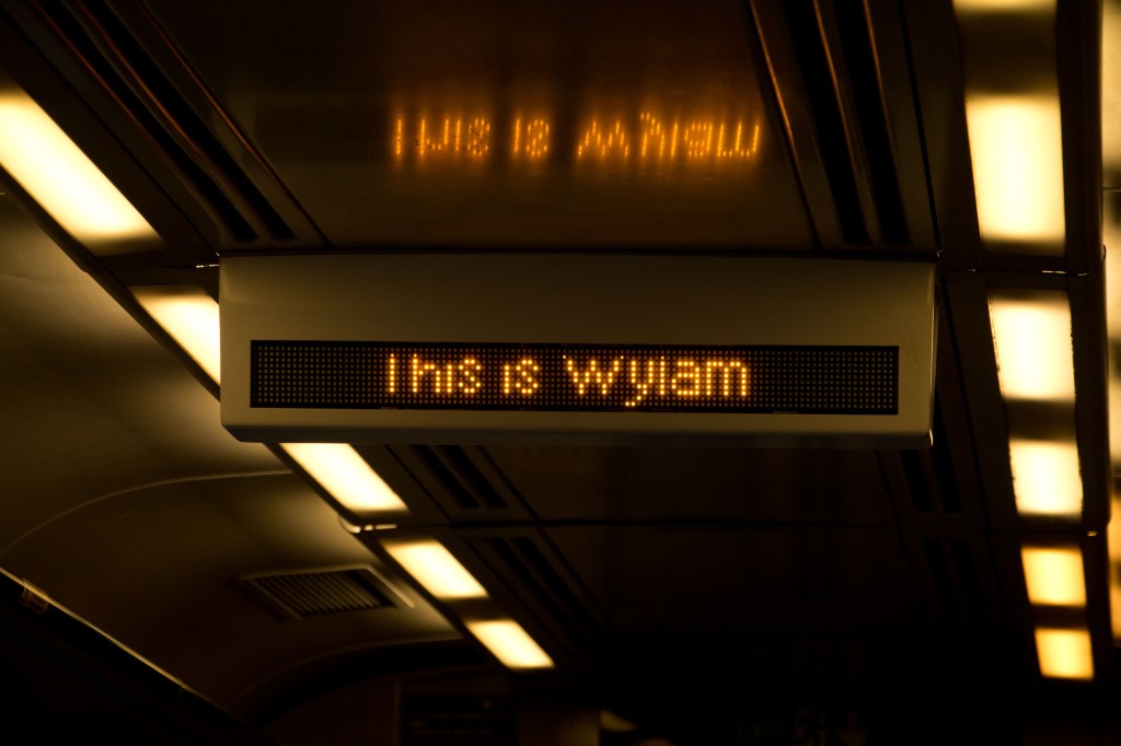
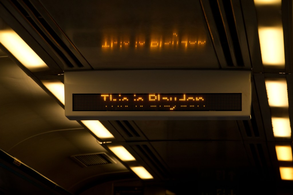
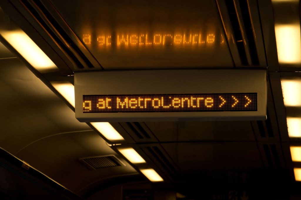
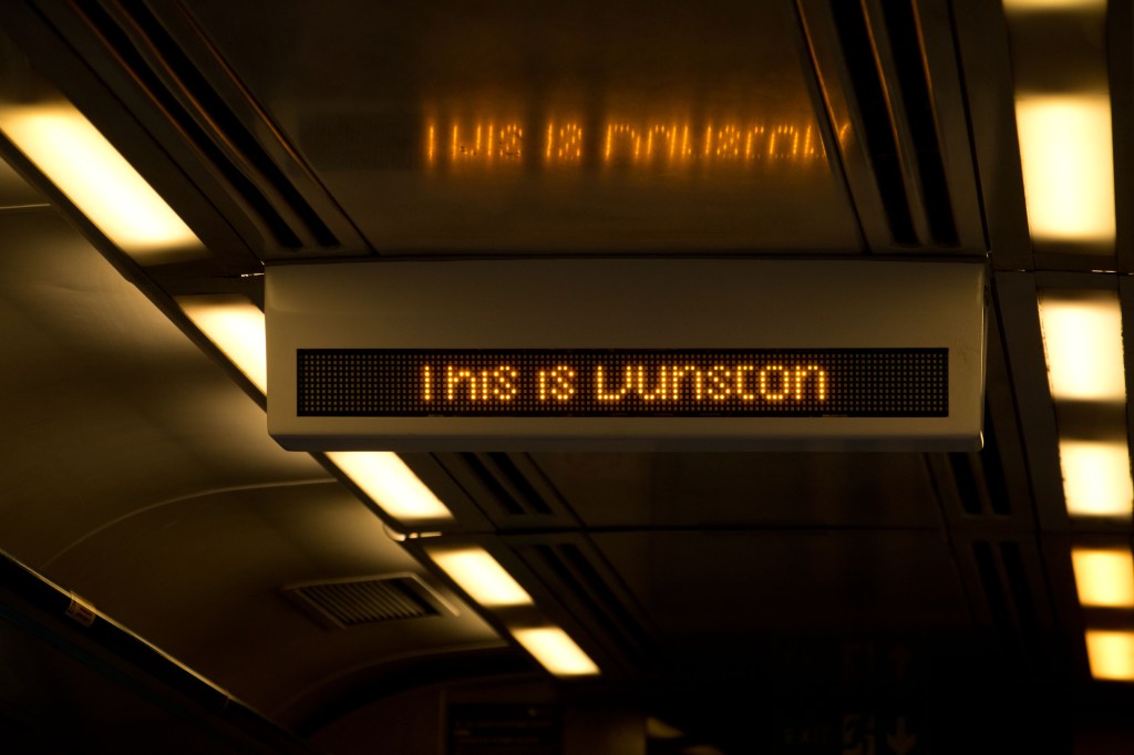
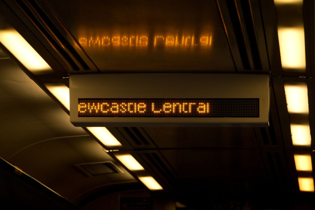
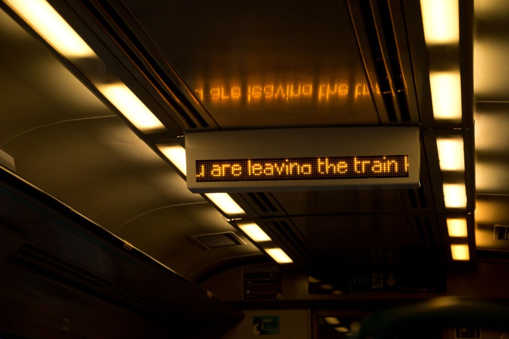
Looking over the contact sheets I made following the second shoot for this assignment I am not sure they entirely work. Firstly I do not think I have quite enough good quality material: it turns out it is much harder than I anticipated to get a clear shot of the moving-light display. Nevertheless there are enough in order to be able to put together at least an attempt at what a better set might look like. Doing a reshoot, unless doing the whole thing from scratch again, would I suspect be quite difficult. I can already see from this first attempt that getting a sufficient degree of consistency is quite difficult, so I am not sure how well images from two or more shoots, put together, would actually form a harmonious whole.
It is also evident to me that a mix of the platform display and the on-train screen does not really work. For this experiment I have therefore stayed with just the on-board images for the sake of consistency, concentrating on the names of the stations through which the train passes. One accidental by-product of this is that all the images shared the same dashed light strips. This is significant to me for two reasons. One is that they recede into the background and in doing so point in the direction of travel, giving a pictorial, though static, impression of movement. The other is that they call to mind the sprocket holes on 35mm film negatives. I shot these digitally rather than on film but I think the effect is that the pictures carry within themselves a marker of their own artificiality, a self-referential reminder that this is a series of photographic images.
I have also taken one image out of the order in which they were taken, the last one in this sequence, as it seemed to offer, without having planned or intended it, a sense of the end of the journey. The first image in the sequence again just seemed, serendipitously, to form an appropriate starting point.
Thinking about presentation, as with the Sublime set for Assignment 1 my initial thought is that again a slide show arrangement might work quite well, the melding of one image into another adding something of a sense of movement. I will experiment!
A few reflections on this part of the course, prompted perhaps more by the two exercises that follow this section of the course material and by some of the reading I did in connection with the Picturesque. Nothing very profound, and indeed slightly random, but nevertheless pertinent to the way my thinking about landscape photography is developing.
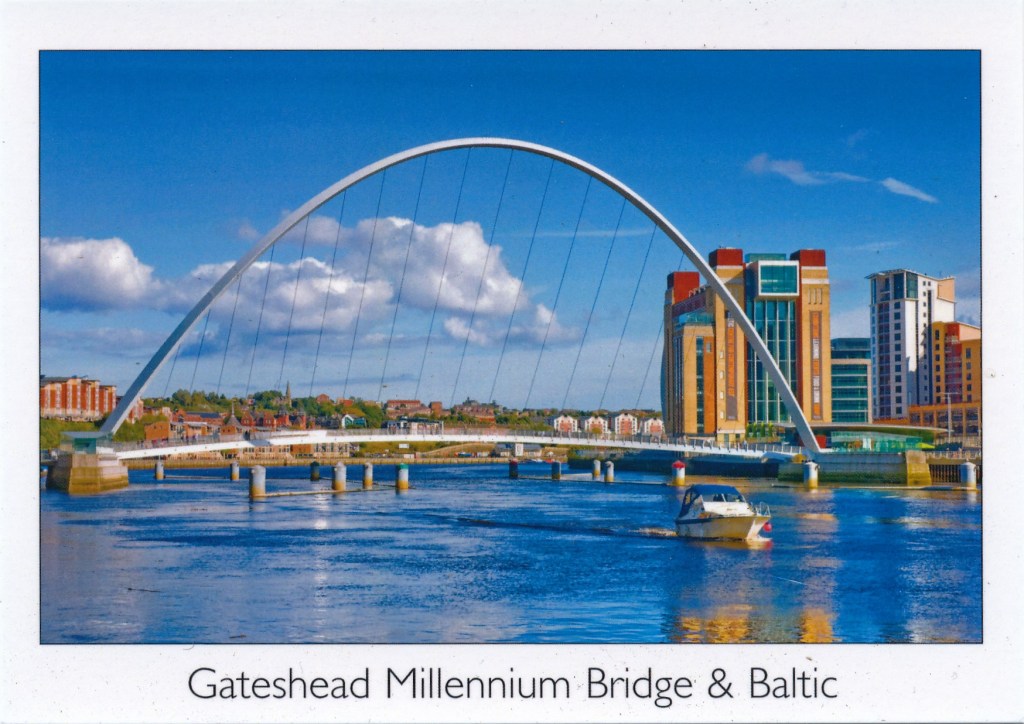
Just by way of a preface, it is unfortunate that the video interview with Martin Parr that appeared in the Guardian and that is cited in the course material is no longer available. Though I am not much of a fan of Parr’s work, it would nevertheless have been interesting to hear his take on collecting in general, and postcards in particular. I never did see the Parrworld exhibition when it showed at the Baltic in Gateshead (more than ten years ago now!) and I have not looked at any of his Boring Postcards books so feel that, for all my generally critical stance, I have perhaps missed out on something here.
With that out of the way, I thought I would start with Susan Sontag (1979) and the closing comments in her essay “In Plato’s Cave” (page 24). Whilst I still bridle at the hyperbolic absolutism of her judgment I do find myself broadly in agreement. No, not “everyone is now addicted” to “an aesthetic consumerism”. Perhaps I and people I know are ‘unusual’ in this regard but I do not know anyone who really falls into this catch-all. For many years I did not take a camera with me when travelling. I had got tired of seeing the world through the viewfinder of a cheap camera (starting with a Kodak Instamatic as a child and working up to an Olympus OM-10 as a young adult) and taking pictures that did not really do reality any justice (a bit like the postcards in my last post). What I was missing was the experience of really looking at what was before me. That led me to replace the camera with a sketchbook, which made me look much harder and, although sometimes quite frustrating, was much more rewarding.
One of the things that brought home to me the banality of a lot of tourist photography, and here I am with Sontag wholeheartedly, was a [particular experience I still recall from nearly thirty years ago. On a road-trip through Europe with friends back in the 1980s we visited the BMW museum in Munich (a couple of those friends were real petrol-heads). At the same time we visited a group of Japanese tourists were also there. (I am most definitely not singling out the Japanese here. They could have been any nationality. They were just more noticeable as at that time I had not encountered many people from East Asia. What was most striking was that a number of them took pictures in front of almost every car on display. The pictures though were not of the cars but of the rest of their little group standing in front of, and in all likelihood almost completely obscuring the exhibits. Although again I do feel that Sontag somewhat overstates her case, I nevertheless do think this was an interesting example one of her comments:
“Ultimately, having an experience becomes identical with taking a photograph of it, and participating in a public event comes more and more to be the equivalent of looking at in photographed form.”
For these tourists the experience was not of looking at some old cars but of having their photographs taken while standing in front of them.
I guess this phenomenon continues today in up-dated form, but essentially the same thing, with the ubiquity of the smart phone and the compulsion (which, at the risk of indulging some Sontag-like hyperbole, seems almost pathological) to take the wretched “selfie” in front of whatever the tourist is ostensibly there to look at and experience.
I think I have since got over my former aversion to travelling with a camera (not that I do much travelling now) but am certainly a lot more considered about when I press the shutter as a tourist (as opposed to someone pursuing a particular photographic project). And yes, I do still sketch a little as well, though not as much as I used to.
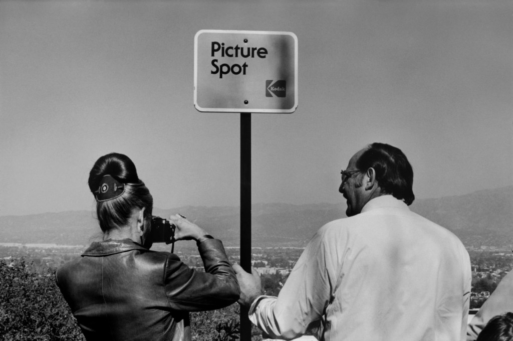
Gilpin’s ‘pioneering’ work (1789) as a guide for tourists came back to mind when I read a little of Wells (2011) (around page 90) prompted by the course material. The tourist photographer is effectively being shepherded into particular places for the specific purpose of taking photographs. The tour bus stops at the local “beauty-spots”. Ordinance Survey maps still include a symbol identifying places from which to view picturesque scenes. I was reminded of a photo by Magnum photographer Raymond Depardon:
USA. California. Los Angeles. 1982.
Perhaps not surprisingly the photographic industry, in this case film and consumer camera manufacturers Kodak (as I have said above my first camera was a Kodak), got on the bandwagon and erected their own signs. Says it all really about the consumerist commodification attacked by Sontag.
Going back to Wells and to Snyder in Mitchell (2002) and their narratives of the development of commercially available photographic images and a consumer market for them, struck a chord when I embarked on the postcards exercise. As I indicated then, I rarely if ever receive postcards now and if I do they tend to be of works of art rather than places. Given the proliferation of smartphones and cheap digital camera I had therefore expected that it would not necessarily be easy to find any decent contemporary postcards that would serve for the exercise. In that respect I was not surprised that I only found one shop in Hexham selling any (though that has to be caveated by the fact that there were a number of possible outlets that I did not get round to visiting). What did surprise me though was to be told by the ladies working in the shop in question that they actually sell a lot of cards. Not just a few but, in their words, “lots”! Apparently there is still a market for these things and my little corner of the world does attract quite a lot of visitors (Not too many: Northumberland is known as “The Hidden Kingdom” and we would like it to stay that way; but enough to support the local tourist economy.) Indeed, the first question I was asked was whether I was there on holiday! These factors then led me to speculate whether the relative health of this particular market for postcards might actually be a demographic issue. Again not at all a scientific analysis, but my guess is that a majority of the visitors we get, particularly in the local towns, as opposed to the wilder reaches of the county (Hadrian’s Wall, bits of the Pennine Way, the Cheviots) tend to be more ‘mature’ (which does not necessarily mean old!) Are they, I wonder, of a generation that is less likely to spend all their time pointing their phones at the sights and not into selfies?
Whatever the explanation might be, it would appear that there is still, possibly against the odds, a market and a life for the picture postcard.
Gilpin, W, (1789). Observations on the River Wye, and Several Parts of South Wales. London: Blamire (Gale ECCO facsimile reprint)
Mitchell, W.J.T, (ed) (2002). Landscape and Power. Chicago: The University of Chicago Press
Sontag, S, (1979). On Photography. London: Penguin
Wells. L, (2011) Land Matters: Landscape Photography, Culture and Identity. London: IB Tauris
Coming back to the first part of this exercise, in some ways I find it a bit of an odd one. These days I have very few postcards. Those that I do I have either bought myself or have been sent to me by others and are invariably of works of art rather than places. I do not recall ever having been sent many postcards of places that I actually know, rather than places I have not otherwise visited – is that not part of the rationale of the postcard?
I do know at least one person with an extensive collection of cards but these are, so far as I know, nearly all historical views, or at least not contemporary, which rather defeats the object of this exercise.
I have therefore had to go out and buy some that show places I know particularly well in Newcastle and the Tyne Valley area where I live. Not quite as easy a task as I first anticipated as very few places locally – I only had time today to go to Hexham – now sell the things. (I will write a little more about buying postcards in general when I get round to reflecting on “The tourist perspective” that prefaces this exercise – yes, I know, I am doing this section in reverse order! That is just the way it has worked out.)
Here are my chosen views, eight in number which was about the limit of those available and usable for this exercise, all local icons:
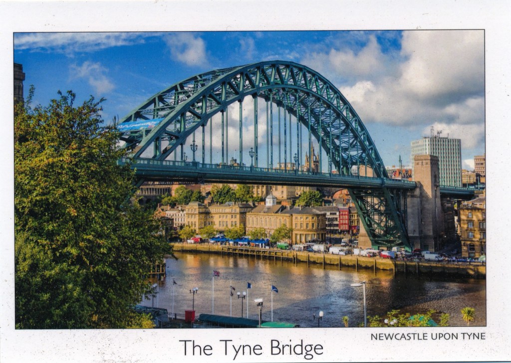
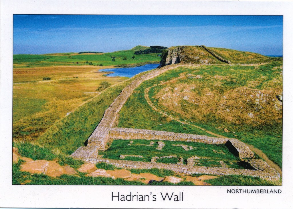
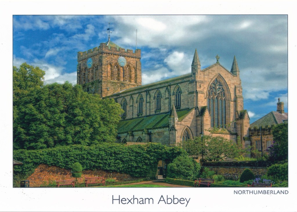
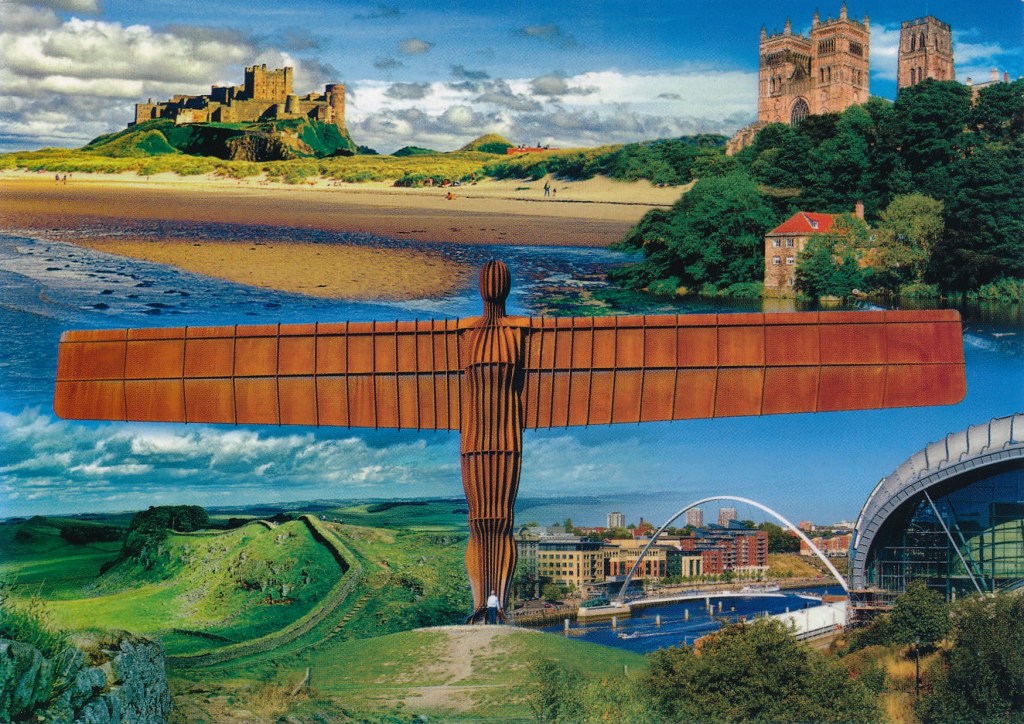
Mile Castle 39 and Crag Lough, looking East towards HousesteadsView across the Sele towards the AbbeySt. Andrews, Corbridge“The North East” Bamburg Castle, Durham Cathedral, The Angel of the North, Hadrian’s Wall, Gateshead Millennium Bridge and Sage Music Centre
The first thing that strikes me about all of them is the exaggerated colours; the blues are too blue and the greens too green. Yes, we do get blue skies up here but these do not feel at all natural. I cannot remember in thirty or so years of seeing the Tyne quite as blue as it appears in the second picture. (Indeed, in that one, all of the colours are too vivid.)
The next thing I get is a remarkable sense of flatness. It is not just that it looks as if they have deep depths of field but something about the reproduction has flattened everything out. The effect is quite unreal and two-dimensional. Are both of these effects simply the result of the processes of mechanical reproduction rather than choices made by the photographer, I wonder?
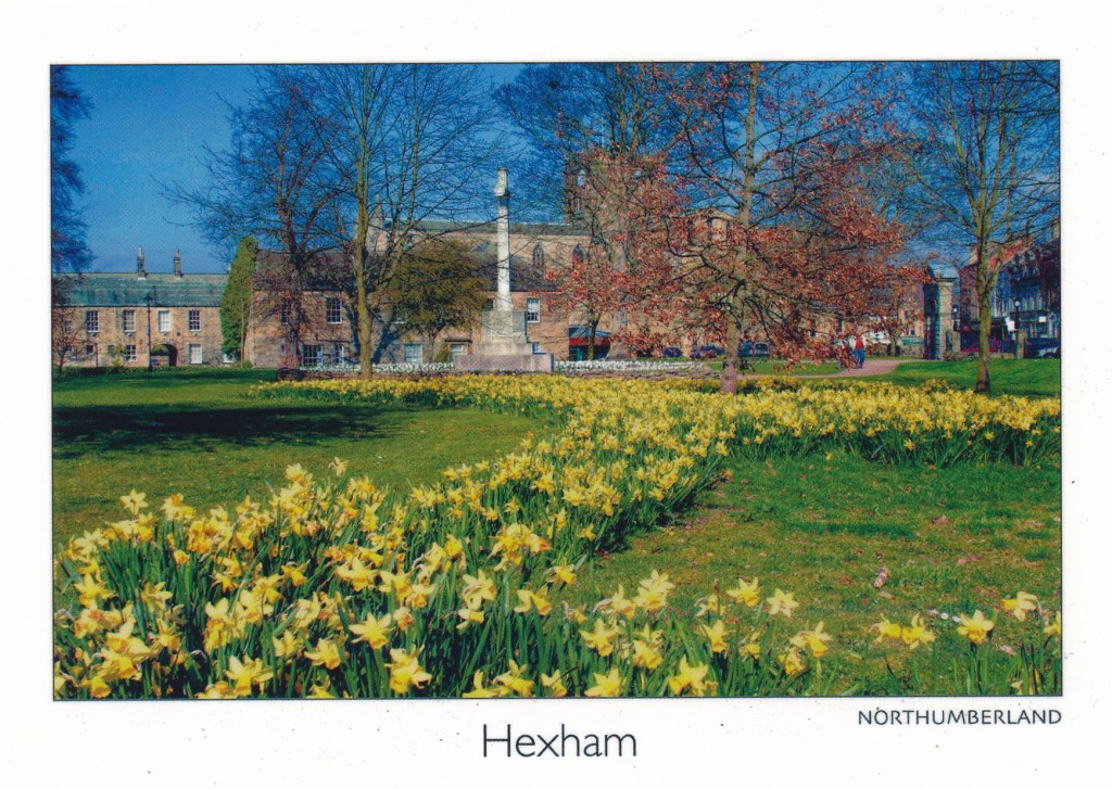
Three of them have what I would regard as odd viewpoints: Hexham, Hexham Abbey, and St. Andrews. The first is simply a bit of an odd view. I can think of plenty of other potentially more ‘picturesque’ views that this one, which is not one that I would expect the average visitor to Hexham to encounter or recognise. Given that the most striking physical presence in Hexham is the Abbey it is odd that in this view it is barely visible through the trees.
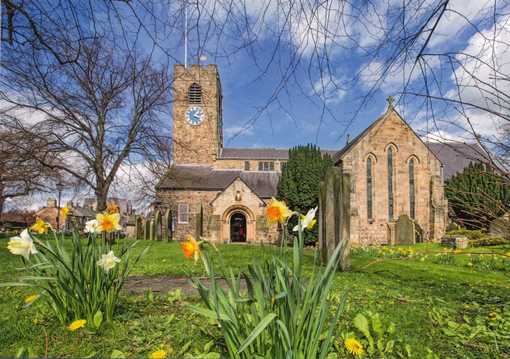
The second does at least focus on the Abbey, an impressive structure dating back in its current form (though much rebuilt in the 19th century) to the 11th century. (The original foundation goes back to 674.) The viewpoint is though not the most obvious or most impressive. The view that most visitors get is of the east facade from the market square, which it tends to dominate. This view is from the west, from the abbey gardens which are attractive enough in their own right, and at least it does show off the fine structure of the nave, but it is not one that your average visitor is likely to see without a bit of effort or help.
The view of St Andrews, which again is Saxon in origin and is a very fine parish church in its own right, home to a first rate annual chamber music festival, is again odd because of its viewpoint. The photographer must have been lying on the ground to get this. As a result the foreground daffodils are. for my taste, too dominant. This angle has also resulted in a dramatic foreshortening of the building so that its proportions have become strangely distorted: the south transept looks much bigger than it really is and the tower looks further away, and shorter, than again it is in reality. For me a much more satisfying, ‘picturesque’ even, view would have been from ordinary eye level and a few metres to the left which would give a much more natural impression of the church.
Not much more to say about the Hadrian’s Wall picture, which is not bad I think in compositional terms and does give some sense of the nature of the topography and countryside along this stretch of the wall (it is not like this for all of its length!).
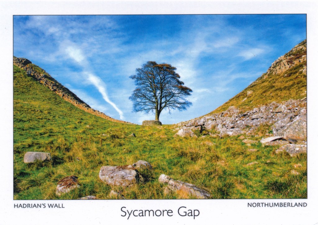
Similarly not a lot to say about the Sycamore Gap picture. Yes, this is the view that I keep on disparaging – nevertheless with apologies to all and sundry who like this sort of thing. What I really do not like about this view in general, not just limited to this postcard, is the way this tree has very much been taken out of context: it is a tree in a dip. That gives no real hint though about the narrowness of the ridge, what, despite the dip in the crest at this point, is quite an impressive natural physical barrier, and why the Wall is built along it I do not even think it is the most ‘dramatic’ view of it, which I think you get from much further back on the road. Again, as an aside, I am struck by the relatively low camera angle, which does at least give more of a sense of the sky, and the openness of the landscape than would, for example, be apparent from a ‘square-on’ view from the road, which is not at quite the same elevation but not much below.
The last one, the collage with the Angel, I have chosen simply because this is not the angle from which I would normally see it. More usually (which is not in fact that often) my view is from below and from the left, either from an East Coast line train heading into Newcastle, or from a car on the A1 which passes just below it. One thing I do like about this view is that there is a person just visible at the Angel’s feet, making this the only card that gives a reliable sense of scale, a reminder of just how big the Angel really is!
None of these cards fully align with my own experience and perception of these places. Nevertheless that does not by any means lead me to conclude that they are good examples of the genre, and they do all contrive to portray this region in a positive and attractive light. It is a beautiful part of the world but not always (often?) quite as brightly coloured as this!
I am a bit out of sequence with this exercise, starting with the second part first, before even I have reflected more generally on “The tourist perspective”.
To put the quotation from Clarke (1997) into perspective I have re-read the whole chapter on Landscape in Photography (pages 55 to 73). This is in my view a well written and thoughtful historical summary of the development of landscape photographing, clearly identifying the different trends as they developed in, specifically, English and American practice. Indeed, it is one of the best that I have read. I was though a bit surprised that the penultimate paragraph that is quoted in the brief resorts to such broad generalisations. Why do some theorists do this, make sleeping assertions that are ill-supported by actual evidence (I am thinking here in particular of Sontag)? I think Clarke’s assertion does hold good from an historical perspective. Photographers were largely literally in a privileged position, in so far as they could afford the cost of the equipment which was beyond the reach of most until the advent of mass market cameras such as the Box Brownie. Or they had, as for example, Timothy O’Sullivan, some official status or backing. They were also frequently tourists or outsiders and the camera was often used for the purposes of appropriation, colonisation and imperialism, for commercial gain. However, can it truly be said that the “photographer of landscapes is always the tourist, and invariably the outsider” (my emphasis)?
I would argue this broad generalisation is not supportable. “Always” and “invariably” are simply not true today for all landscape photographers. What if the photographer is showing his or her own ‘territory’, is depicting places that are known, indeed inhabited by the photographer? Does the act of getting behind the camera automatically make the photographer an outsider? No, I do not agree that this is the case. Let us consider some examples of photographers who have focused on their own patch (all examples who appear in my own library), working from the point of view of insiders with particular knowledge of and familiarity with the places they have photographed: Daido Moriyama in his home parish of Shinjuku in Tokyo; Guido Guidi on his home turf around Cesena; William Eggleston in Memphis; Michael Schmidt in Kreuzberg, Berlin. What about the people of Ashington in the Ashington District Star project photographing their home town, surely the epitome of the insider?
Most of my own landscape work, for this course and also personal projects, is made in and around the village where I live. I very much regard myself as an insider here. The things and places that I photograph have been chosen because I know them, many are places I see almost every day. I have come to know much of the local landscape intimately, watching it in all weathers and through all the seasons. This is after all what I am doing for Assignment 6. This is not something that I would have been able to do if I was an outsider. I simply would not know what to look for or the significance of what I am looking at, the places deeper histories and meanings. In that sense my landscape photography does not insist “on the land as spectacle” or “involve an element of pleasure”. I accept that much landscape photography, which I tend to deride to some extent or to dismiss, does indeed do both. But neither necessarily follow from the simple act of placing a camera between your eye and the landscape before you.
Clarke, G, (1997). The Photograph. Oxford: Oxford University Press
Working on the exercise on the Picturesque and rereading sections of Andrews (1999) a couple of things caught my eye that are relevant to what I have in mind for this assignment.
One (at page 116) is the reference to the Claude glass that travellers used was a means of creating picturesque views of the countryside through which they passed, framing the landscape and so “fixing it”. I suppose that the camera is in a way a modern equivalent framing the view and creating a composition.
The other is his discussion a couple of pages earlier (pages 114 and 115) of Train Landscape, 1940, by Eric Ravilious, and its strangely static nature:
“What is particularly unsettling about this picture is that there is no suggestion of any movement that would normally have the effect of blurring the contours of the exterior world. We are now very used to seeing landscape move rapidly past us through the window frames of train compartments or cars, so that the frame hardly contains a stable composition as it does through a house window. But the car, train or carriage passenger can enjoy a linked sequence of landscapes from that point of view. We imagine ourselves, by an odd transference, as seated in a stationary interior with the world rushing past outside …”
That is very much the effect that I am interested in achieving.
Andrews, M, (1999). Landscape and Western Art. Oxford: Oxford University Press
I have never really given much serious thought to the idea of the Picturesque before and now that I have done so what I have read and looked at goes some way towards why I have not bothered before.
What I get now reading a number of sources is how ill-defined a concept it is. Whilst Gilpin came up with a number of principles that define the Picturesque I find they are actually rather nebulous, changeable, hard to pin down. Indeed, the impression I have is that Gilpin speculated, and sometimes pontificated upon, what amounted to the Picturesque and then found that much of the natural landscape that he looked at did not fit his ideals. As Anna Pavord quotes him in her book (page 29) the Picturesque “is that particular kind of beauty, which is agreeable in a picture”. Not exactly a formula that could be used reliably to predict whether or not a view fits the bill.
The other thing, more importantly, is a sense of its unreality, perhaps in part driven by its fluid definitions. The most striking example of this (no pun intended) that I have come across in Gilpin’s book (1789 at page 47) is his suggestion that Tintern Abbey could be made more picturesque by taking a hammer to some the stonework in order to improve the view: “A mallet judiciously used (but who durst use it?) might be of service in fracturing some of them, particularly those of the cross isles, which are not only disagreeable in themselves, but confound the perspective.” I find this particularly egregious. In line with the rather loose definitions of the Picturesque he gives no real indication of exactly what manner or degree of amateur stone-masonry is required, and how dare the actual physical remains not comply with his conceptions of what is acceptable!
This sense of unreality is also highlighted by Andrews (1999) who quotes Uvedale Price (page 171) in his Essay on the Picturesque (I have discovered that his book is available on the Google Books project and have included a link below though I have not read very much at all of it myself) which is all about the artificial creation of a landscape (true “landscaping”) in order to create something that is Picturesque.
One useful thing that Andrews highlights at various points throughout his book is the important role of the farming of the view in order to make Picturesque, a view worthy of being looked at, which is also there in Gilpin with his talk of ‘screens’. In so many paintings that would be regarded as Picturesque the scene is carefully framed on each side, by trees, rocks, what have you, and the view within is carefully separated into fore-, middle-, and back-grounds. This artificiality is something that you also get in real places, where the picturesque viewing point has been careful chosen, and the viewer’s attention directed in such a way as to bring out the beauty of the view. One particular place that comes to mind in this regard is Queen Victoria’s View near Pitlochry (https://www.visitscotland.com/info/towns-villages/queens-view-p402191) which fits the bill almost perfectly and continues to this day to offer a highly idealised, and stage managed, view of what is admittedly very beautiful and dramatic countryside, but int the process tames and commodifies it.
How has the idea of the Picturesque influenced my own ideas about landscape art? It has not, other than in a negative way. I have expressed the view before that the salon approach to landscape photography, the single beautiful image, holds no interest for me. Coming back to one of my bug-bears, the endless shots of the tree at Sycamore Gap leave me entirely unmoved. These are, I suppose, classic Picturesque views: there are Gilpin’s side screens an idea that calls to mind little more than scenery for a stage play) in the form of the sides of the cleft and the remains of wall; a foreground in the form of the gently sloping land leading up to the tree; and a dramatic, wide-open sky in the background. But they do not say anything, mean anything. I have long been much more interested in landscapes that say something.
Here I am very much in the same camp as Fay Godwin, whose work has been something that I have cited and referred back to at various points throughout this degree course, going right back to the early days of EYV. I did not see the South Bank Show programme about her when it was first shown (I do not recall actually having a television in 1986) so I was glad to be able to find a copy of it on YouTube, though, perhaps a little oddly, a recording of a retransmission on Italian television, complete with Italian subtitles. I was impressed by her disdain, which she was not shy to express, about the banality of so many “picturesque” postcard views of countryside. What interested her more, and what appeals to me in her work and my own approach to landscape in art, is the political, the historical, the human, more broadly environmental, elements that go to help make up the landscape and have been influenced and created by it. I was intrigued by the discussion in the programme about Godwin’s work being seen as Romantic and how she never saw her work in quite that light, although nevertheless took it as something of a compliment. As the critic Ian Jeffery puts it in the programme her romanticism is always offset by something practical, analytical, commonplace. It is never just a pretty view.
Godwin’s work I suppose comes closest to what I would regard as a good landscape photograph.
Andrews, M, (1999). Landscape and Western Art. Oxford: Oxford University Press
Gilpin, W, (1789). Observations on the River Wye, and Several Parts of South Wales. London: Blamire (Gale ECCO facsimile reprint)
Pavord, A, (2016). Landskipping – Painters, Ploughmen, and Places. London: Bloomsbury
The latest exhibitions at the Side Gallery are a welcome antidote to some of the rather harrowing work that has been shown of late (particularly the last show of Ivor Prickett’s work: https://markrobinsonocalandscape.photo.blog/2019/10/17/ivor-prickett-end-of-the-caliphate-seeking-shelter-exhibition/). Working in different parts of the world Rena Effendi and Tessa Bunney have both focused on people leading traditional, rural lives that are increasingly under threat from modernity and development. These are no bucolic paradises, for many of these people life is clearly hard and challenging but these are nevertheless very positive portrayals, tapping into the fundamental dignity and decency of these people and their ways of life. The pictures of traditional haymaking particularly struck a chord with me as I done this work myself, cutting hay by hand with a scythe and raking it up into ricks. Very satisfying but really hard work!
It might sound a bit of a weak reaction but these are “nice” pictures, a pleasure to see, full of life (even though death is something that keeps intruding), wit and empathy. This is a show I positively want to go back to see again.
There is a also a third small show documenting a community project in Pennywell in Sunderland, one of the most deprived areas in the country. Members of the community were given cameras which they used to record aspects of their lives. Again what comes across strongly is a sense of humanity and dignity in the way these people, despite their challenges, help and support each other and have a strong sense of community.