Since my last post on this assignment I have been in contact with the Russian composer whose music I intend to use as a soundtrack to the slideshows. He has come back with his agreement, which is good news. I suspect he is simply pleased that I want use his work. I will still though keep this password protected so that it will not be generally accessible other than to my tutor, and for assessment in due course if I decide to make this part of my submission (which at the moment I am not at all sure about).
Next weekend I will take what I think are going to be the final images and I will then finalise the project and submit it to my tutor.
As that post, and others, might have suggested, one of my abiding fascinations (forget for now Japan and its photography) is for the Artic polar regions, their environment, ecology, people, and their ways of life and culture. I am therefore excited that there is at last (much delayed because of Covid-19) a major exhibition on the region at the British Museum: Arctic: Culture and Climate. Unfortunately I am not going to be able to visit the exhibition in person but I do at least now have a copy of the accompanying book, of the same title, and as appropriately hefty as a slab of ice.
As it only arrived a couple of days ago I have not yet had a chance to go through it in detail (though on a quick flick through it is clear that there are many treasures here waiting to be discovered) but there is one chapter in particular that has already caught my eye, written by a couple of residents of the Alaskan settlement of Shishmaref, the subject of Dana Lixenberg’s book about which I have already written and which still very much remains in my mind’s eye even when looking at, and thinking about, other environments. (Unfortunately Lixenberg does not get a mention in this new book, which is perhaps a shame given her work to record this community and its predicament and bring them to a wider, though still possibly fairly limited, audience, albeit one that is, I hope, more engaged and concerned.)
Against all the odds and predictions, the community is still there! They are still at severe risk, in need of help, and at the mercy of indifferent State and Federal authorities. But most importantly they are still there, still living a life that is intimately connected to, influenced and shaped by, their environment. There is clearly much scope for pessimism but also still room for hope.
What I perhaps find most interesting, coming across this short chapter, only a few pages long, is how moving I find the plight, if that is the right word – the predicament these people face – and how it relates to my own thinking about landscape as it has developed throughout this course, how people affect the landscape, and how they are in turn affected by it. If I had to identify one totemic symbol of my own thinking about this connection it might well be the people of Shishmaref. (And how appropriate that this new book should sit right next to Lixenberg’s in my personal bibliography for this course – kindred spirits at work!)
Lincoln, A, Cooper, J, Laurens Loovers, J P, (2020). Arctic: Culture and Climate. London: British Museum / Thames & Hudson
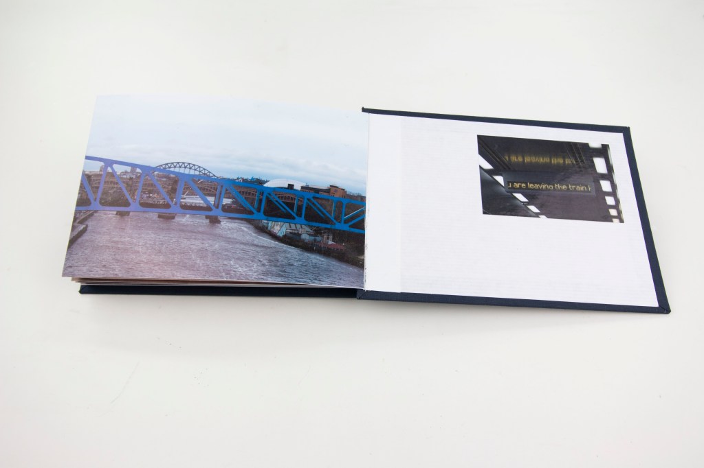
At long last the book is finished. It seems to have taken an inordinate amount of time, but I have to recognise that my studio has been out of action for quite a while and a number of other commitments have intervened. Nevertheless, it has taken much longer than I anticipated, not least because I underestimated how much work is actually involved in making a book of this nature; not surprising, perhaps, because I have never before made anything quite like this.
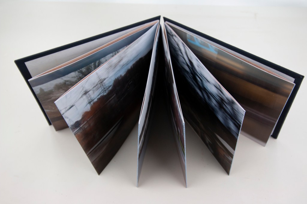
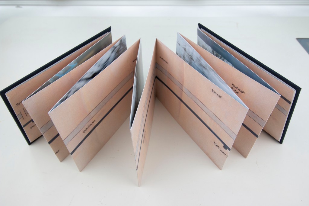
Nevertheless, it is now done, and as a first attempt at such a project I have to say I am pretty pleased with it. It is not perfect and is still, as I anticipated, very much a mock-up, a maquette, but nevertheless I think it looks good. It is on the one hand quite a solid piece of work, not least because in part it is three layers thick – photographs, hinges, map backing – but on the other feels a bit fragile. Possibly this is simply because of its hand-made nature and the fact it is, so to say, a prototype, lacking in a certain professional finish.
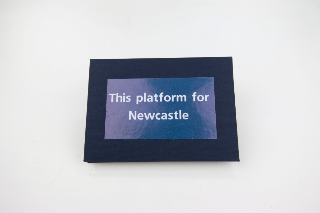
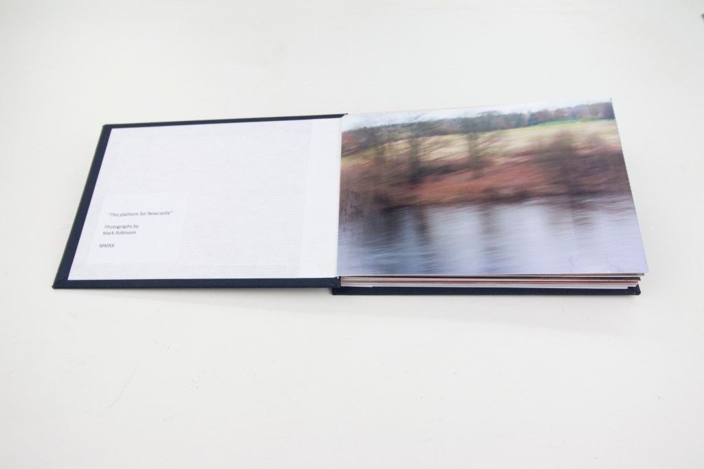
A bit of technical background on its construction. The photographs are digital prints on Canon Pro Platinum paper, hinged together with strips of envelope (a bit more robust than the other papers I have available). The map sections (prints of a scanned, hand-drawn map) are on ordinary plain printer paper and overlap the joins of the photographs, reinforcing the hinges. The covers are cut from some fibre board that I happened to have lying around in the studio – just the right weight and thickness – and covered with a smooth finish rayon dark blue bookcloth These are in turn lined with a white ribbed kraft paper. Everything was stuck together with a rice starch and PVA paste, which has the advantage of being slow drying, so that everything could be adjusted and aligned properly before going into the press, dries without staining, and smooths out any folds or creases in paper. As each step of the construction was completed the growing book went into an old cast-iron bookbinder’s press (which is incredibly heavy!) to keep everything flat while the paste set. (Despite this there is a clear tendency for the photos to curl slightly so it is clear that over time it is going to be necessary to keep the book firmly closed to keep the contents flat.) I have added a small colophon plate to the inside of the front cover and an extra photo, not part of the original sequence for this assignment and on a smaller scale, by way of a coda onside the back.
The specialist bookbinding materials (bookcloth, paste, a couple of tools) I bought from Shepherds in London, a Mecca for bookbinders. I have not visited their shop but I expect it will be an Aladdin’s cave! (My favourite such shop of all is probably Cornelissen near the British Museum, that dates back to 1855, from which I have in the past bought much of my print-making materials.)
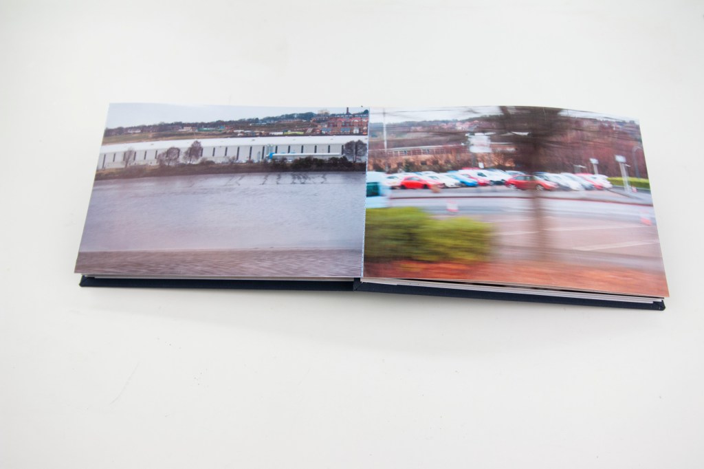
Here are some views of the finished article:
And a short video to give some further sense of the physicality of the book as an artefact:
It could be said that, in a sense, this has been a bit of a distraction in that I did not need to make this book. Nevertheless, I feel it has been a very useful, and enlightening, not to mention valuable, diversion. I have learned so much about the physical process of producing a book (at least one in concertina form) that I am sure is going to be valuable in the future and open up more possibilities worthy of consideration for the presentation of work. It has also itself, as a physical process, simply been enjoyable and satisfying and worth doing from that point of view alone.
I have now got my studio functioning again and have made some progress with this long running book project at last, though paradoxically I have had to move everything into another room to do so.
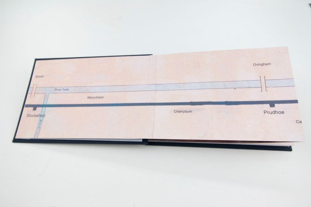
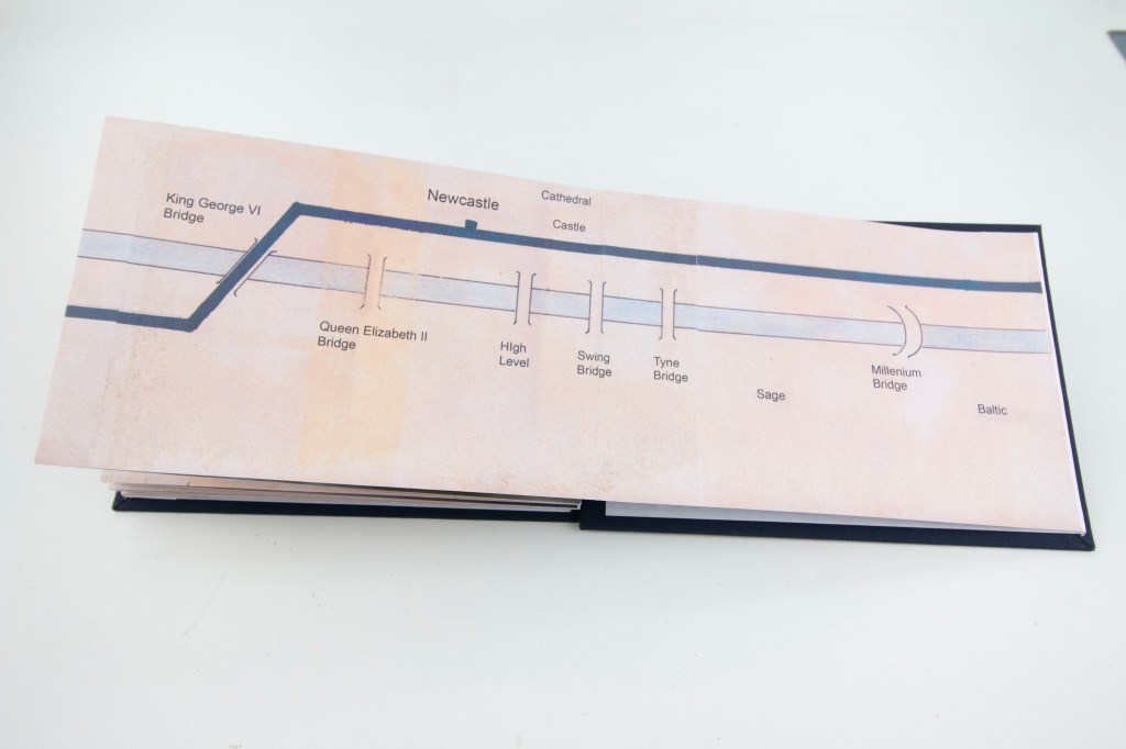
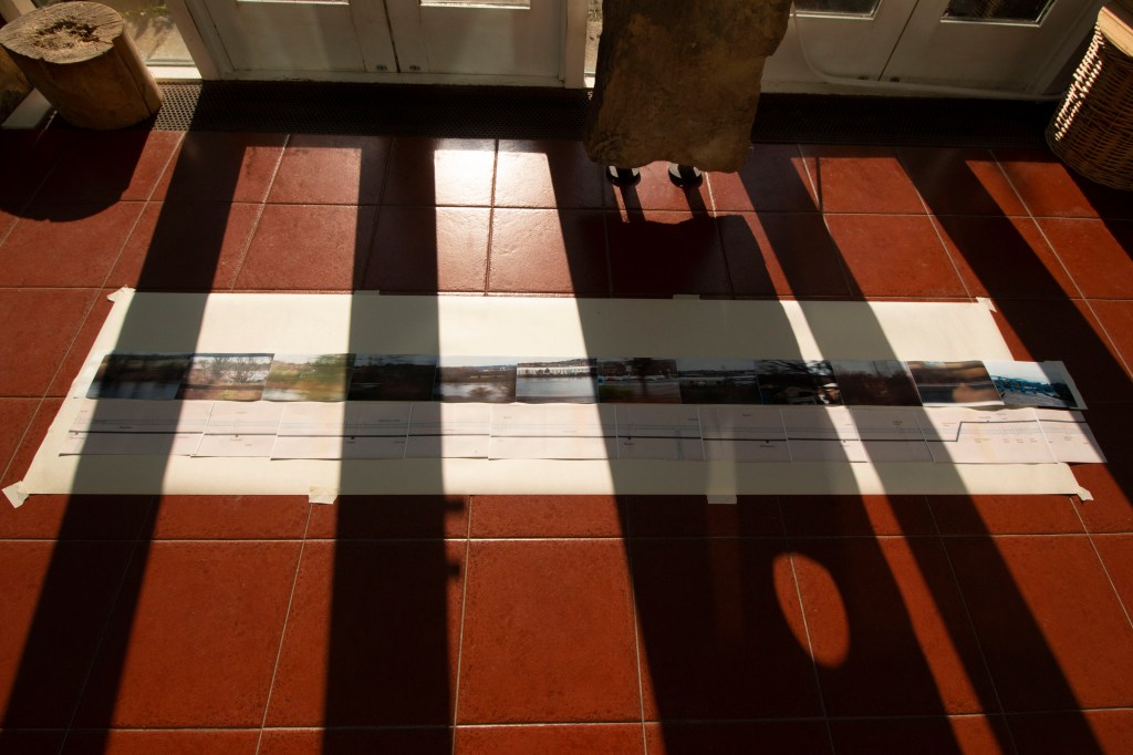
Having got the sequence of photographs sorted and hinged together, the next job, having drawn and printed the map to go on the reverse, has been to arrange the sections of the map to match the overall length of the whole sequence. This has proved to be much trickier than I had anticipated and has involved a certain amount of “editing” of the map. Fortunately, the map has never been strictly to scale, for practical reasons that I have already touched on, and all the more fortunately there are stretches of it that contain very little, and so are ripe for cropping without upsetting the overall scheme. From a practical point of view though it has not been possible to do a proper layout in the studio, because my working table is simply not big enough to accommodate the whole length of the nascent book (almost 2.5 metres, a good metre longer than my drawing desk) which has made synchronising photos and map sections difficult. This is a crucial task that needs to be got right before I can start to fit the concertina within the book covers. I have therefore had to resort to laying the whole thing out on the floor in my garden room, the only other practical space reasonably available. This is not the greatest of photographs because of the bright westerly sun but nevertheless shows how I have been able to lay out the ready prepared concertina sequence of photographs and arrange the map sections to match.
Since then I have pasted the map section onto the back of the photographs and now the whole thing has been refolded and is in my book-press to compress and flatten everything out. The next step will be to mount the cover boards (which are otherwise ready), add an internal lining paper to them, one final image on the inside of the rear cover to round off the main sequence, a small colophon plate that will go on the inside of the front cover, and at last all will be done! All being well, that will all happen within the next couple of days and after a little more time in the press to make sure everything is flat, it will at last be complete.
Not for the first time I find myself struggling with Lightroom. I find it particularly un-user friendly and the “help” function not very helpful at all. I recognise that in part it no doubt comes down to a lack of familiarity with the way it works but I am having so much trouble with it that I am disinclined to use it and so will not gain that familiarity.
The problem that I am having with it at the moment is that it will not let me rearrange the order of the images in the slideshow that I am working in. I have followed the instructions provided by Adobe on how to do this (which is reasonably straightforward) only to be informed by the program that I cannot do it. I am therefore stuck at the moment with the current running order, starting in Autumn. The solution, as I see it at the moment, is to change the order of the accompanying music. Having relistened to both the original and updated versions of my chosen music I have decided to stay with the earlier one (the later version goes into five movements, adding a repeat of the opening Spring movement which serves to complicate things still further) so the music opens with Summer. What I have discovered though, which has proved to be remarkably easy, is to change the order of the music tracks, moving Summer from the start to the end. The “seasons” are not entirely in sync with the images but by starting with Autumn there is a reasonable match. Fortunately changing the order of the music does not greatly compromise the work as a whole.
Unless and until I can get better to grips with Lightroom this will have to do for now. At least it does work!
Central to my thesis about the meaning and significance of landscape photography is the idea of the impact, or at least influence, on the environment of humankind. I have though now come across a collection of photographs, presented as “postcards”, that deal with a physical landscape that has not been affected directly (let us for now leave aside man-made climate change) for millennia.
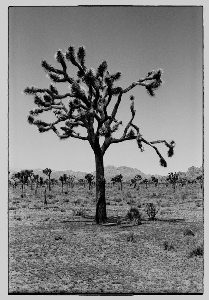
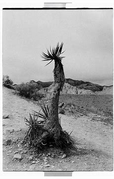
Elena Cremona’s “Postcards from the past” is a set (still a book?) of twenty photographs, all of them postcard size (a ratio of 2:3) taken in Joshua Tree National Park, in the Mojave desert in California, during the break-up (break-down – is it not odd how we use two directly opposed directions to describe the same thing?) of a relationship. I cannot speak to that personal cataclysm but I do respond to these images on not only a photographic but also on a personal level, not least because I have been to that part of the world, more than once (driving, hiking, camping), and have been captivated by this primeval landscape. Apparently, at least superficially (human impact has of course been profound but not always immediately visible), this is an ancient, pristine landscape untouched by homo sapiens where you might not be surprised if a living dinosaur suddenly came into view around the next pile of rocks – think “Jurassic Park” without the vegetation. When U2 released their eponymous album (which I am afraid I did not like much) I thought, somewhat naively, that there was just one tree. There are in fact hundreds of thousands of them – possibly millions – (not strictly speaking trees at all, members of the Yucca family) though now direly threatened by climate change.
From a photographic point of view, there are a couple of things that strike me about these images. One is that they are clearly analogue, shot on film, though I find it hard to identify what format, which gives them an almost physical, tactile quality. Unlike Ansel Adams’s work, they are quite grainy, with relatively shallow depths of field, which I find particularly appealing given the, literally, “grainy” – dry, dusty, gritty – nature of the landscape (the grit gets everywhere). Whereas with Adams’s work when looking at his pictures you can feel like a disembodied observer with these photos I have the feeling of being there in the landscape, just looking at it through a limited aperture (admittedly, possibly because I have been there and seen it in just this way). Although postcard size the images are a little subversive in so far as all but one use portrait rather than conventional “landscape” format. This I find interesting as it not only subverts received notions of what a “landscape” picture should look like but also relates directly to the environment that is depicted. Joshua Tree National Park is high desert, a vast plain at least 1300 feet above sea level. The horizon is broad and flat. There is little to puncture the visual plane other than rock outcroppings. Apart from the trees themselves. They introduce a verticality, like exclamation marks, that serve to emphasise the way the flatness of the landscape actually accentuates the vastness of the sky above, making the experience of being there more of a vertical one than horizontal. It is hard to describe but the feeling that I have had there, every time I have been, is not only of the breadth of the horizon but how much space is above, as if standing on the bottom of a deep sea and looking up towards the sky.
The postcard medium also strikes me as itself entirely appropriate as a means of depicting this specific landscape. There are people that live here (there is a town called Joshua Tree in which I have stayed, and stayed awake much of the night, woken by the comings and goings of a local family of coyotes!) but to visit is to feel a strong sense of being a visitor, an outsider, so that any view that one brings back is little more than a “postcard”.
In their physical postcard form they induce a degree of nostalgia. “Wish you were here!” It is very unlikely that I will ever revisit, but in some ways I would dearly like to do so. Although the memories that these photos encapsulate for the maker, for Elena Cremona, will be quite specific, and not necessarily pleasant, for me they embody very different and personal memories of my own. Although they are not my own photographs they nevertheless speak to me at a very personal level.
Cremona, E, (2019). Postcards from the past. London: Guest Editions
I started shooting for Assignment 6 back in October last year, with a view to recording seasonal and other changes, “transitions”, for a full year. That twelve months is now nearly up so I have started experimenting with possible presentations of the project. I have already discussed and agreed with my tutor that the slideshow approach is probably the best to adopt and so for now I am concentrating on that. I have also been thinking more about, and experimenting with, suitable soundtracks. A few things have become clear immediately.
In so far as one of my primary themes throughout this course has been the effect of humankind on the landscape, and in turn the effect of the landscape on people, what the final sequence needs to show is not just seasonal changes in the landscape but the passage of people through it over time, both on foot (with and without dogs), and in vehicles. I have written elsewhere before now a little of the history of the ford I have chosen for this project. The road follows the route of an ancient pack-horse trail that goes back at least until Medieval times, and quite probably still further back. Given the heavy Roman presence in the area, the proximity to the river Tyne, the transport of lead ore down from the local hills, active farming by the local Roman-British population, this is a route that could well have been in use for at least the last two millennia. Over time the track developed into a road, no doubt a rough one at first, at least partly paved later (there is an off-shoot bridleway nearby that goes back at least to the 17th century that still has remnants of early cobbles and stone setts), before in more recent times becoming metalled. The ford itself developed from a simple track through the water to the present-day concrete footbridge. Including pictures with people and cars in them serves to highlight the latest iteration of this continuing human impact on the landscape.
Something else that is clear is that the slideshow needs to be quite long to have the right impact – at the moment I anticipate sequences of something in the region of 175 images that will run for about 15 – 20 minutes (there are going to be two, one looking west, the other looking east). Anything shorter does not seem to work well.
This last point has implications for the soundtrack. What is obvious is that my idea of using an old Bobby Gentry song is not going to work as it is only about two and a half minutes long. I still do not want to use Vivaldi, but the Four Seasons concerto is in any event too long. Similarly, staying with the seasonal theme, Haydn’s “The Seasons” (which I was a bit surprised to discover when I checked my music collection I do not have) is even longer still, running to about two hours. By chance though, something I do have in my collection is a work by a contemporary Russian composer, Sergey Akhunov, which follows a similar structure to that used by Vivaldi, with one short movement for each season, that runs to about 20 minutes, which is just right. So far the sequence of images starts in Autumn while Akhunov’s sequence starts with Summer (in an early version, Spring in a later one) so I am going to have to adjust the running order of the photographs. Nevertheless, a quick run through yesterday suggests that the pairing should work: it is striking how, wholly coincidentally, some of the passages in the music seem to fit naturally with the images. I am not going to try otherwise to manipulate the order of the pictures to try to match the progression of the music, something well beyond my capabilities!
Using such a piece of contemporary music raises the possibility of being able to get permission to make the project public. Although I do not know Akhunov personally I have been supporting some of his work over the last few years (along with a fairly small band of others) which might give me enough on an intro. Certainly, contacting him would not be difficult. Possibly worth a try. The worst he can say is “no”, in which case the project will simply remain private and accessible only to my tutor.
More supportive feedback from my tutor following our discussion last week. Next steps are to do some more experiments with Assignment 6 before finishing it off, and completing the book version of Assignment 2, which still needs some work. Unfortunately my studio has been out of commission for a number of weeks so I have not been able to work on this particular project.
“Overall Comments
Another long and wide-ranging discussion covering not only Assignment 5 but also revisiting some earlier work and looking ahead to Assignment 6.
Feedback on assignment
This has worked well, successfully visualizing the underlying concept, and achieving what I set out wanting to achieve. The use of the Zone System to deal with the technical challenges presented by achieving proper exposure of the black and white images was good. It has given the final images a pleasantly old-fashioned feel, very much in the style of early landscape photographs. To an extent they are reminiscent of the work of Robert Adams and the American New Topographics school of landscape photography. (Adams did form part of my research for this assignment.)
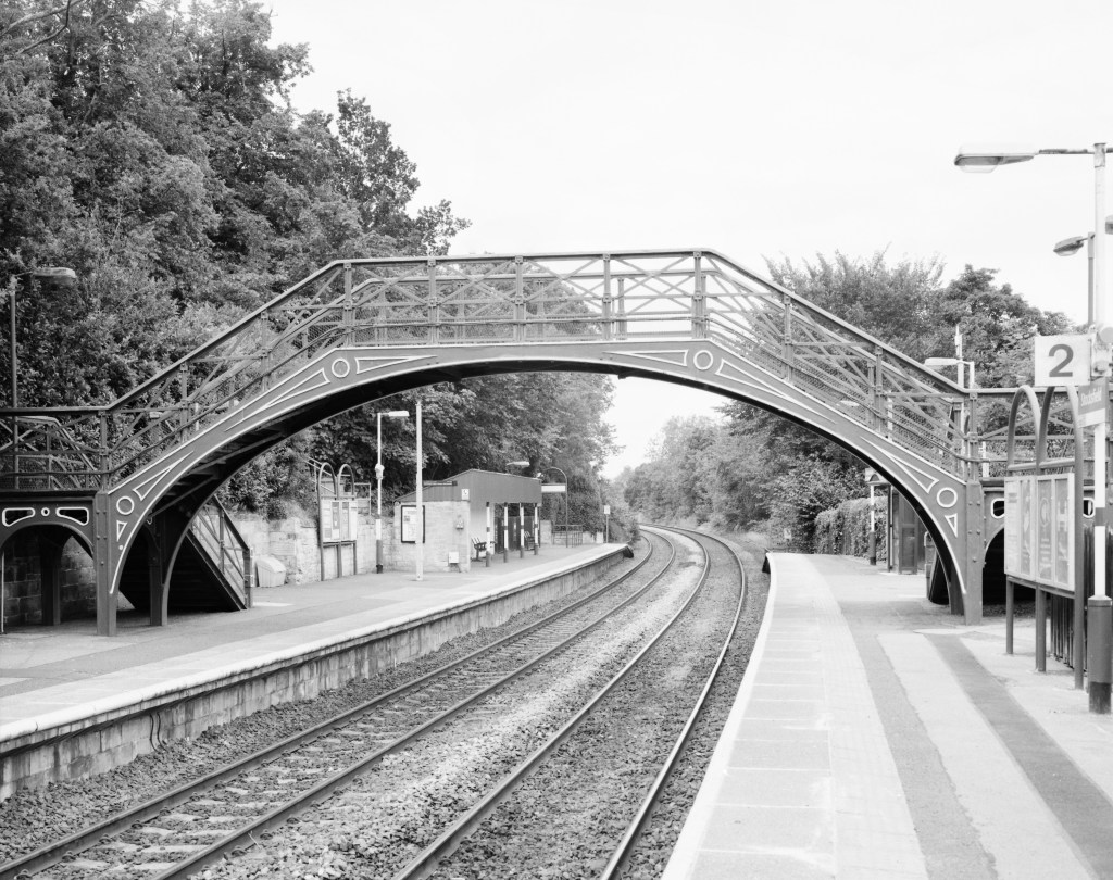
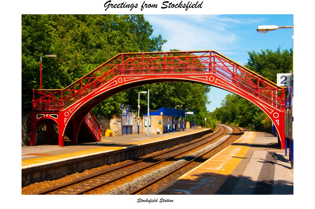
Following on from this we had a lengthy discussion about the differences in the appearance of the composition of the railway station image in particular between the two versions, the result of having used two very different format cameras, notwithstanding that the camera positions were almost the same.
The lurid colours of the postcards are reminiscent of typical postcards from the 1960s and 1970s, and work well in the context of evoking a sense of nostalgia. You suggested I should take a look at and experiment with some of the preset filters in Photoshop / Lightroom that might produce similar effects. We also agreed that they are reminiscent of the early colour work of Guido Guidi, with early single emulsion films, that I have been looking at recently, although not necessarily a conscious influence on my work for this assignment.
If this assignment is to form part of the submission for assessment you recommended that I include more about the technical issues involved with the film work and the learning process that I went through.
Finally we discussed a the issue of engaging with people encountered during a shoot to explain what is happening and allay or defuse any concerns that they might otherwise have, something that I found particularly helpful while making this work, not least in the context of the difficult environment resulting from Covid 19.
Coursework
Demonstration of technical and Visual Skills, Demonstration of Creativity
You remain happy with the quality of what I am producing as part of the regular course work.
We revisited the experience of making books using Blurb, which I felt was very positive. I did not find the Blurb presets in Lightroom at all helpful or user friendly, particularly so far as incorporating text was concerned, but Blurb’s own app was simplicity itself.
So far as the artist’s statement was concerned, you are of the view that what I have put together supports all the work I have done, and continue to do, across all six assignments.
Wide ranging for history and context, focused for exercises and assignment work – excellent throughout.
Learning Log
Overall this contains high quality work and reflects a level of commitment beyond the course itself to the medium and craft of photography.
Pointers for the next assignment / assessment
There is still work to do in gathering images for Assignment 6 (the full period of twelve months will not be complete until October) but it nevertheless appears that some form of slideshow is the way to present it. In this regard we revisited the slideshows with which I experimented for Assignments 1 and 2. The Buddhist bells and singing bowls soundtrack works well with the cloud sequence and adds a meditative nature to it. A soundtrack, perhaps reminiscent of Claudia Molitor’s Sonorama, would work well with the slideshow version of the journey in Assignment 2. Nevertheless we agreed that it would be too big a job and a distraction from the visual work. I should nevertheless experiment for Assignment 6 and see how it goes. I will in particular focus on an old Bobby Gentry song, “Seasons Come, Seasons Go” (not Vivaldi!) and see how it works. Because of potential copyright issues we agreed that if this does form the final soundtrack I should ensure that the slideshow that eventually appears on Vimeo should not be publicly accessible.”
I had a long discussion with my tutor the other day about Assignment 5 (which, happily, he liked) and various other issues (I will deal with the feedback on this session anon) but for now one particular thing stands out for me. Something that I have not done with this latest project is juxtapose the two sets of images that I have produced side-by-side, for direct comparison. My tutor though has done just that and he has made an interesting observation as a result, how two views of the same scene, although taken from almost the same position, can be very different when taken on different cameras.
I have been aware throughout this project of the different characteristics of the different cameras that I have used and their different lenses: a digital Leica, full frame sensor, with a 50mm lens; a digital Canon, cropped sensor, with a 18 – 135mm zoom; and the 4×5 film camera with a 150mm lens (roughly equivalent to a 50mm lens on a 35mm camera. What I had not quite appreciated until my tutor pointed it out is how certain of the views I shot look significantly different from one camera to the other. This is particularly evident on the images of the train station. It does not really show up on most of the others as they are quite deadpan with a flat focal plane. The views of the station though have more depth and the eye is drawn into the picture, and into the distance, by the train tracks. Here are the pictures:
A couple of things strike me. One is how the bridge looks longer in the postcard, which was taken with the Leica and apart from the colour balance has not otherwise been adjusted in any way in Photoshop. The other is how much straighter the tracks appear in the large format camera version. Both were taken in almost exactly the same position. I had expected some differences as a result of the very different aperture settings and the resulting differences in depth of field: the Leica set itself to f/6.8; the film camera lens was set at f/22. It is often apparent in the work of Ansel Adams how the depth of field can have the effect of flattening out the image and a sense of depth starts to disappear as both near and far objects are in clear focus, which sometimes can seem almost hallucinatory. (All the more so when he went all the way to f/64. My 150mm large format lens stops down that far but I have not really had the courage to push it to that limit yet as it requires such long exposure times.) There is an element of that at work here but what I had not expected was how it might affect the apparent geometry of elements in the composition. Interesting, and something that I need to be aware of in future, and think about, before choosing which camera to use for a given project.
That consideration is I think the most important thing that comes out of this comparison. It is said (still, and all too often, and I profoundly disagree) that the camera does not lie. What this exercise demonstrates for me is that even if cameras do not lie, they do not necessarily tell “the” truth. Obvious really bit nevertheless still worth reflecting upon is that they are just means of seeing and recoding an image of a view, mechanical and technological analogues of human eyes. Different cameras, with different lenses and technical specifications and characteristics are going to capture images in different ways, just as the image that I perceive with my eyes and brain is going to be different from what someone else perceives when looking at the same object. There is no “truth” or “reality” in what we see, rather a physiological and neurological version of objective “reality”. As my Buddhist principles would have it though, reality is itself an illusion. So once again I am drawn back to idea that photography is fundamentally unreliable as an objective medium.
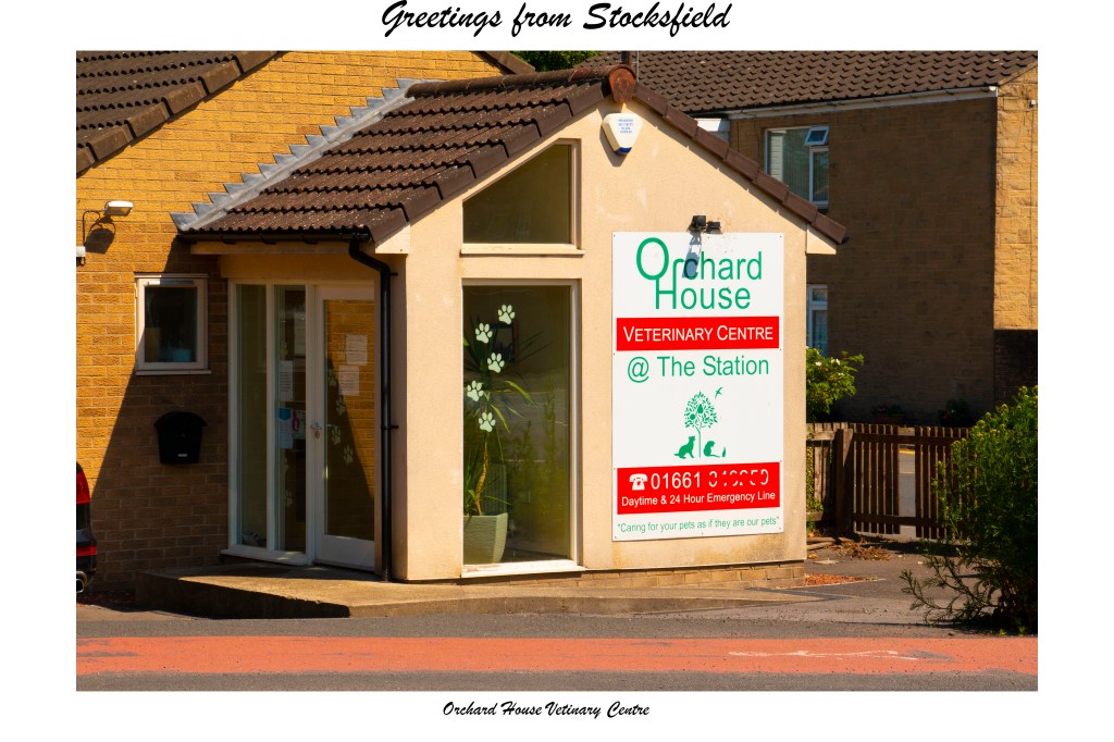
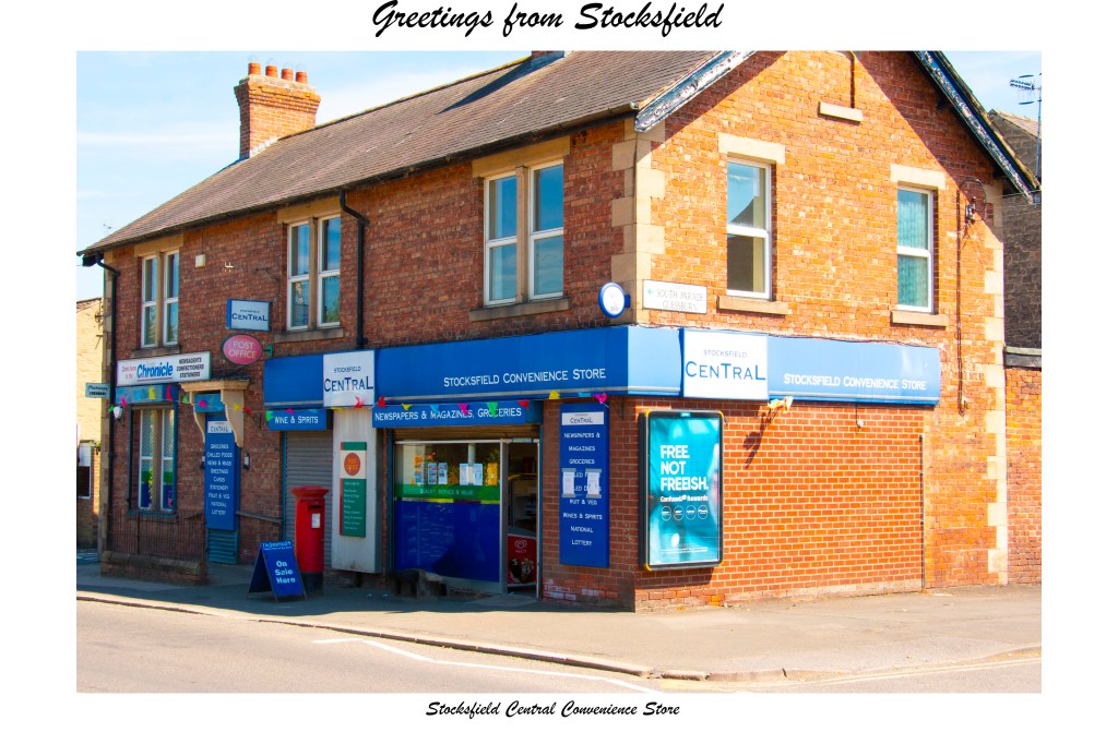
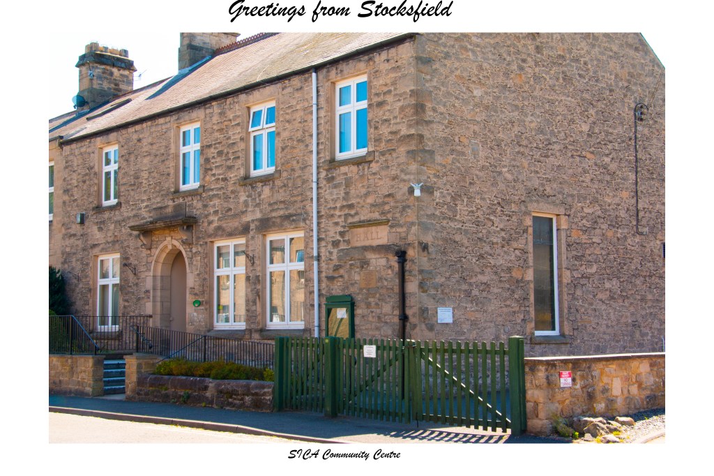
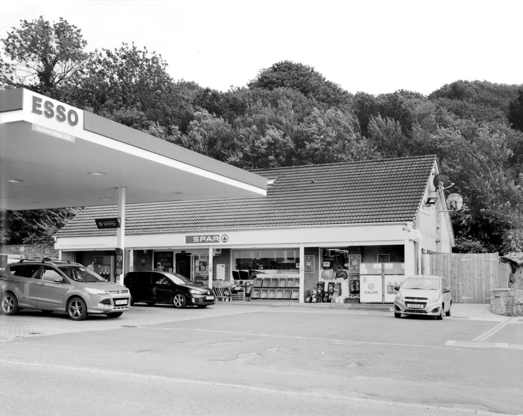
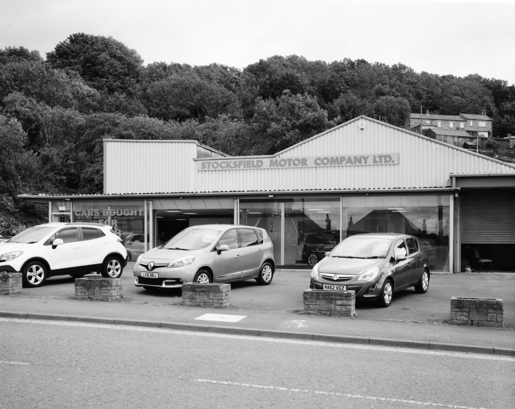
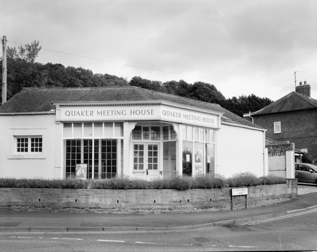
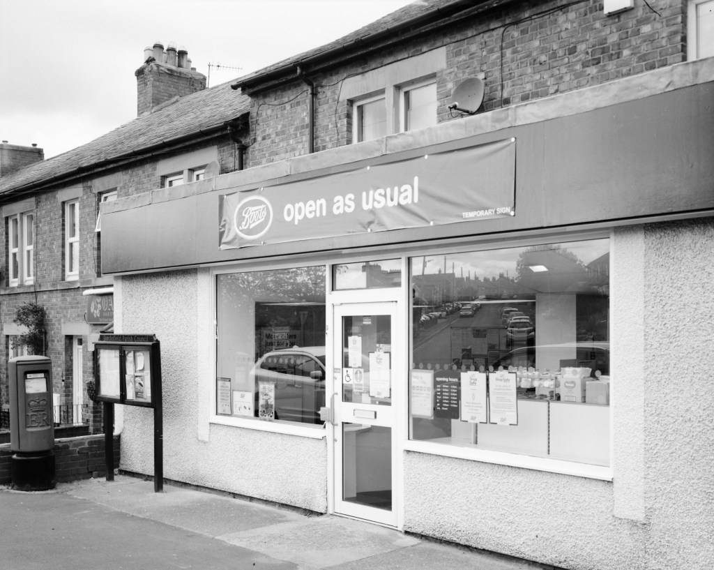
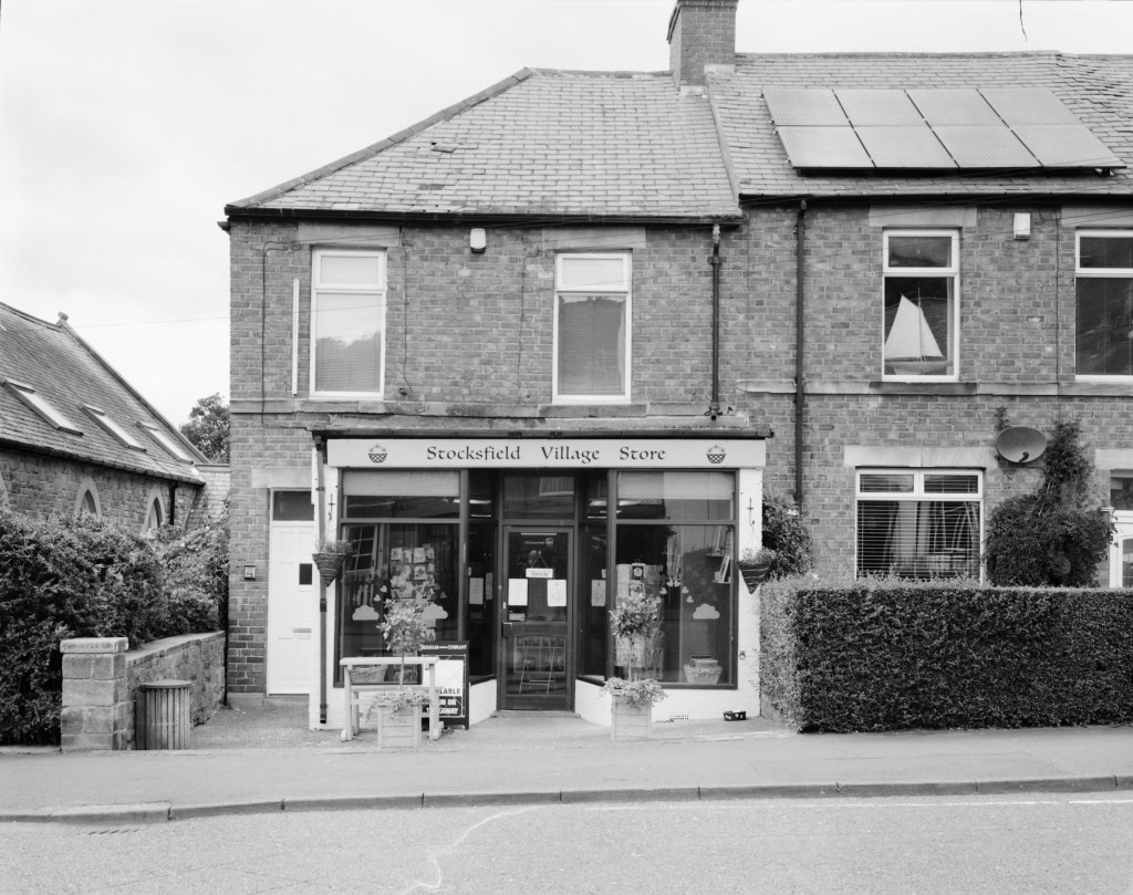
At last this project is now complete, after a total of eight separate shoots, and a number of practical and technical problems encountered along the way as I have chronicled in recent posts. For the film element, I reverted to my original 150mm lens on the 4×5 large format camera and the results are now something that I am happy with. Despite some of my earlier speculations though I have decided not to crop these images to remove “extraneous” background, merely to tidy up the uneven edges produced by the original negatives. I have made this choice after seeing the scanned negatives as I feel that the wider fields of view actually help to create a little more context for my chosen sites, fitting them more clearly into the wider environment of the village. Also, from a purely practical point of view, I do not feel that the wider angle provided by this shorter lens has actually made as much difference as I expected.
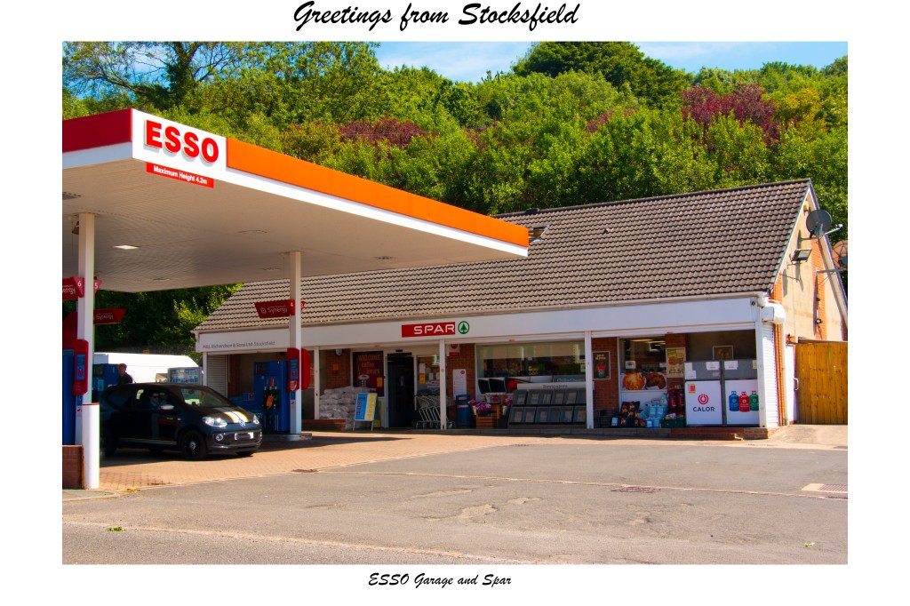
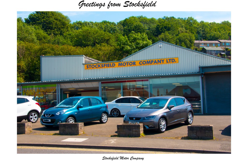
So far as the postcard set is concerned, having reviewed them again I have made only a few very slight adjustments. Otherwise they remain very much as they appeared in my earlier post on them. Here are both sets:
Original Proposal
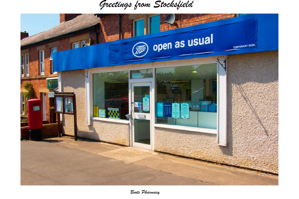
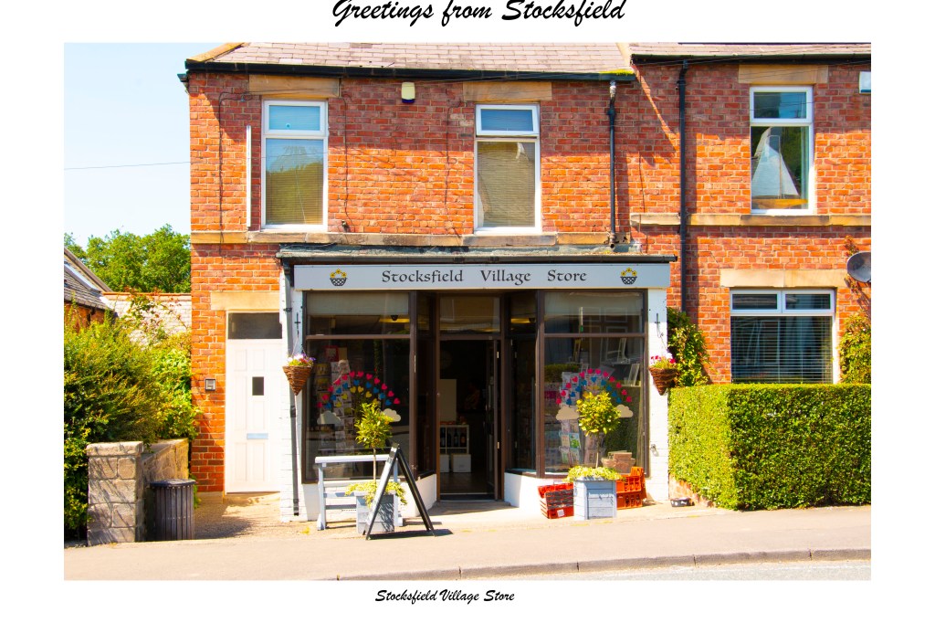
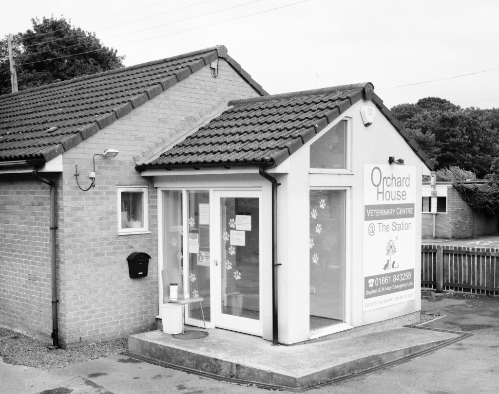
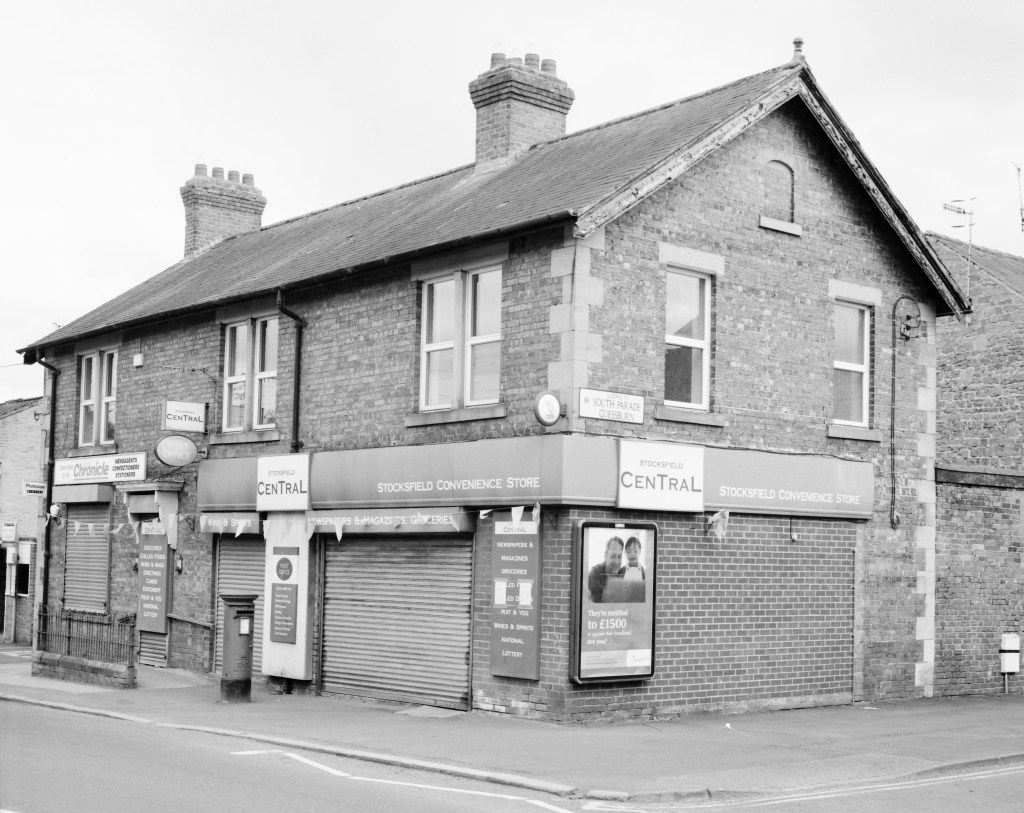
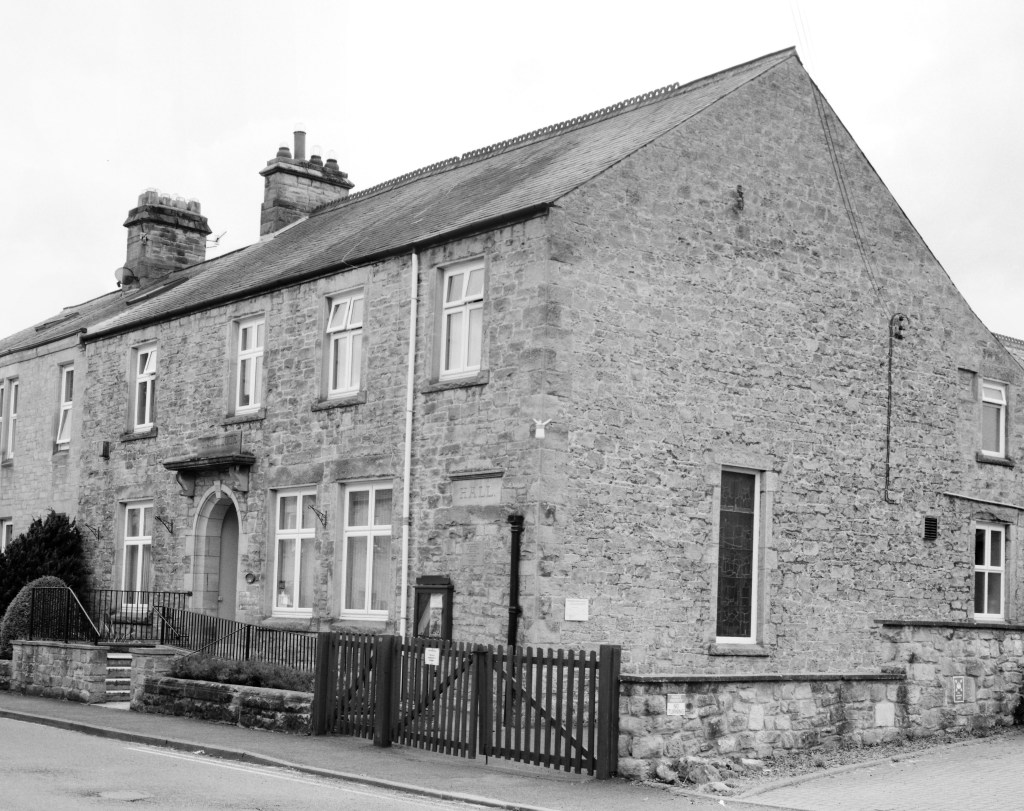
I made my original proposal for this project in Exercise 4.6 – https://markrobinsonocalandscape.photo.blog/2020/05/03/exercise-4-6-proposal-for-the-self-directed-project/ – and the basic idea has not really changed. I would though say that the seriousness of the approaches has increased and that the results are a little less ironic that I had originally envisioned. The key point that has developed is the importance of these particular sites for the identity of the village as a whole. Without them the village would be little more than a dormitory. Their presence turns the space, the wider physical environment of the village, into a particular place, somewhere that is significant for the people that live here and where they can carry out the ostensibly mundane but nevertheless very significant tasks and activities of everyday life. This importance has become increasingly apparent to me in the light of the restrictions on “normal” life imposed as a result of Covid-19.
There is still a sense of irony – would people really want to visit the village and send postcards home? – but I feel that irony serves to emphasise the underlying importance to us as residents of these places. We need them and so they are worthy of being recognised as significant, worthy of being visited and memorialised in a postcard, and treated with the dignity of a more “fine-art” photograph.
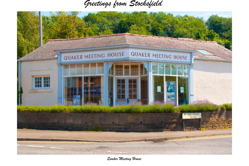
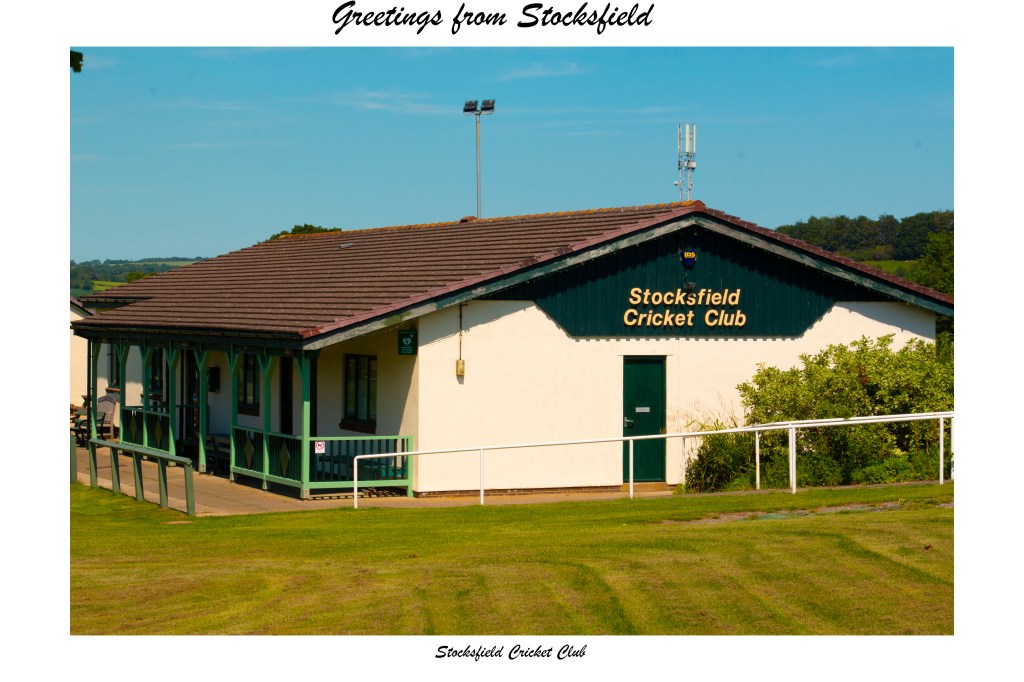
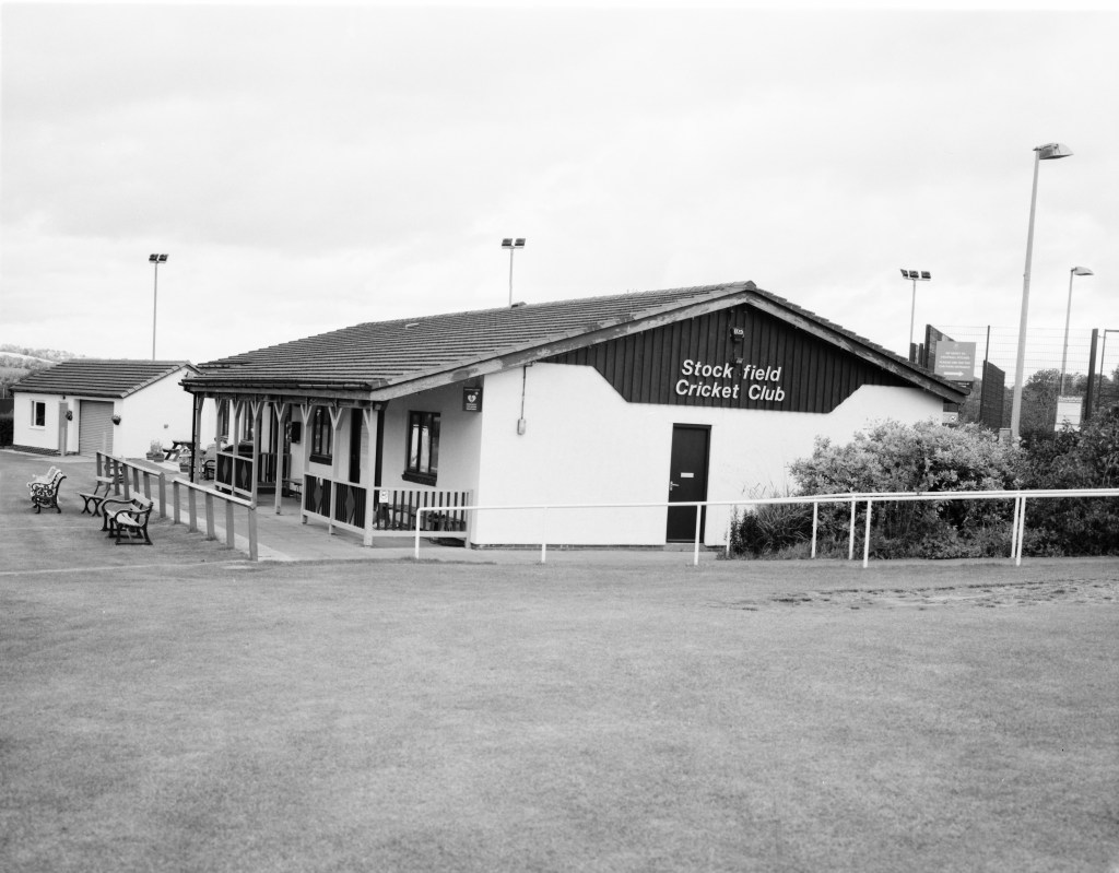
Another important element of the work that comes out of this latter point, is a greater sense of nostalgia. The over-vibrant postcards are a throwback to cards bought on childhood trips (real or imaged memories). The film set look back to the work of the likes of Anselm Adams. Both are in a sense touching on a nostalgia, again real or imagined, for past village life, a sense of a rural ideal. All that is missing here to make it perfect is a village green (I suppose the cricket club comes the closest to serving such a purpose).
Otherwise, and still quite importantly, there is a sense in which by choosing such “ordinary” views, I am challenging, or at least questioning, received notions of “landscape” photography and what are worthy subjects of attention.
The other significant development, since I put forward that first proposal, is that I now have a good quality photo-printer and so can now do all my own printing (all the way up to A3 size!) and do not have to rely on external resources. I can also still print up to 8×10 from the negatives in my darkroom.
“My current work is concerned with the role landscape can play as a place that contains and records memory. I am also interested in how human relationships with the landscape affect that memorial function and can give places particular meanings and significance beyond being merely a geographical location. This project deals particularly with this latter aspect of landscape and explores how ostensibly mundane places can carry significance in themselves and how they contribute to the transformation of space into a place. The choice of such ordinary locations itself challenges received notions of the subject matter that is deemed to be suitable for landscape photography. Questions of memory are also addressed by evoking a sense of nostalgia for an imagined ideal of the rural village, both through the irony of the holiday postcard (which in turn conjures memories of childhood holidays) and the “fine-art” approach of the large format black and white photographs.”
Further Learning
Following on from earlier work on this module, the decision to involve black and white film photography has offered a practical opportunity to revisit and explore further the Zone System. What was striking when shooting these images was the range of different exposure readings that were obtained for almost every shot, depending on where in each scene a point of focus was chosen. In the more extreme cases, for an aperture of f/22 (I wanted good depth of field and to capture as much fine detail as possible but without having to go for really long exposures), shutter speeds ranged from 1/20s to 1/100. By adopting the system (even as imperfectly as I understand it!) I was able to choose points that would serve as Zone V, and set the shutter speed accordingly, without either blowing out the highlighted areas completely, or losing too much detail in the darker areas. I am sure I could tweak and refine this approach further but for now I am quite happy with the tonal ranges that I have achieved – not least as they have not been adjusted at all in Photoshop.
Evaluation
As Assessment is moving away from the old assessment criteria to learning outcomes, for this assignment I am not going to work through the old criteria. Nor am I, in any formal or structured way, going to look at the assignment from the new point of view, if only because I am only just starting to get my head around the new assessment process. I do though have some general observations.
First and foremost, I am quite happy with the way this has worked out. This was the first time that I have planned, developed, and executed a substantial, sustained project for myself, rather than just following a preassigned brief. The technical difficulties encountered with the new large format lens were unexpected and caused not a little emotional angst and upset my schedule. Nevertheless, I am happy that I was able to overcome them. This in itself was an important learning experience for me. Until now I have really only dabbled with the large format camera, more than anything just to find out its capabilities and limitations, so this was the first time I have used it to make a substantial body of work. I am also pleased that I feel that I have been able to capture in the final sets of images (and I remain happy with the decision to follow two distinctly different approaches) the basic ideas that underlay my original proposal.
Fortunately, the concerns that I had from the point of view of Covid-19 did not really materialise. Public attention and sensitivity were pretty much as I expected and again were not difficult to deal with. What my experiences this time have reinforced for me is that a little engagement is what is needed: once people know what is going on their concerns seem largely to evaporate.
Would I do anything differently if I was to revisit this project? Not fundamentally, I think, apart from possibly looking at including a couple more sites. My only hesitation about this is that there is a consistency among the images I have made in that they are all along the length of the main road that runs through the village – imaginatively named Main Road! Some of the other possible sites are away from that road, and so do not form an immediate part of the physical experience of travelling through the village. There are a couple more on the same road, that I did consider from the outset, but they are invariably masked by parked cars, so tha you see more car than site. Approaching the project again with a view to expanding it would therefore necessarily involve some serious rethinking of the underlying concept.