My ideal venue for displaying a set of photographs from Assignment 5 would be the Side Gallery in Newcastle (dream on!). I very much doubt that there would be enough prints to properly fill the space in one of the two upper galleries but there is a small space on the ground floor that would work. It is though fairly small and so the prints themselves would similarly have to be kept on the small scale, probably no bigger than 8×10 inches. Exactly how they would be hung is difficult to estimate, or sketch, at the moment as I do not have any clear details of the scale of this space, which is little more than a large alcove with two and a bit usable walls. Depending on the final number of images though I would expect them to hang in a single row at eye level.
The next most suitable space locally would be the gallery at the Queen’s Hall in Hexham. Again, it is difficult to judge scale but I would expect that a dozen or so prints could easily be accommodated in the main ground floor space of a size up to A3, which is the biggest that I can currently print. Again, one row of images at eye level on the two main walls of the space, with perhaps a couple between the windows on the western elevation that overlook Beaumont Street.
As the subject matter is going to be locations in Stocksfield it would of course be nice to be able to display them here in the village. Unfortunately though, I cannot think of a suitable location. The village hall is not set up to act as a gallery. The Quaker Meeting House would be a nice venue but is too small and again not really suitable as a gallery space. The same goes for the cricket club. The local school (I am still not sure it is going to feature) might be a possibility but then there are issues with access. The local church hall is similarly not geared up to act as gallery.
This is a shame as having read John Walker’s essay (which I got from academia.edu rather than Scribd), it is clear that a local exhibition of local views would have an extra resonance for people local to the village. Such a display context would have greater meaning for people who live here in the village, and who might not otherwise necessarily see the pictures if they were hung in Hexham, albeit only about ten miles away. Equally, Hexham based viewers would not necessarily ascribe the same meaning and importance to such local images.
This is, I suppose, the central point to Walker’s piece, that where and how images are displayed inevitably has an impact on their meaning, just as, for example, does the juxtaposing of images, and the use of text either as caption or accompaniment. How and where images are displayed carries with them implications for the value, cultural or monetary, that might be ascribed to them. This is of course something that has been touched on before in the context of considering what amounts to a “photograph”: something that appears on a gallery wall is naturally going to be regarded as more “valuable” than something that is printed in a newspaper. McLuahan again and the medium as message.
The other main point I take away from his writing is the question of individualism in responses to images. I had not really thought about this before but it now seems to me to be obvious that there will not necessarily be as many different reactions to a picture as there are viewers. Yes, each individual might bring something particular to themselves to their engagement with and response to a photo but there will also be a great deal in common within groups of viewers. Certain experiences, values, understanding, beliefs, will be shared in common within any given group and that should mean that there will be a certain commonality in the way the images are read.
I have had some limited experience of this in the past when exhibiting some of my etchings and prints. In one group show that I participated in all the works were of the same dimensions and hung in the same way. There was a resulting sense of equality, no one’s work being favoured in any way over that of the others. In another group show (in a commercial gallery) there was a much more hierarchical approach, some prints being framed and hung, others simply mounted and put in browsing racks. The different contexts immediately drew different responses to the works from the buying public: the framed and hung pictures were much more likely to be bought than the others. Needless to say my work was only in the browsers and none of it sold! I did also have a small one-man show that coincided with the Tall Ships race calling at Newcastle some years ago. The pictures were of a nautical theme and the show took place on board one of the sailing ships that was taking part (a former colleague arranged things for me with the captain). Because of the context, the nautical theme, the display on board the ship, the prints actually sold quite well!
Working in a rather roundabout fashion I have now got back to this exercise. I have been rather more concerned with producing a physical book (not something I can do through the likes of Blurb given my chosen format) which has been taking up an inordinate amount of time. Turning to this exercise has been something of a light relief!
As I am now using Lightroom I thought I would start with the Book Module contained within it. Although it would appear to be a fairly simple matter if the book is to contain only photos it seems to be of another order of difficulty to incorporate and combine with text. There is no doubt a way of doing it but I have not found it yet. I have therefore fallen back on Blurb’s own Bookwright program and this has proved to be remarkably easy to use and I have come up with something, albeit not yet very refined, after just a few hours work.
As I have barely got off the ground with Assignment 5, for which I do intend to make a book, I have, for sake of ease, gone back to an earlier project and used the images produced for Assignment 3. For these I have adopted Blurb’s standard landscape format, one image per double page spread, on the righthand page alone, with the map reference captions. Simply for the purposes of experimenting I have also added a single page of text at the end which is a lightly edited version of the text that accompanied the final set in my blog post for the assignment. The only other addition is a title page: somewhat mockingly I have decided to call this book version “Sedes Memorabiles”, Latin for memorable seats, which of course ironically, not all of them are and even some of those with a memorial function are not easily readable by a general public.
I have no training in or prior experience of book design but I am well aware it is not a simple matter of putting some images and text on a page. What I see though from looking at photobooks in my own library is that for most keeping things simple is what works best. There are of course exceptions: William Klein’s New York book works precisely because it is busy and slightly disorienting: some of my favoured Japanese photographers’ works are also more successful because of their sometimes unorthodox presentation. I also just like the idea of one image per spread, or no more than one per page, with minimal text. I do not think my effort is anything that someone else would want to go out and buy but as an exercise, an experiment, and first dipping of the toes into the waters of making books, I think it is not bad. No doubt it could be refined further but I am otherwise reasonably pleased with it as a first attempt. Not to mention surprised at how relatively easy it was to put together.
Proof copies of the cover and main body are accessible below:
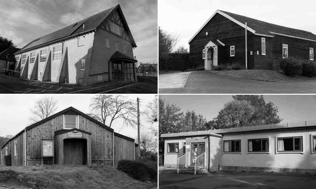
There was a piece in the Guardian that caught my eye this morning about a collection of photographs of village halls in the South-West. Black and white, landscape format photographs of simple, utilitarian, but nevertheless socially important and valuable places, they strike a chord with me in connection with my ideas for the self-directed project that forms Assignment 5. This sort of approach, picturing otherwise quite ordinary, mundane, architecturally neutral buildings and places is just what I plan to do within my own village, I am merely going to cast my net wider for a greater variety of buildings, though one at least is likely to be our own village hall.
I have included a link to the article below but because it is not very long I am also including the text here.
“This way for Bums and Tums! The discreet charm of the village hall
Bleak, bulky yet strangely beautiful, village halls are the beating heart of rural Britain, where great events happen for £8 an hour. We meet a photographer celebrating these harmonious hubs
‘Determinedly mundane’ … clockwise from top left, St Andrews Hall, Charmouth; Ashill; South Perrott; and Bettiscombe village halls in the West Country. Composite: Jethro Marshall
Arow of karate kids are performing mawashi geri kicks in unison to the cries of their teacher. Coincidentally, in the room next door, the Brownies are learning first aid. The next morning, a gaggle of pensioners arrive and are soon waltzing to wartime classics. Then, by the afternoon, a jumble sale is in full swing. One week later, dozens of people are queuing up to vote, hot on the heels of a neighbourhood forum discussing a contentious planning application.
These are just a few moments in the life of a humble village hall. More than any other building type, the village hall represents the ultimate multifunctional democratic space. It is a forum for raffles, cake sales, birthday parties, fitness classes, political meetings and more – a witness, as Jethro Marshall puts it, “to great human events – mostly for around £8 per hour”.
Absent of the life that sustains them, village halls have become haunting symbols of a time when we could congregate
Marshall, a Dorset-based art director and photographer, has surveyed a range of village halls across the West Country for his latest book, Halls & Oats, a celebration of what he calls “utilitarian bucolic construction”. In the midst of the pandemic, his carefully framed black and white images, devoid of human life, take on a new level of pathos. The children’s parties have stopped, the Bums and Tums classes are postponed, Knit and Natter has been put on hold. Absent of the life that sustains them, village halls have become empty shells of promise, haunting symbols of a time when we could congregate – but also hopeful reminders that we might one day do so again.
For all the colourful life they contain, these buildings tend to be fairly nondescript, if not downright bleak. As architect Sam Jacob writes in the introduction: “They are vernacular in a practical rather than sentimental way.” While town halls are draped in the heraldry of civic power, and churches are intent on impressing narrative and belief, the village hall is “determinedly mundane in its dogged lack of architectural expression”. Part barn, part chapel, part schoolhouse, they are, for want of a better word, sheds – but sheds full of civic ambition.
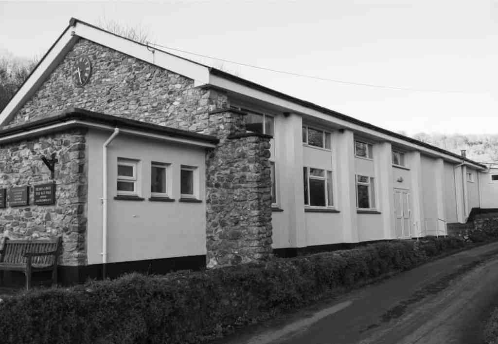
Weighty air … Branoc Hall, Branscombe. Photograph: Jethro Marshall
The Bettiscombe village hall, built in 1961, is a stained timber building with a simple pitched roof, elevated by the addition of a big porch and central square window. It has the look of an Amish barn or a pioneer church, the rituals of worship exchanged for bingo and Pudding and Pie nights. Branoc Hall in Branscome, built in 1976, is a grander affair, with two storeys of windows and exposed ragstone walls lending it a weighty air. A central clock on the gable end cements its status as a force for public good. St Andrews community hall, built in Charmouth in 1909, cranks the ambition up even further, with pebbledashed buttresses and a frontage clad with mock-Tudor timbers, giving the indoor lawn bowls sessions a whiff of Merrie Olde England.
With many taking on new life as hubs for aid networks in the pandemic, they remain radical spaces of social connection
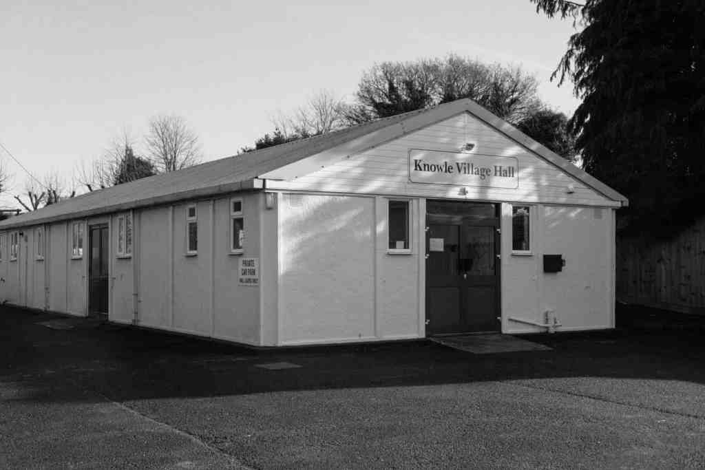
Others are more straightforward prefabs. Knowle village hallwas built in 1948 by the National Council of Social Services as a temporary measure and, like many temporary postwar structures, is still going strong 70 years on. In the Exmouth Journal’s report on its opening, a Mr Tilestone described how “the hall was not a building erected for any one section of the community. It was not for the men, the women, the small children, or the old people but it was for every single one of them – it belonged to the village as a whole.” As Jacob puts it, in their very existence, village halls are “a covenant – a promise even – of the possibility of community that must be fulfilled”. With many taking on a new life as hubs for aid networks in the pandemic, they continue to operate as radical spaces of social connection.
This is Marshall’s fifth book, under the imprint West Country Modern, following such titles as Farm Follows Function, Coastal Brutalism and This is Hardcore, the last a photographic essay of roads. The subjects seem wilfully mundane. They take the matter-of-fact aesthetic of the “new topographics”school of American photography – pioneered in the 1970s by Robert Adams, Lewis Baltz, Bernd and Hilla Becher – and apply it to the most humdrum of structures in the Devon and Dorset countryside.
‘Nondescript if not downright bleak’ … the prefab Knowle Village Hall. Photograph: Jethro Marshall
By doing so, Marshall forces us to look again, to see the beauty in barns and the majesty of flyovers. He says his intention is to “reframe our rural landscapes as inspiring, progressive environments” and sums up his position as “anti bucolic/pro rural”. The countryside is not a rose-tinted Eden, as hundreds of years of romantic propaganda would have us believe, but a place of work, industry and civic life. Activities may be on hold for now, but socially distanced coffee mornings and contactless karate will return soon enough.”
One interesting reflection that this piece sets off is the relationship between what I propose to do for this assignment and the “new topographics” school. I confess that much of the work of Louis Baltz has not moved me, and I do not agree with his ideas about what landscape is, and I do not agree with Adams’s notion of “Form” (as I have written elsewhere – https://markrobinsonocalandscape.photo.blog/2020/04/19/landscape-and-gender-exercise-4-4-of-mother-nature-and-marlboro-men/). I do though like the deadpan approach, particularly as practiced by the Bechers. So perhaps there is a connection, or an influence, at work behind my own intentions, though coming to a similar aesthetic from a rather different theoretical position. Perhaps it is also time to reassess my views of Baltz’s work, separated from his conceptual underpinnings.
Marshall, J, (2020). Halls & Oats. Lyme Regis: West Country Modern
Although I have to produce the physical book for this assignment (I am currently awaiting some book binding materials and tools that will be helpful) I have been giving more thought to how I deal with the map that is to go on the reverse of the photos.
The original intention was to make this up from an Ordnance Survey map. While working on the dimensions of the book (I am intending the images to be A5) it quickly became apparent that this is not going to work. The problem is largely one of scale. The ratio of the physical length of the series of photos to their height is 17:1. Looking at the map though the ratio from the start point to the end is more like 17:3; the distance between the start and finish points, a straight line from west to east, is about 17 miles but the distance between the southernmost point on the route, the start point at Stocksfield, and the northernmost point, Clara Vale roughly half way between Wylam and Blaydon, is three miles. The numbers simply do not fit the format of the book! I have looked at a number of other possibilities but none of them work particularly well. One is simply to distort the map to straighten out the train line. This just looks odd. Another is to make a sort of mosaic made up of twelve panels that each show a section of the line and fit the 17:1 ratio. This though looks very disjointed and does not give a sense of the continuous journey.
I have therefore been looking at a more schematic approach and have been confirmed in my thoughts that this should be better by looking again at the two books I have mentioned in connection with Exercise 5.5. I have been thinking along the lines of train network and route maps (think the London Underground map) that do not contain any reliable geographical information but merely show which station is followed by which when travelling along the line. Northern Railway, our local train company, have a very simple, purely linear, schematic map showing the stations along the line. This I think can form the basis for the book’s map, but to make it more interesting, and tie it more closely to the geographical realities of the journey, I intend to include, at the appropriate points in relation to the stations, some of the places of interest along the way, that are either referred to in the photographs, or are otherwise of local significance. Not least it needs to give an indication of the river and of the bridges over it. I am currently playing around with a few ideas but at the moment I think this is going to have to be hand drawn, at least for the purposes of this initial mock-up. Depending on how well that comes out, it might of course be necessary to come up with something more refined if the book was ever to be produced as something more than an experiment. More on this anon.
Molitor, C, (2015). Sonorama. Listening to the view from the train. Axminster: Uniformbooks
Stenger, S, (2014). Sound Strata of Coastal Northumberland. Newcastle: AV Festival
Last night while cooking dinner, and listening to Mozart sonatas for piano and violin, (not so irrelevant perhaps, as it meant that I was not actively thinking about this coursework) I had some more thoughts about the book project for Assignment 2 and the slideshow experiment for this exercise. In particular there came to mind two books that I had not thought out before in connection with any of this work but that are in fact helpful to what I am doing now, Molitor (2015) and Stenger (2014).
Neither of these involve photography but they do have linked visual and audio elements. Claudia Molitor’s work, which can still be experienced on her website cited below, is an audio representation of a journey by train from London to Margate, the sounds, songs, music, and words, representing places along the way, accompanying a schematic, hand-drawn map of the journey. Susan Stenger’s work was an installation based around a geological cross-sectional map of the coast of Northumberland, from the mouth of the Tyne to the Tweed at Berwick, made in 1839 by Nicholas Wood, some 12.5 metres long. The map was accompanied by a soundtrack, mostly made up of fragments of folk tunes associated with places along the route, lasting about an hour. The idea was that you walked along the map, listening to the fragments at the relevant points along the way.
These two works set off an idea for developing the work I did for Assignment 2 as a possible alternative to the book. When I originally did that work, I did not think that a slideshow would work well, particularly with the limited set that will form the book. I also did not have a good grasp on creating a slideshow. Now that I have done a couple of experiments for this exercise, and having played around a bit more with Lightroom, which has proved easier than I thought, notwithstanding a couple of false starts, I think that something could be done. To work properly though it needs to be much more substantial and include many more of the shots that I took along the route. Indeed, I have for now settled on about 108, making a slideshow that lasts almost 12 minutes. In an ideal world I think it would be interesting to make the slideshow last as long as the journey itself, about 25 minutes, to make a much more immersive experience. I have posted this initial trial set on Vimeo.
Bearing in mind the work of Molitor and Stenger, what the slideshow needs is a soundtrack to accompany it. Realistically I do not think this is easily achievable now, for the purposes of this exercise, and would be quite a major project in its own right, not least if the whole piece was to last the equivalent time of the train trip. There are also issues with regard to licensing, and presumably royalties, for some of the music that would be useful in a project such as this. Nevertheless, here are some ideas for music and sounds that might work:
The start of Richard Rodney Bennett’s theme music for “Murder on the Orient Express”
Extracts from Arthur Honegger’s “Pacific 231”
The sound of migrating geese for the ponds at Merryshield
“Rocket Man” for Wylam where George Stephenson’s cottage is (an unforgivable but irresistible pun)
The sound of golfers for Ryton golf course
“Blaydon Races” (for Blaydon, obviously!)
The sound of cash registers from Pink Floyd’s “Money” (Dark Side of the Moon) for the Metro Centre
Iron foundry/heavy industrial noises for the Armstrong works at Scotswood
Pons Aelius “Fire under the Bridge”
Lindisfarne “Fog on the Tyne”
I am sure there are plenty of other sounds and tunes that could also be incorporated, particularly folk tunes that have specific local connections, but it is going to take quite a lot more work to identify them and bring them together. For now, just let this be a mental exercise.
Molitor, C, (2015). Sonorama. Listening to the view from the train. Axminster: Uniformbooks
Stenger, S, (2014). Sound Strata of Coastal Northumberland. Newcastle: AV Festival
Just a brief note on this. Whilst I understand that Sharon Boothroyd really liked this online exhibition, I am afraid I just do not get it. I agree there are plenty of fine, striking individual images, but I find it hard to see, at least on a first viewing, what is driving the structure and sequencing, what made it so good as a slideshow.
I think Boothroyd sums things up nicely when in comparison she praises the Sally Mann shows. The ability to stop, go back, linger, establish connections between individual works, makes all the difference. When viewing a physical exhibition I usually have a fairly quick go round first to get a sense of the structure of the show and what is to be seen, then go back and forth, across the grain and flow of the show, the better to appreciate what is there and make my own sense of what the artist or curator has chosen to show. I do not reject the idea that a particular flow has been purposefully set up to display the work in a particular light, and to a particular end or purpose, but I like to make my own connections, form my own views and conclusions as well. Needless to say, this also enables me to filter out stuff that does not interest or engage me, or that I simply do not like.
The slideshow based online exhibition simply does not give that sort of opportunity. It has something of the feel of one of those blockbuster art exhibitions where you effectively join a long queue that snakes around the gallery, everyone seeing the same things in the same order and without the opportunity to spend time with any individual work. That is something that I hate and is one of the reasons I rarely go to such exhibitions anymore. I had a similar sort of experience on a brief visit to Auschwitz a few years ago and simply could not stand the sense of being shepherded, herded indeed, around the museum exhibits without any choice of what was to be seen and in what order. Needless to say, I pretty quickly broke ranks!
I am a little out of sequence again, but I have jumped ahead to this exercise as it fits with some work that I have been playing around with recently in connection with Assignment 1. When I completed that assignment my primary mode of presentation was simply a sequence of still images. I did though speculate about the possibility of transforming then into a slideshow, not realising at the time that this is something that we would be coming to later. At the time I was not at all sure how I would be able to achieve this, but I have subsequently worked out how to do it, without special software. I do now have the latest version of Lightroom, and I see that there is a slideshow function within it. I have yet to master it so for the time being I have used the very simple function within iPhoto on my Mac, converting the resulting files into .m4v and .mov to enable them to play on any platform.
As I speculated when working on Assignment 1, in order for a slideshow of this sequence to work well, with a good transition from image to image, I have had to do a bit more editing of the final set I put together at the time. I have had to flip a couple of the images to make sure that there is greater consistency in the direction in which the clouds eventually clear. I have also added a couple of extra images, that did not form part of the original set, to make the dissolve smoother. Ideally, I would have liked to add a couple more but unfortunately there are not enough suitable images amongst the experimental shots to make this possible.
Initially I was not sure about using an audio track, not least because there is not much choice within iPhoto. I have though now had a look at the Free Music Archive website and found a track that is suitable – a manipulated field recording of temple bells and singing bowls, which are appropriate to the Buddhist ideas that underpin the work I made. For the sake of comparison, I have uploaded to my new Vimeo account (apart from this exercise I am not sure how much I am going to use this!) two versions, one with, and one without, sound. My feeling at this stage though is that the version with sound works better. Visually I am also quite pleased with this: the sense of transition that I was looking for in this work is much stronger with the slideshow than a simple sequence of still images.
Apart from the work on the soundtrack, I had essentially finished the editing of the slideshow before I read any of this part of the course material. To that extent I have not been influenced by any of the suggested examples, nor indeed much helped by them. Most of the cited links appear to be bad so I could not access the recommended materials in any event. Some I could not look at properly as I have a problem with running Flashplayer on my computer (why, is a mystery, as it is brand new and running the latest version of Mac OS, but Flashplayer will simply not load and run). A couple of the photo-stories in Foto8 were interesting but not particularly helpful: they are dealing with the use of slideshows in a documentary setting, without a particular narrative, whereas my work for Assignment 1 was predicated on specific start and end points, with a progression between them. In any event I have my doubts about the suitability of slideshows for such documentary work. I think it works with Chris Leslie’s piece where the still images stand in for video. The soundtrack also gives it a sense of structure and progression. For some of the work on Foto8 though it felt more like a mechanical means of moving from one image to the next, doing away with the need to press the “next” button that did not really add a sense of storytelling, at least in a linear sense. I would much rather have moved through the images at my own pace, lingering, going back where necessary.
At the moment I do not envisage that any form of slideshow would be suitable for the work that I have in mind for Assignment 5.
This section of the course material has got me thinking in wider terms about how I look at photographs and to reflect on photobooks as physical items, artefacts in their own right. This not only ties in, to an extent, with the essay that I have written for Assignment 4, but is also relevant to what I am thinking about for the physical presentation of the sequence of images I made for Assignment 2, and also how I might approach Assignment 5.
How do I look at photographs? Inevitably most have to be viewed on-line. The sheer range of material that needs to be looked at for the purposes of the course work means that this is the only practical approach available, in the absence of an accessible, local, public or institutional library with a significant holding of photographic work. The Side gallery in Newcastle has an impressive archive but is of course presently closed and in any event is not somewhere that I would be able to go on a sufficiently regular basis.
Physical exhibitions are similarly limited. Whilst I have been over the last few years to as many local shows as I could, mostly at the Side, they have been few in number, and are now non-existent.
Then there is my own library. This is fairly substantial as a whole (though not comparable with that owned by one of my favourite writers about reading and the ownership of books, Alberto Manguel, whose library is made up of 35,000 or so volumes!) with a photography section that is growing steadily. Obviously, there are plenty of books that have been acquired on the basis of the OCA reading lists. Many though are photobooks – monographs and exhibition catalogues – that have been bought purely out of personal interests and tastes. It is these that I find the most satisfying to use: being something of a Luddite I still prefer the physical feel, the heft, the weight, the smell, of physical books. I find I engage with them more deeply, not least because I get to know them over a longer period and at a more leisurely pace than the internet encourages. It is these books, few of which appear on any of the reading lists, though some of which are from time to time referred to within the course material, that tend to influence and inform my own work more profoundly, even when not necessarily obviously directly relevant to a particular assignment or exercise. There are limits imposed by cost (I shudder to think how much I have paid over time for this modest collection; quite a lot of photobooks today are pretty expensive) and space. This though is the medium that gives me the greatest satisfaction.
Letting my eyes roam across the shelves in my study, which is where all of the photography books in the house live, I am struck by the range of publishers. There are a few under the imprint of some of the big guns in the art publishing world, such as Prestel, Thames & Hudson, Phaidon, but the majority are by much smaller, independent, specialist publishers. Judging from the number of new photobooks coming out on a regular basis this is an area of publishing that seems to be, if not necessarily thriving, at least surviving. I am also struck by the number of books that are self-published or put out by tiny presses, most of which are really nice physical artefacts in their own right, and really interesting photographic work.
The next thing that strikes me is the range of bindings and physical presentation. Most, although varying considerably in size, proportions, and layout, are in conventional book form, either hardback, or soft. Those that really stand out are mostly, at least in my collection, East Asian, specifically Japanese, books – either by Japanese, Chinese or Korean, artists, or published by Japanese companies. There are pamphlets that are little more than folder paper, elaborately stitched bindings, boxes (some elaborate in their own right) containing multiple elements, loose sheets, concertina folds, you name it. Perhaps the most impressive “book” that I have seen was produced by Goliga in Tokyo in very limited numbers of work by Rinko Kawauchi that takes the form of a traditional Japanese scroll in a bespoke wooden box: absolutely beautiful but also, as a result, rather expensive and with very few copies still available. How I wish … dream on!
The relevance of these musings to work for this course is that, as I have written in connection with Assignment 2, I have been thinking of submitting that sequence of images in book form, as a concertina, rather than a conventional book. This is something that I have been working on of late, now that I have a decent printer of my own, enabling me to experiment with different possible prints that might work in the form of such a book. What in particular this process has prompted is a rethink of the outcome of the assignment itself. Specifically, because of the physical constraints imposed by such a book format, I have had to rethink how I approach the map element that is to go on the reverse of the photographs. This is turning into an interesting case of the format to an extent dictating content. I will write more on this in due course.
Coming back to the course material, the William Klein interview I found very interesting because of my focus on his work in the essay for Assignment 4. (The link in the material is no longer working but it was not too difficult to find it on the current Tate website and a new link is cited below.) Unfortunately, the section in which Klein’s assistant talks about an early maquette of his New York book is frustratingly short and does not actually say anything about how and why the book is arranged and laid out as it is. This is a shame because in my opinion the layout is one of the things that helps make this book so successful, as a photobook in its own right but also as an unorthodox “landscape” of New York, as I argue in the essay. I would dearly have liked to hear more about the process that the book went through to reach its final state. This book is an interesting example of the argument made by Marshall McLuhan that “the medium is the message”.
For Assignment 5 I have already been thinking about producing a set of postcards. For the “fine art” alternative a book might well be appropriate, or at least trying as an experiment if nothing more. I already have some thoughts on this and it is encouraging to see that the OCA video about photobooks confirms some of those ideas. The nature of Klein’s project meant that a “busy” layout was appropriate and adds much to the outcome. For what I have in mind, something much more straightforward, minimal even, would be much more appropriate and effective. I am nowhere near ready with that project yet so in the interim, for the purposes of exercise 5.3, I am going to have to use an existing set of images.
As an aside with regard to Blurb, although I have not used them before I do have a book produced by them. It was made by one of the artists who had a residency with VARC and is a visual diary of her year in the wilds of Northumberland. The quality is pretty good and I do not recall it being particularly expensive when I bought it.
So far, although I now have a copy of O’Doherty’s essay, I have only read McEvilley’s introduction for the purposes of this exercise. When I have a moment I will read the full article but for now I have sufficient thoughts to be able to write something in response to this exercise.
The key point is that the modernist White Cube art gallery takes the work of art displayed within it out of time and space, cuts it off from the outside everyday world. This in turn takes the work of art away from “ordinary” people, sets it apart, and makes it available only to a particular, “special”, self-selecting group, namely the art lovers who visit this sort of gallery. The gallery, rooted in Platonic ideas of True Form, becomes a ritual place in its own right, itself a performance, a work of art. As O’Doherty argues, this is nothing new and indeed goes back to the very earliest human art, Palaeolithic cave paintings. (This does of course assume that the not uncommon pre-historical archaeological assumption that these ritual spaces accessible only to a chosen few is correct. Certainly, in so far as it is possible to extrapolate, the example of the Pharaonic tombs suggests that this is at least plausible.) This got me thinking a bit about why there has been this move towards the “exclusive” gallery space (I imagine their modernism might be off-putting for some, or might at least get in the way of some peoples’ connection with, and appreciation of, the art on display. It has also sent me back to a point made by Benjamin (2008) whom I have just been rereading in connection with Exercise 5.2.
Right up until the industrial age – I know I am generalising more than just a bit here – art was displayed either in ritual spaces, such as churches, that were outside time and place, and the art itself was very much tied to the rituals and religious observance and belief, or in private spaces (domestic or ‘official’) accessible only by the wealthy and powerful, not the general populace. Only in the industrial age is there much in the way of the public display of art, particularly of secular art not tied to religion. Even then there was a sense of ritual not far removed from the idea of the White Cube. Grand imposing buildings, with classical porticos, often referred to as “Temples to Art”, were the norm (just think of the National Gallery in London) cut off from the outside world: no windows looking onto the outside from the display galleries, lit from above. Just visiting one of these spaces was a form of ritual: one in honour of an almost religious belief in the power or Art. Not perhaps as theatrical as entering a hushed, subtly lit, colourless box, but nevertheless still something of a performance.
This is where Benjamin comes in and his observations on the reproducibility of works of art. Benjamin argued that works of art were never completely separated from a ritual function. Mechanical reproduction changed that: (at pages 11-12)
“… being reproducible by technological means frees the work of art, for the time in history, from its existence as a parasite on ritual.”
I wonder, is the advent of the modernist white space an attempt to turn back the clock, to reconnect art with ritual and restore its value (cultural and monetary), and take control back into the hands of an elite? (I am not going to attempt to answer that question for now, nor comment on whether I think it is a good or a bad thing. Those are for another time and place. For now it is merely an observation.)
Leaving that for now, a couple of observations on the course material itself on this section. So far as commercial galleries are concerned, I rarely visit them these days, simply because apart from the odd trip to Edinburgh I no longer often go to wherever they might be found, and I can see that for some people they might be quite intimidating, that they might not feel they are the sort of place they can properly go. Some of the cultivate an air of mystique, of exclusivity, of separateness from the general public. Visiting one can therefore itself become a sort of ritual, an act and performance, in a way taking us back to Benjamin’s pre-reproducible age.
On the fashion for building modern galleries in old industrial structures, is this to a large extent a matter of these places being the only ones that are really big enough to function as a gallery (particularly a major one, such as Tate Modern), the lack of land otherwise to build on and the expense involved? One observation in the course material in this regard that I would quibble with a bit is the suggestion that the industrial heritage is hard for them to entirely shake off. Is this really the case? Thinking again of Tate Modern, about the only part of it that really shows its heritage seems to me to be the Turbine Hall, although that has been comprehensively gutted, and its exterior. Otherwise the rest of the gallery is a series of boxes slotted into the shell of the building that betray hardly anything of its past. The same can be said of the Baltic. The two long external walls are all that remain of the original structure. Everything else was ripped out and again the inside offers no hints of the building’s past. I actually think this is regrettable. The problem with so many contemporary gallery spaces is that they do not show any quirks or idiosyncracies so that they all become almost homogenous, difficult to distinguish from each other, and frankly dull and bland. Much more interesting for me are those that do still show some of their past, such as the Arnolfini, and the Side in Newcastle. This latter, quite a small space and conforming to the norm of white box display areas, nevertheless bears signs of its past (I confess I do not know exactly what it was, store, workshop, or something else): substantial exposed wooden ceiling beams, cast iron pillars, a slightly wonky and creaky bare wooden floor. Much is of course to do with the work that is displayed in these disparate spaces but I certainly prefer the atmosphere in the smaller, more characterful spaces, and feel more comfortable there, and probably appreciate the works on display more, than in the bigger identikit modernist galleries. (I am actually a fan of Modernism but I do fear it has become debased as a style and aesthetic through overuse, some of it unthinking, unoriginal, derivative.) In this regard I very much agree with what the course material says about the nature of the space affecting the way the work on display is received and read.
Benjamin, W, (2008). The Work of Art in the Age of Mechanical Reproduction. London: Penguin
O’Doherty, B, (1999) Inside the white cube: the ideology of the gallery space. Berkeley: University of California Press
“The living language of our time is urban.” Sir Michael Tippett, Songs for Dov
Humans and landscape are inextricably linked. People have helped form the environment within which they live and have in turn been formed by it. This is nothing new, as Schama points out (1996, at page 7):
“Objectively, of course, the various ecosystems that sustain life on the planet proceed independently of human agency, just as they operated before the hectic ascendancy of Homo sapiens. But it is also true that it is difficult to think of a single such natural system that has not, for better or worse, been substantially modified by human culture. Nor is this simply the work of the industrial centuries. It has been happening since the days of ancient Mesopotamia. It is coeval with writing, with the entirety of our social existence. And it is this irreversibly modified world, from the polar caps to the equatorial forests, that is all the nature we have.”
With that background in mind, the question that I want to address here is whether the photographing of people in an urban environment, street photography, can itself be regarded as a form of landscape photography; whether the picturing of the human elements of a city can tell us anything about that urban environment without the direct depiction of the built environment itself. I also want to challenge the idea of genres and different disciplines within photography and argue for a greater sense of fluidity and overlap. As in many walks of life and human activity there is a tendency to categorise and draw distinctions. Photography seems particularly prone to this. There are photographers working in landscape, on the streets, in documentary and photojournalism, portraiture, and so on, and these are often presented as distinct disciplines. It is striking though that, for example, many of the photographers interviewed in Wolf (2019) resist such categorisation, reject the ideas of genre and style, and adopt a much more inclusive approach.
In this context what I have in mind is an idea of “street photography” as a form of visual psychogeography rather than a depiction of an identifiable physical, built environment. More than just the photographing of people within a particular environment, but also elements of the physical environment that would not necessarily of themselves be enough to identify with any certainty the particular location at which the photograph was taken, the signs and symbols of human presence and agency, that are encountered on the street.
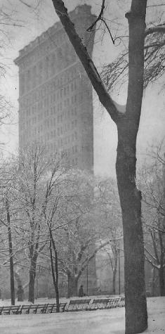
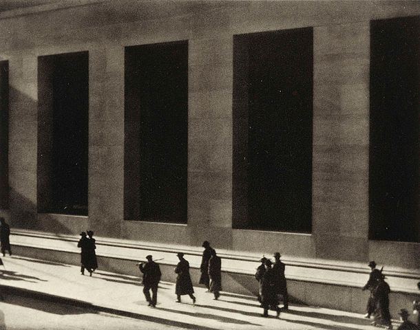
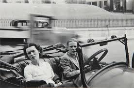
From earliest times people have been a feature of landscape painting. They have been used to give a sense of scale, to make a political point about ownership of the land, to tell a story about the land. As time has gone on people have become increasingly urbanised. Fewer people inhabit some bucolic ideal but live instead among structures of concrete, glass, and steel. In the early days of photography these urban environments themselves became the subject of “landscape” photography. The built environment was itself the subject and people were again often used in a similar way to the painterly conventions, for example in early work of Stieglitz and Strand.
Alfred Stieglitz. Flatiron Building. 1903Paul Strand. Wall Street. 1915
With the advent of more compact, portable cameras the focus shifted more to the people themselves rather than the places they lived. Humanity, with all its quirks and foibles, became the subject of the urban photograph rather than the city itself. The emphasis shifted from the topographical to the anthropological.
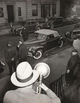
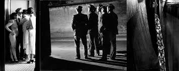
I certainly do not think that all approaches to street photography tell us much, if anything, about the urban environment. “Weegee” does not give us much sense of place as he created his “tabloid” dramas.
Arthur Fellig. Harry Maxwell Shot in Car. 1936
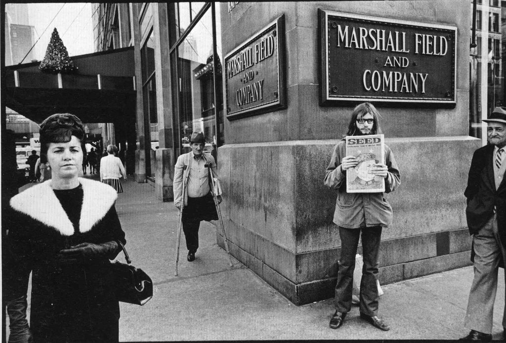
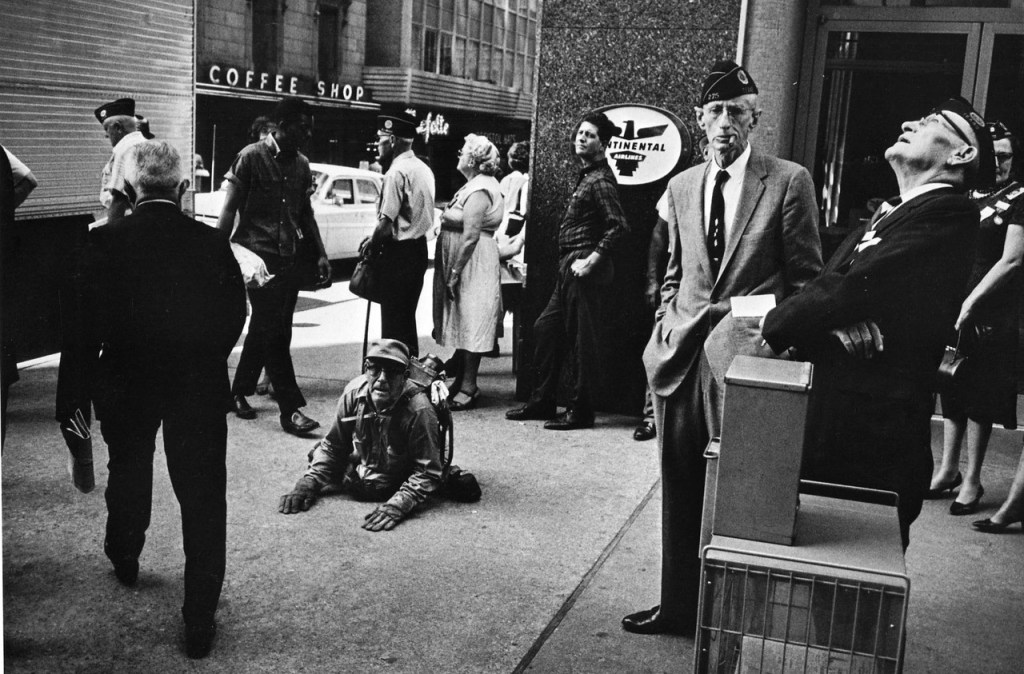
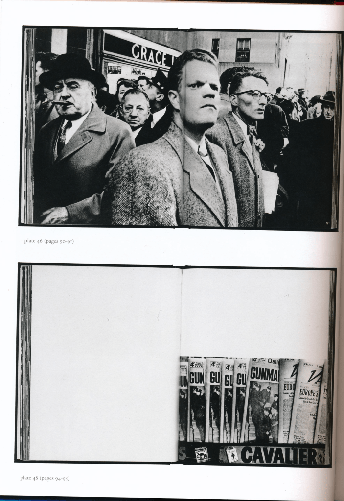
Nor do two of the greatest American street photographers, Lee Friedlander and Gary Winogrand.
Lee Friedlander. New York City. 1963 (?)Garry Winogrand. American Legion Convention, Dallas, Texas. 1964
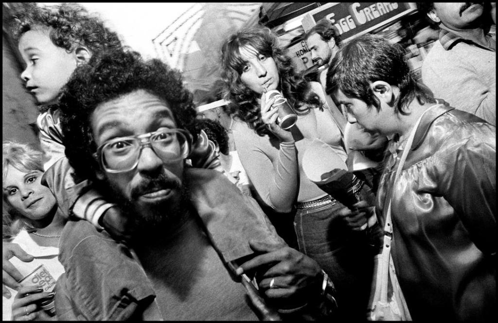
What they do give is a sense of urban, specifically American, society, but not necessarily of the place. Their work is more to do with the ‘social landscape’, as became the subject of a number of influential exhibitions in the 1960s (Warner Marien, 2014, p348 ff) and was subsequently taken further by the likes of Lisette Model and Diane Arbus. More recently there have been characters such as Bill Cunningham, more concerned with fashion and style than anything else, and Bruce Gilden with his (for my taste, rather aggressive and intrusive) flash-in-your-face approach to picturing ordinary people on the streets.
Bruce Gilden. New York City. (Date?)
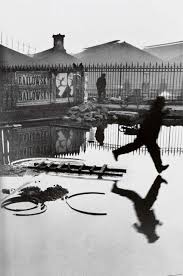
In the birthplace of photography as a medium, and urban photography as a particular approach, Paris, I again do not really find any artists who have caught the physical environment of the city through the photography of its inhabitants: Eugene Atget’s work is more purely topographical and people are largely absent; André Kertész was more interested in Surrealism; Brassai with the social landscape; Cartier-Bresson with the so-called decisive moment.
André Kertész. Meudon. 1928Brassaï. Paris by Night. 1933 Henri Cartier-Bresson. Behind Gare Saint-Lazare. 1932
It is perhaps surprising that this is arguable given that the street photographer might be regarded as the photographic equivalent of the flaneur and so immersed in the human/urban environment. It is though my impression that unlike the literary flâneur, particularly the more contemporary psychogeographers, the photographic flâneur does not generally create a photographic equivalent depiction of the city through images of its people alone. As Florian Ebner discusses in his article “Urban Characters, Imaginary Cities” in Eskilden (2008, p186 ff) and as Sontag argued (1979, pages 54 to 58) the photographic flâneur is more concerned with peering into the world outside his or her bourgeois milieu, a particularly socially-downward view (arguably a patronising one as a result) and the camera “makes everyone a tourist in other people’s reality, and eventually in one’s own” (page 57). Sontag’s views are not uncontroversial and accepted universally uncritically, despite the iconic status of her book (I personally have difficulty with many of her pronouncements on the medium). She did of course later revise her own views (2004). I do nevertheless feel there is a kernel of justification for what she says here and that it is a valid charge that can be laid at the door of some street photography; it simply does not always give us any real sense of the environment through which the photographer moves. One passage is particularly apt and worth quoting at some length, despite its hyperbole, (page 55):
“Gazing on other people’s reality with curiosity, with detachment, with professionalism, the ubiquitous photographer operates as if that activity transcends social class interests, as if its perspective is universal. In fact, photography first comes into its own as an extension of the eye of the middle-class flâneur, whose sensibility was so accurately charted by Baudelaire. The photographer is an armed version of the solitary walker reconnoitring, stalking, cruising the urban inferno, the voyeuristic stroller who discovers the city as a landscape of voluptuous extremes. Adept at the joys of watching, connoisseur of empathy, the flaneur finds the world “picturesque”. … The flâneur is not attracted to the city’s official realities but to its dark seamy corners, its neglected populations – an unofficial reality behind the façade of bourgeois life that the photographer “apprehends”, as a detective apprehends a criminal.”
The true irony, I suppose, is succinctly identified by Ebner (at page 192), that despite these indictments, “it is due to photography’s compulsion to collect in an apparently indifferent manner that it has provided the very bedrock of our visual memory of the city”.
Before moving on to my main point I must add a note here about the photographic examples that I am including below. In my view it is extremely difficult to identify one single example of the work of each of the artists I am about to discuss that adequately illustrates the argument. In each case it seems to me that it is the larger body of work, the whole book, or in Moriyama’s case his entire oeuvre, that is significant and that, I would argue, supports my position. Each image that follows is therefore little more than an isolated example of each photographers’ “bigger picture”.
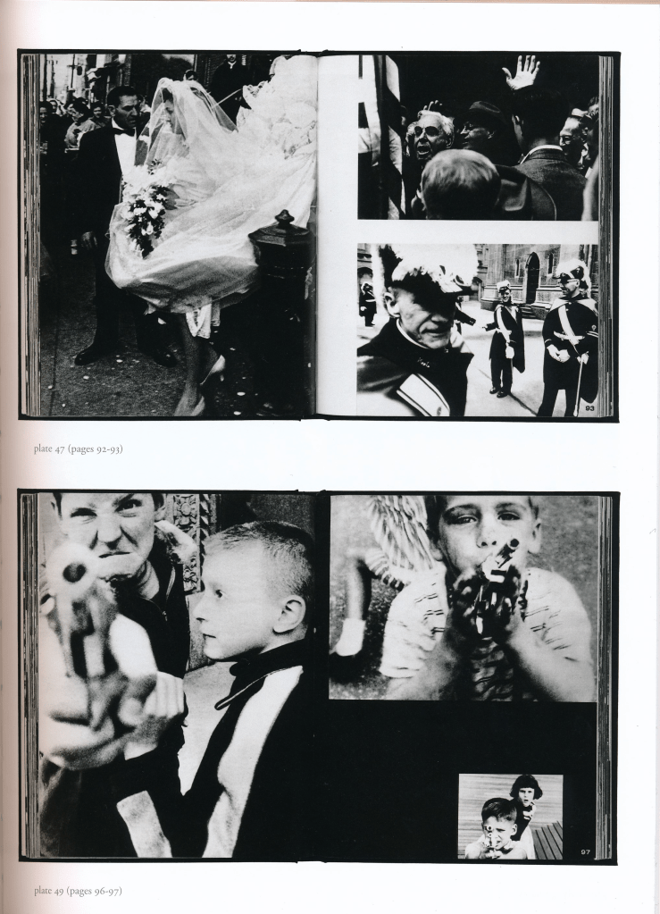
Despite the foregoing I do believe that there are some strands within the broad church of street photography that can be included within the wrapper of landscape photography. Walker Evans (always a good starting point) could perhaps be said to have sown some seeds with his American Photographs (2012), though I see this as work that overall is still more firmly rooted in the topographic.
Parked Car, Small Town Main Street. 1932
The real catalyst is perhaps Robert Frank’s “The Americans”, to my mind the first work to produce a psychogeographic picture of a nation as a whole (rather than a specific urban environment).
Rodeo – New York City. 1955/6
It strikes me that one significant element of Frank’s view, and depiction of then contemporary America, is that Frank was a “foreigner”, in so far as he was born in Switzerland, so was able, to an extent, to bring an outsider’s eye to the nation. To what extent this is a really a significant factor is a debate for elsewhere but perhaps it is more than coincidental that it is something that he shared to an extent with my next example, William Klein.
Klein’s book (2016) is one of the very few that I have come across that seem to me to show that street photography can approach the picturing of a physical landscape without depicting its topography in a literal, conventional “landscape photography” way. His approach is various, eclectic, sometimes apparently chaotic. The editing and arrangement of the images across the physical pages of the book are unconventional and often visually jarring. It sometimes reminds me of the “jump-cut” approach to editing used by French Nouvelle Vague film directors, particularly the sequence in Jean-Luc Goddard’s “A bout de souffle” in which Jean-Paul Belmondo and Jean Seberg drive around central Paris: the editing flits about from place to place in a non-linear manner but nevertheless conveys a sense of Paris itself. In Klein’s work we see people, snatches of places and locations, rarely, but not without exception, easily identifiable, signs, adverts, all sorts of symbols of an idea of the city. Occasionally it falls into Sontag’s flâneur trap, wallowing in the seedier sides of life, but nevertheless the cumulative effect is to give an impression of the city as a physical, geographical, place. In his article included in the 2016 ‘Books on Books’ edition of the book, Max Kozloff comments (unhelpfully, the pages of the commentary section of the book are not numbered):
“The experience of paging through New York comes to seem almost one of being on the run, of stumbling over obstacles, ending in visual fatigue. The big city often does that to its denizens, bombards them with feckless montage.”
And on Klein’s approach:
“Not people within an urbanscape, not architecture with signs of life, but the whole populated setting, far or close, draws his regard.”
Klein himself, as reported by Jeffrey Ladd in his accompanying article on the making of the book, had said from the outset that “he wanted to photograph New York in a “new way””. Not just the people, not just the physical nature and appearance of the city, but something much more. In a way the book becomes a pictorial analog of the physical experience of the city and being within its environment.
William Klein. Life is Good & Good for You in New York. 1956
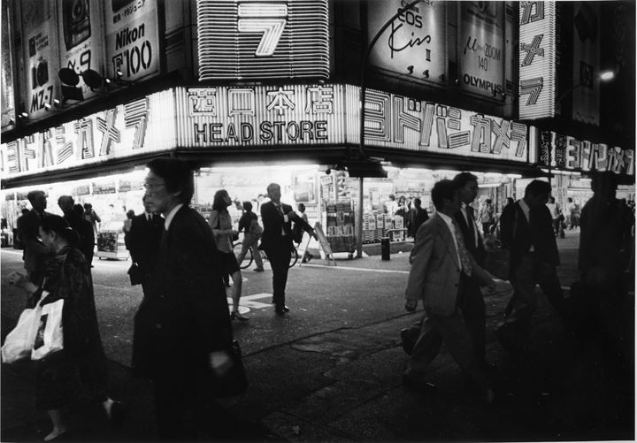
As with Robert Frank, was it significant that Klein effectively photographed the city from the perspective of an outsider having spent the preceding years living in Paris? This recurring question, which is unanswerable here, actually leads me to another example, this time in Japan. (Another question that this investigation has thrown up is why so much street photography has focused on New York? It is no coincidence that all of the examples that I have cited so far have been photographers who have worked in New York City. The only other city that seems to have attracted a similar amount of attention is Tokyo. What is the attraction, what do they have in common given that they are physically such different cities?) The one particular photographer than comes to mind here is Daido Moriyama. His hometown is Osaka, in my own experience a very different city topographically and in terms of “atmosphere” from Tokyo.
Whilst I am not personally well acquainted with Shinjuku (I spent more time in Shiba and more ‘genteel’ areas such as Asakusa and Ginza) I nevertheless find his obsessive photographs give a real sense of this rather shabby, seedy, somewhat disreputable area as a recognisable environment. He is not immune from the charge levelled at the voyeuristic flâneur of luxuriating in the more louche sides of city life – to quote from his 2016 book (again, the pages are unnumbered):
“… I still see Shinjuku as the great backwater, a formidable den of iniquity. The countless other neighbourhoods that make up the huge metropolis of Tokyo sped through the gradual changes of the fifty-plus years since the end of the war and, before our own eyes, have now been reduced to white, hygienic, sterile landscapes … but Shinjuku is still there in its primary colors, a living, writhing monster.”
“No matter in what city of what country I happen to find myself, the outside world I observe as I wander the streets presents me with the exciting or the erotic; my eyes roam freely over these sights and I release the shutter whenever I feel the urges of eternal desire or temptation.”
Daido Moriyama
Nevertheless, although Moriyama is not a perfect example, my impression is that there is plenty of work within his vast and sprawling oeuvre that can be taken as supporting an argument that certain aspects of and approaches to street photography are capable of conveying a sense of the built environment without simply and directly depicting its buildings.
So, what conclusions do I reach from this admittedly brief and somewhat superficial survey, how would I now answer my question? The conclusion that I reach is somewhat equivocal. Much street photography does not seem to me offer an affirmative answer to my question; from much I do not get any real sense of the street as a place. On the other hand, certain approaches to street photography can indeed amount to or encompass what might otherwise be seen conventionally as landscape photography and transcend, or transgress, ideas of genre and style. A related question, that is also perhaps beyond the practical scope of this essay, is why that should be the case? My tentative view at this stage is that a significant element might simply be the intention of the photographers; what are they looking for in their work on the city streets: is it sensationalism, squalor, serendipity, or a sense of the landscape as something that reflects the symbiotic relationship between the human and the physical environment?
I give the last word to Mario Carnicelli (another outsider, an Italian photographer who worked in America briefly between 1967 and 1973), quoted in Hotshoe (2019, pages 26-27), who sums up a possible positive answer to my question:
“The element of human beings – people – in the street. We are simply creating a theatrical fifth, a giant stage. The street represents a microcosm of the life, rhythms, feelings of common people. Street photography is a typically “local” universal because it is relatable to other places where people live, even in complete diversity of language, history and traditions. Photographs of faces, and gestures of inhabitants of a certain place, provide anthropological, and geographical, social and humanistic interest, as well as a catalogue of memories in rapidly changing times.”
Eskilden, U, (ed). (2008). Street & Studio. London: Tate Publishing
Evans, W, (2012). American Photographs. New York: The Museum of Modern Art
Frank, R, (2016). The Americans. Göttingen: Steidl
Klein, W, (2016). Life is Good & Good for You in New York. New York: Errata Editions
Moriyama, D, (2016). Daido Tokyo. Paris: FondationCartier pour l’art contemporain