Author: mark516450

Exercise 5.2: Print Quotes

I am taking this exercise slightly out of order, before reading about the White Cube, simply because I have been experimenting with printing of late, having just bought a new, professional standard Canon inkjet printer. For some time I have struggled with a fairly basic all-rounder Epson printer but it simply does not produce good quality prints. Colour balance can be problematic and ink delivery can sometimes be a bit streaky. Given what I have paid over the last couple of years to have prints made professionally for assessment purposes I reckon that although the new printer was expensive it will actually pay for itself in fairly short order, particularly as I am now likely to print more of my work routinely.

This exercise is also a bit odd in its timing as I have been through the process of preparing images for professional printing on various occasions before now, not least for the assessment of the last three modules. Nevertheless, I have gone through the motions of file preparation again as I have just added Lightroom to my computer and this is a useful opportunity to get to know how that program works.

  1. Quotes

Much of the work that I have had printed has been in the region of A4 so for the purposes of this exercise I have checked the prices for 12×8 inches. The type of paper used does not seem to make a great deal of difference to the price, so I have chosen a lustre finish for C-types. For Inkjet comparison I have checked out prices for giclée and where there has been a choice I have opted for a fairly basic Fuji or equivalent paper, rather than a more fine art, and therefore more expensive, paper such as those produced by Hahnemühle (which I have used in the past for printing etchings).

The company that used to print for me, Lumejet, unfortunately stopped trading a while ago which is a real shame as I was very impressed with their quality. They were somewhat on the pricey side but I felt it was worth it as their product (a new form of silver halide print that they had developed) was excellent. In their stead for the last lot of printing that I needed I used Loxley, who also seem to be pretty good, so I have turned to them first. In rough terms their prices start at about £2.24 for C-type, and £7.29 for giclée.

Next I have checked DS Colour. Although I have not used them before I understand they have a good reputation. Their prices seem to start as low as £0.65 for a C-type (I have to say this does not seem to me to be quite right and maybe I have just got it wrong or misunderstood) and £6.99 for inkjet.

A company that I use for my film supplies, but which I have not used before for printing, is AG Photographic. C-types are about £3.86. They have also started offering inkjet prints but unfortunately the prices do not yet appear on their website.

Out of curiosity I have also looked at a local, Newcastle-based, printer, Max Spielman. C-types are about £2.50. They do not seem to do inkjet printing other than in poster form, which unfortunately they do seem to do as small as 12×8. Their smallest size, 16×12, comes in at about £11, which sounds about right compared with the other giclée costs mentioned above.

In practice, now that I have a good printer, I am more likely to make my own inkjet prints for the foreseeable future, unless I need something a bit more special. Costs per unit should be significantly less this way, mostly just being the cost of the paper. The inks are pretty expensive but depending on the number of prints that can be made before running out I do not expect the proportionate unit cost per print to be significant.

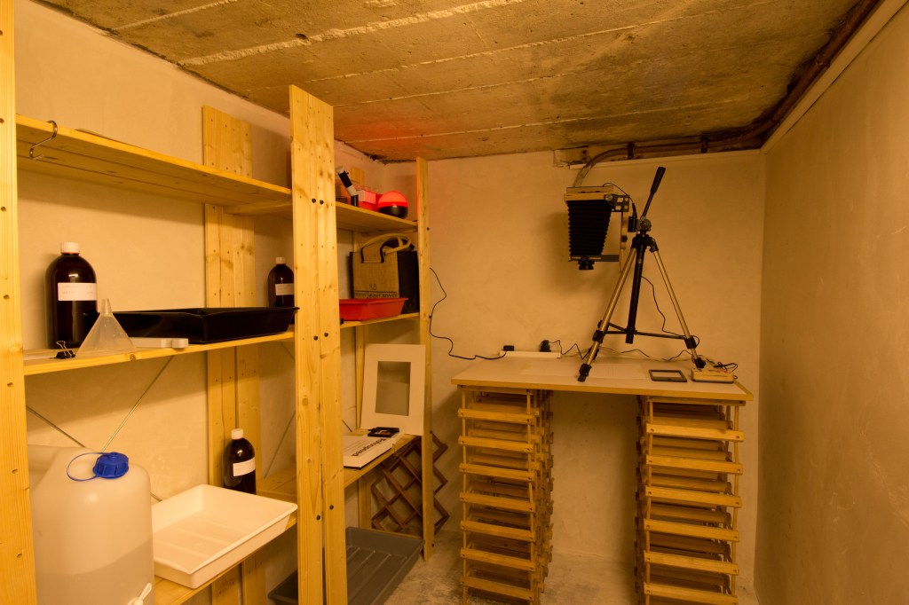
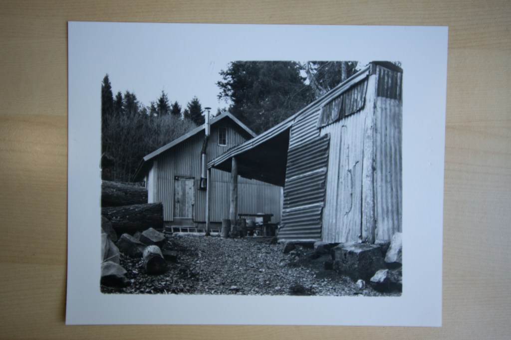
For my black and white film work I can now do all my own printing in the new darkroom in the traditional way.

2. File preparation

This is now fortunately pretty easy and straightforward. By way of example I have included a link below to Loxley’s file preparation guide, which is simplicity itself. This is greatly helped by the company handling colour management for you.

Nevertheless, as indicated above, notwithstanding that I have been through the process before I have gone through the exercise again to try to get the hang of Lightroom. Unfortunately though so far it has defeated me – I clearly need to spend more time learning how to use it (and to properly understand the difference between Lightroom Classic and the cloud-based Lightroom CC!). I have therefore for now simply redone it in the latest version of Photoshop, which is much more familiar having used older versions of it in the past.


This was originally a .dng file, now converted to .jpg, 300 dpi resolution, compression level 10, Adobe RGB colour profile.

3. Inkjet/photograph?

This is in a way a particularly significant question given that I have just bought a printer.

At the same time though I wonder whether it is still really relevant in today’s digital world.  I can certainly see the argument that only a traditional print (whether produced in a darkroom from a negative or digitally) on light sensitive paper is a “photograph”.  It is certainly supported by the dictionary definition of a photographic print.  I do though feel that this is an old-fashioned and unhelpful distinction today.  Not the least part of the problem that I have with the distinction is actually a point by Walter Benjamin back in 1936 (2008, at page 12):

“The reproduced work of art is to an ever-increasing extent the reproduction of a work of art designed for reproducibility.  From a photographic plate, for instance, many prints can be made; the question of the genuine print has no meaning.”

More than whether or not something is properly a “photograph”, it strikes me the issue is more one of the value to be placed on the physical artefact.  A print made by the photographer in person in the darkroom will have a certain value, that is, what someone is prepared to pay to acquire it.  The more prints the photographer makes, the less will be their value.  It seems to me that a photograph printed in a newspaper is still a photograph but it will be effectively worthless.  I see no reason why an inkjet print should be regarded in any different way.  If a photographer works digitally and uses a printer instead of light-sensitive paper why should that not also amount to a “photograph”?  Why should it, indeed, have any less value as an artefact?

The way I look at this is that so many photographs now do not actually have any tangible, physical existence.  They are little more than bits of information in an electronic realm.  They only become “photographs” when given physical form, by printing, for example.  That is not so different from an analog image.  It exists in the form of a negative but it is not until light is shone through that negative onto photo-paper that a physical “photograph” comes into being.  The photograph is something that is created by exposing a light-sensitive chemical or electrical cell to light.  How the physical photograph is then produced seems to me to be more a matter of process and that process should not in itself determine whether or not something can properly be called a “photograph”. 

Benjamin, W, (2008).  The Work of Art in the Age of Mechanical Reproduction.  London:  Penguin

https://www.loxleycolour.com/help/Preparation

Exercise 4.6: Proposal for the self-directed project

My present intention is to develop some of the ideas explored in Assignment 3 about how spaces that are in themselves non-descript, not picturesque, are transformed into places of significance through human agency.  In addition I want to explore how an additional layer of significance can be added to them by the simple act of photographing them.  Specifically I have in mind various sites around the village, such as the petrol station, the cricket club, pharmacy, communal recycling bins, etc.

Background influences are very much the same as for Assignment 3, with perhaps particular emphasis on the work of Ed Ruscha and Toshio Shibata, Eiji Ohashi, and, in terms of presentation, Ingrid Pollard, as explained below.

The precise number of images is not yet clear.  One consideration is that most of the sites I have in mind so far are along the main road that runs through the village.  I need to assess each one first to ensure that I can photograph them safely without having to stand in the road!  Subject to that, I currently have in mind eight to ten sites.

So far as presentation is concerned I have in mind two contrasting approaches that will both nevertheless make the same point.  One, inspired by some of Ingrid Pollard’s work, is to produce a series of postcards, in similar style to those I bought for Exercise 3, using a digital camera and processing in Photoshop, with saturated colours and emblazoned with “Greetings from Stocksfield”; a somewhat ironic, tongue-in-cheek approach.  The other is to take a more fine-art based approach, in the style of Anselm Adams and use black and white film (4×5) and a large format camera.  Again, an ironic approach, raising the mundane to the level of art, possibly inviting a “gallery” exhibition to display them.  Technically, this latter approach will involve some expense but as I already have film, paper for printing and darkroom equipment, that expense will be negligible.  The “postcards” will need to be printed professionally (I cannot presently print in colour to a high enough standard) but as the prints will be fairly small I do not anticipate great expense.

One important practical consideration that needs to be borne in mind, and will have an effect on when this project might be carried out and how long it will take, is the effect of the current Covid-19 lock-down.  So long as that remains in place there may well be physical constraints that hamper its execution.  It will in any event have to approached sensitively to avoid too much unwelcome attention being drawn to it.  With that in mind, I anticipate that the first stage will be to take a series of test shots to establish the best viewpoints and camera angles to keep setting-up time for the large format camera to a minimum.  A further assessment of this will need to be made in due course.

Further musings on development of a voice & body of work

While Assignment 4 has been simmering away in the background – I am just about ready to start writing in earnest – I have been thinking more about Assignment 5 and this has in turn set off further musings about the issue of development of a personal voice (which I last wrote about when reflecting on the work I did for Assignment 3) and the development of something that might at least start to form a recognisable body of work.

It increasingly looks likely that what I want to produce for Assignment 5 will be feature aspects of the village where I live and will develop the theme of spaces and places that I looked at in Assignment 3. With that at the back of my mind, it occurred to me while walking the dog this afternoon on one of his increasingly well-trodden routes round the village that a lot of the work I have done while studying with OCA has been local, much of it within the confines of the village itself. Newcastle, half an hour away by train, is about as far as any of my work has taken me physically. Starting right at the beginning with Square Mile for EYV, many of the exercises for that module, much of I&P, and just about all of the photographic work for LPE, has been local. C&N was a bit different in that it was more personal because of the events of that year but still was very locally based.

For all that I have before questioned the extent to which a personal voice is developing, it strikes me now that this fairly consistent, close focus on my immediate surroundings, how the locality is feeding and developing my ideas, and is consistently offering material to work on, is in itself becoming something of a distinctive voice.

It also struck me that there is at least the potential for a definable body of work. I can well imagine taking much of the work I have done to date, separating it from the specific context of the OCA courses and their assignments, and starting to build from it a personal vision of and response to where I live. Something to think about over the longer term but for now I think I will just let it take its course and see where I end up.

Exercise 4.5: Signifier – Signified

I thought for this exercise that I would have a look at an advert in a photography magazine and see where it goes.  I have chosen an ad from the company MPB who specialise in the buying and selling of quality used equipment (I have had various bits of kit from them over the last few years, including a Leica – M type 240 – which is relevant to this particular advert)  that appeared in the British Journal of Photography a couple of issues ago.  As an aside, it is interesting how little advertising the BJP carries, which is something of which I approve!  Another reason for choosing this ad is that it works with both text and image.

As I read this I see four primary Signifiers:  the camera, the guitar, the two bits of text – “Iconic” and “You can’t buy iconic new”. From these I get a number of Signifieds: these are things that you cannot simply go out and buy, they are no longer made; they are design classics; they are likely to be expensive, and so all the more desirable; you are clearly a person of discernment and taste, not to mention means, for being interested in such items; you are an “artist”, or at least take artistic activity and endeavours seriously; you are possibly quite good at what you do – photography and/or music, but really any artistic practice – for you to consider such an item; although expensive these are quality products designed and built to last a life-time, and if anything improve with age – note the cracking of the varnish on the guitar, signs of wear and dirt, a patina of use and age that shouts “quality” – and so are actually good value, an investment; by buying and using such a camera or guitar you can be up there with your heroes, “standing on the shoulders of giants”.

Another point that is significant here from the point of view of Signifier and Signified is that the image of the camera is really quite small, taking up only a tiny portion of the page and dwarfed by the guitar, and the text emphasises the compactness of the camera.   The message I get here is that with this camera you can be discrete, tasteful even, not having to flaunt your taste or means.

There are no doubt more SIgnifieds that could be read from this image but that is probably enough for now.

What I particularly like about this advert is the way it also works with and depends on Barthes’s idea of myth.  To get a full meaning out of the image you need to take account of existing contextual knowledge.  You need to know, for example, what the guitar is, a Gibson Les Paul – there is nothing explicit in the image to tell the viewer this – (I am not enough of a guitar geek to know which specific model this is, but that is not to say that I would not quite like to have one), and that this is a classic and desirable instrument.  You also need to know the significance of the camera.  It is interesting that “Leica” is not referred to by name in the ad, appearing only on the body of the camera in the classic red dot, and on the lens cover. 

At a literal level there is of course a ‘myth’ that Leicas are in themselves superior cameras, with a rich historical background and pedigree.  I have to confess that this myth is a very strong and attractive one. I know because to an extent this myth, and all the Signifieds identified above, led me for quite some time to aspire to owning a Leica.  I now have two:  the digital M; and an almost 60 year old M3 (35mm film).  (And no, they were not very expensive, both bought second-hand and no more expensive than any of the current crop of good new digital cameras.) They are great to use and their optical qualities are first rate but I have to accept that they are not to everyone’s taste and there are plenty of other cameras that perform as well and do some things better (I still use my old Canon dslr for a lot of work).  And no, they cannot in themselves make you a better photographer!  They certainly do not make me a better photographer.  I just like using them.

Landscape in advertising

I have to confess I am not really interested in advertising, indeed am deeply sceptical of it and pay it very little attention.  I cannot therefore say that I enjoyed looking at much of the images suggested by the course material.  (Not helped by the fact the Tim Simmons link appears to be bad and I could not find anything about the billboards on his website.  The ads-ngo reference was also a bit of a mystery as I could not find any examples of parody ads:  has the site moved on and changed since the course material was written, I wonder?)

What I did find interesting is Richard Prince’s work (which I have come across before) and revisiting Roland Barthes.  In the case of the latter there is for me an interesting example of the unreliability of memory, relating to his Mythologies book (1972).  I have a very clear mental image of owning a copy of this book.  I remember the colour of the spine and the lettering on it; I can picture it sitting on a shelf next to his Image Music Text and The Pleasure of the Text; I remember reading it nearly thirty years ago. But where is it?  I cannot find it anywhere in my library and it does not appear in my catalogue of the library.  Did I actually own a copy?  Did I but has it gone West somewhere along the line?  Or have I just imagined it?  Whether real or imagined I now have a pdf copy on my computer!

Having now (re)read Myth Today section (pp 109 ff) I was wondering what to say about this aspect of semiology, which he also writes about in the later book (1977, Change the Object Itself:  Mythology Today, pp 165 ff), the concept having moved on in the intervening years, and how to express it.  It then occurred to me that Prince’s work with the Marlboro adverts is actually quite a good example of what Barthes was talking about, and it fact made it easier for me to understand  Barthes’s argument, which although very lucidly written, is still a bit dense to take in fully with just one reading.  The course material itself even uses the word “myth” in discussing his work.

As the course material succinctly puts it, myth “takes into account the viewer’s existing contextual knowledge that informs a reading of the image.  This, it seems to me, is what is at work in Prince’s work.  Having removed the explicit context from the original adverts, having taken out the text and brand logo, the viewer is left to read the images in the light of their own knowledge and experience.  In Western, European, culture, that knowledge is possibly fairly universal and consistent.  Anyone who has ever seen a cowboy movie will bring a similar set of experiences, beliefs, memories, ideas, to a reading of the image and so imbue it with that second level of meaning that goes beyond mere signification.

Barthes was of course writing about myth as a system of communication, a message.   In its English dictionary definition though it has also taken on connotations of widely held but false belief or ideas.  The myth of the cowboy, that the cigarette company and Prince were playing with, exploiting, fits nicely within that form of meaning, adding an extra layer of richness to a Barthesian use of the word.  The idea of the cowboy that most of us carry with us is of course made up, largely by Hollywood and the movie industry.  The very ‘look’ of the cowboy is made up, a relatively modern construct.  If you look at contemporary photographs from the end of the 19thcentury, early 20th, such as the work of Erwin E Smith (easily findable on-line with a Google search) their ‘look’ is quite different, much more dated and ‘old-fashioned’. 

With those thoughts in mind, what now occurs to me is that all these glossy car adverts that the course material talks about, are using “myth” in both these senses.  But what appears to me to be particularly significant is that to an extent they are actually helping to form the viewers’ contextual knowledge, rather than relying on or exploiting what is already there, and it is this that perhaps I find particularly pernicious about advertising in general.

Barthes, R, (1977). Image Music Text.  London:  Fontana Press

Barthes, R, (1972). Mythologies.  London:  Jonathan Cape

The Learned Pig & Recollecting Landscapes

A bit of a digression (but not much), possibly interesting for some doing this particular module, but here is a recommendation of a website that revels in the name of The Learned Pig. As they put it, “The Learned Pig is an online arts magazine that brings together multiple perspectives on relationships between the human and the non-human.” Personally I find it a source of stimulating thinking about our relationships with environment.

Something I have just picked up from their latest email newsletter is a reference to what sounds like a fascinating book that is directly relevant to what we are doing here, not least to the long term project of Assignment 6: “Recollecting Landscapes”, a photographic survey and record of the changing landscapes in Flanders over the last century. Obviously this is not a project that we can possibly emulate in the short term but the idea is nevertheless intriguing and inspiring.

I shall see if I can get a better look at the book.

https://www.orderromapublications.org/publications/recollecting-landscapes-rephotography-memory-and-transformation-1904-1980-2004-2014/198050

http://www.thelearnedpig.org

Assignment 3 – Tutor feedback

Happily, good feedback from my tutor on this assignment. We also had a good discussion about Assignment 4, as a result of which I have decided to go ahead with my original proposal, though I think I have slightly revised and refined my ideas about exactly how the argument should develop.

The full report is below. I have though redacted out one paragraph that is not for general consumption:

Overall Comments

As always, a detailed conversation which covered all aspects of the course.

In addition to the coursework and assignment, we discussed critical reflection*, identifying the photographer’s voice, your highly involved research and evidence of theory into practice and engagement with peers. *I will attach a pdf to the email.

Feedback on assignment 

Over all a good response to the Assignment brief.  The diptych arrangement worked well.  We did though discuss other possible means of presentation.   We agreed that given the relative lack of material other forms of presentation might well be difficult and unlikely to work well.  That apart, could the work be presented in book form, as a slide -show, or in some other way?  Does the format of landscape orientation work or could the images be arranged in some other way?  The experiment with the black and white film in square format suggests that the letterbox format does indeed work and having the extra height in the pictures does not add anything.  The letterbox format actually helps to emphasise the relative lack of (interesting) view from the vantage point of each bench.

We also discussed my reflection on the work and the difficulties of forming an objective view of how well it meets the assessment criteria.  Some further guidance from OCA on how this might be might be done more practically and consistently.  Subject to that, my response addressing the issue of development of a personal voice was a wholly satisfactory one.

Coursework

I am continuing to engage well with the course material.

Research

I am drawing on a wide range of sources and influences, literary and visual, and synthesizing it well, posting a lot of material on my learning log.

Learning Log

You have gone so far as to recommend to some of your other students that they might usefully read some of the material on my learning log.

Suggested reading/viewing 

Picking up a reference in one of my learning log posts to the book Shimagatari by Yasuhiro Ogawa, you recommended having a look at the Japanese film The Naked Island, about life on a small, remote island. (Having checked, it does appear to be on You Tube and I will follow this up.)

You also recommended, by way of further research on the ideas explored in Assignment 3, the work of Chloe Dewe Matthews, in particular her series Shot at Dawn.

Pointers for the next assignment / assessment

We discussed at some length my ideas for the critical review that forms Assignment 4, taking the subject of street photography as a possible means of exploring the idea of landscape phototgraphy.  We agreed that this opens up lots of possible avenues for exploration that it will not be possible to investigate fully, or indeed at all, within the confines of the set word limit:  for example, what is it that makes New York City more attractive to and productive for practitioners of street photography than so many other cities?  What is it about the form and physical structure that makes a difference, compared with, say, Paris or London?  How might thinking about the nature and creation of architectural space be brought in? What about ideas about design of architecture for people?  As a result your recommendation is that the review perhaps be treated more as an abstract, opening up possible ideas and themes for further enquiry in due course. It might also be useful to look at the work of OCA tutor Clive White and even to reach out to him.”

Landscape as memory device – redux

Continuing to indulge my interest in and fascination with Japanese photography I have just picked up a couple of books by Koji Onaka. I have been particularly struck by how similar thematic threads are running through the work of a number of artists whose work I have been looking at of late that are relevant to some of the issues addressed in this course.

These two books have something in common with Ogawa (2014) in so far as they are exploring parts of Japan, islands and smaller towns, away from the metropolitan centres, exploring a sense of memory of and in these places, memorialising them as they were, while they now change and are in danger of losing their original character. Onaka though takes the idea of the memory device a bit further.

Although put together quite recently both of these books are made up of photographs taken in the 1980s and 90s. They are, in a way, little memory capsules of Onaka’s time visiting and photographing these places. There are two points though that I find particularly interesting. In the earlier of the two books Onaka writes:

“I have plenty of negatives, which I’ve already forgotten, in which situation I shoot the films. So it was up to me to label them as old pictures, nonetheless, I somehow knew that it doesn’t matter when and where I took them and why I took those pictures.”

As photographs are generally unreliable so far as “truth” is concerned, so too are they unreliable as memory devices. The photographer’s memories, embedded in the images, are no longer accessible even to the person who made them.

The other point, which reinforces this last observation, comes from the more recent book. Onaka did not edit this set of images but left it to someone else. His editor has chosen and sequenced this set in such a way that they can be read as telling particular story, as Onaka puts it, of adolescent first love, a story that he says he could not have produced himself. The original memories have again become inaccessible and in their place has grown a new “memory” that is in fact entirely fictional. Nevertheless, there it now is, embedded in specific places at specific times. Or has the editor taken her own memories, from different places and times, and overlaid them on Onaka’s memories, obscuring their origins?

Ogawa, Y, (2014). Shimagatari. Tokyo: Sokyu-Sha

Onaka, K, (2019). Faraway Boat. Tokyo: Kaido Books

Onaka, K, (2013). twin boat. New York: Session Press

https://markrobinsonocalandscape.photo.blog/2020/03/08/landscape-as-a-memory-device-shimagatari-book-further-thoughts-on-assignment-3/

The Darkroom has arrived!

At last, the darkroom is now up and running – and it works! I spent this morning (as if I do not have more important things to be doing) getting everything set up and making some test prints. There are still a couple of things that need a bit more attention, such as a cutting mat or some other grid to go under the enlarger to make sure the paper is properly aligned, but I managed to get a couple of quite acceptable prints from some 4×5 b&w negatives.

Here is a view of the set-up. It is a bit snug, and the ceiling is quite low so it is just as well I am not very tall, but there is enough room.

And here is one of the prints: a landscape to give it some relevance to this course though this was originally made for one of the Assignments in I&P but did not make it into the final set:

Not perfect but pretty good for a first attempt, if I dare say so myself.

Landscape and Gender & Exercise 4.4: ‘Of Mother Nature and Marlboro Men’

Usually I find that my writing is fairly fluent and I do not have to labour to produce a piece, subject to a bit of judicious editing. For some reason though that eludes me at the moment I have found this piece a bit of a struggle. Maybe it is just a sign of the times. Anyway, rather than continuing to wrestle with this, here it is, imperfect and unsatisfactory though it might be, though at least I think it gets across the principle points I want to make.

I have this growing feeling that Part 4 of the course is a bit of a rag-bag, trying to cover a diverse range of issues but not in any great depth.  As a result, not all of the material that is presented in the course book always seems to sit well, and coherently, together.  The section on ‘landscape and gender’ is another case in point.  The underlying point, that from within the conventions of landscape painting into contemporary photographic practice, there is still a very male-centric point of view, seems to me entirely apt.  The female and the natural world have for millennia been raped, actually and metaphorically (visually – at this point, Berger junkie that I unashamedly am, I would rather reread his Ways of Seeing and its discussion of the “male gaze”), by the male of the species, and continue to be.  This is something that it seems to me Jo Spence’s work was particularly engaged with – it still makes me feel somewhat uncomfortable, which is presumable what she intended, though I am attracted by her exploration of, and attacks upon, the ideas of exclusionary land-ownership.  But I struggle to see how Helen Sear’s work, good and interesting in its own, perhaps slightly surreal light, right, clearly it is, let alone that of Joan Fontcuberta, add much, if anything, to the gender debate.

Bright’s essay, coming to the exercise, is, I think, much more interesting, coherent, and pertinent. On a first reading it struck me, admittedly a little superficially, as just a bit of a feminist rant (not that I have any problems in principle with that).  Going through it again though it seems to me there are some discrete, and important, themes running through her piece that raise it above the level of simple polemic.  That said, I do not see it as a particularly gender-based analysis.  Certainly, she does, and quite rightly in my view, castigate certain critics, curators, and others for ignoring or excluding from exhibitions, overviews, or assessments of photographic works photographers who happen to have been women, in the past and also today.  Nevertheless, I do not read her critique as a particularly feminist one. Rather, not wishing to in any way denigrate the important feminist issues, I read it as an attack on attempts to subvert and appropriate photography and its more “political”,  in the widest sense, intentions and effects: to divert work into the higher, purer, and therefore un-political world of “fine art”.

I am intrigued, in a way, to find that John Szarkowski becomes something of the villain in the piece. He was undeniably a major figure in gaining recognition for photography within the wider art world it has troubled me before that he seems to have sought to put photography on some art-pedestal but in doing so cut photographs off from their historical and cultural contexts, leading to Jenkins’s spurious and unsustainable assertion that photographs are “aesthetic arrangements resisting interpretation”.  Much though I otherwise admire some of Robert Adams’s writing I do very much agree with her argument that there is no such thing as “Form” that exists naturally, outside human agency.

I similarly share her concerns about the commodification of the medium.  Certainly, photographers should be able to make a proper living from their work but it seems to me the “market” is heavily skewed and distorted, in part at least as a result curatorial decisions.  It seems the big names, the ones that get the big shows in the big galleries, make the big bucks whereas the lesser names, who let us face it must make up the majority, can struggle to gain recognition and reward, notwithstanding that their work is, for example, more socially committed.  It has long troubled me that, for example, Salgado prints sell for tens of thousands of dollars because they have appeared on big gallery walls, because they are “Art”, notwithstanding that some of his work can be seen as morally questionable, in particular with its “essentialism – dwelling on the notion of a fixed or unchanging world” as argued by Franklin (2016, at page 46).

More than just a rant, Bright’s article is a call to action, to collective social action, and that landscape photography should be more than just a canvas on which the artist sets out their own personal aesthetic.  Her final paragraph, responding to Lewis Baltz’s comment that landscape is simply “a location where things and events might transpire rather than a given thing or event in itself” is particularly apt and expresses a view with which I very much agree:

“But landscapes needn’t serve such meagre ends.  If we are to redeem landscape photography from such a narrow, self-reflexive project, why not use it to question the assumptions about nature and culture it has traditionally served?  Landscape is not the ideologically neutral subject many imagine it to be.  Rather, it is an historical artefact that can be viewed as record of the material facts of our social reality and what we have chosen to make of them.”

Give me any day of the week a gritty Fay Godwin photo of a “keep out” sign rather than a picturesque image of a sycamore tree on Hadrian’s Wall.

Franklin, S, (2016).  The Documentary Impulse.  London:  Phaidon