Category: Coursework

Exercise 3.3: Late Photography – Safety in Numbness & Joel Meyerowitz

I have of course already looked at Campany’s essay “Safety in Numbness” while working on C&N. (https://markrobinsonocablog2cn.wordpress.com/2018/01/05/safety-in-numbness/). The focus then though was on the issue of compassion fatigue that Sontag had addressed in her earlier book (1979) but on which she later changed her mind in her last book (2004). This time round we are coming to the article from a different angle. This time the relevant point is more about the role of “late photography”.

Rereading the essay this time round there are two particular points that come across strongly to me, which are of course related: that in a world of instant news feeds and live video broadcasts, the photograph, particularly in the mode of late-photography, offers a slower, more considered view of and approach to events; at the same time the late-photograph has increasingly become an aesthetic object rather than simply (was it ever a case of “simply?) a piece of photojournalism.

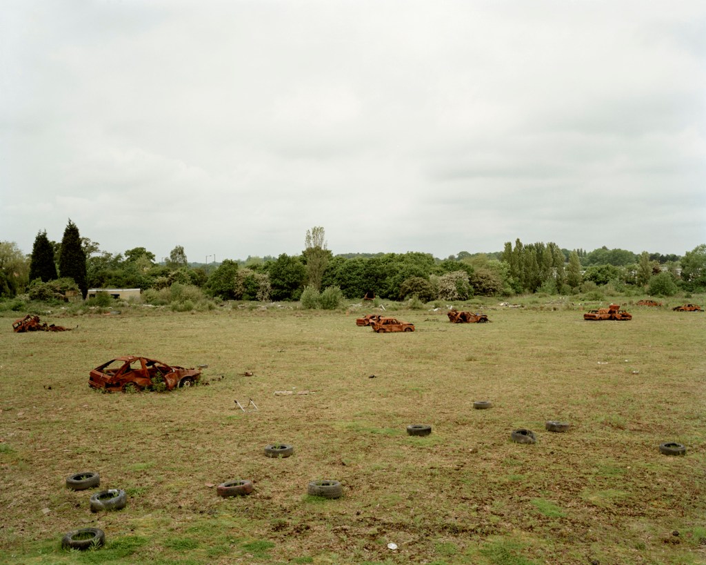
Today images of unfolding or recent events are more likely to be in the form of video, often taken at the very time on bystanders’ smart phones. As such they have an immediacy, though not necessarily reliability or objectivity. If we see a still image of an event it is just as likely to be a screen grab from a video sequence. Thinking back on the other hand to, for example, the Vietnam war (I am of an age to remember the nightly news bulletins) the images that were taken in the thick of the action were taken not on film or TV cameras, which were too bulky, but on 35mm film cameras: just look at the work of the likes of Don McCullin and Tim Page, to name but two. Now the photographer goes in with a camera after the event, to record what Campany calls the traces of traces, the aftermath, the consequences of action that has gone before. (Ivor Prickett’s work in Syria and Iraq immediately jumps to mind here having seen it at the Side Gallery and having written about it recently. There are a few images where something has just happened – a bomb blast or an airstrike – but mostly they are separated and divorced from the immediate action.)

Late photography offers an opportunity away from the sound/image-bite and increasingly short news cycles for a more considered, sober, assessment of events. It offers an opportunity to memorialise events. One consequence though is the aestheticisation, or at least the risk of turning reportage into art, of the work. This is not work for immediate consumption and is more likely to be seen, not by way of news outlets, but on the walls of galleries, as is the case with Prickett’s work, and Meyerowitz’s World Trade Centre photos. That is not necessarily a bad thing but is something that I think needs to be borne in mind when viewing and interpreting such work.

The pictures that Joel Meyerowitz took at the site of the twin towers is in some ways a perfect example.

As a first step, rather than looking at them again on-line, I have deliberately chosen to look at them only in hard copy, going back to the second chapter of his recent book (2018). These are pictures that deserve to be looked at more slowly, lingered over, and appreciated in a physical, tactile form, rather than as pixels on a bright screen. The scenes that he captured were intensely physical and to get something of that back I think it is worth slowing down and appreciating the physical feel of printed images in a hefty book.

How they differ from what we saw at the time on television is obvious. We saw repeated (indeed too often distastefully so) images of planes flying into the buildings and exploding, the spreading fires, people falling to their deaths, the steady collapse of the buildings. What we did not see, and for obvious reasons could not, is what was happening on the ground. Meyerowitz obviously cannot show this either but what he does show is the aftermath, what was left after, literally, the dust settled. What he shows is what, by the time he was able to photograph there, was no longer a prime concern of the news outlets.

And its value? In part it is I think precisely that, this filling in of the less “newsworthy” details. In some ways I see it as a truer, at the very least less sensationalist and therefore more reliable, portrayal of what happened here. Rather than sensationalist it is much more considered. As such I feel it serves as a more fitting memorial to events, the people who died (though they are of course strikingly absent from much of this work, other than in an more indirect way, as in photos such as “Five more found, New York City, 2001” – (2018) at pages 34 and 35.) It also serves as a tribute to those who worked to clean up the site afterwards, an unpleasant, dirty, traumatic, and dangerous process in its own right, who might otherwise be overlooked.

Meyerowitz, J, (2018).  Where I find myself.  London:  Lawrence King

Sontag, S, (1979).  On Photography.  London:  Penguin

Sontag, S, (2004).  Regarding the Pain of Others.  London:  Penguin

http://davidcampany.com/safety-in-numbness/

The Tourist Perspective

A few reflections on this part of the course, prompted perhaps more by the two exercises that follow this section of the course material and by some of the reading I did in connection with the Picturesque. Nothing very profound, and indeed slightly random, but nevertheless pertinent to the way my thinking about landscape photography is developing.

Just by way of a preface, it is unfortunate that the video interview with Martin Parr that appeared in the Guardian and that is cited in the course material is no longer available. Though I am not much of a fan of Parr’s work, it would nevertheless have been interesting to hear his take on collecting in general, and postcards in particular. I never did see the Parrworld exhibition when it showed at the Baltic in Gateshead (more than ten years ago now!) and I have not looked at any of his Boring Postcards books so feel that, for all my generally critical stance, I have perhaps missed out on something here.

With that out of the way, I thought I would start with Susan Sontag (1979) and the closing comments in her essay “In Plato’s Cave” (page 24). Whilst I still bridle at the hyperbolic absolutism of her judgment I do find myself broadly in agreement. No, not “everyone is now addicted” to “an aesthetic consumerism”. Perhaps I and people I know are ‘unusual’ in this regard but I do not know anyone who really falls into this catch-all. For many years I did not take a camera with me when travelling. I had got tired of seeing the world through the viewfinder of a cheap camera (starting with a Kodak Instamatic as a child and working up to an Olympus OM-10 as a young adult) and taking pictures that did not really do reality any justice (a bit like the postcards in my last post). What I was missing was the experience of really looking at what was before me. That led me to replace the camera with a sketchbook, which made me look much harder and, although sometimes quite frustrating, was much more rewarding.

One of the things that brought home to me the banality of a lot of tourist photography, and here I am with Sontag wholeheartedly, was a [particular experience I still recall from nearly thirty years ago. On a road-trip through Europe with friends back in the 1980s we visited the BMW museum in Munich (a couple of those friends were real petrol-heads). At the same time we visited a group of Japanese tourists were also there. (I am most definitely not singling out the Japanese here. They could have been any nationality. They were just more noticeable as at that time I had not encountered many people from East Asia. What was most striking was that a number of them took pictures in front of almost every car on display. The pictures though were not of the cars but of the rest of their little group standing in front of, and in all likelihood almost completely obscuring the exhibits. Although again I do feel that Sontag somewhat overstates her case, I nevertheless do think this was an interesting example one of her comments:

“Ultimately, having an experience becomes identical with taking a photograph of it, and participating in a public event comes more and more to be the equivalent of looking at in photographed form.”

For these tourists the experience was not of looking at some old cars but of having their photographs taken while standing in front of them.

I guess this phenomenon continues today in up-dated form, but essentially the same thing, with the ubiquity of the smart phone and the compulsion (which, at the risk of indulging some Sontag-like hyperbole, seems almost pathological) to take the wretched “selfie” in front of whatever the tourist is ostensibly there to look at and experience.

I think I have since got over my former aversion to travelling with a camera (not that I do much travelling now) but am certainly a lot more considered about when I press the shutter as a tourist (as opposed to someone pursuing a particular photographic project). And yes, I do still sketch a little as well, though not as much as I used to.

Gilpin’s ‘pioneering’ work (1789) as a guide for tourists came back to mind when I read a little of Wells (2011) (around page 90) prompted by the course material. The tourist photographer is effectively being shepherded into particular places for the specific purpose of taking photographs. The tour bus stops at the local “beauty-spots”. Ordinance Survey maps still include a symbol identifying places from which to view picturesque scenes. I was reminded of a photo by Magnum photographer Raymond Depardon:

USA. California. Los Angeles. 1982.

Perhaps not surprisingly the photographic industry, in this case film and consumer camera manufacturers Kodak (as I have said above my first camera was a Kodak), got on the bandwagon and erected their own signs. Says it all really about the consumerist commodification attacked by Sontag.

Going back to Wells and to Snyder in Mitchell (2002) and their narratives of the development of commercially available photographic images and a consumer market for them, struck a chord when I embarked on the postcards exercise. As I indicated then, I rarely if ever receive postcards now and if I do they tend to be of works of art rather than places. Given the proliferation of smartphones and cheap digital camera I had therefore expected that it would not necessarily be easy to find any decent contemporary postcards that would serve for the exercise. In that respect I was not surprised that I only found one shop in Hexham selling any (though that has to be caveated by the fact that there were a number of possible outlets that I did not get round to visiting). What did surprise me though was to be told by the ladies working in the shop in question that they actually sell a lot of cards. Not just a few but, in their words, “lots”! Apparently there is still a market for these things and my little corner of the world does attract quite a lot of visitors (Not too many: Northumberland is known as “The Hidden Kingdom” and we would like it to stay that way; but enough to support the local tourist economy.) Indeed, the first question I was asked was whether I was there on holiday! These factors then led me to speculate whether the relative health of this particular market for postcards might actually be a demographic issue. Again not at all a scientific analysis, but my guess is that a majority of the visitors we get, particularly in the local towns, as opposed to the wilder reaches of the county (Hadrian’s Wall, bits of the Pennine Way, the Cheviots) tend to be more ‘mature’ (which does not necessarily mean old!) Are they, I wonder, of a generation that is less likely to spend all their time pointing their phones at the sights and not into selfies?

Whatever the explanation might be, it would appear that there is still, possibly against the odds, a market and a life for the picture postcard.

Gilpin, W, (1789).  Observations on the River Wye, and Several Parts of South Wales.  London:  Blamire  (Gale ECCO facsimile reprint)

Mitchell, W.J.T, (ed) (2002).  Landscape and Power.  Chicago: The University of Chicago Press

Sontag, S, (1979).  On Photography.  London:  Penguin

Wells. L, (2011)  Land Matters:  Landscape Photography, Culture and Identity.  London:  IB Tauris

Exercise 3.2 – Postcard views – 1

Coming back to the first part of this exercise, in some ways I find it a bit of an odd one. These days I have very few postcards. Those that I do I have either bought myself or have been sent to me by others and are invariably of works of art rather than places. I do not recall ever having been sent many postcards of places that I actually know, rather than places I have not otherwise visited – is that not part of the rationale of the postcard?

I do know at least one person with an extensive collection of cards but these are, so far as I know, nearly all historical views, or at least not contemporary, which rather defeats the object of this exercise.

I have therefore had to go out and buy some that show places I know particularly well in Newcastle and the Tyne Valley area where I live. Not quite as easy a task as I first anticipated as very few places locally – I only had time today to go to Hexham – now sell the things. (I will write a little more about buying postcards in general when I get round to reflecting on “The tourist perspective” that prefaces this exercise – yes, I know, I am doing this section in reverse order! That is just the way it has worked out.)

Here are my chosen views, eight in number which was about the limit of those available and usable for this exercise, all local icons:

Mile Castle 39 and Crag Lough, looking East towards Housesteads
View across the Sele towards the Abbey
St. Andrews, Corbridge
“The North East”
Bamburg Castle, Durham Cathedral, The Angel of the North, Hadrian’s Wall, Gateshead Millennium Bridge and Sage Music Centre

The first thing that strikes me about all of them is the exaggerated colours; the blues are too blue and the greens too green. Yes, we do get blue skies up here but these do not feel at all natural. I cannot remember in thirty or so years of seeing the Tyne quite as blue as it appears in the second picture. (Indeed, in that one, all of the colours are too vivid.)

The next thing I get is a remarkable sense of flatness. It is not just that it looks as if they have deep depths of field but something about the reproduction has flattened everything out. The effect is quite unreal and two-dimensional. Are both of these effects simply the result of the processes of mechanical reproduction rather than choices made by the photographer, I wonder?

Three of them have what I would regard as odd viewpoints: Hexham, Hexham Abbey, and St. Andrews. The first is simply a bit of an odd view. I can think of plenty of other potentially more ‘picturesque’ views that this one, which is not one that I would expect the average visitor to Hexham to encounter or recognise. Given that the most striking physical presence in Hexham is the Abbey it is odd that in this view it is barely visible through the trees.

The second does at least focus on the Abbey, an impressive structure dating back in its current form (though much rebuilt in the 19th century) to the 11th century. (The original foundation goes back to 674.) The viewpoint is though not the most obvious or most impressive. The view that most visitors get is of the east facade from the market square, which it tends to dominate. This view is from the west, from the abbey gardens which are attractive enough in their own right, and at least it does show off the fine structure of the nave, but it is not one that your average visitor is likely to see without a bit of effort or help.

The view of St Andrews, which again is Saxon in origin and is a very fine parish church in its own right, home to a first rate annual chamber music festival, is again odd because of its viewpoint. The photographer must have been lying on the ground to get this. As a result the foreground daffodils are. for my taste, too dominant. This angle has also resulted in a dramatic foreshortening of the building so that its proportions have become strangely distorted: the south transept looks much bigger than it really is and the tower looks further away, and shorter, than again it is in reality. For me a much more satisfying, ‘picturesque’ even, view would have been from ordinary eye level and a few metres to the left which would give a much more natural impression of the church.

Not much more to say about the Hadrian’s Wall picture, which is not bad I think in compositional terms and does give some sense of the nature of the topography and countryside along this stretch of the wall (it is not like this for all of its length!).

Similarly not a lot to say about the Sycamore Gap picture. Yes, this is the view that I keep on disparaging – nevertheless with apologies to all and sundry who like this sort of thing. What I really do not like about this view in general, not just limited to this postcard, is the way this tree has very much been taken out of context: it is a tree in a dip. That gives no real hint though about the narrowness of the ridge, what, despite the dip in the crest at this point, is quite an impressive natural physical barrier, and why the Wall is built along it I do not even think it is the most ‘dramatic’ view of it, which I think you get from much further back on the road. Again, as an aside, I am struck by the relatively low camera angle, which does at least give more of a sense of the sky, and the openness of the landscape than would, for example, be apparent from a ‘square-on’ view from the road, which is not at quite the same elevation but not much below.

The last one, the collage with the Angel, I have chosen simply because this is not the angle from which I would normally see it. More usually (which is not in fact that often) my view is from below and from the left, either from an East Coast line train heading into Newcastle, or from a car on the A1 which passes just below it. One thing I do like about this view is that there is a person just visible at the Angel’s feet, making this the only card that gives a reliable sense of scale, a reminder of just how big the Angel really is!

None of these cards fully align with my own experience and perception of these places. Nevertheless that does not by any means lead me to conclude that they are good examples of the genre, and they do all contrive to portray this region in a positive and attractive light. It is a beautiful part of the world but not always (often?) quite as brightly coloured as this!

Exercise 3.2 – Postcard views – 2

I am a bit out of sequence with this exercise, starting with the second part first, before even I have reflected more generally on “The tourist perspective”.

To put the quotation from Clarke (1997) into perspective I have re-read the whole chapter on Landscape in Photography (pages 55 to 73). This is in my view a well written and thoughtful historical summary of the development of landscape photographing, clearly identifying the different trends as they developed in, specifically, English and American practice. Indeed, it is one of the best that I have read. I was though a bit surprised that the penultimate paragraph that is quoted in the brief resorts to such broad generalisations. Why do some theorists do this, make sleeping assertions that are ill-supported by actual evidence (I am thinking here in particular of Sontag)? I think Clarke’s assertion does hold good from an historical perspective. Photographers were largely literally in a privileged position, in so far as they could afford the cost of the equipment which was beyond the reach of most until the advent of mass market cameras such as the Box Brownie. Or they had, as for example, Timothy O’Sullivan, some official status or backing. They were also frequently tourists or outsiders and the camera was often used for the purposes of appropriation, colonisation and imperialism, for commercial gain. However, can it truly be said that the “photographer of landscapes is always the tourist, and invariably the outsider” (my emphasis)?

I would argue this broad generalisation is not supportable. “Always” and “invariably” are simply not true today for all landscape photographers. What if the photographer is showing his or her own ‘territory’, is depicting places that are known, indeed inhabited by the photographer? Does the act of getting behind the camera automatically make the photographer an outsider? No, I do not agree that this is the case. Let us consider some examples of photographers who have focused on their own patch (all examples who appear in my own library), working from the point of view of insiders with particular knowledge of and familiarity with the places they have photographed: Daido Moriyama in his home parish of Shinjuku in Tokyo; Guido Guidi on his home turf around Cesena; William Eggleston in Memphis; Michael Schmidt in Kreuzberg, Berlin. What about the people of Ashington in the Ashington District Star project photographing their home town, surely the epitome of the insider?

Most of my own landscape work, for this course and also personal projects, is made in and around the village where I live. I very much regard myself as an insider here. The things and places that I photograph have been chosen because I know them, many are places I see almost every day. I have come to know much of the local landscape intimately, watching it in all weathers and through all the seasons. This is after all what I am doing for Assignment 6. This is not something that I would have been able to do if I was an outsider. I simply would not know what to look for or the significance of what I am looking at, the places deeper histories and meanings. In that sense my landscape photography does not insist “on the land as spectacle” or “involve an element of pleasure”. I accept that much landscape photography, which I tend to deride to some extent or to dismiss, does indeed do both. But neither necessarily follow from the simple act of placing a camera between your eye and the landscape before you.

Clarke, G, (1997). The Photograph. Oxford: Oxford University Press

https://culturematters.org.uk/index.php/arts/visual-art/item/2248-the-pitmen-painters-and-the-ashington-district-star

Exercise 3.1: Reflecting on the Picturesque

I have never really given much serious thought to the idea of the Picturesque before and now that I have done so what I have read and looked at goes some way towards why I have not bothered before.

What I get now reading a number of sources is how ill-defined a concept it is. Whilst Gilpin came up with a number of principles that define the Picturesque I find they are actually rather nebulous, changeable, hard to pin down. Indeed, the impression I have is that Gilpin speculated, and sometimes pontificated upon, what amounted to the Picturesque and then found that much of the natural landscape that he looked at did not fit his ideals. As Anna Pavord quotes him in her book (page 29) the Picturesque “is that particular kind of beauty, which is agreeable in a picture”. Not exactly a formula that could be used reliably to predict whether or not a view fits the bill.

The other thing, more importantly, is a sense of its unreality, perhaps in part driven by its fluid definitions. The most striking example of this (no pun intended) that I have come across in Gilpin’s book (1789 at page 47) is his suggestion that Tintern Abbey could be made more picturesque by taking a hammer to some the stonework in order to improve the view: “A mallet judiciously used (but who durst use it?) might be of service in fracturing some of them, particularly those of the cross isles, which are not only disagreeable in themselves, but confound the perspective.” I find this particularly egregious. In line with the rather loose definitions of the Picturesque he gives no real indication of exactly what manner or degree of amateur stone-masonry is required, and how dare the actual physical remains not comply with his conceptions of what is acceptable!

This sense of unreality is also highlighted by Andrews (1999) who quotes Uvedale Price (page 171) in his Essay on the Picturesque (I have discovered that his book is available on the Google Books project and have included a link below though I have not read very much at all of it myself) which is all about the artificial creation of a landscape (true “landscaping”) in order to create something that is Picturesque.

One useful thing that Andrews highlights at various points throughout his book is the important role of the farming of the view in order to make Picturesque, a view worthy of being looked at, which is also there in Gilpin with his talk of ‘screens’. In so many paintings that would be regarded as Picturesque the scene is carefully framed on each side, by trees, rocks, what have you, and the view within is carefully separated into fore-, middle-, and back-grounds. This artificiality is something that you also get in real places, where the picturesque viewing point has been careful chosen, and the viewer’s attention directed in such a way as to bring out the beauty of the view. One particular place that comes to mind in this regard is Queen Victoria’s View near Pitlochry (https://www.visitscotland.com/info/towns-villages/queens-view-p402191) which fits the bill almost perfectly and continues to this day to offer a highly idealised, and stage managed, view of what is admittedly very beautiful and dramatic countryside, but int the process tames and commodifies it.

How has the idea of the Picturesque influenced my own ideas about landscape art? It has not, other than in a negative way. I have expressed the view before that the salon approach to landscape photography, the single beautiful image, holds no interest for me. Coming back to one of my bug-bears, the endless shots of the tree at Sycamore Gap leave me entirely unmoved. These are, I suppose, classic Picturesque views: there are Gilpin’s side screens an idea that calls to mind little more than scenery for a stage play) in the form of the sides of the cleft and the remains of wall; a foreground in the form of the gently sloping land leading up to the tree; and a dramatic, wide-open sky in the background. But they do not say anything, mean anything. I have long been much more interested in landscapes that say something.

Here I am very much in the same camp as Fay Godwin, whose work has been something that I have cited and referred back to at various points throughout this degree course, going right back to the early days of EYV. I did not see the South Bank Show programme about her when it was first shown (I do not recall actually having a television in 1986) so I was glad to be able to find a copy of it on YouTube, though, perhaps a little oddly, a recording of a retransmission on Italian television, complete with Italian subtitles. I was impressed by her disdain, which she was not shy to express, about the banality of so many “picturesque” postcard views of countryside. What interested her more, and what appeals to me in her work and my own approach to landscape in art, is the political, the historical, the human, more broadly environmental, elements that go to help make up the landscape and have been influenced and created by it. I was intrigued by the discussion in the programme about Godwin’s work being seen as Romantic and how she never saw her work in quite that light, although nevertheless took it as something of a compliment. As the critic Ian Jeffery puts it in the programme her romanticism is always offset by something practical, analytical, commonplace. It is never just a pretty view.

Godwin’s work I suppose comes closest to what I would regard as a good landscape photograph.

Andrews, M, (1999).  Landscape and Western Art.  Oxford:  Oxford University Press

Gilpin, W, (1789).  Observations on the River Wye, and Several Parts of South Wales.  London:  Blamire  (Gale ECCO facsimile reprint)

Pavord, A, (2016). Landskipping – Painters, Ploughmen, and Places. London: Bloomsbury

Price, U, (1796). An Essay on the Picturesque. London: Robson (available at https://books.google.co.uk/books?id=Nbo8AAAAYAAJ&printsec=frontcover&source=gbs_ge_summary_r&cad=0#v=onepage&q&f=false)

Fay Godwin video:

https://www.yuotube.com/watch?v=4JE8144Ak7o&feature+emb_logo

Exercise 2.6: ‘Edgelands’

It is a few years since I last reread parts of this book, having first read it when it originally came out in paperback in 2012. One of the things I had forgotten was how much of a rag-bag, a collection of scraps and tatters, shreds and threads, it is, very much like the edgelands themselves. Infinite in their variety, shifting, mutable, hard to pin down.

That is what I felt about the Wire chapter this time round. It is an entertaining and interesting read but at the end it does not really pull together into something I feel is fully coherent. That is by no means a bad thing and is perhaps a reflection of the variability of these spaces.

What I get in particular from this chapter, which is something that already interests me and is something that I have explored to a limited extent in earlier work is how a fence, an ostensible barrier, can actually be so much more complex. They are physical barriers to keep people out (or in, going back to Donovan Wylie’s Maze project) but also means of entry. I remember as child, as the chapter touches on, using the so-called barrier of the chain link perimeter fence to get inside the compound of a local factory (where I ended up working briefly as a summer job when I left school, but then I walked in through the front gate) which during the war had built armoured cars. The attraction, the irresistible pull, was a number of bunkers and air-raid shelters that were still there, scattered around the perimeter: damp and smelly but occasionally with interesting thirty year old scraps still to be found (this was in the 1970s).

It also got me thinking about a couple of more substantial barriers that I am familiar with that have multiple connotations. One is very old, Hadrian’s Wall, stretches of which are not far from where I live. This strikes me as not simply being physical barrier meant to impede movement: in some places it is nigh-on impenetrable because of the underlying topography on which it is built; in other it is not much of a physical barrier at all. Rather what this structure is about is power and control. It is a statement of ownership – everything south from here is ours! – a tangible, physical manifestation of an abstract concept. It is about control in so far as traffic passed both ways through the wall – there are various places where ancient roadways, paths and tracks, cross the line of the wall – so these became places where trade could be regulated, and more importantly, taxed.

The other, more recent and something that was contemporary with my own lifetime until it was breached in 1989, is the Berlin Wall. This was designed to keep people in, not out, though paradoxically by enclosing the small enclave of West Berlin. It also became over time a monument and memorial to those who tried, but failed and died in the attempt, to cross it – like Farley and Symmons Robert’s memorials attached to fences and barriers. Even before it was breached and even more so since 1989, it became a huge open-air gallery, much graffitied and painted on the “west” side, an extensive, not to mention potentially deadly, mural.

The Power chapter is also a bit mixed The focus on power generation stations, old fashioned ones burning coal, of which few now remain in this country following “dash for gas” – which are not actually much more ecologically friendly – says a lot about how we take so much of the infrastructure of modern life for granted, how so much of it is invisible, mysterious, banished to the exurbs where it can be seen from a distance but not encountered close up. Space, distance from the city, open ground around these sites, becomes almost as effective a barrier, physically and psychologically, as the wire fence.

The last couple of pages dealing with photography, particularly the typological work of the Bechers, and the “before and after”, post-industrial work of John Davies, are a bit of an abrupt change of pace, almost a non-sequitur if it was not for the common subject matter of industrial structures. Nevertheless, one thought that occurred to me is that this photographic work is important because it is typological, because it acts as a record, a remembrance of a recent past that is steadily being erased physically, but also mentally. It is important that these places, their functions, their societal importance and significant, be remembered.

Coincidentally, as I think I have mentioned elsewhere, I have recently been looking again at Davies’s work in his recent “Retraced” book (2019), showing industrial, rural and urban, scenes and their post-industrial appearance. Appropriately given my reference to the Berlin Wall above, he does the same out of thing in Berlin comparing and contrasting how the city looked before and after 1989.

Something else that came to mind reading this chapter was the work of Mitch Epstein and what I noticed was an interesting contrast. In this country these power stations are generally separate, if not actually remote, from places of habitation. In many of Epstein’s picture the power stations and industrial plants are cheek by jowl with and loom over suburbia.

Davies, J, (2019).  Retraced 81/19.  London:  GOST

Epstein, M, (2011).  American Power.  Göttingen: Steidl

Farley, P & Symmons Roberts, M, (2012).  Edgelands.  London:  Vintage

Psychogeography and Photography

Coming back to psychogeography, the last post was written from a mostly literary perspective. Now I want to put down some thoughts from a speficially photographic point of view, taking as a starting point the three photographers mentioned in the course material.

The first is Brassaï. Initially I thought, yes, a psychogeographic photographer. On second thoughts though I am much more skeptical that he was. Certainly he photographed Paris, geographically certainly, and arguably psychologically in so far as he spent a lot of time in pursuit of the demimonde and Parisian nightlife. To that extent he chose the home of modern psychogeography as we know it, and he does have some of the appearance of the flaneur. I do wonder though whether that is really right.

I have difficulty with the idea of him as flâneur to start with not least because his use of a large format camera and magnesium flash does not strike me as being compatible with, let alone practical for, the aimless stroller. What is more he clearly had a certain milieu in mind and went in pursuit of it. It is not as if he stumbled upon his subject matter just by strolling around. On that basis alone I would suggest that Henri Cartier-Bresson fits the bill better, though even then I am not convinced, as I will explain when I come below to the subject of street photography.

The decisive point for me though is that many of Brassaï’s photos were actually staged, carefully posed and arranged, with people standing in for the ‘types’ he was looking for. I had not realised this until I read Stuart Jeffries’s article in the Guardian cited below but it now seems almost obvious when looking again at his pictures. Here is the particular example that Jeffries singles out in his piece (unfortunately not a very good copy but easily findable through Google or Bing Images):

The posing of the figures and the composition, pivoting round the multiple reflections, now seems obviously contrived.

Before moving on I suppose it is worth considering, albeit only very briefly, another photographer of the cityscape of Paris, Eugene Atget, who admittedly is not mentioned. Again I do not think he fits the bill: no flâneury, more of a typological than psychological recording and cataloguing of parts of Paris. The only example of his work that I feel come close are the more surreal, random (?) shots of reflections in shop windows.

What of Robert Adams (whose writing I probably know better than I do his photographs) and his Summer Nights Walking? This I feel is more encouraging.

Although these are ostensibly just a collection of topological views taken on nocturnal walks around his home time I do feel they have much more psychological depth. They say so much more about the way of life in this town, which could probably stand as an exemplar of much of suburban America. They say much about the suburban domestic attitude towards night-time. Whereas in Brassaï’s Paris people came out at night to play, here they retreat behind closed doors and drawn curtains. There is almost a sense of menace in these pictures as if the camera, and we the viewers of the photos, are prowlers, looking for an opportunity to get up to no good.

At a superficial level, principally because of their nocturnal nature and the use of lighting, they call to mind some of Gregory Crewdson’s work but none of these seem to me to have the same sense of artificiality and contrivance. Crewdson’s work is often deeply psychological but rarely, to the limited extent that I am familiar with his work, in a specific, rather than generalised, way geographically rooted.

Mark Power’s work is new to me but comes across as the most psychogeographical work that I have looked at so far. There are clear echoes of the subjects written about by Farley & Symmons Roberts (2012) and the sort of places considered by Ian Sinclair. What I get first and foremost is a sense that these are not necessarily psychologically easy place to live. There is a strange almost post-apocalyptic absence of people and some of the places look more like the aftermath of a war-zone.

Rarely has an otherwise ordinary suburbia, or perhaps more appropriately exurbia, looked quite as menacing and unsettling.

This has set me thinking in more general terms about psychogeography in photographic terms. For example, where does the broad church of street photography stand in relation to the concept? My immediate reaction is that mostly it does not. So much street photography seems to be more concerned with human activity, and particularly the catching of people unawares, than addressing how they relate to the environment within which they are captured on camera. Coming back to HCB, he seems to be more concerned with capturing that elusive moment (I am not a devotee of the idea of the decisive moment, as I have written more than once elsewhere!), the sudden confluence of events and elements that makes an interesting picture, rather than how that is affected, caused, or influenced by the environment, notwithstanding that some of his work is set in quite specific geographical locations, such as India and China.

Casting my eyes over the bookshelves in my study two artists leap out at me as fitting more closely the idea of psychogeography. One is Guido Guidi. I am not sure about his work in Sardinia and around his home town of Cesena but I do think there is an element of the concept in his work in the Veneto (2019) in so far as he is not just picturing marginal and marginalised areas but how those places, policies of development and land use practices, have affected life there.

The other, more specifically, is Daido Moriyama, with his repeated, obsessive strolling around the Shinjuku area of Tokyo – a Japanese flâneur – compact camera in hand observing anything and everything going on, recording the environment, warts and all, the people, and the way the place affects their lives. There will no doubt be others who also fit the bill but Moriyama is for me the one who stands out most clearly as being the nearest photographic equivalent to one of Debord’s situationists.

Guidi, G, (2019).  In Veneto, 1984-89.  London:  MACK

Moriyama, D, (2017).  Daido Moriyama: Record.  London:  Thames & Hudson

Moriyama, D, (2016).  Daido Tokyo.  Paris:  FondationCartier pour l’art contemporain

https://www.markpower.co.uk/projects/26-DIFFERENT-ENDINGS

https://www.theguardian.com/culture/2001/feb/06/artsfeatures

Psychogeography

Before getting to the next exercise, some initial thoughts about and observations upon the concept of psychogeography on the basis of my reading to date.

The first is more of a question: why London and Paris? These two cities are at the roots of and dominate much of the writing (at least that I have read) on psychogeography. Debord and the Situationists were of course based in Paris. It is from Paris, thanks to Baudelaire, that we have the figure of the flâneur, particularly as subsequently developed by Walter Benjamin, and although Debord’s formulation of psychogeography does not specifically refer to the flaneur he (or she, the flâneuse), the stroller is implicit within the concept of the dérive as the means of carrying out psychogeographic research.

In London we have, historically, Defoe, Blake, De Quincey, Stephenson, and Machin, among others although in writing about London I doubt that they would necessarily have recognised themselves as psychogeographers. Latterly of course we have Ackroyd and Sinclair. I have to confess I have not read much by Ackroyd as I actually find his almost monomaniacal focus on the city to be overwhelming, to the extent of almost being a parody of itself. Sinclair I have read more though I do find his writing style sometimes a little overwrought and mannered for a comfortable read.

And of course there is also JG Ballard, but I sometimes wonder if his work is more psycho than geography.

Where are the other cities? I see from his book (2007) Will Self has sought to extend the scope of investigation to other places, notably New York, but so far I have only had a chance to skim through it and not yet read it closely. (Another confession: I am not a great fan of Self’s writing so although I have a copy of his book I am not quite straining at the leash to spend time on it.) Rebecca Solnit has written extensively about San Francisco in a way that I suppose counts as psychogeographical, and walking generally. She is also just about the only woman that I can currently think of who has addressed the subject, particularly the role of walking, in any concentrated way, which begs another question: where are the women psychogeographers? (Pace Rachel Lichtenstein mentioned below.) I am rereading her chapter on Paris (2002, at pages 196ff) at the moment and might come back to her again in a later post.

The opening question remains unanswered. Or is it just that because of the roots in London and Paris similar explorations of other cities have not made their presence felt here?

My next question is why the prevalence of writing on and about cities? Is it as much as anything a practical issue, that it is difficult to be a flâneur, to wander aimlessly in the countryside? At most, particularly with Farley & Symmons Roberts (2012), and of course Ian Sinclair’s orbital walk around the M25 (which I have not read), it seems to me exploration has pushed only as far as the edge lands.

I do not really feel comfortable with appending the label of psychogeography to much contemporary nature and topographical writing, which simply does not seem to be concerned with quite the same things, though I accept that there is an argument to be made in connection with the psychological effects on us of exposure to nature, wildlife and place. Nevertheless I still feel somewhat resistant. Partly I think the issue is of the inappropriateness of the idea of the flaneur in the country. Merlin Coverley makes something of a case for this in the preface to the latest edition of his book (2018) but, as I read him, decides that ultimately the label that is attached to any given work is not what really matters.

Incidentally, he identifies more women wandering into the otherwise solidly masculine realms of psychogeography but unfortunately I cannot comment on them as I am not familiar with their work, with the exception of Rachel Lichtenstein whose book (1999) I read years ago, which was, surprise surprise, co-authored with Ian Sinclair!

I wonder though if a stronger case might be made for earlier works, such as William Cobbett’s Rural Rides, given the influence of his Radical politics? Does that give him something more in common with Sinclair and Debord? Unfortunately these are questions that I cannot answer or explore further for now as I have never before read his book properly (not since I was introduced to bits of it at school more than forty years ago) and do not currently have a copy.

I would venture that perhaps Sinclair’s Black Apples of Gower (2015) fits the bill, notwithstanding that it is as much about Ceri Richards as anyone or anything else. Partly this is a matter of his style and the way he writes about the subject but it does strike that it is significant that he engaged in an exploration of childhood memories specifically through the medium of walking. Something similar might also be claimed for Robert Macfarlane’s first book (2003) though I hesitate somewhat that mountains are not really places where one can indulge in aimless wandering. Of his more recent work I do think his chapter on Invisible Cities (2019) (at pages 127 ff) does fall into the category but then we are back in, or underneath, Paris again.

A few more points to close with to avoid this post becoming too long. Unfortunately I have not been able to listen to Philip Pullman’s discussion of the Manet painting. The Guardian site requires the latest version of Flash Player which for some reason will not instal on my computer (a ten year old iMac, possibly because it cannot run the latest version of Mac OS) and is similarly not supported by my iPad. This is frustrating as Pullman is a writer I admire and picking apart this deeply enigmatic painting is always interesting – I had not thought of the gent, through whose eyes we, the viewers of the painting, rather alarmingly regard the young woman, as a flaneur but given the strong undertones of sexual exploitation it makes sense to me.

Brassai, Adams, and Power I have not yet looked at properly but as a trio of photographers they are probably worth addressing separately.

Lastly, I am struck by the fact that apart from Coverley and Self all of the books cited below are ones that I have already read some years ago, or where more recently, independently of this course.

Coverley, M, (2018).  Psychogeography.  Harpenden:  Oldcastle Books

Farley, P & Symmons Roberts, M, (2012).  Edgelands.  London:  Vintage

Lichtenstein, R, & Sinclair, I, (1999).  Rodinksy’s Room.  London:  Granta

Macfarlane, R, (2003).  Mountains of the Mind.  London:  Granta

Macfarlane, R, (2019).  Underland.  London:  Hamish Hamilton

Self, W, (2007).  Psychogeography.  London:  Bloomsbury

Sinclair, I, (2015).  Black Apples of Gower.  Taller Fratrum:  Little Toller Books

Solnit, R, (2002).  Wanderlust: A History of Walking.  London:  Verso

Solnit R, (2006).  A Field Guide to Getting Lost.  Edinburgh:  Cannongate

Land Art

I had not thought about it before but I suppose there is indeed a distinction between the works of the likes of Robert Smithson (which I have not seen in the flesh) and that of Richard Long, Hamish Fulton, and others. The polar differences are defined by the permanence or ephemerality of the work: Spiral Jetty still exists, although from time to time either swallowed up by the lake water, or left high and dry as the water recedes: much of Long’s work, such as A Line Made by Walking and his mud paintings (which I last saw about twelve years ago in Edinburgh) now exist only as photographs.

Christo and Jean-Claude are also mentioned in the part of the course material but I would place their work somewhere in between. Certainly it is “capitalist” art, to use Long’s phrase, in so far as these projects are expensive to implement. However their lasting impact on the ground is limited, they sit on more than in or as part of the landscape, and are ephemeral in their installed form – Running Fence, for example, took four years or so to plan and install but was then in place only for a brief time in 1976.

Another artist who comes to mind, much more environmentally minded and drive than Christo, is Andy Goldsworthy. Some of his works remain, such as “Wall that went for a walk” in Grizedale, but many, such as the ice or leaf sculptures, were naturally short-lived and remain now only as photographs.

What I think sets Long’s work apart is the mixture of approaches: physical artefacts both long-lived (gallery installations, painted sculptures) and temporary, some accessible, many not; photography; text; and the conceptual, the otherwise unrecordable activity simply of walking. (One other artist who occasionally mixes the physical with the conceptual that comes to mind here is David Nash. In particular I think of his Wooden Boulder which was both a physical artefact, a large carved wooden boulder, and the conceptual in the form of its journey down stream from Ffestiniog to the sea and its ultimate disappearance.)

It is this conceptual element, the idea that simple activity can itself be art is one of the aspects of Long’s work that I find particularly interesting and it is this part of his approach that has heavily influenced my efforts in the text in art exercise. (https://markrobinsonocalandscape.photo.blog/2019/12/27/exercise-2-5-text-in-art/). It is though also an influence on my thinking for Assignment 2 and the idea that it is the act of performing the journey, rather than for example simply recording the landscape through which it passes, that is important. I am similarly attracted by his use of chance in his work. As he says in the Guardian interview: “I guess I’m an opportunist, really. I go out into the world with an open mind, and I rely to a degree on intuition and chance.” Thesis one of the thoughts that has driven my first experiments with the camera simply pointed through the train window and images taken automatically with the interval timer.

Goldsworthy, A, (1994). Stone. London: Viking

Long, R, (2007).  Walking and Marking.  Edinburgh:  National Galleries of Scotland

Nash, D, (2007). David Nash. London: Thames & Hudson

http://www.richardlong.org

https://www.theguardian.com/artanddesign/2009/may/10/art-richard-long

Exercise 2.5: Text in art

As will be evident from some of my other work, particularly for C&N, I am a bit wary about combining photographs and text for fear that the latter can restrict the meaning of the image, or subvert and distort it. The idea of using text to make a piece of art is though a different matter.

I have had a look at the websites for Ed Ruscha, Barbara Kruger and Mark Titchner as recommended by the brief for this exercise but do not actually find any inspiration here. Whilst I admire Ruscha’s gas station paintings, for example, I find his text works do nothing for me: I struggle to see the point of an apparently random statement superimposed over a painting of a mountain. Kruger’s work is interesting but still does not affect me. Titchner’s work comes across to me as little more than empty sloganeering. Maybe I am being a little unfair to them all, but this is simply art that I do not like and from which I find I extract very little meaning.

Much more interesting and influential I find the text works made by Richard Long (on whom I am writing a separate post), Hamish Fulton, and some of the work of Autumn Richardson and Richard Skelton, to which I will return below.

For the purposes of this exercise I have started by making two lists rather than one as I have in mind different means of presentation for each. These are the product not just of one journey but a few over the last week or so. All stem from my daily dog-walking routine.

In the first I have made a list of all of the types of trees and shrubs that I can see (and can identify!) around here. Not all are necessarily native but at least they are all wild. I have deliberately excluded various of ‘plantation’ trees, ones that would not otherwise occur naturally in this area, such as the Pines and Spruces. Here is the list:

Apple, Ash, Beech, Birch, Blackthorn, Bramble, Broom, Buckthorn, Cherry, Chestnut, Dog Rose, Gorse, Hawthorn, Hazel, Holly, Hornbeam, Ivy, Larch, Oak, Rowan, Yew.

The second is of birds that I have seen on these same walks. There are a lot more varieties of birds about that I see on a regular basis at this time of year but I am excluding them because I have not seen any recently, such as Dipper, Goldfinch, Heron, Kingfisher, Red Kite, Mallard, (and obviously not including birds that are not here during the winter):

Blackbird, Bullfinch, Buzzard, Chaffinch, Crow, Dunnock, Jackdaw, Jay, Kestrel, Magpie, Nuthatch, Tawney Owl, Pheasant, Wood Pigeon, Redwing, Robin, Rook, Sparrowhawk, Starling, Mistel Thrush, Song Thrush, Blue Tit, Coal Tit, Great Tit, Grey Wagtail, Wren.

For the first list I take inspiration from Richardson and Skelton who have produced some text based works relating to trees, particularly those collected in Relics (2013). For each of a selection of trees they have created circular works made up of rings formed by various names for each tree, modern, ancient, dialect, and so on. The effect is of a cross section through the rings of thee tree. There is a form of dendrochronological effect in the finished work in so far as there is a temporal progression from the oldest form of the word in the centre to the modern on the outer ring. For example, Ash:

Taking this example as a starting point I have created my own version using a selection of the trees recorded on my walks, with Yew and Rowan alone on the inner two rings and pairs of trees, arranged nothing more than alphabetically, on the others:


This is a bit rough-and-ready, nothing more than an initial sketch. I do not have any programs on my computer which would enable me to make anything like this so I have simply roughed it out by hand on a sheet of paper. Although in need of further work and refinement it nevertheless serves for present purposes and gives an indication of what might be achieved. As a first attempt I do not think it has come out too badly!

For the bird list I have two ideas. For the first I unfortunately cannot remember where the idea comes from (I thought it was either Richard Long or Hamish Fulton but cannot find any examples of their work that fit the bill). I know though that I have seem similar work before. The idea is to take a map, at fairly large scale, of the immediate area where I live and walk my dog, and put a ring on it, with a half mile radius circle centred upon my house, made up of the names of the birds on the list. (I have not yet had a chance to try a mock up to see how it might work in practice.)

The other is based on Richard Long’s text works: a simple list of the birds but the size of the text varying depending on the frequency of sitings, from abundant as the largest to rare as the smallest. The text sizes are not strictly to scale but simply give an indication of the relative numbers of each species, and of course do not reflect their relative physical sizes. Again this could be refined and worked on further but here is what the first attempt looks like:

Richardson, A, & Skelton, R, (2013).  Relics.  Newcastleton:  Corbel Stone Press

http://www.barbarakruger.com

https://www.corbelstonepress.com

http://www.edruscha.com

https://hamish-fulton.com

http://marktitchner.com/work/