Category: Coursework

Exercise 2.4: Is appropriation appropriate?

The course material calls for about 300 words on this question, particularly in the light of the use by artists and “photographers” – I use the word cautiously here – of such internet vehicles as Google Earth and, more particularly, Street View. I do not honestly believe this is achievable in any way that does justice to the subject. This is a big topic, perhaps as old as visual art in all its forms itself, and there are lots of issues at stake. Not least there are ethical and legal issues, which I have been struck by their repeated absence, or at best only cursory address, in what I have read so far. I am therefore not even going to try to keep to that word count, but nor am I going to address this in as much detail or with the forensic rigour that it deserves. Rather I will simply make a number of observations in general and upon the practices of specific artists.

One immediate issue I have with much of what I have seen and read is that the word “appropriation” is used rather loosely. On the one hand there are those who, for example, are taking material produced by others and simply by presenting it in a particular way are effectively claiming that work for their own. On the other, are those who take someone else’s work and then use it to produce something new (in which category I do not include those simply making a different edit or juxtaposition).

Throughout art history artists have borrowed, stolen, from each other but despite that what has been produced is something that is the work of the ultimate author. Copying the work of earlier masters has long been a means of training new artists. There is nothing wrong with that, nor in my opinion, taking ideas or elements from earlier existing work to produce something new.

In the field of photography two works spring to mind, simply because they are in my library. The first is Bertolt Brecht’s War Primer (2017). There is no sense of Brecht claiming the photos for his own work but by arranging them as he did and applying his own text he produced something that is very much his own. In a similar way so too have Adam Broomberg and Oliver Chanarin with their updating of that earlier work in War Primer 2 (2011). There is no sense of them seeking to appropriate Brecht’s work as their own, nor the contemporary photos that they have overlaid upon those used by Brecht. Indeed they specifically give credit to the original sources of all of the images that they have used. I do not therefore regard this as a work of “appropriation” either.

This leads me on to the first article cited below on the OCA site. I struggle with the idea of Marc Quinn’s tapestry being in any way an act of appropriation. Certainly he has used a photograph as his starting point and has apparently rendered it faithfully (I have not actually seen it) but what he has done is produce something new, in a different medium, that is not the same as the photograph, and he has not sought to claim the photograph itself. Indeed as the article explicitly points out Quinn obtained the rights to make his new work.

In contrast there is the work of Jon Rafman and Mishka Henner, the former addressed in Geoff Dyer’s article and Henner in the course material. I have serious problems with the work of both. In Rafman’s case I confess I do not really understand what he is doing. He is presenting work by others, albeit a huge corporation, as his own, without, as I note looking at some of the images on his website, even bothering to remove or cover the statement of Google’s copyright (why they have not sued the pants off him is beyond me) and without any sense of him having intervened with the original material to produce something new. All he seems to do is juxtapose them in an apparently random manner. This is why I say I do not understand what he is trying to do, what his themes are, what message he is trying to put across. I regard the comment quoted by Dyer, “By reintroducing the human gaze, I reassert the importance, the uniqueness of the individual”, as little more than self-serving BS. He is taking ideas that come from photography and then seeking to apply them to his random, and apparently rambling, assortment of choices. And it seems to me that to assert that, as Dyer again quotes him, that these are “photographs that no one took and memories that no one has” is similarly self-serving and simply wrong. I struggle to see the relevance of memory here! (I would have expected a bit more of a robust response to this from Dyer, but there we go.) These might not be images that were actively and consciously taken by an individual but they were taken at the instigation and under the control of a company. They did not materialise out of thin air. Someone made this happen. These are not random snapshots of unidentified provenance that just happen to be picked up while walking along the street. To claim them as his own strikes me as naive at best, dishonest at worst.

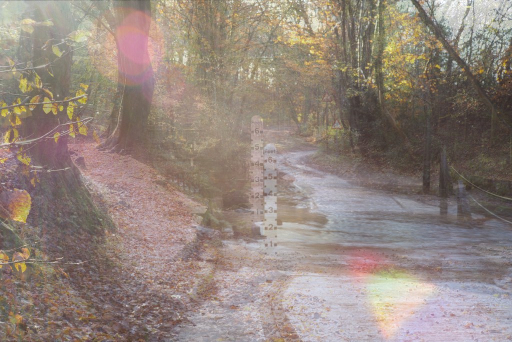
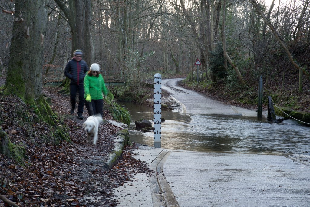
I similarly have a problem with Henner’s work. I do not feel comfortable with the art-critical view expressed in the course material about his work (specifically the Street View shots of prostitutes waiting for business) operating as a critique about the invasive nature of such photographic technology. Yes, I can see that to an extent it certainly does this. But I do not consider that this is sufficient to take away the charge of voyeurism. The Google cameras are presumably indiscriminate in what they photograph, they simply capture whatever, or whoever, happens to be there at the time. Henner on the other hand has specifically and consciously chosen this particular set of subject matter. His point about invasive technology could have been made with any number of other subjects but this is the one that he chose, very much a male centred gaze of woman who find that in order to make a living they need to be sexually subservient to male desires.

I felt rather more comfortable with his satellite image work, discussed for example in Robert Shore (2014) (pages 14 to 21) but I still have difficulties with the question of whether he has done enough to make a new work rather than just apply his own name to something that already exists. I remain to be convinced that it is enough simply that the images he has used are apparently really quite difficult to find in the first place.

Michael Wolf is an interesting case. What sets him apart from the likes of Rafman and Henner is that he is actually a photographer, and an interesting, innovative, thought-provoking one at that. Again I thought Dyer could have been a bit more questioning rather than simply accepting the Unfortunate Events series as a continuity with his earlier work, something I have difficulty seeing clearly. Shore (pages 226 to 233), unfortunately I felt did not add much. I am therefore left a little ambivalent about his use of Street View. It is not to say that mining the images these commercial enterprises produce is not in itself a valid exercise but I have difficulty with he idea that it is sufficient simply to rely on artistic historical traditions of appropriation. I also still question whether the crop or the edit are themselves sufficient. (I think here that Dyers reference to Blow Up is not quite on point as of course the David Hemmings character was blowing up his own photograph, not taking someone else’s work as his starting point.) I am not hostile to Wolf’s work, as I would have to admit I am to Rafman and Henner, but I remain to be convinced.

One of the tricky questions which I do not see being addressed much, which I have touched upon above in my reference to War Primer, is how much intervention, rather than just finding, editing , and re-presenting obscure material, is enough to make the product new or original. This is though touched upon in the second OCA article in so far as it refers to the work of Richard Prince and the action brought against him by photographer Patrick Cariou. I understand the case originally went against Prince, was later overturned on appeal, but subsequently settled out of court. We are therefore unfortunately left without much guidance (from the courts in New York at least) from this particular case. (My knowledge of intellectual property law, despite having been a lawyer, is unfortunately minimal as this was a subject I never studies or practiced so I cannot offer any thoughts on where we might stand from an English point of view.)

In this regard it is interesting to see the work of Doug Rickard, also mentioned by Dyer. Evidently the source images have been processed and treated in a number of ways, though how is not immediately clear. This does seem to me to make a difference. I also have to admit though that the nature of the subject matter and the social concern that his collection and treatment of these images illustrate – many of these are people on the fringes of society, at least more affluent society and are viewed with a degree of sympathy and not, unlike Henner, in a way that comes across as voyeuristic – and that alone (the element of intention) makes me more accepting of his work.

In doing a bit of research into the Prince case I came upon a 2016 article in the Guardian, cited below, in which I note that Prince had been up to his old tricks again and was once more being sued. I know nothing more of the details of the case or its rights and wrongs. I was though nevertheless struck, most unfavourably, by something he is quoted as having said during the earlier case: “Copyright has never interested me. For most of my life I owned half a stereo, so there was no point in suing me, but that’s changed now and it’s interesting … So, sometimes it’s better not to be successful and well-known and you can get away with much more. I knew that I was stealing 30 years ago but it didn’t matter because no one cared, no one was paying any attention.”

After exceeding the suggested word-count very considerably, do I think appropriation is appropriate? I think the answer is far from straightforward and variable depending on the circumstances. I think much depends, or at least should, on the manner of the appropriation, the intentions behind it, the nature and extent of any intervention or manipulation, including, though not alone, selection, editing, presentation, cropping, and so on. I also think a very important element should come down simply to respect, whether the source work is that of an individual, whether an artist or not, or of a giant corporation (much though I have to confess I do not like Google the product of Street View is their property), and acknowledgment of the prior work and its ownership.

And no, this is not a method of working that I have any particular desire to explore, even if only experimentally. I am happy to take ideas from other people’s work to help make something of my own but not simply to try to take their work into my own oeuvre.

Brecht, B, (2017). War Primer. London: Verso

Bloomberg, A, & Chanarin. O, (2011). War Primer 2. London: MACK

Shore. R, (2014). Post-Photography: The Artist with a Camera. London; Lawrence King

https://9-eyes.com

https://dougrickard.com

https://mishkahenner.com

http://photomichaelwolf.com/#

https://www.theguardian.com/artanddesign/2012/jul/14/google-street-view-new-photography

https://www.theguardian.com/artanddesign/2016/jan/04/richard-prince-sued-copyright-infringement-rastafarian-instagram

https://www.oca.ac.uk/weareoca/fine-art/photography-meets-textiles/

https://www.oca.ac.uk/weareoca/fine-art/whos-afraid-of-appropriation/

Mapping and other technologies

As the next exercise directly addresses the issue of appropriation and the use of internet utilities such as Google Street View, I will leave my responses to the work of the like of Rafman and Henna until then. For now I will just make some observations – nothing too profound! – on the work of Liz Nicol and Ian Brown.

I have to confess I am not entirely sure why Liz Nicol’s work is featured at this point in the curse material. Whilst I understand how the Rubber Band Project came about I struggle to see it as a map of the walks in question and cannot but help feel that the mapping element is a little overstated. I do not expect it to be a literal map but looking at the work in isolation I do not get any sense of a progression, of a journey. Perhaps I am just missing something.

I do not have a problem with the use of cyanotypes as such but by their very nature, particularly when dealing with anything other than flat objects (I think the process was particularly well suited to Anna Atkins’s botanical work) they can be a bit difficult to decipher. As a result I sometimes find them to be a bit unengaging. It has to be said though that it is a fun medium and one that can be used very flexibly. I helped with a cyanotype workshop, run by the local rural arts charity that I volunteer for, at a small rural first school and the kids had lots of fun. I have also worked with another artist in residence at VARC, Lucy May Schofield, who has made some interesting pieces – including a mattress! – using the process. Nevertheless, of the various non-camera media I think I find photograms, such as the work of Man Ray and Laszlo Moholy-Nagy, more interesting.

Ian Brown’s work I have found more immediately engaging and thought-provoking. It has in particular got me to think differently about the work that I am continuing to do for Assignment 6. The idea of layering multiple images made over time of the same scene is intriguing and is perhaps another way of recording and representing a series of transitions. Just out of interest I have made an experiment in Photoshop with just half a dozen of the pictures I have taken so far, layering them one over another, and playing around with the opacity of each layer so that all are at least partially visible, to see how this might work in practice:

It is still very early days but already it is possible to start to see how the image is already starting to become blurred and indistinct, with the varying light and weather conditions and the small differences in the position of the camera from shot to shot over the weeks. Over time I can see how this view would become increasingly impressionistic. When I have some time I think some more extensive experiments would be in order.

http://www.beardsmoregallery.com/exhibitions/walking-the-land/

https://www.liznicol.co.uk

http://www.lucymayschofield.com/work

Exercise 1.5: More people and a car

Following my last brief post on this project, and my tutor’s comments about the possibility of including people and cars, as luck would have it the ford today turned out to be quite busy. While I was there a couple came through with their dog, whom I caught with less blur this time as the light was better (it was not raining today) so my shutter speed was a bit faster. There were three cars that came through quite close to each other. One came through while I was setting up, another while I was moving from one side of the ford to the other, but one dropped, as it were, right into my lap.

So here is a little more variety:

Exercise 2.3: Typologies

Having read O’Hagan’s Guardian article I have decided to focus on the work of Stephen Shore in Uncommon Places for the simple reason is that this is the work mentioned that I have in my library. It has actually been sitting in the pile of books in my study waiting to be looked at that never seems to get any smaller! This exercise gives me the perfect excuse – encouragement – to look at it in more detail.

The first thing that strikes me about it, and which I immediately find appealing, it that although there is an over-arching typology to the collected work – views of ordinary but as a result overlooked, hence “uncommon” places – there are a number of sub-categories within it, for example: motels, inside and out; street intersections; shops and shop windows; downtown, business areas; automobiles everywhere; portraits. This gives the work an openness and a freedom to the viewer to construct and collect their own sets from within the whole. Much as, for example, I admire the work of the Bechers, I find it can get a little overwhelming sometimes looking at examples of the same type of structure over and over again. In Shore’s work there is more relief, more fluidity, and as a result a greater richness through variety. It is also interesting to note, and make fresh, juxtapositions between different sub-sets of subjects and yet still see how they fit into the overarching typology.

The Lewis Baltz interview I also found interesting as it chimes with some of the thoughts I have already had for myself about typological approaches. A few things he says particularly caught my attention. He concentrates on looking at and recording the “overlooked”, very much what Shore has done. In my response to Exercise 2.2 exploring a road I settled on precisely this sort of approach, concentrating mostly on the overlooked road hardware, overlooked often for the simple reason we are standing on it! (https://markrobinsonocalandscape.photo.blog/2019/11/28/exercise-2-2-explore-a-road-2-photos/)

Interest in the pictures comes from something in the work with which to engage. I think it is precisely the depiction of, the drawing attention to, the overlooked that does this. There is so much in our environments that we take for granted and do not notice, that is in fact worth some attention. The very fact this stuff is ubiquitous but unseen is itself interesting enough to make the exercise of making and looking at typologies worth it.

Waltz’s concern is not beauty and art is interesting to think about rather than look at. This is I suppose just a different way of saying the point above. A picture of one water-tower is not in itself that interesting, but a collection of numerous of them is definitely something that gets you thinking, and looking more attentively. I would though not necessarily rule out entirely the role of, or simply room for, beauty within a typology. Some of Shore’s work, for example, has a beauty of its own that stands scrutiny when looked at alone and outside the context of the book as a whole. Though I dare say it myself, some of the individuals in my road exercise are not without some aesthetic attraction.

Looking back over some of my own work for this degree course, right from the early days of EYV, I am surprised to see how often some sort of typological approach has made an appearance.

Now I come to think about the issue it seems to me typologies are everywhere and infinitely flexible but themselves easy to overlook unless presented in the sort of rigorous, almost scientific way the Bechers used. Is this in a sense the result of the primacy of the photo-book? Putting together a themed collection and assemblage of work is I think almost inevitably going to result in the generation of some typologies, even if they are more or less loose. Just looking across the bookshelves in my study there are a significant number that indulge to an extent in creating typologies, some more than others. A few examples, in no particular order: Mitch Epstein, Guidi Guidi, Ute and Werner Mahler, Alys Thomlinson, Hiroshi Sugimoto, Ragnar Axelsson, Sirkka-Liisa Konttinen, Martin Parr, Vanessa Winship. If nothing else this suggests that the typological approaches offer rich veins of material for exploration and experimentation.

Lastly, as if to confirm my last point, while working on this I came across the work of Antoine D’Agatas on the Magnum website, and which coincidentally links back to Donovan Wylie’s work at the Maze. Thesis an interesting example of how a number of typologies, working together, can help to bring out in greater detail and richness a portrait of a place, in this case Belfast, that is not simply geographical or topological, but also social and historical.

Axelsson,R, (2019).  Faces of the North.  Reykjavik:  Qerndu

Guidi, G, (2019).  In Sardegna: 1974, 2011.  London:  MACK

Guidi, G, (2019). In Veneto, 1984-89. London: MACK

Guidi, G, (2018).  Per Strada.  London:  MACK

Konttinen, S-L, (1989). Step by Step. Newcastle upon Tyne: Bloodaxe Books

Parr, M, (2013). The Non-Conformists. New York: Aperture

Mahler, U, & Mahler, W, 2018.  Kleinstadt.  Stuttgart:  Hartmann Books

Shore, S, (2014).  Uncommon Places.  London:  Thames & Hudson

Sugimoto, H, (2019).  Seascapes.  Bologna:  Damiani Editore

Tomlinson, A, (2019).  Ex-Voto.  London:  GOST Books

Winship, V, (2018). And Time Folds. London: MACK

https://www.tate.org.uk/art/artists/lewis-baltz-5373/lewis-baltz-industrial-suburban-landscape

https://www.theguardian.com/artanddesign/2010/feb/08/new-topographics-photographs-american-landscapes

Typologies and New Topographies – Donovan Wylie – 2 : The Maze – Book

Further to my last post on this subject I now have a copy of the book – and what a book; how did I miss this when it first came out? And how did I miss this site when driving past it given its sheer size?

Now I can see the typological elements properly. Although all of the images are from the same site I can now see that they are arranged in a way that is clearly typological: “inertias” and “steriles” (‘dead-zones’ but at least without the machine gun towers that might otherwise be associated with concentration camps); roads; yards; cells with beds and neat piles of bedding, all taken from exactly the same position.

The book is actually a bit of a jolt. I had got used, when growing up, to seeing the Maze through the prism of the dirty protests, to the inmates dressed in nothing more than a blanket (here I think of Richard Hamilton’s iconic, Christ-like painting), the walls daubed with shit, the emaciated and dying Bobby Sands, so it is a bit of a shock to the system to see the surprisingly domestic nature of, of all things, the curtains in the cells. Everything else though reminds us that this was not a holiday camp but a place of imprisonment, of oppression, of disorientation, and of violence (both inmates and guards died here).

A scary thought, looking at all of those walls and lengths of razor wire: it is so reminiscent of that great British invention, the concentration camp. We invented these god-forsaken places back during the Boer Wars. Then it was men, women and children. Here it was only men but that does not make it feel any less uncomfortable. At least we did not go the whole hog and turn them into death camps. This place is though nevertheless burdened with an uneasy ethical legacy in so far as many of the inmates were “interned”, an administrative euphemism for locked up without trial. Without question there were people incarcerated here who were, without wanting to be too coy about it, not the nicest. Nevertheless this place remains for me an indelible stain on “the rule of law”. I am glad that is is gone, but it is nevertheless important that it be remembered.

Wylie, D, (2004). The Maze. London: Granta

Typologies and New Topographies – Donovan Wylie

I have unfortunately found the experience of looking for Wylie’s work a bit frustrating: none of the links given in the course material, including those in the erratum, appear to work; the Belfast Exposed website (a project that I did not know about before now but one that is clearly of significant importance) contains very little on The Maze project, only a few images, and no examples of or extracts from the essays in the book. At least there is some more information on Wylie’s own website and there are the short videos on YouTube. These latter are at least more informative about the Watchtowers and Outposts projects.

I am trying to get hold of a cheap second-hand example of the Maze book as probably the only way of seeing this project in detail. Until I have done so I can only defer making any comments or observations on it apart from a couple of preliminary points.

The first is that this does not strike me as falling comfortably within the category of typological in so far as all of the pictures were taken within the confines of the one camp. I am not convinced that the repetition of similar views (as I understand the project includes) necessarily makes this a typological study. To that extent I feel the point is being stretched a bit to far in this section of the course material. I see this more as straight documentary and a topological survey. Ultimately though I do not think that the label that is attached to this work really matters.

As an aside, it is only now that I realise that I have driven past the site of the camp without realising it, going from Magheralin to Lisburn along the Moira road, which runs very close to the site, and visiting Hillsborough which is just to the south. This is a beautiful, verdant, and quite well off part of County Down, so it is a bit shocking to realise that the most notorious prison camp in the North was right at the heart of it.

The Watchtowers and Outposts series are clearly more straightforwardly typological. There are similarities in location and construction for each OP, in the North and Afghanistan respectively, but it is only when they are seen en masse that the similarities, and more to the point the differences, become evident and important. It seems to me that this accumulation and juxtaposition of the images is what serves to focus the work on the themes of power and control, something that is also shared by the Maze project. However I am also led to think that the power and control that these structures represent was perhaps more illusory than real.

In the case of the Maze there was certainly an exercise of power, in so far as people were held subject to a prison system, denied their freedom. Inherent in this is also an exercise of control. However it seems to me that it would be too easy to overstate the extent to which that power and control were exercised. Prisoners organised themselves within their respective parts of the camp. There were times and places within it when it was difficult for the authorities to exercise power: just think of the dirty protests and the periodic mass breakouts.

This contradiction is even more apparent with the OPs. (Again I remember seeing some of these on my first lists to the North in the 1980s, particularly in Armagh and in and around Derry.) The problem as I see it with these sort of structures is that they do not very effectively exercise power or control. Certainly they are important for intelligence gathering that can then be used in a wider context but as individual sites they neither exercise power or control over the immediate area. Rather what they do is isolate soldiers in a small, exposed, isolated, and vulnerable position and do not prevent enemy movements around or past them, whether that was IRA or Taliban. In am nay ways I therefore see these places, and these images, as monuments to military hubris. Perhaps this is a more important theme in Wylie’s work.

Moving on, I see that Sontag crops up again here and I have to confess that I do not fully understand why. Wylie’s work, in so far as it is about power and control, is not about the power or control, supposed or real, of the photographer and the photograph. What Sontag was writing about was the way that photography itself is a form of acquisition, a symbolic act of possession. These two positions are far from being the same thing.

Putting aside my general dislike of Sontag’s book I have to admit that I do find some common ground with her on this point, even if I do still think her case is somewhat overstated. It is though interesting that although Campany was thinking about the photographer as a collector he does not go into the same sort of territory of possession and control and concentrates, more appropriately in my view, on the way that process of collection, the acquisitiveness of the photographer, has an impact and effect upon the meaning and significance of the images so collected.

Incidentally, so fas as I can see the page references for Sontag given in the course material are wrong. The section on possession that I can find is in the essay The Image-World, from page 153. Pages 12 to 16 are more about the camera as weapon and means of sexual fantasy. I am not going to analyse her arguments now but simply point out what strikes me as a glaring contradiction between the two sections. The later essay explicitly argues that photography is a form of possession, albeit symbolic or surrogate. At page 13 though she says “The camera doesn’t rape or even possess, though it may presume, intrude, trespass, distort, exploit..”. Is this just another change of mind along the lines of that in Regarding the Pain of Others on documentary photography and compassion fatigue? Nothing wrong with that.

Sontag, S, (1979).  On Photography.  London:  Penguin

Sontag, S, (2004). Regarding the Pain of Others. London: Penguin

https://www.belfastexposed.org/exhibitions/the-maze/

http://donovanwyliestudio.com/index.php?page=about

https://www.youtube.com/watch?v=VQekhfX73zE

Typologies and New Topographies

I had not read ahead to this next part of the course material while working on the last exercise and taking a typological approach to photographing my road so did not realise that this is what we would be getting into next. A happy coincidence though as increasingly I find my thoughts on landscape photography focusing more and more on collections of images, typologies, and the accumulation of meaning over time. Because I have already been thinking in these terms some of the material discussed here is already, to an extent, familiar.

Farley & Symmons Roberts (2012) is a book that I read when it first came out. I was not at the time, and to an extent I am still deficient in this regard, well acquainted with their poetry, though I am sure I had come across the odd piece, and was not really sure about the subject matter, though I had previously read some of Iain Sinclair’s in a similar, psychogeographic vein. I found though that I enjoyed it greatly, particularly the way they bring their poets’ eyes to these marginal, liminal, landscapes. I particularly remember the reference to the Bechers: as I did not know their work at the time I went in search of it to learn more, and in the process realised that I had in fact seen some of their collected images in galleries without properly registering it, or them, or appreciating its importance. The poets’ observations very much echo my own thoughts: the single image does not necessarily communicate its meaning adequately. Juxtaposing a series of images though sets up dialogues, reflections, clashes, synchronies, that bring out much more meaning and significance. This is why I still prefer, as I have written elsewhere, collections of related images to the idea of the singular image, the salon photograph.

There is an interesting parallel on the previous page (page 193) extolling the virtues of not just the individual wind turbine but serried ranks of them: “How majestic it would be, on our way into or out of our cities, to drive past strips of giant white daffodils blowing in the breeze.”

An interesting coincidence is that after the Bechers they mention the work of John Davies. One of the things that attracts me to his work is the use of the repeated view, particularly when separated over time, as exemplified by his latest book, Retraced 81/19, a copy of which I have just bought, with its pairs of pictures of the same place but separated by decades.

I have not been able to track down a copy of Cruel and Tender but David Company’s essay is at least available on his own website. Though he makes a number of points, it seems to me that the most important one is about the way photographs have come over time to be seen more in book form than in exhibitions and that the enables them to communicate their meanings more fully and effectively. As he puts it, showing series of images collectively gives them “the chance to articulate each other. In this way photography doesn’t simply show but ‘shows itself showing what it it showing’. The straight image is made self-conscious and reflexive …”

“The isolated picture/artefact is given a depth of meaning through the structure and orchestration of the group. Art is largely effaced from the image but returns in the act of assembly.”

The other important point for present purposes is his observation about the ‘snapshot model’ which “has had its own tendency towards accumulation that is very different from the archival straight image. Essentially chancy and speculative it works by taking many images then editing the large haul for revelations and epiphanies.” Here we have the photographer as collector and one of the underlying strengths of the typological approach.

Veracity and voracity became almost indistinguishable.”

Here is another of those coincidences: while reading and thinking about this issue I have been looking again at some of the work of Rinko Kawauchi and reading about her working practices in Sasha Wolf’s new book (2019).

Whilst her approach is not invariably the same, particularly when working on a specific project such as Ametsuchi or The River Embraced Me, where the work is produced with a single subject inn mind, I understand she often collects and juxtaposes individual images that are sometimes made years apart. As she puts it in her interview in Wolf’s book (at pages 108 and 109):

“An individual photograph is like a single cell, or a single voice; I think that a body of work comes into being when those individual elements constellate and resonate with one another. “

“… In a way different from viewing a single photograph on its own, another world comes into view when lining up photographs of varying subjects. The overall ‘countenance’ of a work can be expressed in a variety of ways depending on how one arranges these components; as such the editing process is crucial. It is also an entertaining one, as elements I had not been conscious of while shooting often come into view when editing.”

The last mentioned work in this part of the course material, Donovan Wylie’s typological work, raises some interesting issue about power and control, and the role of photography in those regards, is, I think, worthy of looking at separately so I will deal with that in another post. I will also include a brief reference to Sontag who I see crops up again in the context of collection and possession.

Davies, J, (2019).  Retraced 81/19.  London:  GOST

Farley, P & Symmons Roberts, M, (2012).  Edgelands.  London:  Vintage

Sontag, S, (1979).  On Photography.  London:  Penguin

Wolf, S, (ed), (2019). PhotoWork: Forty Photographers on Process and Practice. New York: Aperture

https://davidcampany.com/almost-the-same-thing-some-thoughts-on-the-photographer-as-collector/

Exercise 1.5: Visualising Assignment Six Transitions – A Random Thought

As I continue to take my weekly shots at the ford for this project I am becoming increasingly aware of, and attuned to, the subtle changes in the scene as time passes There are the occasional substantial changes, such as when the water level increases dramatically after prolonged rain, or as was the case this last weekend when the temperature plummeted, down to around minus 7º C first thing and not rising above freezing all day leaving everywhere iced up. Otherwise the major changes are only going to be visible over a much longer period.

This strikes me as being relevant to project in part 2, typologies and new topographies that I am just starting to explore and think about. As I am going to write elsewhere it is not the single image that is important but the greater mass and the juxtapositions that mass can create.

The true random thought here though for now is a musical analogy. I have been listening recently to a new set of recordings of piano music by Morton Feldman and what I see is a commonality of approach: Feldman’s work often evolves slowly, positively glacially (for example the second string quartet lasts for more than three hours and sometimes it is difficult to properly register the changes and development of the music from moment to moment – I have never yet managed to listen to the whole work in one sitting!) and it is only by taking a long view that it makes proper sense. That sort of process is at work here in this project and I expect that it will only be once it is complete that it will make proper sense.

Exercise 2.2: Explore a Road – 2 – Photos

What I have chosen to do for this part of the exercise is simply to walk from one end of my chosen stretch of road to the other and along the way photographs elements that would mostly normally pass unnoticed: house numbers and other signage; street furniture; drain grids, man-hole covers, water stopcocks, fire hydrants – road hardware. This last group are largely invisible (apart from a couple of the larger covers) unless you pay attention and indeed I could not find one of them (I know it is there, it is the stopcock cover for my house) as it is buried under leafmold, gravel, mud, and other natural detritus!

The house numbers are not complete (and I do not know why, having arranged them carefully in Photoshop, they have not come out in the right order in the contact sheet) as not every house has a visible number (only nine out of fourteen), something that causes no end of trouble for visitors who do not know the area. As with Assignment 5 of I&P I have obscured house names where they would otherwise appear with the number in the interests of privacy – many houses in the village are known better by their name rather than street number.

Which do I think are the most interesting? As a typological set, in the style of the Bechers, I would choose the road hardware, the various covers and grids set into the road surface, simply because there are so many of them, and are surprisingly diverse. The numbers and street furniture do not, for me, offer enough in quantity nor in variety. For the same reason I suspect that a wider audience might similarly find the larger set more interesting, also because it is the more surprising, overlooked set of subjects.

The contact sheets are edited down from the total number of shots that I took (seventy-odd) and do not include alternate takes, other trial shots that did not, for whatever reason, work out quite so well.

Finally, as our little stretch of road is a cul de sac and very quiet, I did not encounter anyone while shooting. Except when I was photographing the stopcock cover outside one of the cottages. To do so I was bent right over to frame the shot. My neighbour suddenly came out to see if I was alright: he and his wife had seen me through their window and were concerned I was unwell. He was also surprised to see me without my dog. Small village life is like that, people expect certain regular behaviours from their neighbours and any deviation from the norm is more likely to draw attention. Many of the people that I see on anything like a regular basis are out because they are walking their dogs and I am walking mine. It is though encouraging that neighbours, even if we do not know each other very well (another characteristic of life in this village, as again my work on Assignment 5 for I&P demonstrated, is that many people tend to be very private, and some positively withdrawn), are ready to come to another’s aid in case of need!

House numbers
Signage and street furniture
Road hardware

Exercise 1.5: Visualising Assignment Six Transitions – Update

A brief update on how this project is progressing.

Firstly, I have decided to abandon my plan B as it is increasingly clear that there is insufficient prospect of enough change over a prolonged period of time to make the scrapyard a viable subject. Similarly I think that the microcosmic approach of plan C is similarly too limited. I am though going to persevere with the views of the local ford.

I will deal separately with my tutor’s feedback on Assignment 1 but will mention now a couple of points that he has raised in connection with this project.

One is that I should consider shooting in different weather conditions rather than just relying on seasonal changes. In fact I am already doing this. The very first shots that I took were made during a rain storm and I had to shelter the camera under an umbrella, as it is not weathertight. The fact that it was raining quite hard is though not readily apparent from the pictures that I have already posted as the exposure times were quite long because the light was so poor so the rain is hard to see. The same happened with my last foray, this past weekend:

24/11/2019

The exposure here was about 1.7s (hence the blurred figures, to whom I shall return below) which has smoothed out the water again.

24/11/2019

I reduced the aperture here to f/8 to increase shutter speed though it did not make a significant difference and it is still hard to see that it was raining.

24/11/2019

The weather has been pretty monolithically and monotonously bad of late so there has simply been little variation in conditions. Nevertheless there have been a couple of times when there has been a bit of sun:

10/11/219
18/11/2019

This view of the ford looks west so by early afternoon the sun is already quite low and it is almost a case of shooting contre jour, creating some interesting lens flare for variety.

The other question is whether I intend to include any people or vehicles. This is not really a matter of active choice and simply depends on if anyone is around when I am there shooting. This is not a busy stretch of road at the best of times, even less so during the current wet weather. By chance when I took the first two pictures above a family, who are actually near neighbours and whom I see fairly regularly when out with my dog, were braving the weather with their black lab and just happened to fall within shot. As indicated above, because of the slow shutter speeds they have appeared blurred. I do though think this introduces a new sense of dynamism in the scene.

Cars are another matter. This road does not attract a lot of traffic. I have to be careful of what little does come through because at this point the road is little more than one car wide and to avoid becoming a hazard I need to step aside with the camera on its tripod. The poor weather has also limited the number of vehicles coming through. Although it does not look too bad, the depth of water on the upstream side of the ford this last weekend was two feet. The flow rate was also very fast. That is more than enough to cause a problem for, and consequently deter, the average car. Indeed, while setting up for the first shot a car was coming from the west but beat a hasty retreat when the driver saw how much water there was. I am just going to have to play this by ear and see what happens whenever I am there.

As an aside, these recent conditions have been by no means particularly bad for this ford. During winter it is not uncommon for the depth to exceed three feet, as for example it did last March after a heavy snowfall melted, enough to put my vantage point at risk. There have been occasions when it has been even deeper!

I will for now simply continue to turn up regularly once a week and see what ever there is to be seen.