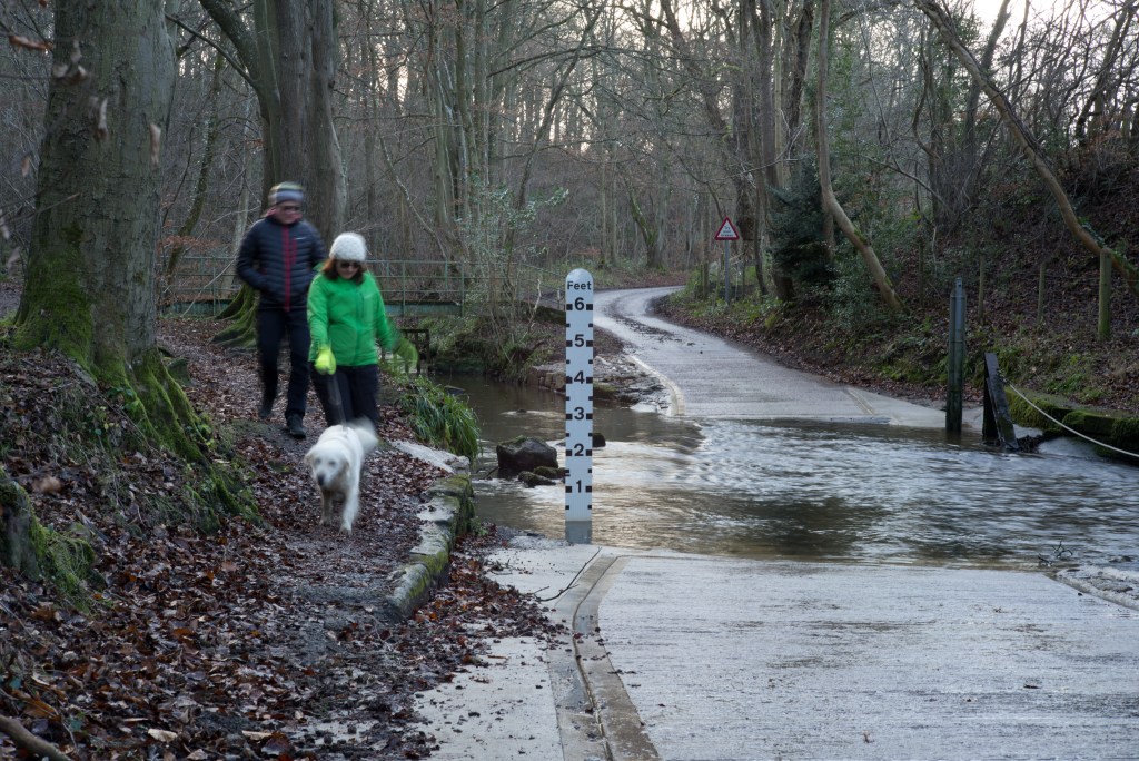
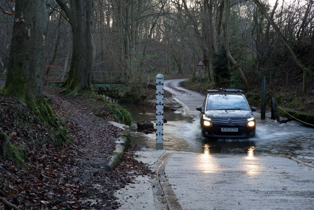
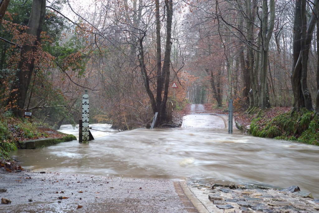
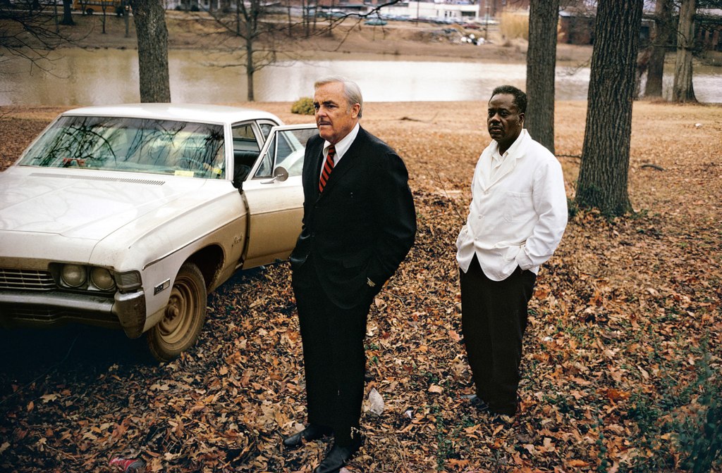
Following my last brief post on this project, and my tutor’s comments about the possibility of including people and cars, as luck would have it the ford today turned out to be quite busy. While I was there a couple came through with their dog, whom I caught with less blur this time as the light was better (it was not raining today) so my shutter speed was a bit faster. There were three cars that came through quite close to each other. One came through while I was setting up, another while I was moving from one side of the ford to the other, but one dropped, as it were, right into my lap.
As I continue to take my weekly shots at the ford for this project I am becoming increasingly aware of, and attuned to, the subtle changes in the scene as time passes There are the occasional substantial changes, such as when the water level increases dramatically after prolonged rain, or as was the case this last weekend when the temperature plummeted, down to around minus 7º C first thing and not rising above freezing all day leaving everywhere iced up. Otherwise the major changes are only going to be visible over a much longer period.
This strikes me as being relevant to project in part 2, typologies and new topographies that I am just starting to explore and think about. As I am going to write elsewhere it is not the single image that is important but the greater mass and the juxtapositions that mass can create.
The true random thought here though for now is a musical analogy. I have been listening recently to a new set of recordings of piano music by Morton Feldman and what I see is a commonality of approach: Feldman’s work often evolves slowly, positively glacially (for example the second string quartet lasts for more than three hours and sometimes it is difficult to properly register the changes and development of the music from moment to moment – I have never yet managed to listen to the whole work in one sitting!) and it is only by taking a long view that it makes proper sense. That sort of process is at work here in this project and I expect that it will only be once it is complete that it will make proper sense.
A brief update on how this project is progressing.
Firstly, I have decided to abandon my plan B as it is increasingly clear that there is insufficient prospect of enough change over a prolonged period of time to make the scrapyard a viable subject. Similarly I think that the microcosmic approach of plan C is similarly too limited. I am though going to persevere with the views of the local ford.
I will deal separately with my tutor’s feedback on Assignment 1 but will mention now a couple of points that he has raised in connection with this project.
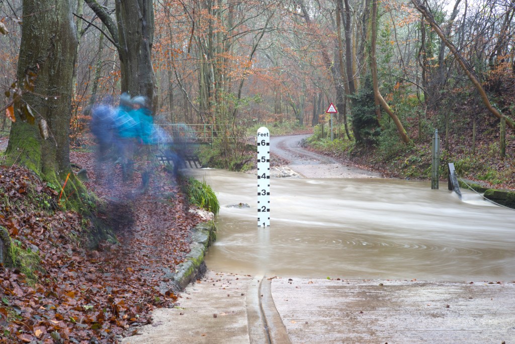
One is that I should consider shooting in different weather conditions rather than just relying on seasonal changes. In fact I am already doing this. The very first shots that I took were made during a rain storm and I had to shelter the camera under an umbrella, as it is not weathertight. The fact that it was raining quite hard is though not readily apparent from the pictures that I have already posted as the exposure times were quite long because the light was so poor so the rain is hard to see. The same happened with my last foray, this past weekend:
24/11/2019
The exposure here was about 1.7s (hence the blurred figures, to whom I shall return below) which has smoothed out the water again.
24/11/2019
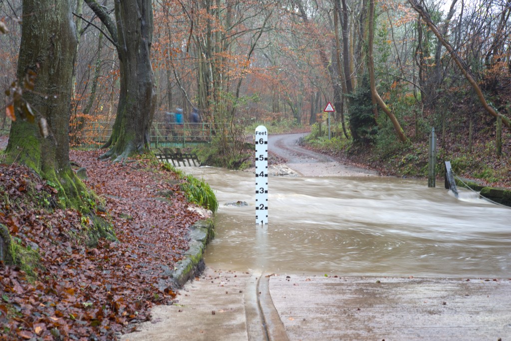
I reduced the aperture here to f/8 to increase shutter speed though it did not make a significant difference and it is still hard to see that it was raining.
24/11/2019
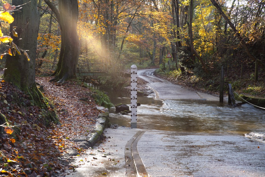
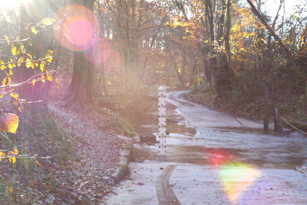
The weather has been pretty monolithically and monotonously bad of late so there has simply been little variation in conditions. Nevertheless there have been a couple of times when there has been a bit of sun:
10/11/21918/11/2019
This view of the ford looks west so by early afternoon the sun is already quite low and it is almost a case of shooting contre jour, creating some interesting lens flare for variety.
The other question is whether I intend to include any people or vehicles. This is not really a matter of active choice and simply depends on if anyone is around when I am there shooting. This is not a busy stretch of road at the best of times, even less so during the current wet weather. By chance when I took the first two pictures above a family, who are actually near neighbours and whom I see fairly regularly when out with my dog, were braving the weather with their black lab and just happened to fall within shot. As indicated above, because of the slow shutter speeds they have appeared blurred. I do though think this introduces a new sense of dynamism in the scene.
Cars are another matter. This road does not attract a lot of traffic. I have to be careful of what little does come through because at this point the road is little more than one car wide and to avoid becoming a hazard I need to step aside with the camera on its tripod. The poor weather has also limited the number of vehicles coming through. Although it does not look too bad, the depth of water on the upstream side of the ford this last weekend was two feet. The flow rate was also very fast. That is more than enough to cause a problem for, and consequently deter, the average car. Indeed, while setting up for the first shot a car was coming from the west but beat a hasty retreat when the driver saw how much water there was. I am just going to have to play this by ear and see what happens whenever I am there.
As an aside, these recent conditions have been by no means particularly bad for this ford. During winter it is not uncommon for the depth to exceed three feet, as for example it did last March after a heavy snowfall melted, enough to put my vantage point at risk. There have been occasions when it has been even deeper!
I will for now simply continue to turn up regularly once a week and see what ever there is to be seen.
I am not entirely sure why the course material now requires me to record correspondence with my tutor about my chosen subject for Assignment One. It is not something that any of the other modules have asked for. Nevertheless, suitably redacted to concentrate on the principal subject, here is my email and my tutor’s reply:
“Whilst the idea of the Beautiful has not really engaged me I feel more drawn to the ideas of the Sublime and that is the path I want to go down. If you have a look at my recent blog-post, particularly on 1.6 The contemporary Abyss and preparatory work in 1.7 you will get an idea of where my thinking is heading at the moment. The ideas that appeal most to me are the Sublime as representing the unrepresentable, the void, and Buddhist notions of emptiness/nothingness. The two particular artists who are influencing me most at the moment are Hiroshi Sugimoto and James Turrell. What I have been concentrating on is a series of sky-scapes, cloud-scapes, with a view to producing images that are in a way devoid of any meaning or significance in and of themselves – other than at a most basic level, meteorological records – almost abstract, hinting at something ineffable and transcendent (without wishing to sound too much likes Pseuds’ Corner!).
If you have a moment please take a look and yours thoughts would be most welcome. All going well I would hope to have this assignment finalised within the next few weeks, at which point I would propose simply to produce a further blog post covering the points required by the brief and a final set of images. I will probably also include contact sheets to give some idea of the preparatory work and final selection process.”
Reply:
“The direction you’re taking A1 looks fine, with some solid points of research – Turrell, Sugimoto and Richter: they all have a solid conceptual framework for their work. Also, very detailed exercises uploaded to your LL.”
My first reaction on reading the brief for this exercise was where on earth am I going to find what they are looking for? A moment’s further thought though led me to ask the question, in fact there is so much of this stuff out there how am I going to narrow it down to just a few images?
This exercise is such an oddly abrupt change of pace and direction, though not necessarily a bad thing at this stage, an opportunity introduce a different concept of landscape photography and break up what might otherwise start to become an habitual line of thought about how to approach the topic. It is though one that I feel deserves a much wider and deeper exploration than just this exercise. Let us see if ti comes up again later in the module.
To try to narrow things down a bit and make it more manageable for present purposes I have decided to rely solely on the resources within my own library. This means I can concentrate on work that I already know reasonably well and which, by virtue of the very fact it is in my library, has some resonance and importance for me. It also helps to show up some important differences in the approaches of the artists involved that is not questioned by the exercise but is I feel worth referring to.
Starting with that difference, what I note is that where we are looking at work that is explicitly socially concerned within a specific place or area, socially-concerned landscape, (another case of ‘landscape’ being much more than just a pretty view) the social comment side of things tends to be quite one sided, focused mostly on just one social class or milieu, rather than directed to highlighting social contrasts. A few examples:
Oscar Marzaroli in Glasgow. Tish Murtha in Newcastle. Jim Mortram in Dereham. Paul Trevor in Liverpool. Matthew Genitempo in the Ozarks. Alec Soth on the Mississippi. Ute & Werner Mahler in the German Kleinstadt. Marketa Luskacova in Whitley Bay. Ragnar Axelsson’s work in Iceland, Greenland, and the Faroes.
For the illustration of social contrasts I find the most fertile ground is provided a number of mostly American (I do have one Japanese example) “street photographers”, that is photography grounded in a particular place, not always a city. Here I am thinking of works by the likes of Robert Frank, William Klein, Joel Meyerowitz, and Daido Moriyama. (I could have chosen any number of other examples, as indeed I could with the list in the paragraph above, but these will do for now.)
The work in New York City in particular of Frank, Klein, and Meyerowitz, and to a lesser extent Walker Evans, whom I will otherwise leave out of the frame for now, should provide more than enough material to illustrate the differing social views and make up of the city, and indeed probably of some of the same streets and particular vantage points. All of them show affluence, poverty, “just-getting-by”, order, disorder, mixed and diverse social, not to mention ethnic, groups.
Meyerowitz’s street work in Paris shows similar contrasts there, something that is writ large across the page of any of his books that you might light upon made by Daido Moriyama in Tokyo.
There is so much material available here that it is difficult to do it justice. What I think though does help is to concentrate an a few examples, more than the two required by the brief, of the work of this particular constellation of artists that contain social contrasts within single or closely related images.
Another point that is worth making now is that on looking back over my choices I note that they all focus on people more than they do on particular places (with the possible exception of the last one). However, a sense of a particular place was clearly important to each of the artists. In the cases of Frank and Klein each picture is captioned by reference to a particular place. The subjects of Frank’s pictures in a way go to define, or at least contribute to, the “landscapes”, the environments within which they lived, not only physically but also socially. Klein’s work in this particular collection are all set in New York so as well as being pictures of various, socially diverse people, they are also still photos of the wider physical and social environment of the city itself.
Meyerowitz’s work, set in Paris, shows something of the character and nature of the city by portraying the varieties and mix of people living within it, who in turn give character to what one might regard as a typical Parisian street scene. Throughout his work Moriyama is showing us Tokyo, as a very specific, sui generis, place, or collection of heterogenous places, and again the people are integral to this process
As I hope I have made it clear elsewhere I do not view the concept of landscape in purely topographical or geographical terms but also in much wider documentary and social terms. I therefore make no apology for my choices.
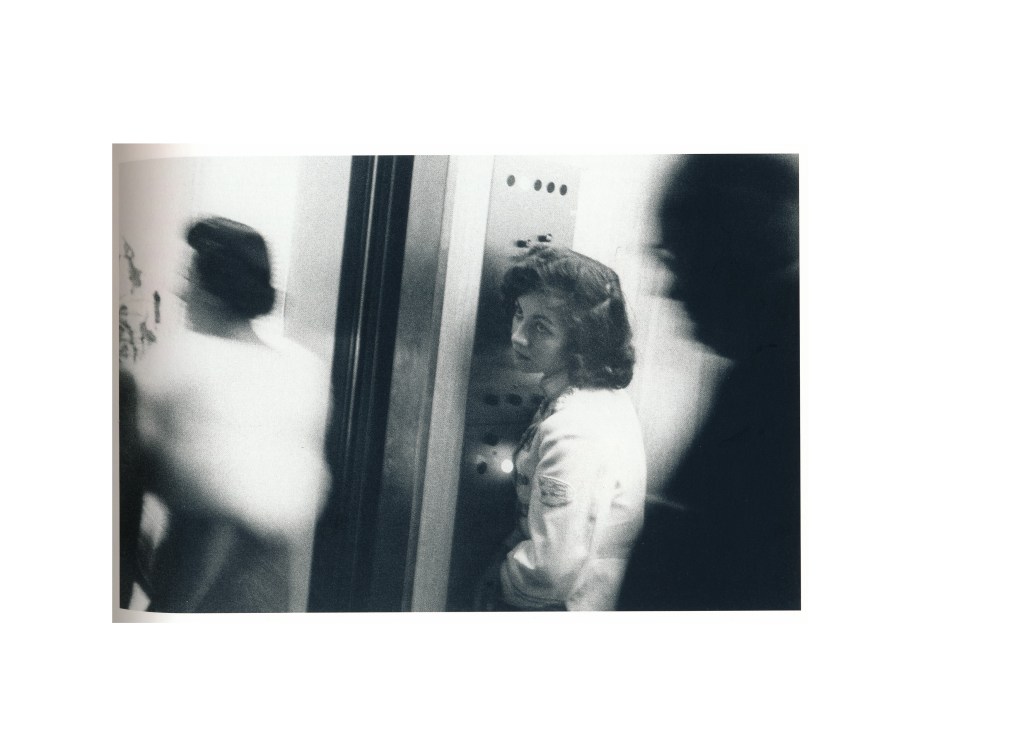
My starting point is one of Robert Frank’s images from The Americans (2016), Elevator – Miami Beach:
The lowly elevator attendant at the service of affluent society – check out the fur stole!
Another from the same book would be Charleston, South Carolina (I am going to come back to the issue of race later):
This image shows little of the physicality of the location but says a huge amount about it socially. This is the segregated south so the only real contact between races is through the relationship of master and servant, in some ways a continuation of the owner/slave relationship but on less extreme terms. The woman is clearly a maid or nanny, a servant of some sort, in the service of a white family, and presumably it is only the nature of that relationship and arrangement that allows her to be in that part of town with some degree of autonomy, if not authority.
Two double page spreads from Klein (2016):
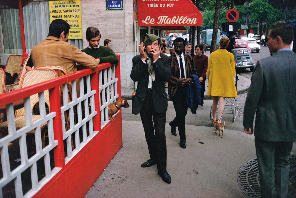
From Meyerowitz (2018), Paris, France, 1967:
The affluent Parisians, the well-dressed man presumably of African descent evidently at ease within the ‘boulevardier’ environment though perhaps a little wary of what I assume is the fun being made by the men on the cafe terrace of the more louche character playing the harmonica – presumably a drunk judging from the bottle in his jacket pocket. A certain irony, possibly even a hint of hypocrisy if that is not pushing the point too far, here with those in the cafe, presumably having a drink, finding amusement in someone who seems to have had a drink.
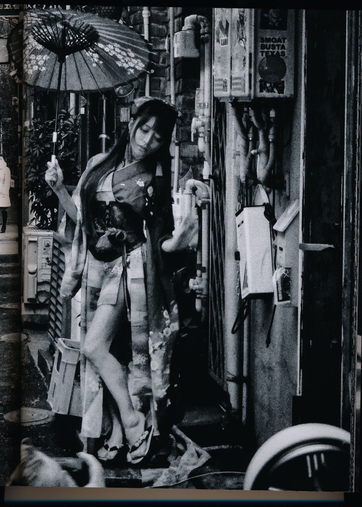
For Daido Moriyama there are any number of examples that I could have chosen. What I wanted to do was compare two double page spreads from Record No. 29 that show on the one hand a couple dressed in traditional kimonos on a busy Tokyo street (presumably in Shinjuku) and on the other hand what I take to be a homeless man, asleep on a sheet of cardboard. Unfortunately I cannot find examples of them on-line and as double pages they do not fit on my scanner. Instead I have therefore settled on this image from Record No.37. It is only half of a similar two page spread but this half catches one of the things I find in Moriyama’s work, the contrast , and indeed collision, between traditional and Western cultures in contemporary Japanese society, the elegance of traditional culture and the grittiness of much of modern Tokyo, and the contradictions between what might be perceived as an inherent quality of coyness and propriety in Japanese society and, as here, an open and obvious eroticisation of those traditional values:
My last example is a picture by William Eggleston, included in the catalogue of the fairly recent National Portrait Gallery exhibition (2016):
Untitled , 1969-70 (the artist’s uncle, Adyn Schuyler Senior, with assistant and driver, Jasper Staples, in Cassidy Bayou, Sumner, Mississippi
Much as I admire much of Eggleston’s work, some of it, not least this example, disturbs me. As with my Meyerowitz choice there is more of a sense of a landscape, in literal terms, here again specifically identified in the caption. Because of the social elements of the image though this location could stand in as a generic one for many places throughout the southern states. Indeed, if it was not for the caption it would be difficult to identify just where the place depicted is, so that it could be pretty much anywhere.
It is though the social contrasts that are most striking. What I cannot quite tell is whether Eggleston was being ironic in his composition and highlighting the social tensions at play in the south, or whether is was actually being non-judgmental, more accepting, given his background as an offspring of a wealthy plantation owning family, who presumably made their money from slavery. (This is one of the issues or difficulties that I have with warming to Eggleston as an individual.) What I find most striking is the composition and posing of the figures, the assistant matching the posture of the boss, but at a respectful distance behind him, itself signally social hierarchies. The racial element is, it seems to me, highlighted by the way the figures are made negatives of each other: the boss, a white man in a black suit, the assistant, a black man in a white jacket. This again emphasises the sense of difference, literally of social contrast: black is not white, and white is not black.
Frank, R (2016). The Americans. Göttingen: Steidl
Klein, W, (2016). Life is Good & Good for You in New York. New York:Errata Editions
Meyerowitz, J, (2018). Where I find myself. London: Lawrence King Publishing.
As is often the case with the present course material, any discussion of a given subject seems to set off a number of different connections, resonances, and issues that are ostensibly unconnected. The subject of the city here does precisely that for me.
I have not lived in a city for the last fifteen years or so and I find them increasingly to be alien and sometimes uncomfortable environments; I see that in the next section on psychogeography is going to look at the city as a means of making work and I anticipate that I am going to find that challenging. Living in the country I find myself increasingly distanced, not just physically but also mentally and emotionally from the city. I go into Newcastle only once a month or so. Very few other cities are now graced by my presence: Edinburgh once or twice a year at most (incidentally, for reasons that are still not entirely clear to me Edinburgh is the one city in which I feel more comfortable and at home despite never having lived there apart from occasional visits, in the past more frequent than now); Birmingham once every other year or so, though that is now likely to become much rarer; Glasgow and Belfast (which, like Edinburgh, I both enjoy) once in a while. London I have not visited for years (I did live there for a couple of years a long time ago and could not wait to get out!).
In photographic terms I do not find cities fertile places for making work. I have made some pictures in Newcastle for EYV and I&P but all too often, if I do not have a specific project or task in mind, taking a camera with me into the Toon is a waste of time (though it still does not stop me, just in case). I know that many people find the views along the Tyne of it bridges, for example, appealingly picturesque, but I am afraid this does nothing for me and they are not what I want to photograph. Part of the issue here might be, I suppose, that living and working in Newcastle over a period of thirty-odd years, this is what I saw very working day so it all became rather mundane and just part of the background.
Most of what I do make is local; if not within walking distance then no more than a short car ride away. In this regard it was interesting to note the comments in the material on Fox Talbot staying close to home for his better work. I certainly feel a lot more engaged and focused locally.
In that earlier post I wrote about the illusory distinction between documentary and art photography and argued that the one does not necessarily exclude the other. The same can be said here about, for example, landscape and documentary. His Invisible Cities work is both. I feel that any attempt to distinguish between the two in work such as this would be forced and unsustainable. That is very much how I feel and have argued right from the start of this course. As should be clear by now I find the more straightforward ‘picturesque’ approach to landscape photography uninteresting, unappealing, indeed quite sterile. For me the more interesting work is that which operates at other different levels as well. Invisible Cities certainly does that for me, as does, to take just one example that I have been looking at recently, the work of Mitch Epstein that I have already mentioned in connection with this module, and at the end of I&P.
I am also intrigued that apparently the title of this body of Seawright’s work is “appropriated” from the eponymous novel by Italo Calvino, a fabulous book that I am shocked to discover, on looking at my copy of it, I first read nearly thirty years ago! What is intriguing to me is the choice of this title. Although the novel is, at face value, a series of descriptions of cities visited by Marco Polo on his travels, it is of course a description of just one, real, city, Venice. The locations of Seawright’s pictures are not recorded in their captions. Is he, as Calvino, depicting the same city, while giving the impression that the work covers and derives from many? Is a single city being used to stand as a model for many? Or are a number of places being used to depict a sort of idea of a Pan-African city, not really an ideal but a sort of visual synecdoche? Is he, in line with his thinking behind his other work, simply leaving open an interpretative space for the viewer to occupy and inhabit? This sort of complexity, indeterminacy, gives an even richer, denser, more interesting flavour to what might otherwise be seen as rather deadpan work, which makes it all the more appealing to me.
Calvino, I, (1974). Invisible Cities. London: Picador
As I mentioned in my previous post on the Zone System I was not at all sure quite how to approach this exercise with a digital camera and without a spot meter. I have though now worked out how to approach this and have come up with a trio of shots.
With its exposure compensation and bracketing functions it is of course quite a simple matter to get the camera itself too take a series of shots at different exposures, the equivalent of moving the mid-tone from one zone to another, and then processing them together to produce a final image that is properly balanced across the light range. The object of this exercise is though of course to have a go manually, at least as an exercise to demonstrate an understanding of the principle.
The trio of shots that I have produced are not the greatest, not least because I have not devoted as much time to them as I might otherwise – I have had other things that needed to be done today. They are at least nevertheless illustrative.
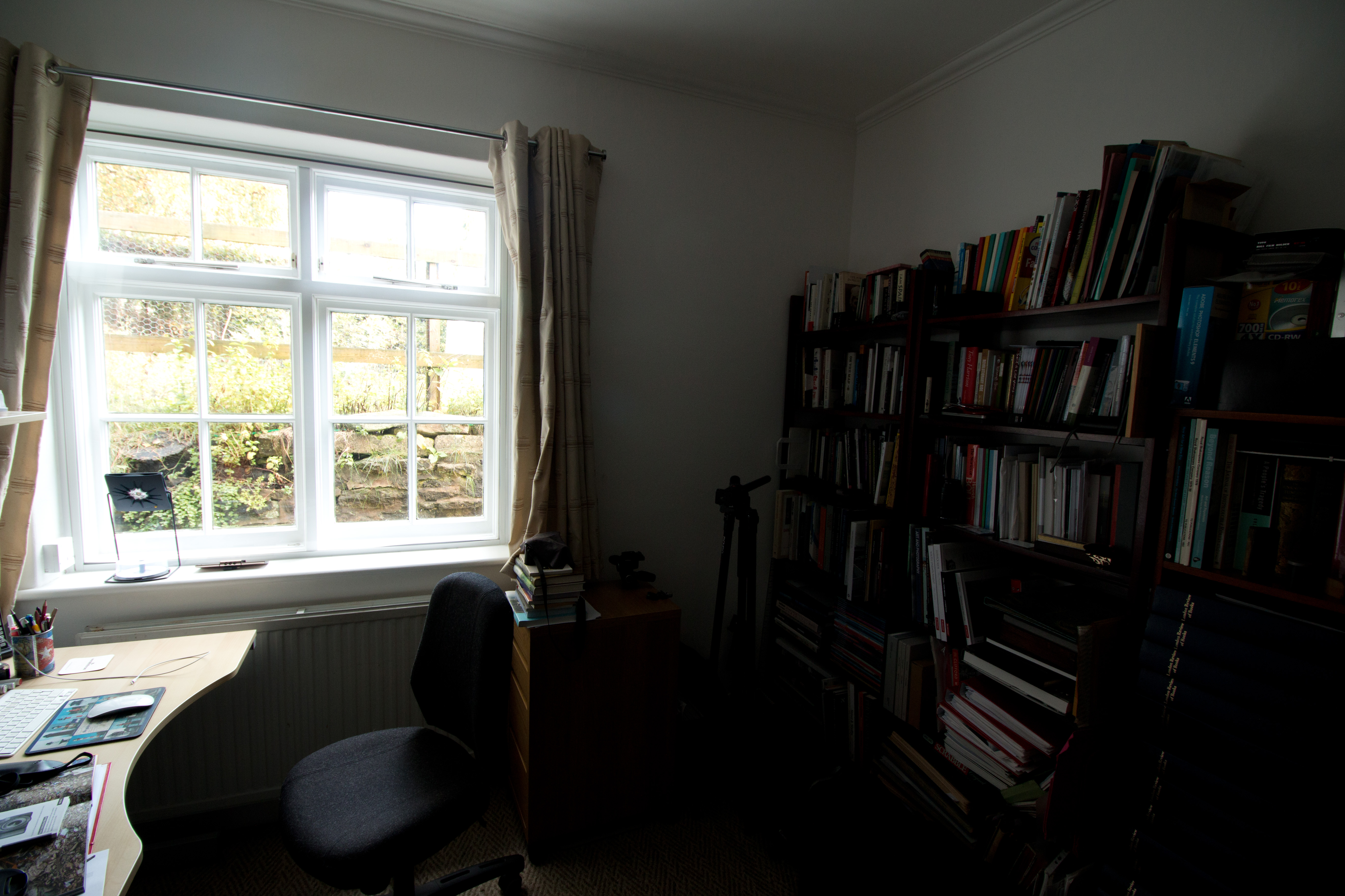
What I have chosen is a view across my study towards its window, and the dark corner next to it, to get the widely different light conditions. I used my old Canon rather than the newer Leica as I have not yet got my head round the light-metering options on the latter whereas I am reasonably familiar with those on the former. I set autofocus and metering to spot mode to at least approach what I might get if I had a separate spot meter.
As a first step I put a sheet of grey card in what felt like the middle of the light range in the study, catching a reasonable amount of light but not in direct sunlight (not that there has been much of that today!). Using a wide angle lens set at 10mm (this was the only way I could get in both the window and the darker corner) and putting the camera in Programme mode I metered the light on the card and got a reading of 1/15s at f/5.6 (at ISO 400). I used this as my baseline, Zone V. I then took my first shot, this time in Manual mode using these settings, effectively placing the wall between the window and the corner in that Zone:
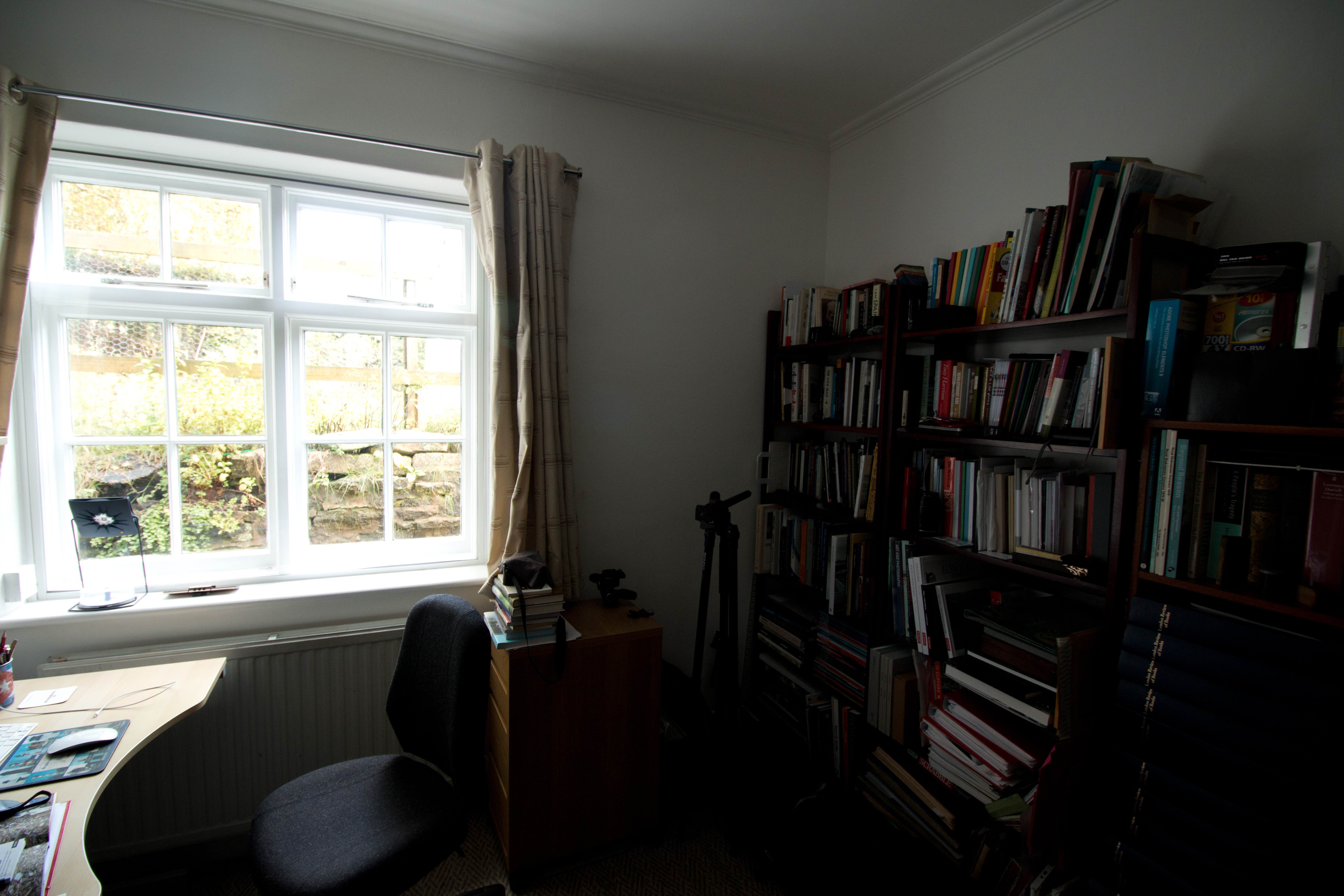
I then repeated at f/4.5, going up a stop (I wanted to go up two stops but this is the largest aperture available on this particular lens), effectively moving that area into Zone VI and consequently lightening the bookcases on the right, bringing out more detail. The downside is that it has also lightened the view through the window but at least it has not all burned out.
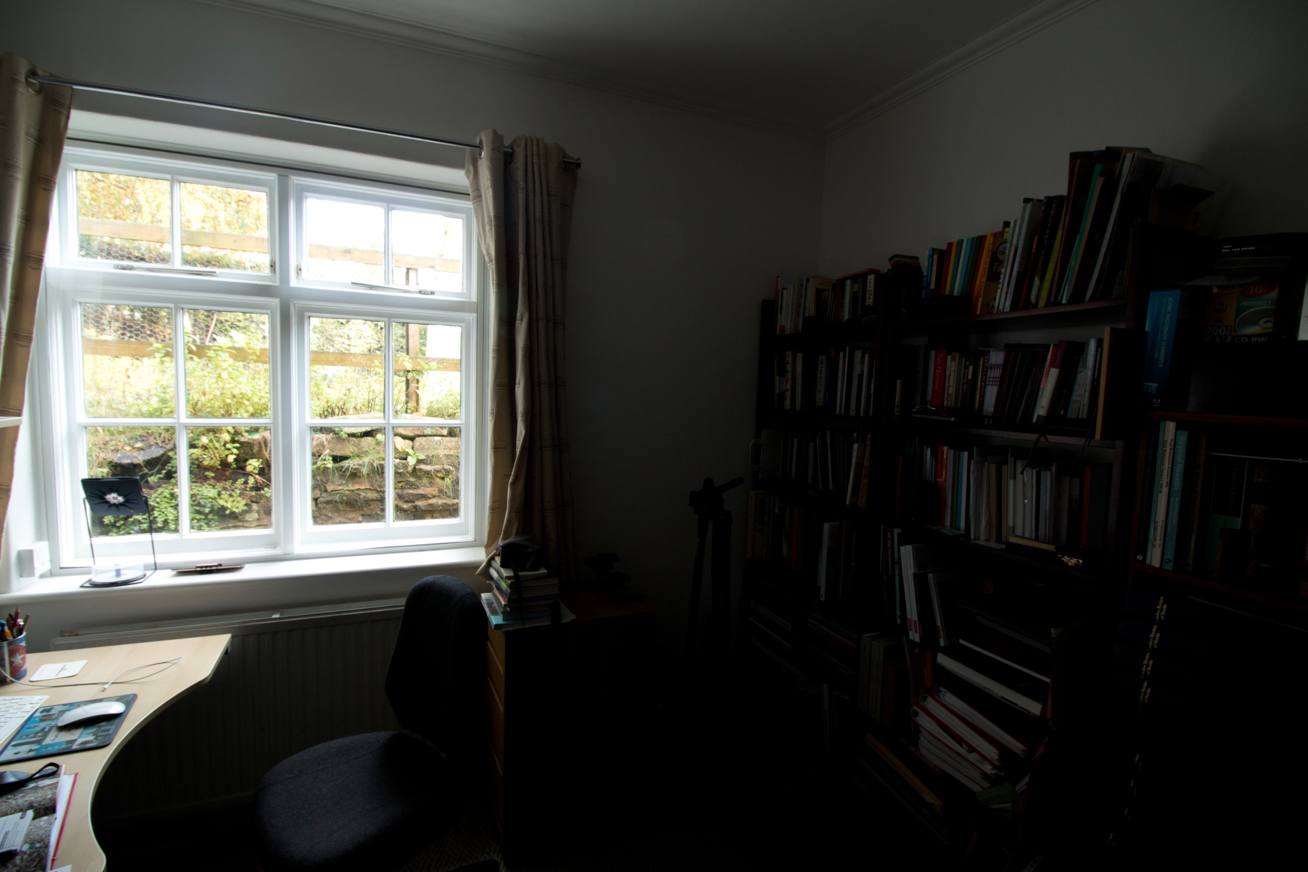
Going the other way I then stopped down two stops to f/7.6:
This moved the mid-tone to Zone III, making the right side considerably darker and difficult to see, but makes the window view more natural.
None are really ideal but shifting the mid-tone to Zone VI at least makes for a more balanced image in terms of the extremes of light and dark, and it striking how much of a difference it has made between the first two shots. I have to confess I was a bit sceptical at the outset about how this would work out in practice but I can now see that the system is in fact quite simple in practice and really can be useful even with a digital camera, not something that is confined just to negative printing.
This is an interesting topic to introduce at this point in the course and it is one that I suspect many of my fellow students will have little prior knowledge of, unless in the past they have worked predominantly in film. Today we are working mostly, and in many cases I imagine exclusively, with digital cameras. I am though aware that there are a number of us – Badger’s Luddites, ha! – who are at least dabbling in film, both as an artistic choice, and as a means of learning, or relearning, some of the technical basics that are still relevant but somewhat subsumed by and potentially lost in the digital world. I therefore find it intriguing to see how a technique – which I confess until now has seemed to me, wrongly, somewhat esoteric and overcomplicated – that was worked out to help with development and printing of analog film photos can still be relevant in a digital realm.
With this in mind it is perhaps telling that none of the few books that deal with technique in my own modest library have much if anything to say about this Zone system. Ingledew (2005), for example, (at page 245) has only a very brief glossary entry: “An aid for determining the correct exposure and developing times to achieve the maximum gradation of grey values in a negative print.”
Even an older book, Hedgecoe (1976), which is pre-digital, does not mention it at all whilst nevertheless going through the basics of negative printing.
Adams’s book (1983), of course, refers to the Zone system a lot, picture by picture, but does not go much further in explaining how it actually works in practice.
Paradoxically, one of the best explanations I have come across has been published just very recently on the website of the Intrepid Camera Company, who are the makers of my 4×5 film camera. There is a link to the article below, which is a useful step by step, guide to the use of the system in practice. I have to confess though that I have not tried following it yet, not least because I am still trying to sort out a darkroom so that I can try my own printing. (It is amazing how much extra kit is needed in order to do your own printing. In comparison film developing is really easy as the chemicals are simple and the only critical equipment are a light-safe changing bag and developing tank. To print there are all sorts of extra things needed, not to mention a dark room itself. Fortunately I have a wine cellar that can be made fully light proof without too much work and will function adequately at least on a temporary basis.)
From a practical point of view I will explore the system further by having a go at the next exercise, though at the moment I am not at all sure what the subjects are going to be, nor exactly how I am going to go about it, in the absence of any guidance on how the system works with a digital camera. I think for the purposes of this I am going to have to concentrate just on using a digital camera, which is probably the only way I can get fully accurate light-readings. I do have a light meter, which I use in particular with my film cameras, but it is an incident meter rather than a spot meter, so although it is a very good one it does have some limitations. (Spot meters seem to be really expensive and for what I currently need for my analog photography it is not an indulgence I really want.)
Adams, A, (1983). Examples: The Making of 40 Photographs. Boston: Little, Brown & Co
Hedgecoe, J, (1976). The Book of Photography. London: Ebury Press
Ingledew, J, (2005). Photography. London: Lawrence King Publishing
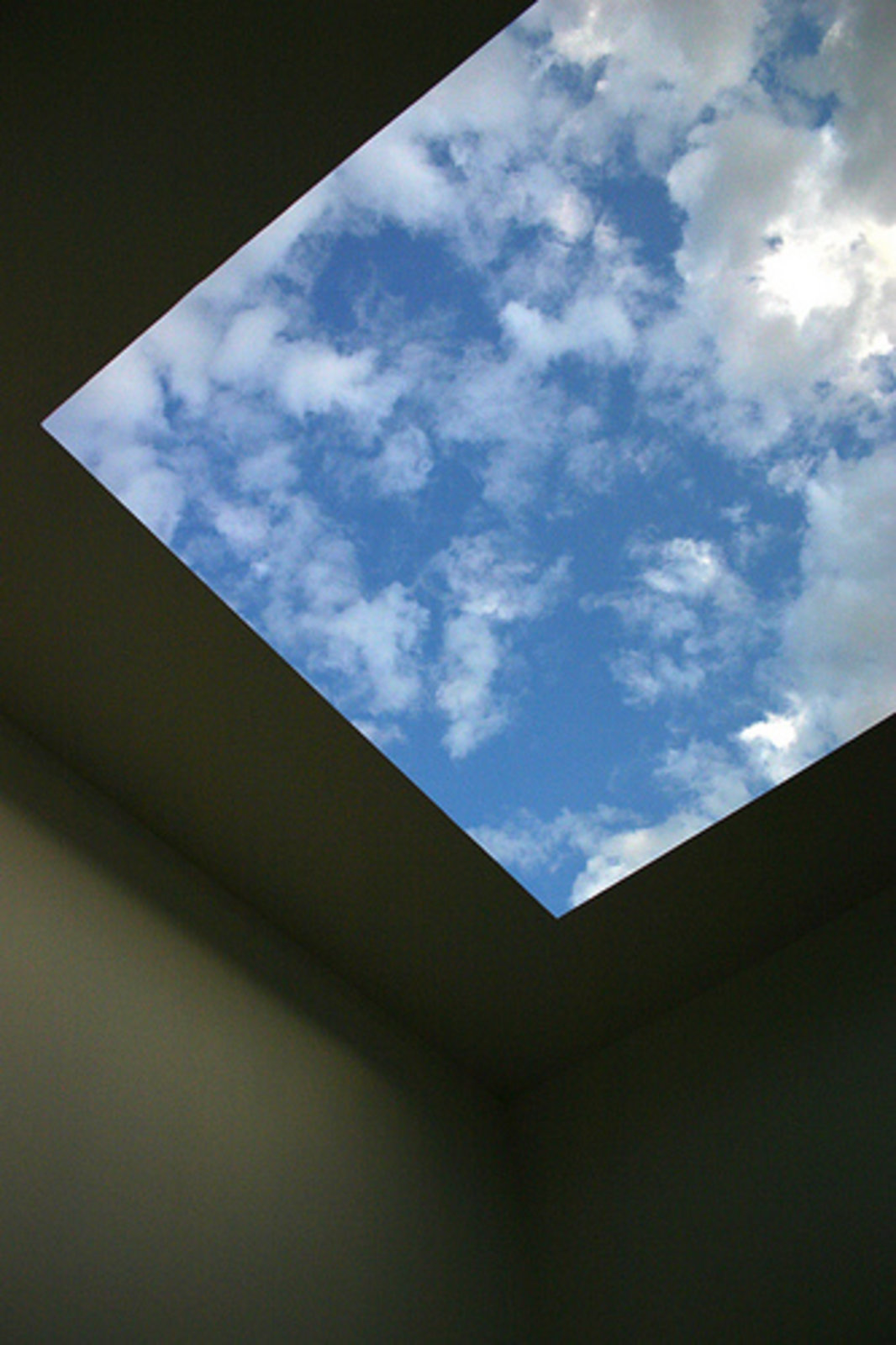
Looking ahead to Assignment One I am thinking about concentrating on the Sublime, rather than the Beautiful, as this should give me greater scope to explore the ideas of presenting the unpresentable and of nothingness/emptiness that I have written about recently.
What I would most dearly like to do, as I have lady suggested, is work on a seascapes project. However I have to admit that this would in many ways probably be far too derivative of Sugimoto, even if I was to go for somewhat more dramatic scenes, such as those made by Garry Fabian Miller. From a practical point of view I doubt the feasibility at the moment of making such work given the length of the round-trip to the nearest bit of coast.
As an alternative I am currently thinking more along the lines of James Turrell’s Skyspaces. This will link back to the cloud paintings of the likes of Cozens, Turner, and Constable all of whom I mentioned in Exercise 1.3. It also still fits with the idea of the void in Sugimoto’s work, and the concepts of the sublime that have appealed to me from the outset.
Again it is not really practical at the moment for me to make repeated trips to the nearest Turrell to me at Kielder. It is not that far away but still at least an hour’s drive in each direction – it is easy to forget how big and relatively empty this county is! Really though I do not need to go there and can shoot sky scenes in the comfort of my own garden.
Here are the first couple of experiments, taken yesterday and today. Yesterday was very overcast so the picture actually reveals little – it is a void, empty, a picture of nothingness. Today was a bit more broken so the picture is more easily recognisable as clouds.
14/10/201915/10/2019
I will continue with this experiment over the next couple of weeks (weather permitting) and try a shot each day and see what we get. I will also, in the meantime, think about some other possible approaches.
These were all taken over the course of the same afternoon. It was quite breezy so the sky was constantly changing. Though not easy to see, the third in this day’s sequence managed to catch the moon, a very small crescent in the middle towards the booth of the picture, just below the cloud edge.
While working on this I have been giving further thought to other potential influences on what I am trying to achieve. One of course has to be Alfred Stieglitz and his “Equivalents”, photographs of clouds that are arguably the first abstract pictures ever made. I do not though feel any conscious influence. Yes of course I am doing something similar with my cloud pictures but only up to a point. Stieglitz was, I think, very much pursuing a pictorialist line of approach. His could pictures do not carry, so far as I can divine, any deeper meaning or significance. It is not clear to me that he “meant” anything in particular in making these pictures. In a way what he was doing was more closely aligned with what Cozens, Turner, and Constable were doing.
The other is Gerhard Richter who made a number of sea- and sky-scape paintings in the late 1960s and early 1970s. While working on my pictures I had this nagging feeling at the back of my mind that a contemporary artist had done this sort of work but it is only now, now that I am just about ready to submit this first assignment, that I have realised that it is Richter that I have had in mind and have gone back to look at this work. Although not an active, conscious influence this work has clearly had an effect, even if only at an unconscious level because clearly Richter was seeking to do with his cloud paintings what I am trying to do now. As Mark Godfrey points out (2011, at page 83): “these are not just paintings of skies – they are paintings that show Richter’s attraction to the ‘unknowable and unrepresentable’…” This fits exactly with the interpretation that I have sought to place upon the Sublime.
Wolken, 1970
Godfrey, M, & Serota, N, (2011). Gerhard Richter: Panorama. London: Tate
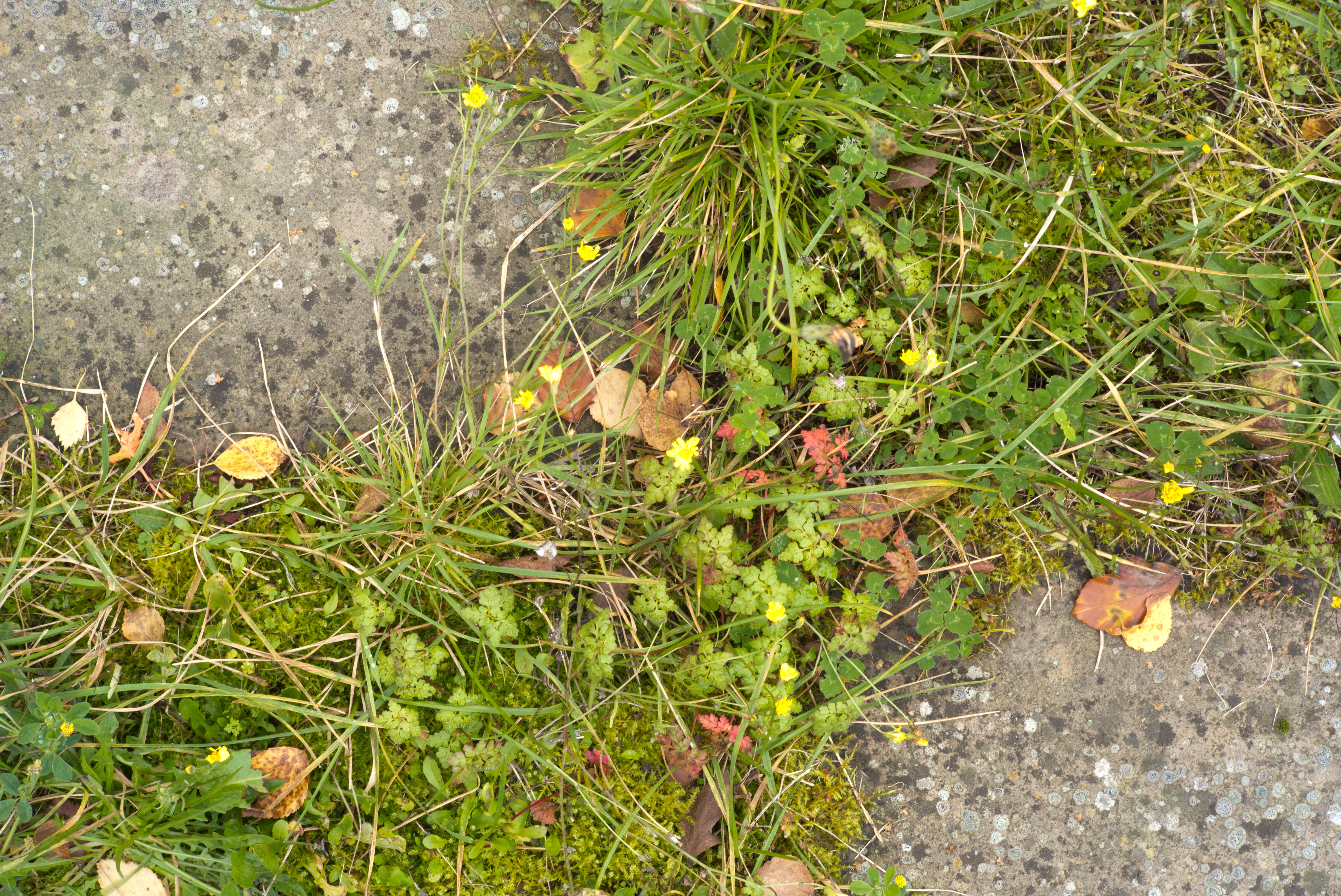
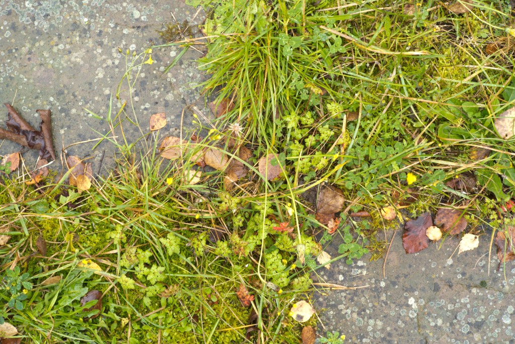
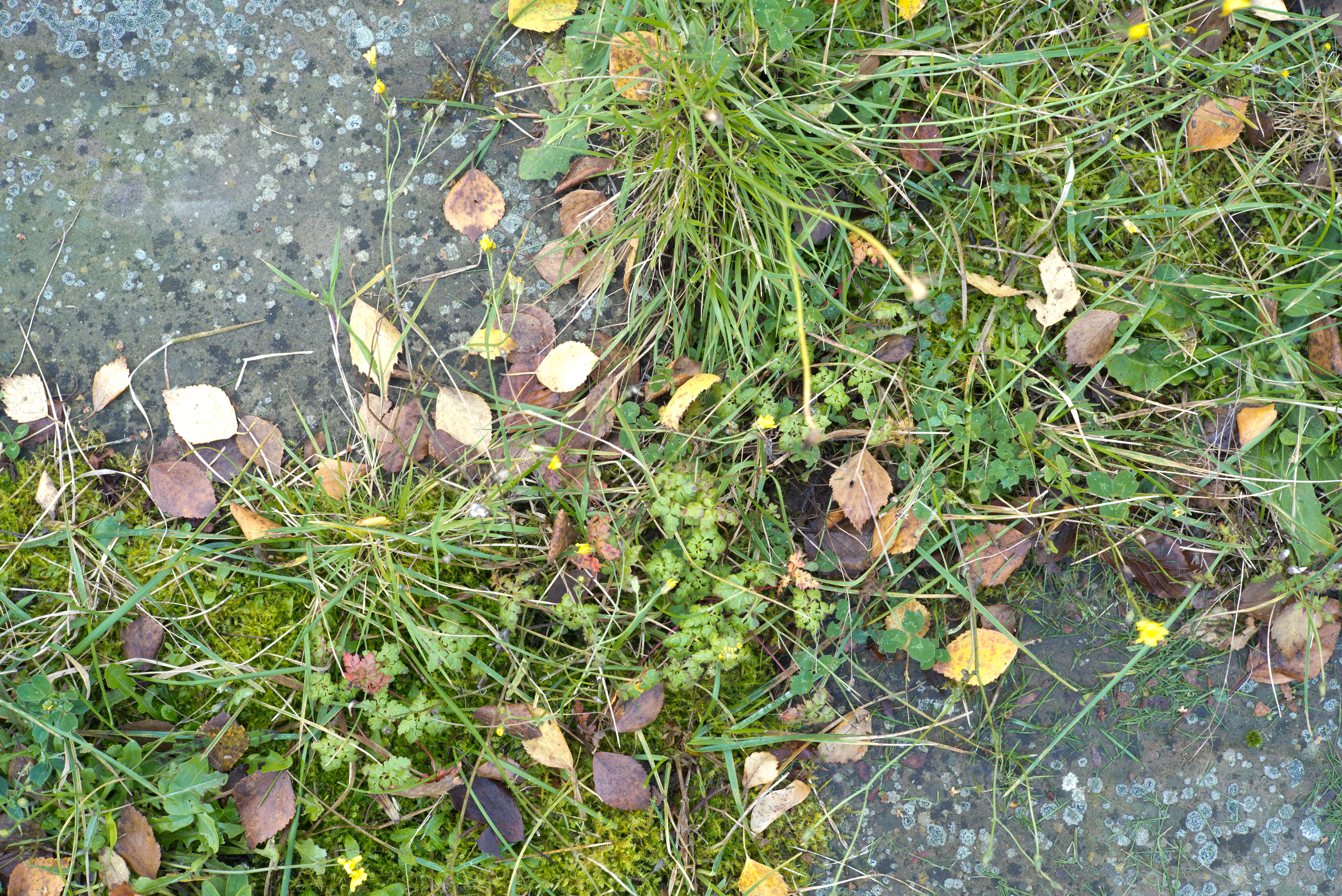
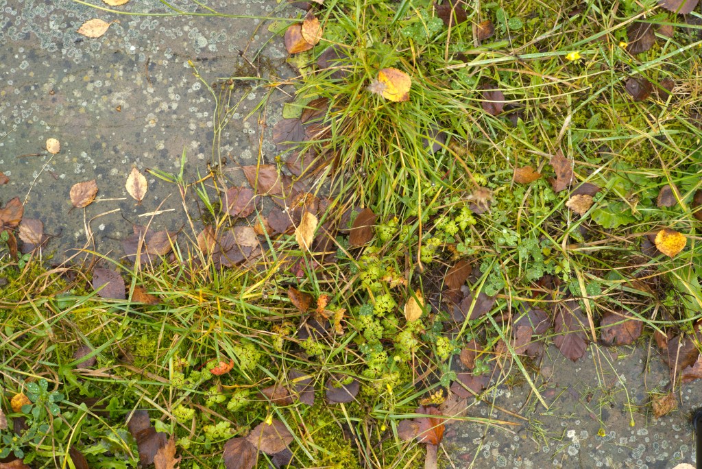
I have been struggling to come up with a microcosm view as another possibility for this exercise but have for now settled on a small area in my garden that I know will change over the coming year. Let us see how this progresses.
14 October 2019
20/10/201927/10/2019
Here is the latest instalment. I have to confess I am not quite sure where this is going and I very much doubt that this will turn out to be the final choice of subject. I am not helped by this particular shot being a bit clumsy in that one of the tripod legs makes an unwelcome appearance in the bottom right corner! I will persevere for a while longer though but only update this post if and when there is a change worthy of report.