Category: Home

Assignment 4 – Tutor Feedback

A little bit delayed but I have now had formal feedback from my tutor on Assignment 4 following our conversation a couple of weeks ago:  all very positive and supportive.

“We had a long conversation about a range of topics including progress on the course, the thematic continuity in your work, including the written assignment, and the possible modes of presentation for Assignment 6.

The essay, although a subject difficult to condense into 2000 words, reflects a strength and depth of research that supports all of the coursework – theory and practice.  I was impressed with the revision/reworking of earlier assignments – 2 and 3 looking at alternative forms of exhibition/dissemination; real evidence of dealing with a body of work in continual development.

Feedback on assignment 

Discussing the essay for Assignment 4, your view is that it works as a starting point for a much larger piece.  The limitations imposed by the brief mean that it is not really possible to explore the subject in depth at this stage.  Perhaps it is something that could be picked up again later and developed.  My own view is that it is little more than an introduction to a potentially much bigger exploration of the topic; there are lots more places that it might be possible to go with this line of thought.   If anything, it leaves open and raises still more questions that might usefully be addressed and to be answered.   As it stands though, it offers a starting point for a personal exploration of a subject that has not already been covered within the course or any of the other work I have done for it.   As ever, a major practical question is whether or not I might have the time to devote to developing the subject further.

Coursework

Demonstration of technical and Visual Skills, Demonstration of Creativity 

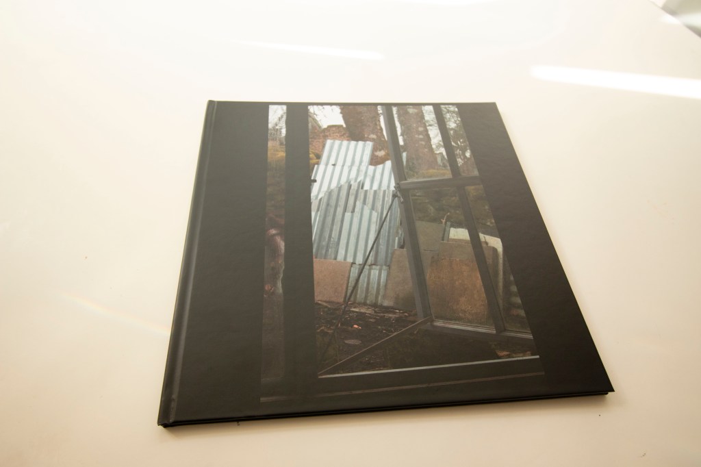
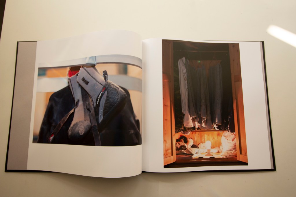
So far as other course work is concerned, we discussed my approach to the print on demand book mock-up exercise.  You feel that this has worked well for the chosen subject matter and is possibly worth having printed in any event just for myself.  I certainly feel quite happy with the concept that I have produced.  I am already having a book made by Blurb of another, older, project, and once I have seen how that comes out, I will probably go ahead with this project as well.

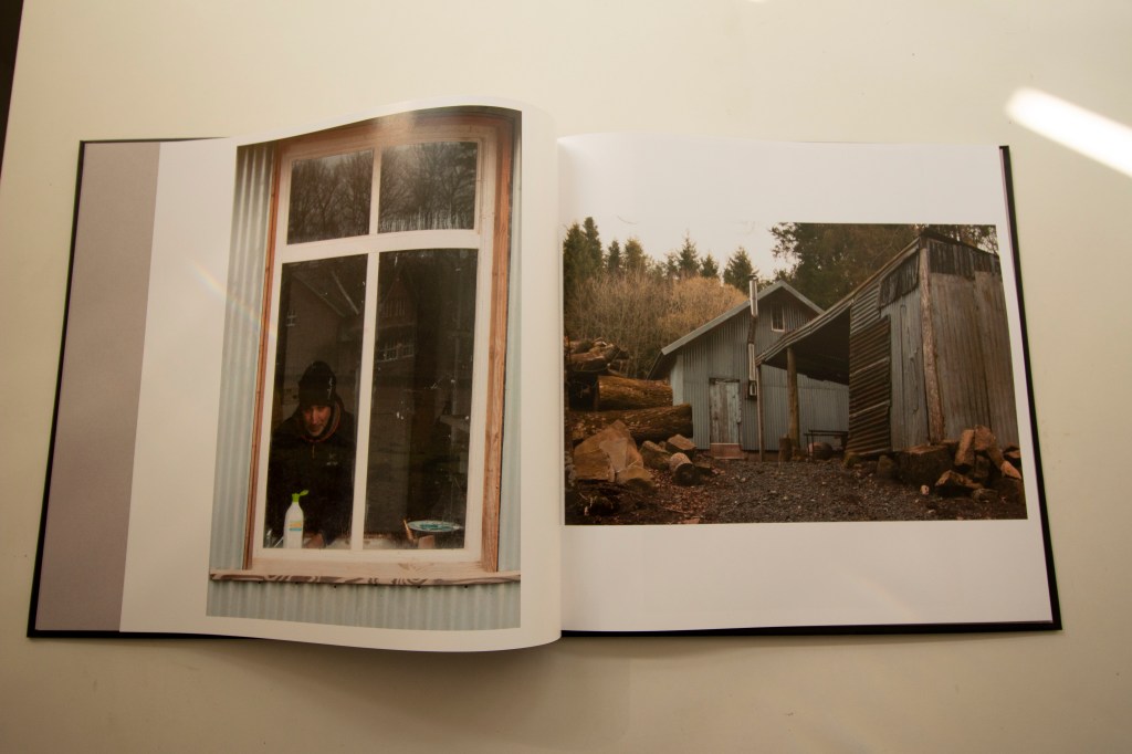
 I have in the meantime been working on a hand-made concertina book for the sequence of images that make up Assignment 2, in particular struggling with how to approach the map to go on the verso, discussing the practical and stylistic problems of trying to use an OS map.  I showed you my current mock-up of a hand-drawn, rail network style map (which is currently having text added to it in Photoshop) and your reaction was that this looks good.  In particular, that it does not contain too much information, which would otherwise be the case if it had been practical to use an OS map.  I will press ahead with this concept and complete a maquette.

We also discussed my thoughts about slideshows for Assignment 1 and possibly for Assignment 6.  You will have a look at the examples that I have produced so far, posted on my learning log, and we can discuss next time we speak.

Research

Context, reflective thinking, critical thinking, analysis  

Thorough and detailed research for A4, covering practitioners from three continents and a long time-frame.

Suggested ‘Return Journey, a film about Mass Observation and Jimmy Forsyth for further research, also a link to Amber’s site and exhibition of Jimmy Forsyth.  Work – You are already acquainted with both.

Learning Log

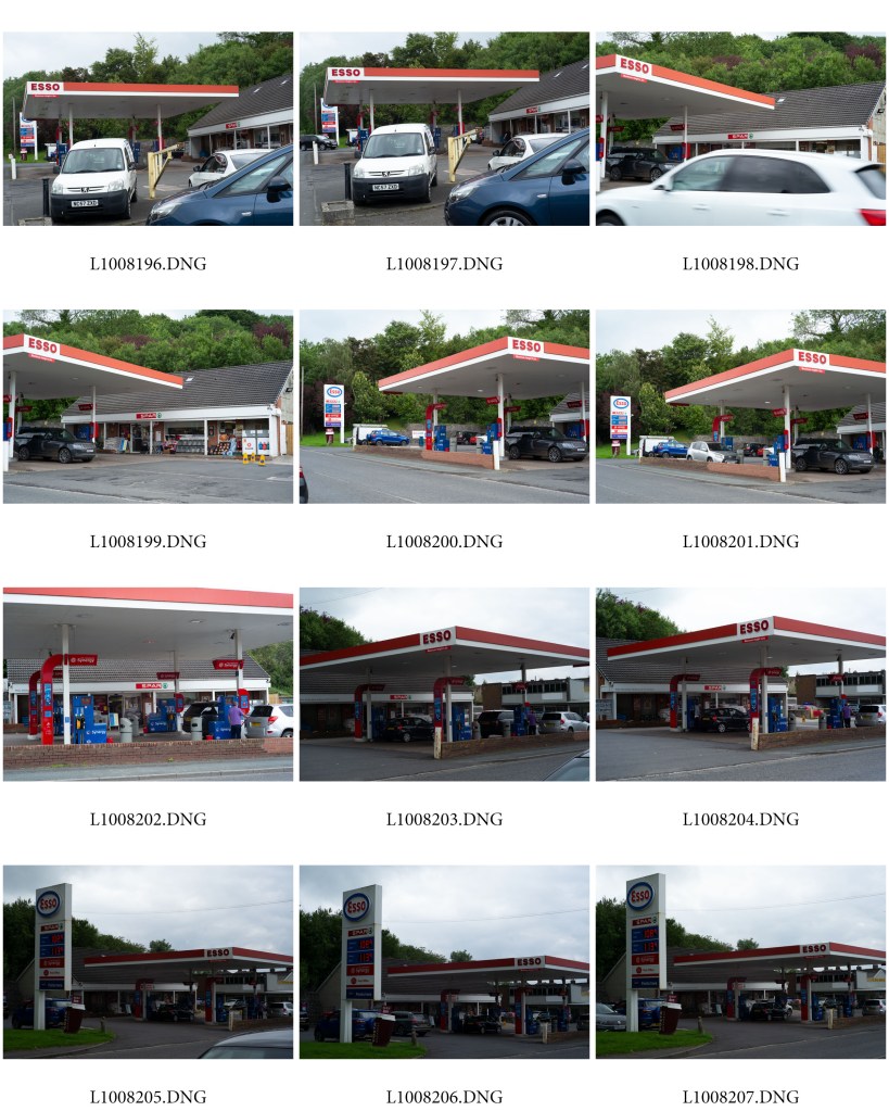
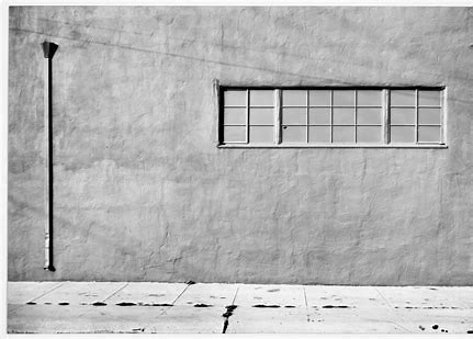
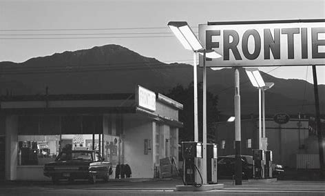
There are a range of new items uploaded under the Books tab, including the online arts magazine Learned Pig,  ‘Landscape as memory device – redux’ looking at the work of Onaka and Ogawa, interpretation through curating. Shibata’s ‘Gas Stations’, which could relate to your work for A5.

Suggested reading/viewing 

You will come back with some suggestions for slideshows and movies that might be useful to consider when developing my own ideas.

(Still) looking for something a bit more engaging than time lapse sequences

An interesting pair of videos constructed from still images following the tsunami at Fukushima.  The link wasn’t working at the time of search, but CSP’s site is worth exploring.  http://www.chrissteeleperkins.com/multimedia/

Pointers for the next assignment / assessment

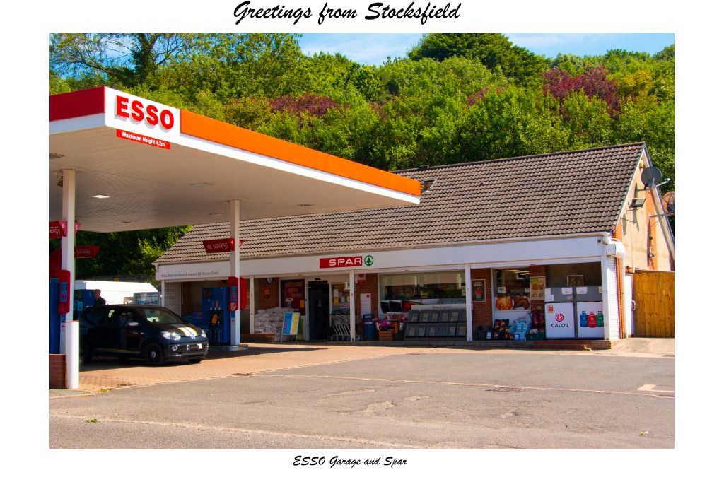
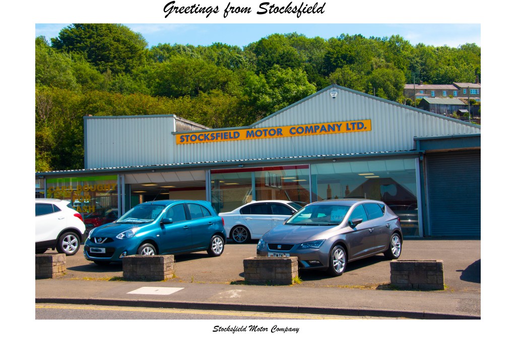
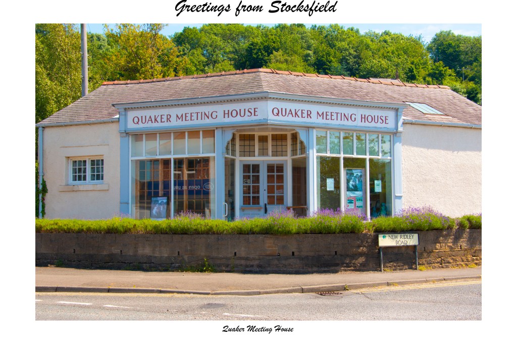
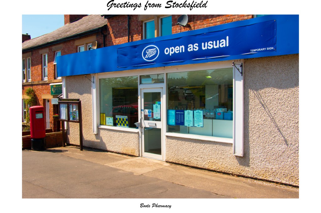
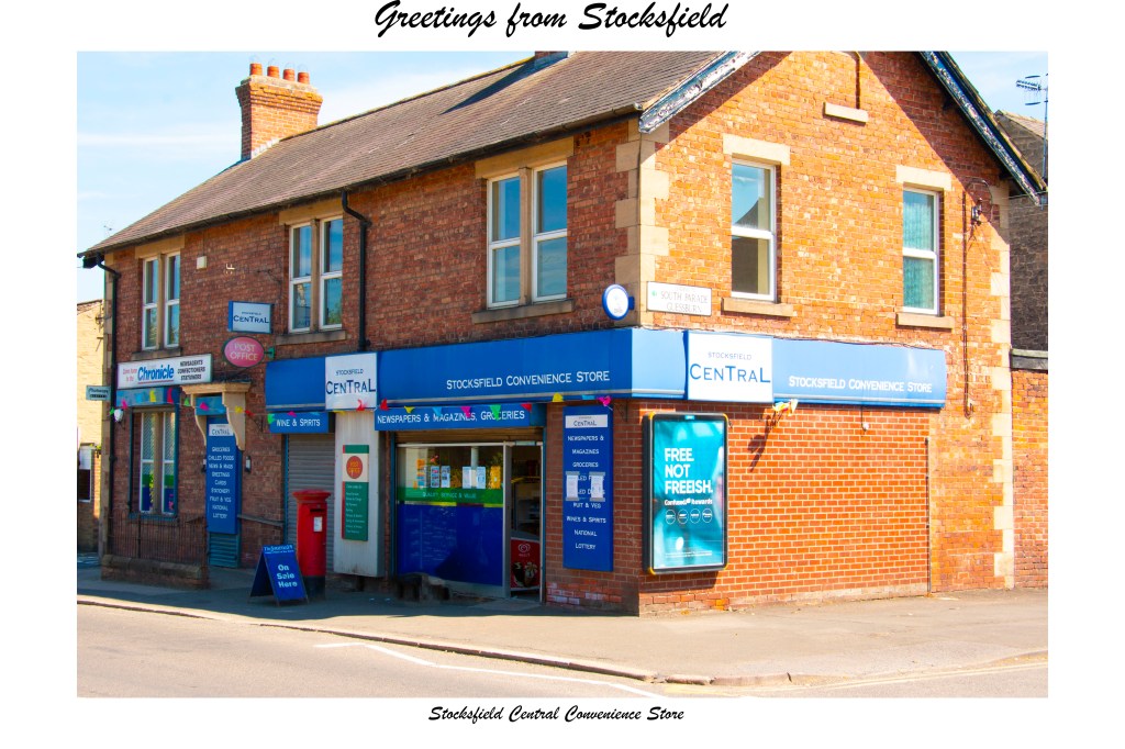
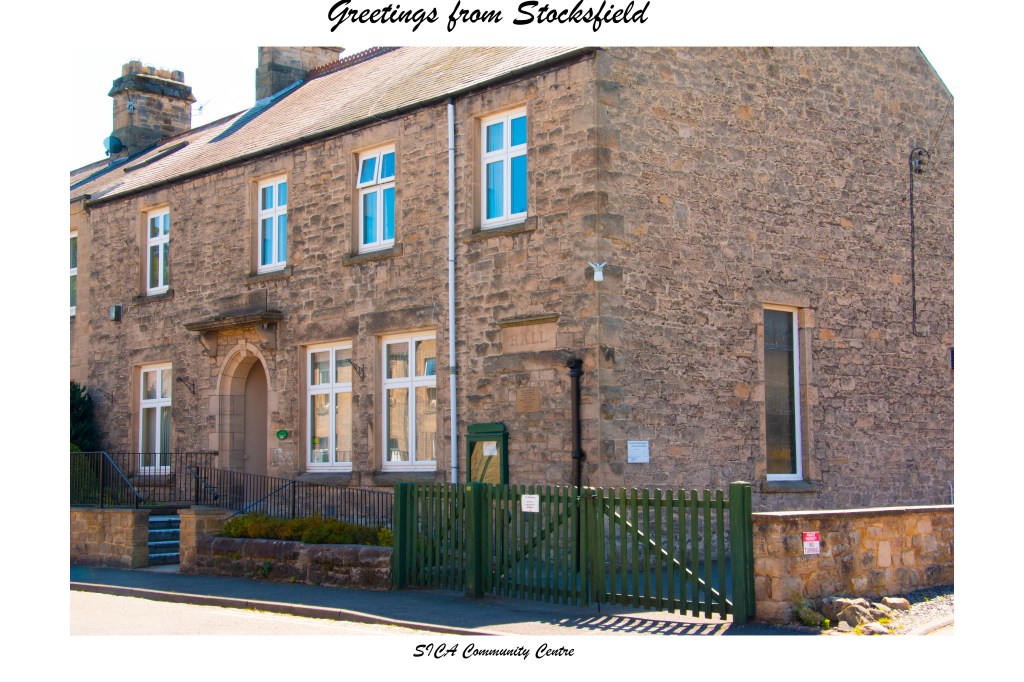
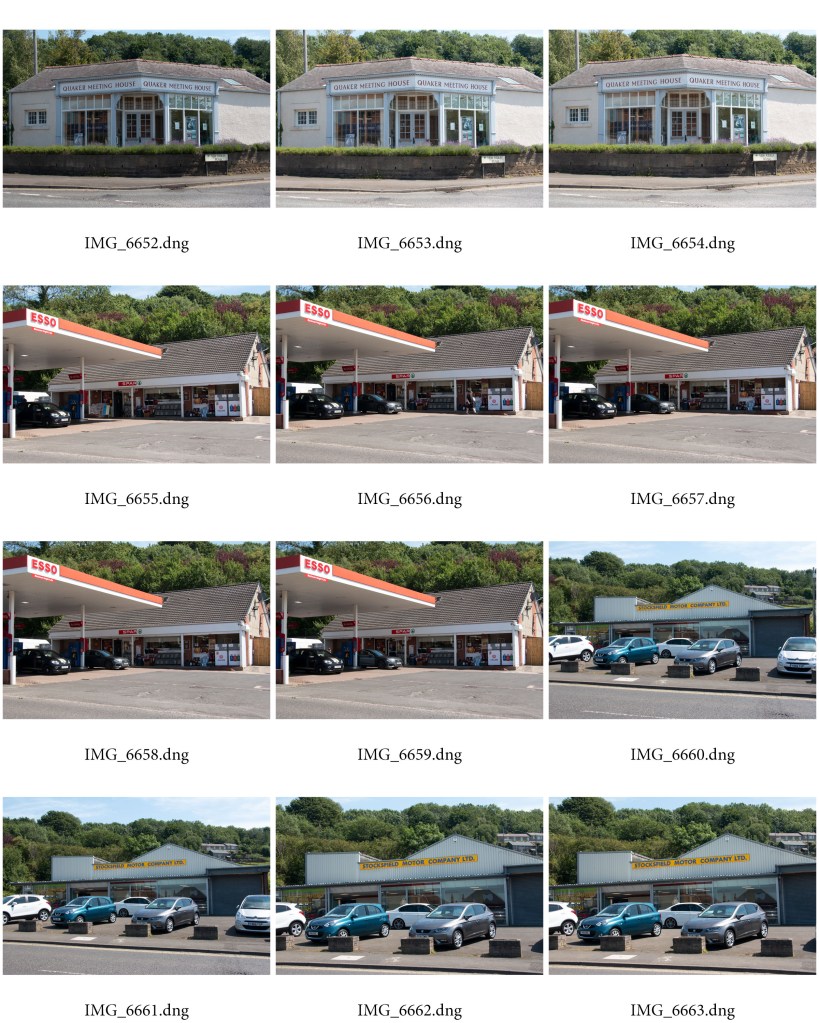
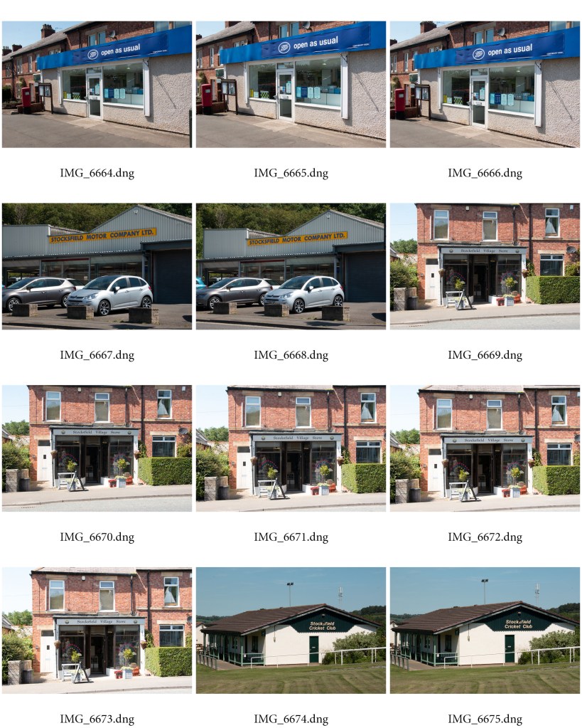
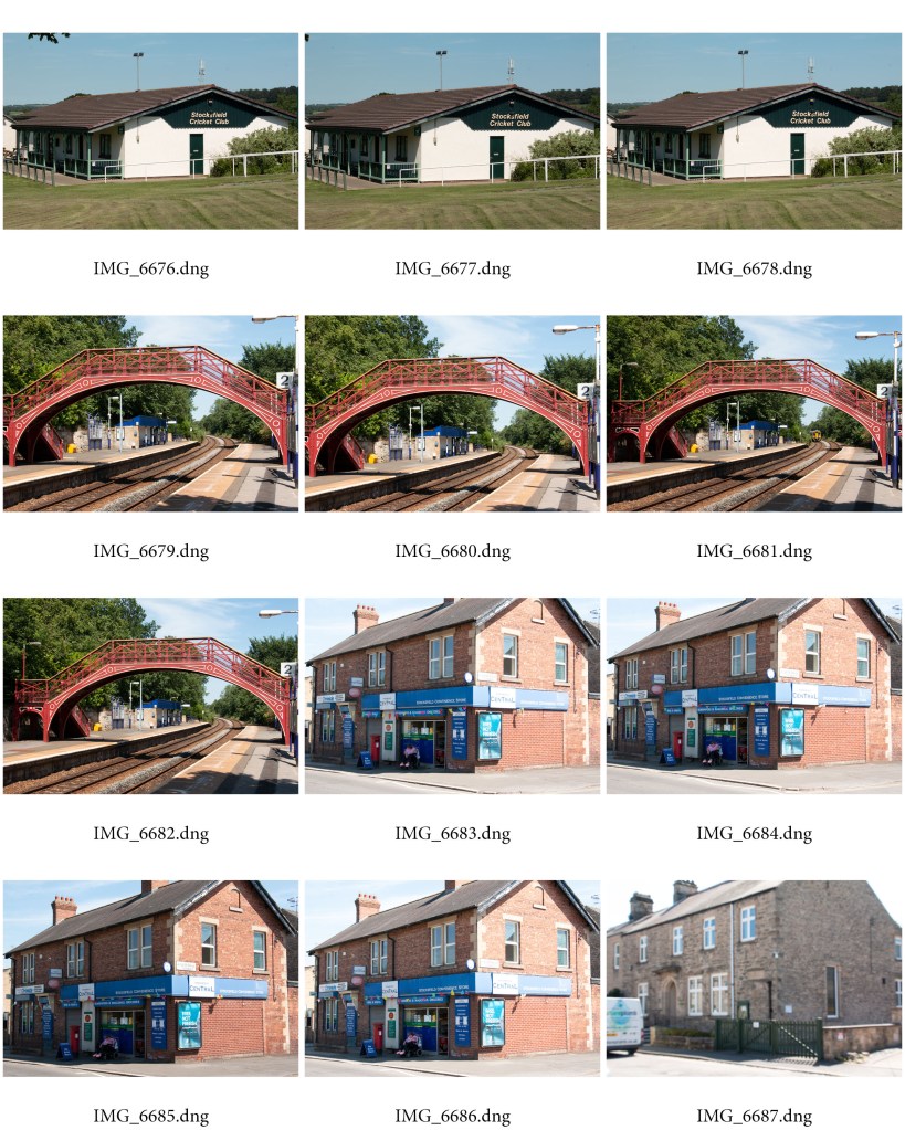
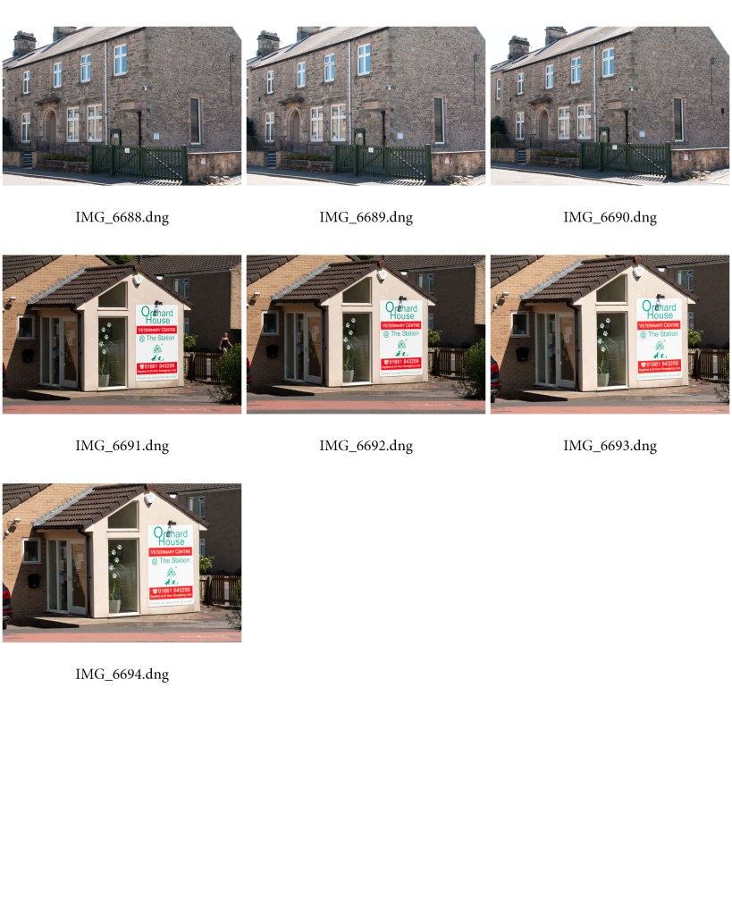
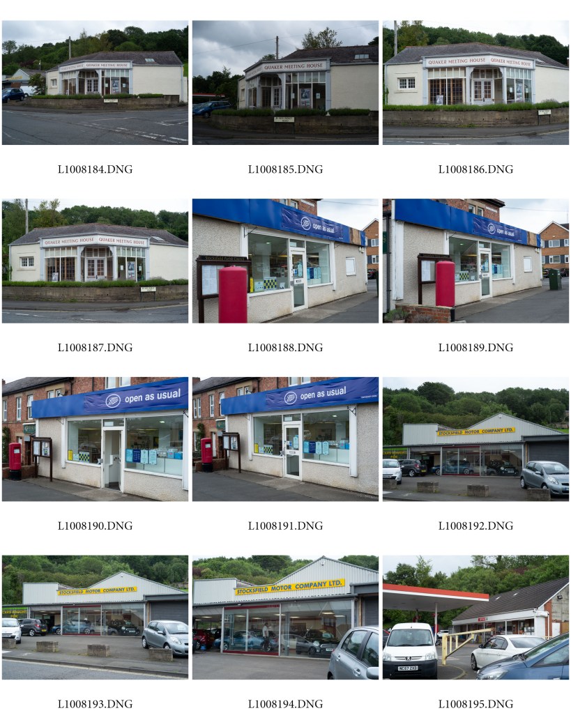
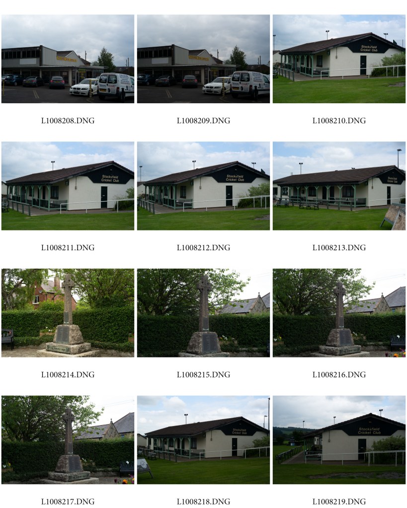
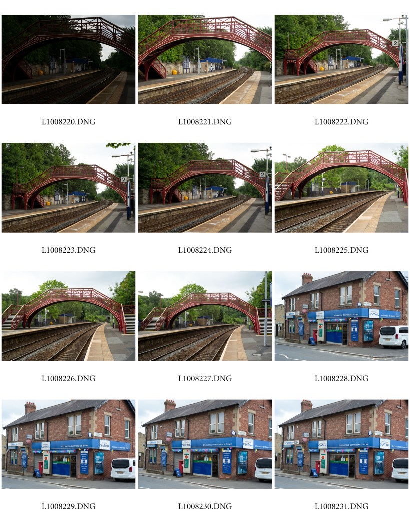
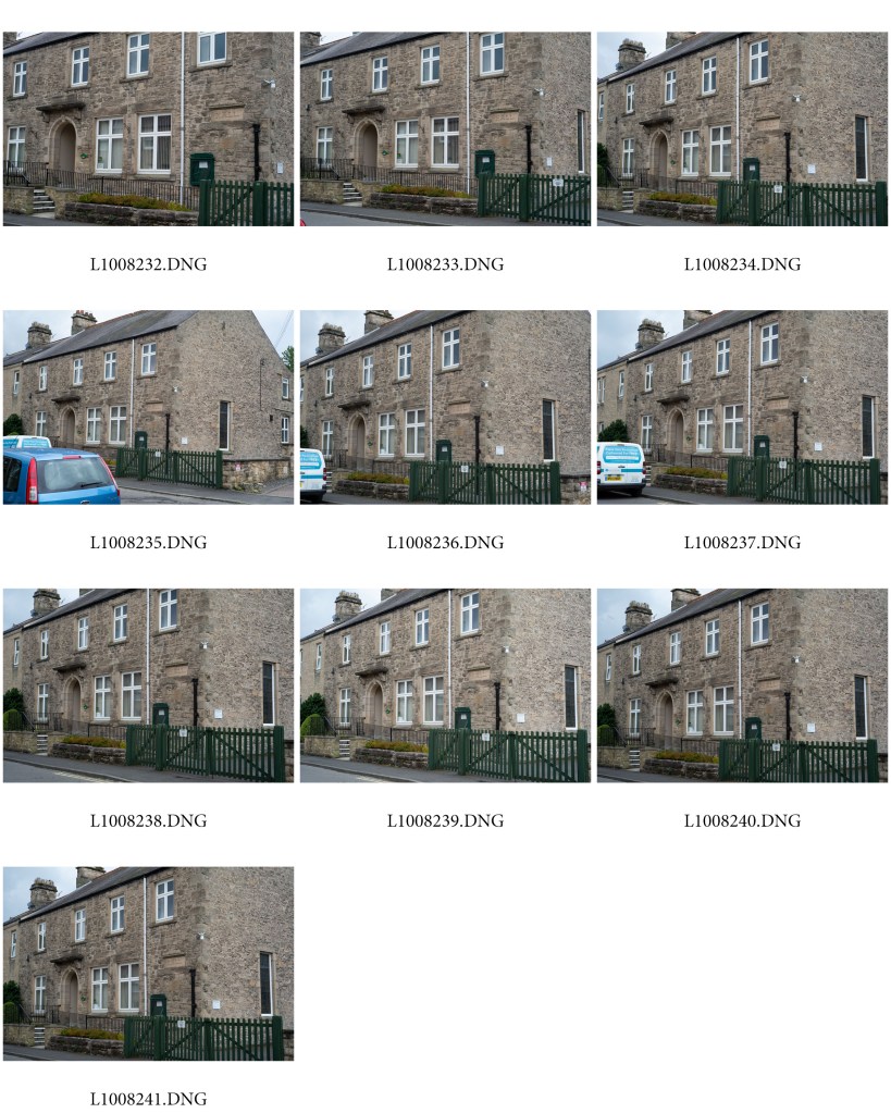
Having discussed my proposal for Assignment 5 we agreed that I should press ahead as planned.  It is a logical development from the benches project for Assignment 3 and fits in well with the work that I have done until now on this course, and even going back as far as Square Mile for EYV.  I certainly feel that over time my work has developed a distinctly local flavor and that my immediate locality is proving to be a major theme, and area of interest.  We also discussed how my move from the city (now almost 15 years ago!) has influenced the way that I look at the village.  This chimes with the hypothesis that I raised in the essay for Assignment 4 about the photographer as an outsider and how that colours the way a locality is seen.

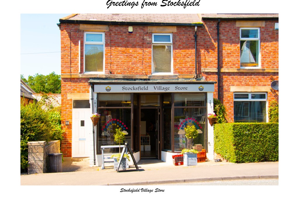
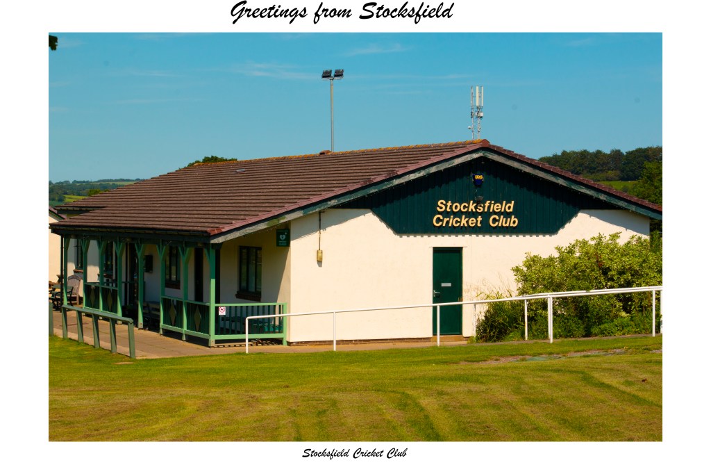
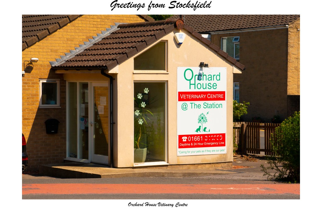
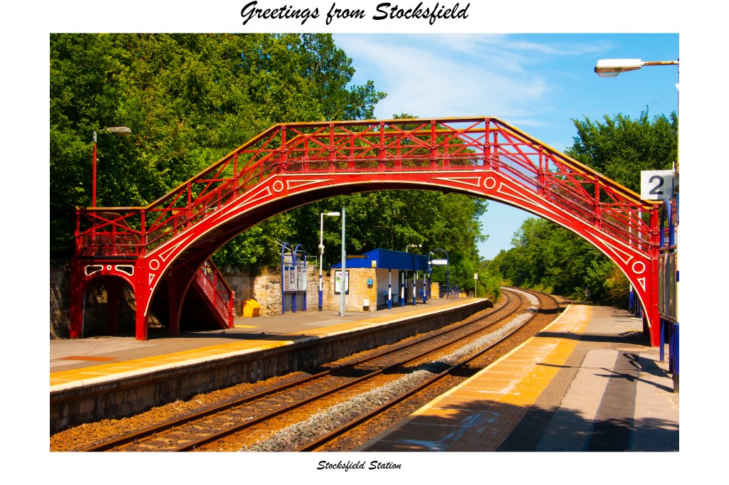
You encouraged me to press ahead with both of the ideas that I have come up with so far:  the postcards, and black and white, large format, images.  This will fit well the workflow that I have already projected, starting with test shots with a digital camera to determine points of view and composition, which can then be developed into the postcards, before taking out the 4×5 camera.  Using the latter I cannot afford to be making test shots and need to make each exposure count.  Whilst the continuing Covod-19 lock-down continues, this is not really something that should get in the way of pressing on with this project.  It is now more a practical question of when I am going to be able to devote the time to it.”

Assignment 5 – Postcards

Here is a first go at the postcard set for this assignment.  The pictures I took the other day have come out quite well and with a bit of tinkering in Photoshop have a suitably “postcard” aesthetic about them, appropriately kitsch.  I simply increased the colour saturation and vibrancy and added an extra boost by resetting the white balance to “daylight” (notwithstanding that the camera was already set to this), added a border and some text.  When it comes to printing them I will use a glossy paper.

I might make some more minor adjustments before the set is finalised but for now I am quite happy with the results.

Assignment 5 – Second shoot

Having already had one go at this, I got out again this week with a view to getting some proper shots for the postcard element of this project.  This time I used my old Canon with a zoom lens, 18 – 135mm, to give a bit more flexibility that was offered by my Leica and 50mm set-up.  Interestingly enough, whilst I expected to be using longer focal lengths, it looks as if more shots worked out at around 35mm.  Set at ISO 125 and f/16 throughout, the other interesting thing is that the exposures were all quite long, around 1/40s, despite the very bright sunshine (it was a really hot afternoon!) but I had already made the decision to use a tripod to maintain uniformity of point of view.  From my experience to date of the 4×5 camera I think I will wait for a slightly more overcast day.  The film that I use seems to work better in flatter light: if it is too bright the lighter areas tend to wash out and be over-exposed.  (I could use a ND grad filter but I have not had enough practice with them on this camera to feel comfortable and confident yet.)

Having decided after the first shoot to drop the war memorial I have added a couple more sites instead.  There is another pair of shops (butcher and dress hire – what a combination, but it is that sort of village!) that I would have liked to include, or at least try out, but unfortunately there is almost always a car or other vehicle parked in front that gets in the way, as was the case the other day.  I nevertheless feel that I have enough subjects for present purposes now.

Here are the contact sheets from this latest shoot.  The next step will be to select the final views and make them into postcards. (I think I will have to Photoshop out the lady in pink in front of the convenience store.)

Assignment 5 – Sensitivities

Throughout the planning for this assignment I have had in mind the need to approach it carefully and avoid as much as possible attracting unwanted attention.  Today I got out for a further shoot (on which more anon) and had an example of just the sort of thing that I am wary of.

Having decided after the first foray to drop the war memorial and look at some alternative additional sites, I decided today to include the recently revamped “Village Store” (not to be confused with the local Spar).  Rather than my Leica, this time I used my old Canon with a zoom lens and mounted it on a tripod.  Although I was on the opposite side of the road, as soon as I set up the shopkeeper came straight out and ran across the road to ask why I was taking pictures of his shop.  He was not at all unpleasant or challenging but he was clearly anxious.  Once I explained what I was doing he was fine and said that he was worried that his landlord had decided to sell the shop and had not told him.  Not quite the sort of response that I was expecting.  He then went back to the shop looking relieved.

When I go back to shoot with the film camera, which will be even more conspicuous, I think it would be sensible to go into the shop first and tell him what I am doing, if only to keep him calm.

It never ceases to amaze me that most people today do not seem to bat an eyelid if you take pictures on a phone but react when you use a proper camera.  At one end of the spectrum I have attracted friendly curiosity, particularly when using my old film Leica, through nervousness, as today, suspicion, to outright hostility.  In the latter case I have learned simply to walk away and avoid any confrontation.  With luck, when I get out again with the 4×5 it will be curiosity rather than anything else that is generated.  I do not doubt that the sight of a large format camera on a tripod and my head underneath the focusing cloth is going to raise some eyebrows!

MACK First Book Award

Something I picked up from an email from the publishers MACK yesterday, the announcement of the winner of their First Book Award for 2020, 45 by Damian Heinisch.  This caught my eye for a couple of reasons.

First, and foremost, it is based on a train journey between Ukraine and Oslo, all pictures taken through the train windows.  This resonates not least because the subject of my project for Assignment 2 was a train journey, albeit a much shorter one, and the pictures were taken through the window (though I was more concerned with landscape than people, as in Heinisch’s case).    I did though undertake a similar, small scale, project of photographing people on station platforms (though it did not get very far with it at all) as part of the Decisive Moment assignment for EYV (https://markrobinsonocablog.wordpress.com/2017/05/31/assignment-three-the-decisive-moment-part-3/).  It also has something in common with Obara’s work (2018), which coincidentally is set in Ukraine, and uses a physical journey to tell stories about people.  Given time and an opportunity to travel (neither of which are likely to happen soon) this is very much a strand of work that I would like to pursue further on a larger scale.

The other thing is the binding.  I am often attracted by different styles of binding and this one is “Japanese fold”, which I understand to be a form that involves printing a long sheet of paper that is then concertinaed, one set of edges then being bound.  The result is that each page is effectively two pages folded back-to-back.  Barachini’s book (2019) follows this mode, as does the Dog Man section of Kimura (2019), though that one differs in that it is also printed inside the folded pages, making the inner bits hard to look at properly!  Eiji Ohashi also used a version in one of his vending-machine books (2017).  I also have in my general library a beautiful old book (I am not sure of its actual age or publisher) of brush and ink drawings of, mostly, botanical specimens, interspersed with some poems, that unfortunately I cannot read, and a few landscapes in a Chinese style, housed in a silk covered folding box.  It all makes an aesthetically pleasing change from the standard form of binding and can add an additional layer of interest to the photographs.

Barachini, V, (2019).  Cuore Velato.  Livorno:  ORIGINI edizione

Heinisch, D, (2020).  45.  London:  MACK

Kimura, H, (2019).  Snowflakes Dog Man.  Italy:  ceiba editions

Obara, K, (2018).  Exposure / Everlasting.  Cordoba:  Editorial RM / RM Verlag

Ohashi, E, (2017).  Roadside Lights.  Tokyo:  Zen Foto Gallery

https://www.firstbookaward.com

Exercise 5.3: Print on demand – Printed!

Although this exercise did not call for anything more than making a mock-up and producing a pdf, I nevertheless went ahead and had a couple of books printed up to see how they would look.  Blurb have been falling over themselves to offer substantial discounts so I thought I might as well go ahead.  One book is the one of which I made the mock-up for the exercise, a development of the work for Assignment 3.  The other is a development and expansion of a project that I did for one of the Assignments for I&P.

Both are fairly slight, using no more than the standard layout of twenty pages.  For Assignment 3 I have kept the layout of images only on the right-hand page.  For the other, I effectively doubled the number of images that formed the final set for the earlier project and put one on each facing page.  In both cases I went for image wrapped hardcovers, rather than dust jackets, and premium matte paper.  The end results look and feel reassuringly professional, if a little spartan.  If I have any issue with them it is the colour balance on a few pictures from the old project is a little off, compared with the original prints. That said, unless you were to compare them with those prints I doubt you realise that they are slightly different.  They certainly do not look “wrong” in their own right.  I guess some slight differences like this are probably inevitable.

And here is a short video showing the printed version of Assignment 3:

Assignment 5 – First shoot

I have at last been able to get out for an hour or so to make a start on this assignment.  At this stage what I am concerned about is testing out view-points and camera angles, rather than making “finished” images, and looking critically at the sites that I have in mind.  This is perhaps just as well as the light was horrible:  the sky was heavily overcast, the clouds leaden, and indeed it started to rain quite heavily not long after I came home. Nevertheless, it was a useful exercise and although I have yet to go through the pictures I took in detail I already have some ideas about what positions are going to work when I get to the shoot proper.  It also became abundantly clear to me that one of my chosen sites, the village war memorial, does not really fit or work with the other sites and so I might well omit this.  On the other hand, although they do not feature in the product of this first foray, there are a couple more sites, that did not feature in my initial thinking, that might well fit in quite well.  I will have to do another test shoot of them before deciding.

From a technical point of view, I quickly learned that the local petrol station and convenience store is going to be quite hard to capture.  This is not just because of its size but also the effect the large forecourt canopy has on the light.  This is certainly going to need some careful metering before I expose any film in the large format camera.

As a bit of an aside in this regard, I felt I was getting some slightly odd meter reading on the digital Leica I used for this first shoot.  Despite the fact the light was so poor, I was surprised by some of the aperture settings that the camera recommended.  Set at ISO 400 and 125s I was surprised that it kept wanting small apertures; I had expected it would need smaller f stops but it consistently pushed me towards the upper range on this camera’s lens, f/16.  Unfortunately, I did not take a light meter with me to double-check but I did a quick test when I got home that suggested the readings were consistent.  (This is not the first time that I have had what I feel to be aberrant readings on this camera but everything actually seems to work fine.)  What this does serve to emphasise though is that I am going to have to be careful with meter readings for the film camera.

Another point is that the siting of the large format camera is going to be problematic in a couple of places because of the main road that runs through the village.  Coincidentally, more with an eye on portrait photography, I have just bought a 210mm lens for the 4×5 camera which should help with capturing some of the views I want from slightly further way, that is across the road, than I would be able to achieve  with my usual 150mm lens.

So far as attracting attention is concerned, in fact only one person approached me during this shoot:  someone working at the local car dealer di ask what I was doing but then apologised for getting in my shots!  I did take the precaution of putting my NUJ Student and OCA cards in a holder on a lanyard to make things look “official” and that perhaps helped.  What sort of reaction I get when I set up a field camera on a heavy tripod, with a focusing cloth over my head, remains to be seen!

As yet unsorted and unedited, here are the contacts sheets from this first shoot (from which it is immediately clear that I need to rethink and look again at the angles for some of these sites):

Assignment 5 – Further research

While waiting for an opportunity to get out and start shooting this project (I have been rather frustrated by recent bad weather and too many other things to do when the weather has been reasonable) I have been doing a bit more research, in particular looking at the “New Topographics”, among others, which has led to some interesting conclusions and raised some further questions.

I have not looked much again at the Bechers notwithstanding they were part of the New Topographics show. This is not because I do not like their work, as I have written elsewhere more than once I do, but simply because their overtly and deliberately typological approach does not really help me with this project.  They would have been relevant if I had intended to photograph different examples of the same type of building, as with Jethro Marshall’s village halls, but instead I am looking at a range of different buildings within the one village.

Putting aside my disagreement with Baltz’s views on the nature and function of landscape, and Adam’s notion of Form, I have looked again at both of their work but have found that neither really adds anything to my current thinking.  I find that Baltz’s exaggeratedly deadpan aesthetic, though I quite like it in its own right,  does not really fit with what I want to explore here.  What I am interested in is the human intervention in the landscape to make otherwise non-descript spaces places with a particular significance.  His approach is just that bit too blank for my purposes.

I have a similar issue with Adams’s work.  Some is more closely related to what I am after, such as his gas station images, but I have already formed my own views in the light of the work of Ed Ruscha and Toshio Shibata, as I wrote in my first post on this project (https://markrobinsonocalandscape.photo.blog/2020/05/03/exercise-4-6-proposal-for-the-self-directed-project/).

Otherwise, again much though I admire, for example, his night-time suburban images, they do not really take me any further forward.

Much of his rural landscape work, even where it shows signs of human intervention, is a bit too empty for what I am after, simply because the countryside that he worked in was itself so empty!

Taking the New Topographics as a starting point, I have also looked at some of the New Düsseldorf School, such as Struth, Ruff, and Gursky,  but again do not feel that I gain anything useful from them.  Gursky, for example, is certainly deadpan, but the monumentality of many of his images, both the subject matter and the physical photographs themselves, are a little off-putting and not really relevant to the much more domestic scale of my project.

This leads me to a couple of thoughts on research generally.  In the case of this project the explicit, direct, conscious influences have been few, as I have already identified (Ruscha, Shibata, Ohashi, and now Marshall).  I have to recognise though that there might well be other influences operating at an unconscious level, which quite possibly includes the New Topographics.  I suspect it is inevitable that when you look at so much work, so many images, as we are doing on this course, it is hard for them not to have an effect at some level.  The other thought is actually a question:  how much does research help in reality?  In so far as there is an unconscious influence, I do not doubt that it does.  I do though wonder about the extent to which it has a conscious impact in the case of the project as I have conceived it.  The point is that I have started with a particular idea, a development of much of the work that I have done for this module and in particular Assignment 2, and it is that idea that determines how I need to approach this work and what it should look like.  Arguably therefore, even the conscious influences are not in themselves that significant.  I think that research is important, even vital, even if only to set one’s own work into a wider context, but it is not necessarily a substitute for, and certainly not a bar, to coming up with original, personal ideas ab initio.  I suppose the point is that it important to develop one’s own voice and not simply to follow what others have done in the past, or are doing now.  Be aware of the traditions and wider context but find one’s own place with them.

The other thing that I found myself thinking about was the notion of “schools” in art generally.  Can the artists featured in the New Topographics show truly be said to belong to a particular “school”, a conceptual style, of photography?  Did the Bechers, Baltz, and Adams, for example, really have that much in common from an ideological or aesthetic point of view?  Is it more a case of a curator creating a framework within which to collect and exhibit varied bodies of work?  Certainly, it seems to me the Bechers have been doing something quite different, ploughing their own particular furrow.  I do not see much of the same typological approach in the work of the others.  Flicking through Wolf (2019) again it is striking how many of the artists interviewed do not seem to identify with any particular school, genre, or style, simply getting on with the work they need to do without having to carry the shackles and burdens of categorisation?  Is it a case of curators, and critics, commentators and academics (let us not go near the theorists for now) trying to impose categories, structures, genres, on disparate bodies of work to meet their own practical or theoretical, ideological, needs and agendas?  This is a much bigger topic than I want to get into in any depth at the moment but I am much inclined towards such a view.  This is not to dismiss such an approach out of hand, but as I have indicated before I am inherently suspicious of, if not actively hostile to, efforts to pigeon-hole artist and their work, to fit them into categories not of their own making.  I am wary of “isms”.  Art, in all its forms, is too multifarious and varied to warrant or bear being straitjacketed in this sort of way.

All of which, in a somewhat roundabout way, brings me back to my starting point:  what I am trying to do with this project is find my own way of expressing the ideas that interest me, without necessarily, consciously, being swayed or influenced by the work of others (except to the extent I have already acknowledged) or aligning my work to any particular school, genre, or style.

Wolf, S, (ed), (2019).  PhotoWork:  Forty Photographers on Process and Practice.  New York:  Aperture

Assignment 2 – Still working on the book!

Since I last wrote about this book project, which now seems to have taken on a life of its own, consuming mine in the process, I have been able to make some more progress and to discuss it with my tutor when we discussed my submission for Assignment 4 (I will post on that separately once we have finalised the feedback).  I had made a mock-up of the map (2.25 metres long!) which he quite liked.  I have since gone on and created a jpeg version of it, which has allowed me to add type for the stations and other points of note along the route instead of having to write them on by hand, which I fear would have looked a bit too messy.

The prints of the photos have now been made and trimmed to size and I am in the process of adding hinges between them.  Once that has been done, I will print and trim to match the sections of the map, then add the covers. Still lots of work to do and I still expect that the result is going to be a maquette from which a final version might, theoretically, be produced professionally, rather than an “artist’s book” in its own right.

On that last note, quite coincidentally there are a couple of brief articles in the latest edition of Printmaking Today (pp 22-23) relating to artists’ concertina form books.  (I am not actively making etchings or other prints of my own at the moment, being all-consumed in my spare time by this course, but I still occasionally collect prints so like to keep abreast of what is going on in the wider print world.)  I am not entirely sure whether it is reassuring, but at least I am not alone with my struggles, but both show how difficult, and time-consuming a process making such a book is.

With a bit of luck, and not a small amount of further effort, I should be finished soon!

Printmaking Today.  Summer 2020.  Vol.29, Issue 114

Exercise 5.7: Prepare your artist’s statement

For this exercise I have taken a very unscientific approach and have not drawn on a very wide assortment of artists.  Nevertheless, there are a couple of things that have been particularly striking.

The first is how few of the artists I have looked at – all are ones whose work I like and a number of them are represented on my book-shelves – have any form of statement at all.  To take just a few examples, Rinko Kawauchi, Matthew Genitempo, Hiroshi Sugimoto, Nick Waplington, do not say anything.  I would also have included Alec Soth but he is already mentioned in the course material:  his rather laconic description of himself does not really come across to me as a “statement” at all, beyond, I am a photographer and what I do is make photographs.  In many ways that is actually the sort of statement to which I would aspire.

Elina Brotherus does not have what I would necessarily call an artist’s statement but her biography, on her website, I suppose serves the purpose in so far as it identifies the shifting strands within her work as it has developed over time.  Rinko Kawauchi does, it seems to me, despite the strictures of the course material, let her work speak for itself, and has in effect left it to others to write her statement for her.  As Charlotte Cotton put it in Aperture, “She shapes subtle, elegiac narratives without the aid of interpretive or endorsing text, leaving the reader nonetheless fully nourished by the extent of exquisite and intriguing sights to be found on this earth”.  An elegant argument against the need for an artist’s statement at all!

A few statements that I did find all seem to me to add to the argument against the need for a statement in so far as they are simply not very well written.  It is horrible to single out anyone but a couple stand out.  Shane Taylor is a street photographer whose work I find subtle and intriguing.  His statement includes the following:  “His street photography explores classic, humanistic themes, drawing inspiration from classic street photography of the 1950s and 60’s.”  My problems with this include the repetition of the word “classic”, the wooliness of “humanistic themes” – just what is that supposed to mean? –  the misuse of the apostrophe at the end of the sentence and the inconsistent ways of referring to the two decades.  A lot of people do not seem to know how to use an apostrophe properly, indeed do not know what it is really for and what its purpose is, and this is a classic – to reuse an already over-used word – example. 

Another, and this came as something of a surprise given that he is also an academic, is Donovan Wylie, again for the repetition of a key word:  “Utilizing a combination of conceptual and typological approaches, Wylie’s work integrates the conceptual architecture of power, containment and war”.

In neither case is my appreciation or understanding of their work enhanced by such language.

The one statement that I do really like, not least because it addresses one of the problems of language, appeared in the first issue of Provoke:  “We now live in a world in which words have lost their material foundations, have become detached from reality and wander in space.  Faced with this, what we photographers can do, indeed, must do, is capture with our own eyes those fragments of reality which are utterly impossible to capture with existing words, and actively keep creating materials to confront those words and thought.  This was the instigation behind PROVOKE, and the reason we chose, admittedly a little self-consciously, the sub-title “Provocative Materials for Thought”.”  Another anti-manifesto argument.  Why should we tie a visual medium, one that is as airy as light itself, down with leaden words of clay?

Taking a slightly different tack, it was illuminating to go back to Sasha Wolf’s book.  Rather than speaking in terms of any sense of manifesto or statement, each of the artists that she interviewed simply talks about how they approach their work rather than trying to categorise and anatomise it.  This is an approach I find much more enlightening.

My inclination, it should by now be clear, is to steer clear of artist’s statements and their potentially limiting, or just plain embarrassing, nature.  Nevertheless, for the purposes of this exercise if nothing else, I am going to make an attempt.  The link referred to in the course material appears to be bad and as there is no indication of what the article referred to is, I have done a bit of hunting in the UCA on-line library and found a couple of articles that are helpful.  I have not gone through the exercises outlined in Goodwin’s article but have at least thought about this sort of approach.  Conor Risch’s piece is perhaps more immediately helpful and practical.  What I get from these, if nothing else, is that I should keep things simple, so here goes:

“My current work is concerned with the role landscape can play as a place that contains and records memory. I am also interested in how human relationships with the landscape affect that memorial function and can give places particular meanings and significance beyond being merely a geographical location.”

I think I still do not like it!

Cotton, C, (2004).  Rinko Kawauchi Utatane.  Aperture No. 177

Goodwin, A, (1999).  Writing an Artist’s Statement.  Ceramics Monthly, May 1999, Vol. 45, Issue 5.

Nakahira, T, Okada, T, Takahashi, Y, Taki, K, (1968). Provoke No. 1. Tokyo: Nitesha

Risch, C, (2017).  Conquering the dreaded artist statement:  expert advice for writing about your photography.  Photo District News, Vol. 37, Issue 8.

Wolf, S, (ed), (2019).  PhotoWork:  Forty Photographers on Process and Practice.  New York:  Aperture

http://www.donovanwyliestudio.com

www.shanetaylor.net