A bit of a digression (but not much), possibly interesting for some doing this particular module, but here is a recommendation of a website that revels in the name of The Learned Pig. As they put it, “The Learned Pig is an online arts magazine that brings together multiple perspectives on relationships between the human and the non-human.” Personally I find it a source of stimulating thinking about our relationships with environment.
Something I have just picked up from their latest email newsletter is a reference to what sounds like a fascinating book that is directly relevant to what we are doing here, not least to the long term project of Assignment 6: “Recollecting Landscapes”, a photographic survey and record of the changing landscapes in Flanders over the last century. Obviously this is not a project that we can possibly emulate in the short term but the idea is nevertheless intriguing and inspiring.
I shall see if I can get a better look at the book.
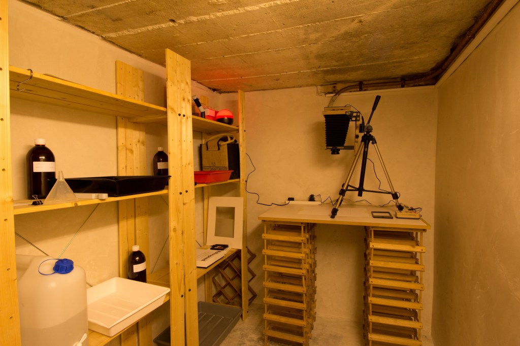
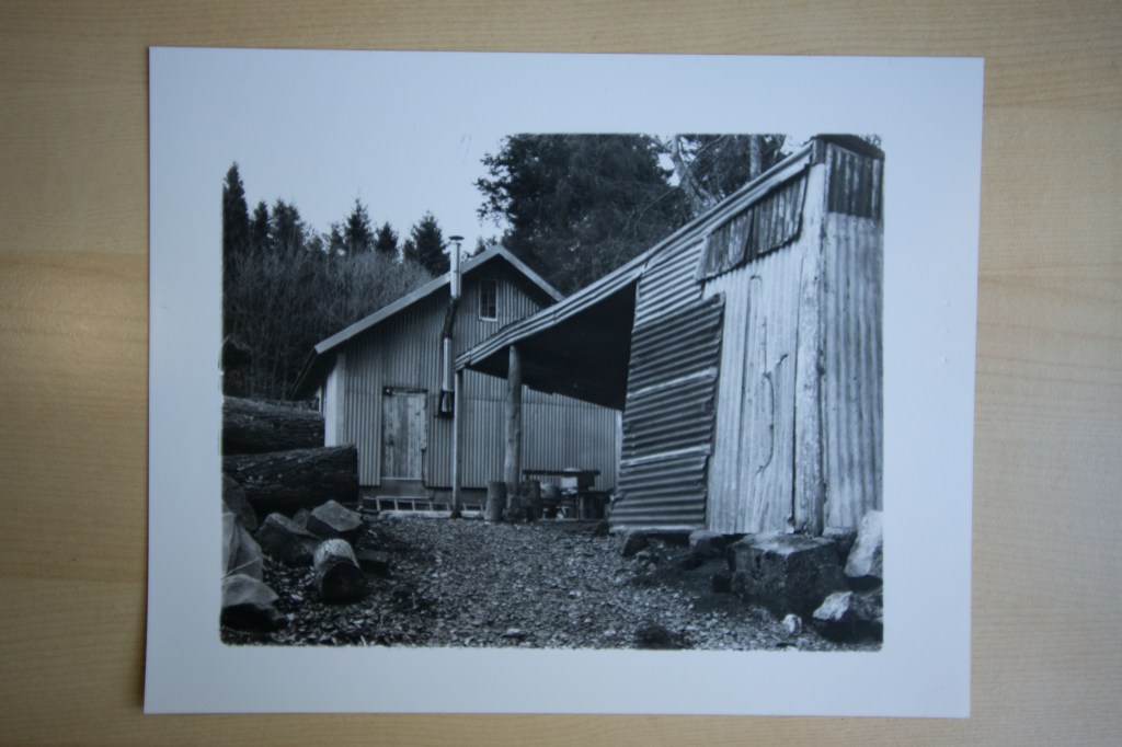
At last, the darkroom is now up and running – and it works! I spent this morning (as if I do not have more important things to be doing) getting everything set up and making some test prints. There are still a couple of things that need a bit more attention, such as a cutting mat or some other grid to go under the enlarger to make sure the paper is properly aligned, but I managed to get a couple of quite acceptable prints from some 4×5 b&w negatives.
Here is a view of the set-up. It is a bit snug, and the ceiling is quite low so it is just as well I am not very tall, but there is enough room.
And here is one of the prints: a landscape to give it some relevance to this course though this was originally made for one of the Assignments in I&P but did not make it into the final set:
Not perfect but pretty good for a first attempt, if I dare say so myself.
A bit of a day off today from routine course-work. Since the lock-down started, even in our sparsely populated part of the world, mundane tasks such as the weekly shop have become rather more demanding enterprises – at least today it was no more than a half hour queue to get into our local Waitrose and I was able to get almost all of what we need.
As a reward to myself (after a couple of hours sorting out the veg garden as well as walking the dog) I finally got my darkroom sorted out! Having failed miserably to buy a suitable table from IKEA (nothing suitable in stock or only deliverable at too high a cost) I have improvised with an old cupboard shelf and two stacks of wine rack as pedestals. Just the right height and big enough to accommodate an old tripod that my wife bought years ago to use with a video camera (the old compact VHS type for anyone who remembers) in the absence of a proper copy stand. (I have an Intrepid 4×5 which converts into a developer/enlarger with a back mounted light source and timer unit.)
Otherwise, to my surprise, making sure the room in my undercroft that I am going to use light-safe proved to be easier than anticipated. So all done! All I need now is a power extension cable to serve the enlarger light source unit, timer, and safe-light (the power sockets down there are just that bit too far away from the work area), which will not be difficult to get. Developing trays, chemicals, paper, and all the other bits-and-bobs, are ready. There is unfortunately no running water but a couple of plastic jerrycans will suffice.
So, at last, the next step is actually to print some of my own work. That might sound pretty mundane but in these days of digital dominance that is, for me, a pretty important thing.
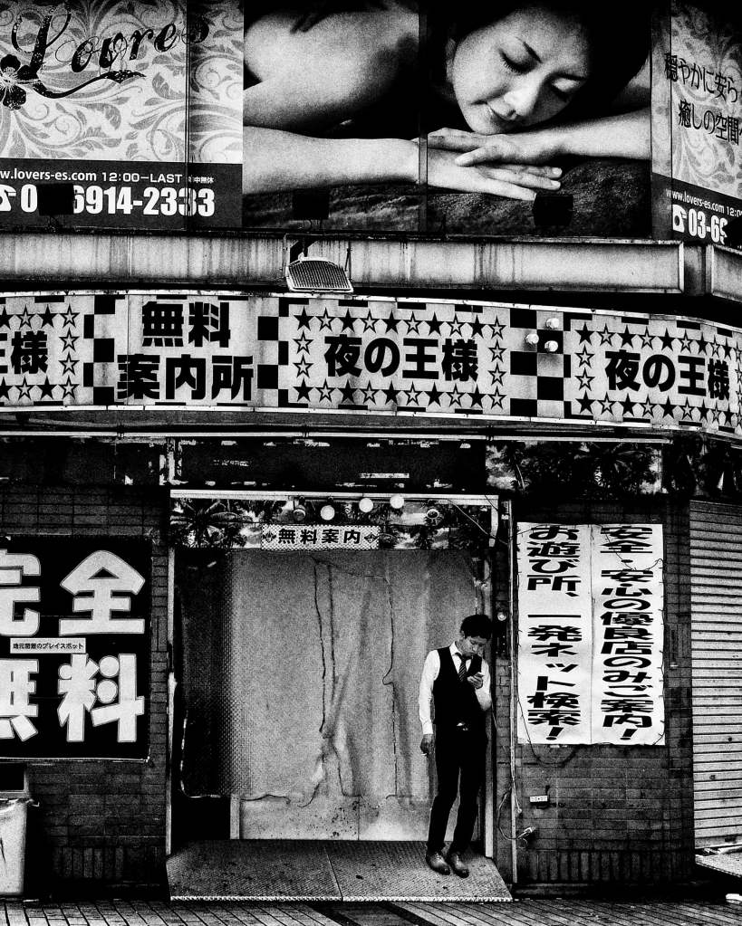
A brief note on an article that appeared in the Guardian earlier this week. I have been meaning to get a short post up since it appeared but have been hampered by a lousy internet connection.
Suitably short on words, this shows a brief but nicely representative selection of his work. It is amazing that he is now in his eighties but still goes out with his camera every day. The flow of images in his self-published Record seems unquenchable, though I must say that now I am beginning to find the volume of stuff that he publishes a bit overwhelming and I have given up trying to keep on top of his output!
He nevertheless remains one of my favourite photographers (funny how now so many of them seem to be Japanese!). Perhaps paradoxically though I do not think of him as an active influence on my own work (unlike, for example, Rinko Kawauchi who has affected some of what I have produced, though admittedly not much of that I have made for the OCA courses) and have never felt much of an urge to emulate his approach or style, or at least not yet.
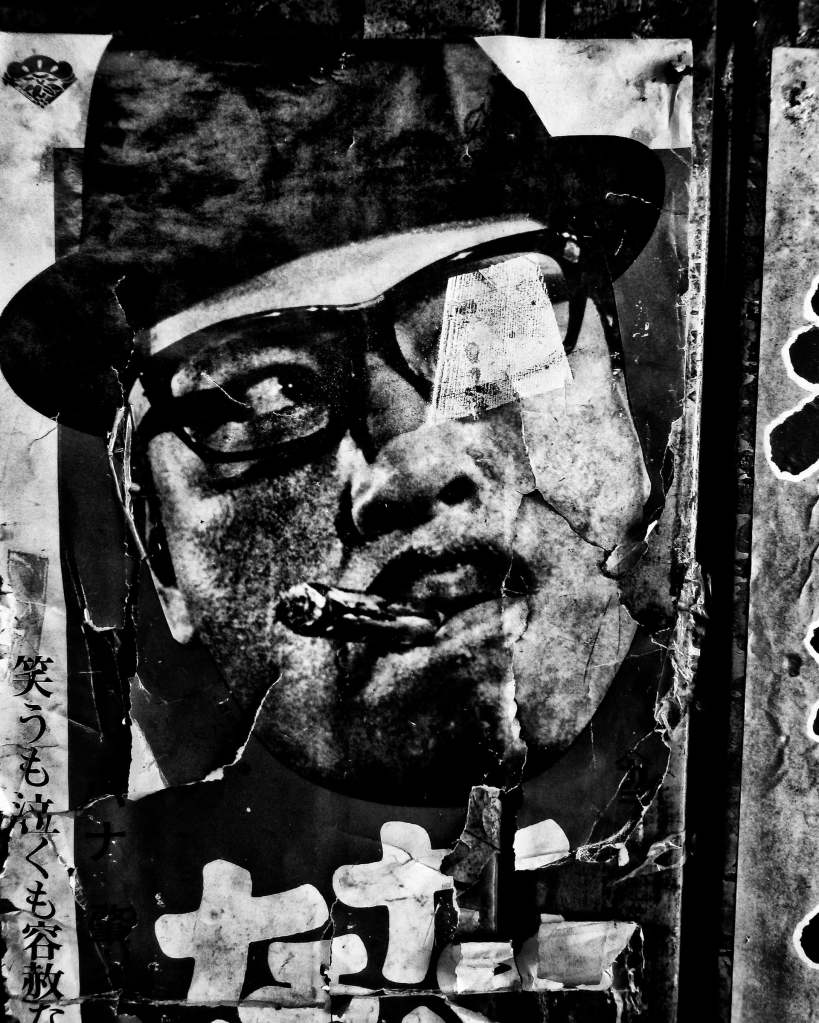
Here is a copy of the article:
Harsh, blurred and brilliant: the great Daidō Moriyama – in pictures
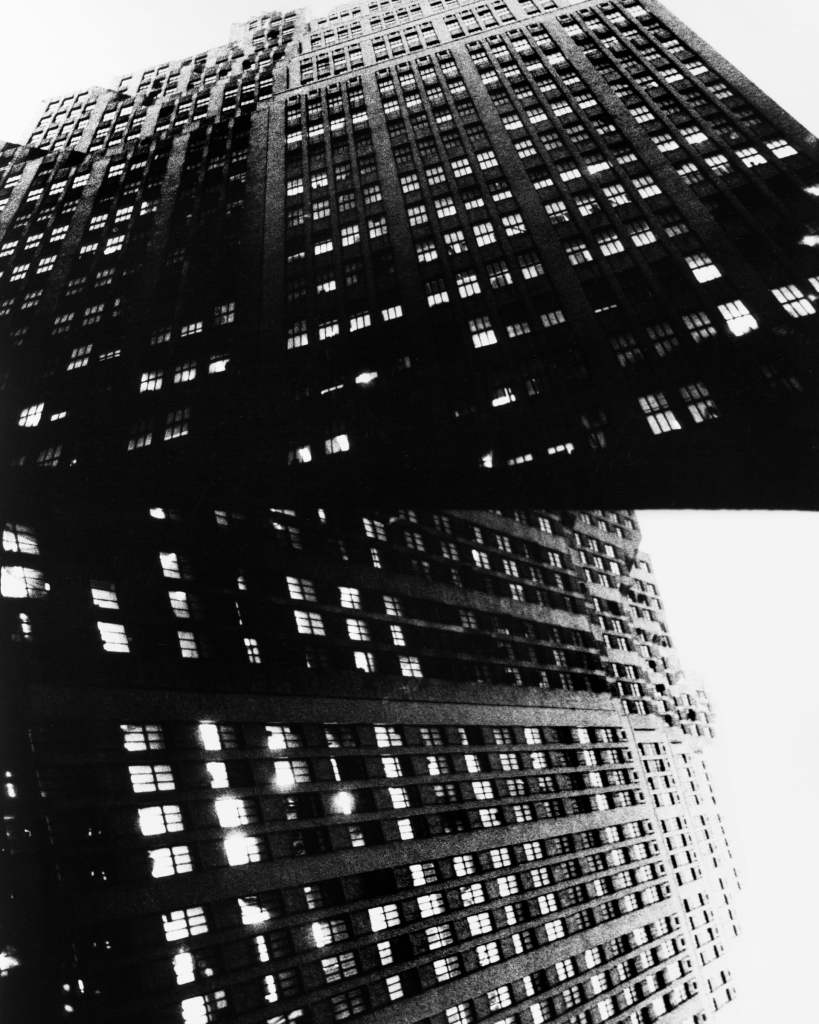
The faceless city … a modern high-rise.
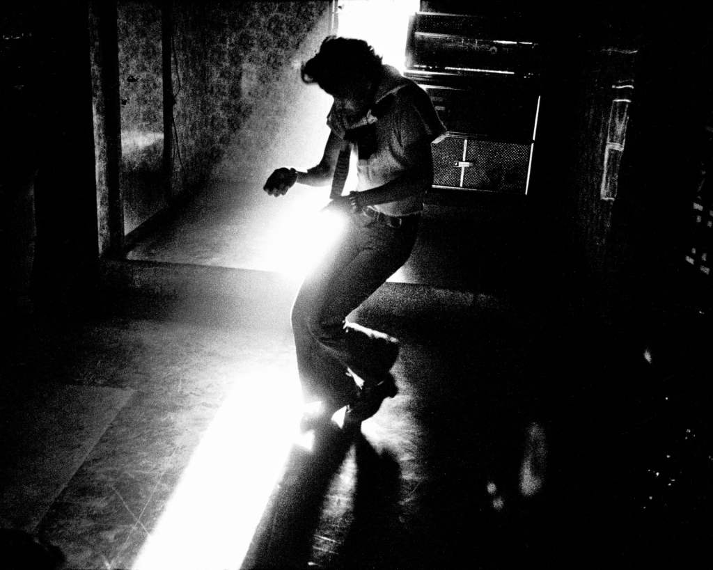
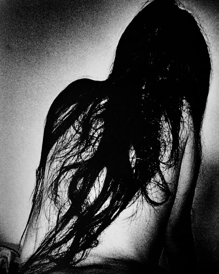
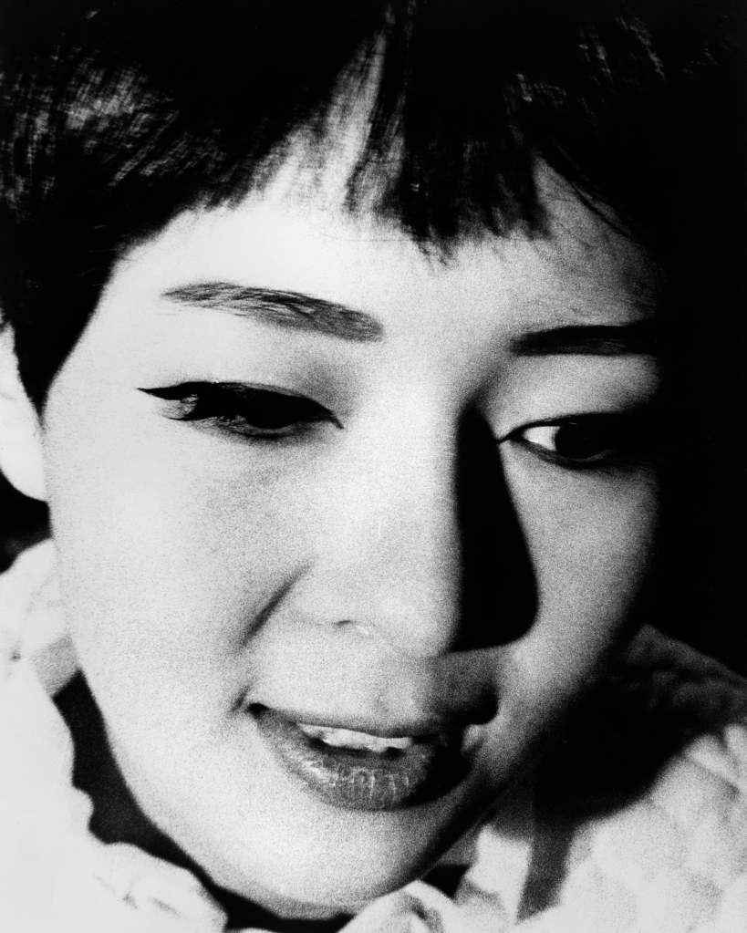
He is one of Japan’s most renowned photographers, a giant of the Provoke movement whose compelling images take a disturbing view of city life and the chaos of existence
Daidō Moriyama emerged from the influential Provoke movement, which began as a magazine in 1968 aiming to ‘free photography from subservience to the language of words’.
His bold, uncompromising style put Japanese photography on the international stage
Moriyama acquired an early reputation as a provocative street photographer. These images are from Daidō Moriyama: A Diary due to open at Foto Colectania Foundation, Barcelona, on 12 March but now postponed.
The photographs due to be seen in this show were drawn from nearly 50 years of work. Moriyama’s images resist chronological reading or thematic division
Reproduction is important to Moriyama. He sometimes took photographs of his photographs, which he would then photograph again
Moriyama continues to work every day, photographing his neighbourhood in Tokyo, but also travelling to America and Europe. His style is simple: stop, take a photo, move on
His work is often abstract but he also creates decadent still lifes out of banal objects, giving them an almost fetishistic quality
His work has been reproduced on coffee mugs, skateboards and T-shirts, reflecting his desire that these images should have a life beyond the exhibition space
Moriyama has influenced generations of photographers around the world
The photographer, who is 81, won the prestigious Hasselblad award in 2019
What, you might ask, has William Blake got to do with landscape photography? That is a question I might have asked myself if it had not been for the catalogue that accompanies the recent, comprehensive, exhibition of the work of Blake at Tate Britain in London this past winter.
I did not actually get to see the exhibition itself and in a way I am glad. A lot of his work is quite small in scale. In a busy gallery, and I understand this has been a very successful show (for which read “busy”!), it can be difficult to see the work clearly, and at leisure, and to be able to get close enough to it to appreciate the detail. So, on the recommendation of a friend who did visit the show, I simply bought the catalogue.
Whether anyone is interested in photography or not, if you have any interest in Blake I would heartily recommend this volume. The reproductions are first rate, the scholarly articles that accompany them are very easy to read, and, perhaps most importantly for me, the images in the book include works that I have never seen before. I have other books on Blake already but there is material here that is new.
But the relevance to landscape? This comes in the final essay in the book by the graphic novelist Alan Moore (whose work I am aware of but not at all familiar with) who writes about the influence on Blake’s work of the address to which he and his wife moved in 1790, 13 Hercules Buildings, in Lambeth (page 199).
It is worth quoting almost all of the first paragraph in full as it both poses and and answers the question:
“When we speak of the poetry of place, we generally refer to words and images that celebrate or else investigate some fixed location. And yet, given that all creative works have arisen from whatever influences surrounded their geographic point of composition, surely all art could be said to be the art of place, something that could only have emerged from that specific spot at that specific time? A city, a field, a house, a street: all of these have their own aura, their own atmosphere, a lyric condensation born of memory and history, of people and events, …”
This appeals to me very much and fits with my own broad, catholic and inclusive, view of what might amount to landscape art. I find it quite liberating to think of landscape in such terms. But also quite challenging to find ways that this sort of sensibility might be shown when making a photograph, which has got to be a good thing. It is not just a matter of pointing the lens at a view but of finding something within what is visible that is of some significance or deeper meaning.
Myrone, M, & Concannon, A, (2019). William Blake. London: Tate Publishing
What struck me first is how our tastes overlap. Masahisa Fukase’s Ravens and Robert Frank’s The Americans are there on my shelves. So is Rinko Kawauchi’s Illuminance. I have also of late found myself looking a lot at her Ametsuchi and The River Embraced Me.
It then got me thinking about what I have been looking at on a regular basis recently, apart from stuff directly relevant to the current part of this course (though some of these are). Here are some that I keep coming back to:
Matthew Genitempo – Jasper
Guido Guidi – 5 Architectures, and the most recent Lunario
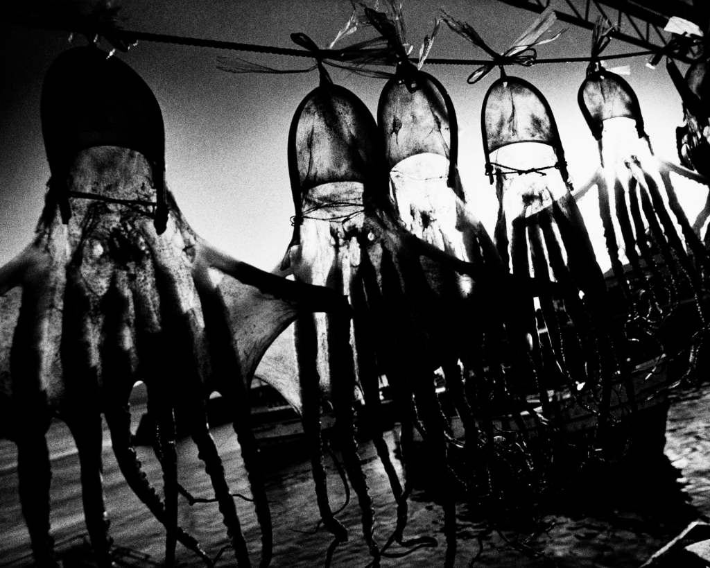
Daido Moriyama – Record
Provoke
Kazuma Obara – Exposure
Hiroshi Sugimoto – Seascapes
Alys Tomlinson – Ex Voto
(All of these have been referenced elsewhere apart from the latest Guidi so for now that is the only one that I will cite here.)
In my last post on Unmapping The City I think I have set a hare running by questioning the usefulness of theory to my practice as a photographer. This is something that I am going to have to chase down but anticipate that it is going to take some time and might even be an elusive quarry that I will never actually run to earth. In some ways it raises an existential question about what I am currently doing.
My current train of thought has been set in motion by some research that I have been doing in connection with the next section of the course on the Picturesque. Looking for the South Bank Show programme about Fay Godwin on YouTube I stumbled upon another show that I had not heard of before from 1991 (I am not and have never been much of a watcher of television) in the Channel 4 series “In With Mavis” (no, I have no idea who Mavis Nicholson was) that was an interview with her. Not a long programme but well done, interesting and thought-provoking, very intelligently presented by the eponymous Mavis (cheesy theme music apart).
Godwin makes a very interesting comment at one point: “The more conscious I am of why I am taking a picture the less successful it is.”
This strikes a chord with me: this is is very much how I feel about theory. It is useful, clearly, to have a grounding in theory but when it comes to actually taking a picture I do not find that underlying theory is at all useful. Godwin also comments that she did a lot of preparatory work and research for her projects but when it came to actually making the picture she had to put that behind her and rely more on her instincts. My own approach to work is very similar. At the end of the day the picture depends on what comes in front of my eye and whether or not the subject and composition work. When I am out taking pictures there is no room in my bag for books on theory!
At various points throughout this degree course so far I have experimented with black and white film in a 4×5 large format camera (though I have not yet used it for this particular landscape module, but will as soon as opportunity permits). Although I did not eventually use them, because the colour set that I shot digitally worked better than the monochrome analog images, I did make a number of pictures for one of the I&P assignments. The work that I did for I&P has just been assessed and the assessors have picked up on that work and have offered encouragement for further experiments with this medium. I already had the intention of doing some more landscape work using that camera but the encouragement is welcome.
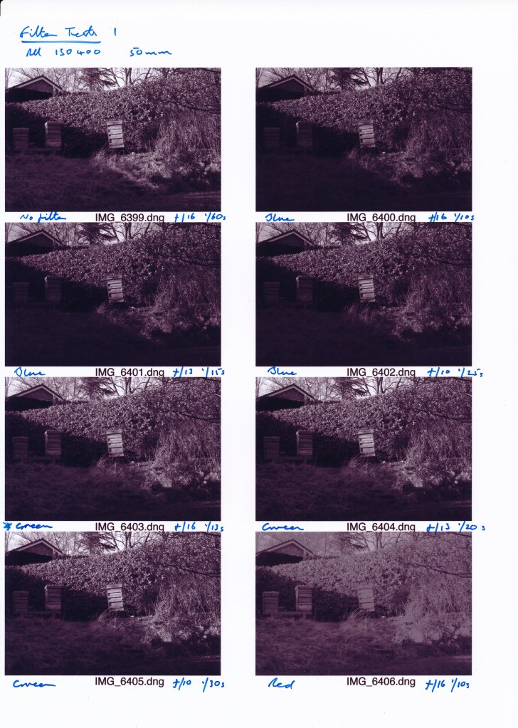
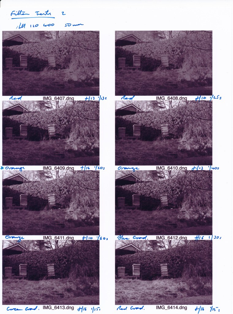
With that existing intention in mind, one thing I had already decided to look at is the use of filters. I noted when reading Adams’s book (1983) that he often used coloured filters to achieve certain effects. I already have a few neutral density, mostly graduated, filters that I use from time to time with a couple of the lenses on my Canon. I recently decided that it would be useful to have an extra set of lens adapters for another couple of lenses that are of a different diameter and one that would fit my 4×5, and came across a fairly cheap but reasonable quality set (stuff made by the likes of Cokin, some of which I already have, is great quality but also pretty expensive) that includes an array of coloured, and graduated coloured, filters, so though I would give them a go.
I am already reasonably familiar with ND grad filters but need to experiment with the coloured filters to see what they will do when shooting black and white. (I do not see much if any need for using them when shooting in colour unless I decide to go for some weird effects, which is pretty unlikely: in the set there is, for example, a purple filter that I cannot imagine I will ever use!) To start with therefore, as b&w 4×5 sheet film is not particularly cheap and as it takes more time to set up a shoot, then develop and print the film, I have used my Canon set to b&w mode. I started with a shot without filter to act as a baseline for comparison then worked through a number of shots, at different f stops for comparison of the effect on shutter speeds, using four solid coloured filters (the ones that expect will be the most useful) – blue, green, red (the primary elements of natural light), and orange as a sort of softer version of red. As the light conditions were fading when I did this test I only managed three grad filters, just the primary colours.
At first it seemed odd to use colour filters when shooting b&w but thinking about it I realised this is a matter of fairly simple physics. Taken in isolation each of the three primary colours of light is capable of absorbing the other two. As a result any given colour will be accentuated and lightened while the other two will be darkened. A coloured filter can therefore change the tonal balance of the colours as they appear in b&w. For example, take a red barn in a green field: a red filter would brighten the barn and darken the field, placing more emphasis on the barn; a green filter would darken the barn and give more emphasis to the grass. In this way, without having to resort to post-production digital manipulation, or burning and dodging, for example, when printing manually from a negative, certain effects can be applied from the outset in camera before the image is made in order to emphasise certain elements of the composition.
Here are a couple of contact sheets that I have made of these first tests, annotated to identify the colour of each filter, aperture and shutter speed setting.
Unfortunately these scans do not really do the test justice but it is immediately apparent that there are a number of significant differences. What stands out first is that the blue filter significantly darkens the scene (a corner of my garden where I keep my beehives; in colour terms the hedge is beech so the leaves are at this time of the year russet, the hives are pale but reddish wood, the grass in the foreground is still quite green but starting to bleach out for the winter, the sliver of sky at the top was quite strongly blue; to start with the sun was bright so the shadows were fairly strong). The green filter lightened the foreground and introduced a bit more contrast into the hedge and the hives. The red has produced an odd even but washed out tone that looks completely unnatural. The orange filter (which I would regard as simply a lighter shade of red for present purposes) though has produced a much softer effect, keeping some of the strong shadows but bringing out more detail in the shaded areas. Of the four solid coloured filters this is the one that I think worked best in these particular light conditions for this view.
Because the light was changing so quickly when I switched to the grad filters I cannot regard the results as wholly representative but what I do find interesting is that the red filter has brought out more detail across the tonal range, much more so than the blue or green. What this does at least suggest though is that the red grad filter might be useful to accentuate tonal differences when the light is otherwise fairly flat and not creating much contrast.
The other obviously striking thing is the effects on shutter speeds which will obviously have to be factored in when using the 4×5 in earnest.
Despite the relative expense I think the next step is to take some test shots on the 4×5 and print them up properly (I am now close to having a working darkroom) for better comparisons. I am also going to try with my medium format Hasselblad film camera that I also use for landscape based work from time to time (at least 120 film is cheaper and less fiddly to develop!) but I first need to make a special adapter to fit the filter holder to the lens, a Zeiss 80mm F lens. Rather unhelpfully this lens does not have a thread on the inside of the front rim, as most lenses do (even the old Rodenstock I use on my 4×5 does), to which the adapter ring can be screwed. I therefore need to make a ring that will fit the outside of the rim and lock against the raised lips that otherwise hold the lens cap on. As if I have got nothing better to do!
Adams, A, (1983). Examples: The Making of 40 Photographs. Boston: Little, Brown & Co
A chance discovery on the BBC iPlayer last night of a programme that originally aired in 2011 offering an overview of British landscape painting. It is so apt it could easily be recommended watching for this course. Its scope is wide ranging, all the way up to contemporary work, but is particularly good on early exponents and the development of conventions, not just here but also in Europe. Claude Lorrain, Gainsborough, Turner, all make substantial appearances. Not the most critically engaged of programmes, and the narrator Simon Callow has his finest posh actor voice on, which can get a bit wearying, but nevertheless an enjoyable and occasionally enlightening canter through the history of this genre as it specifically developed in this country and focusing on British landscapes.
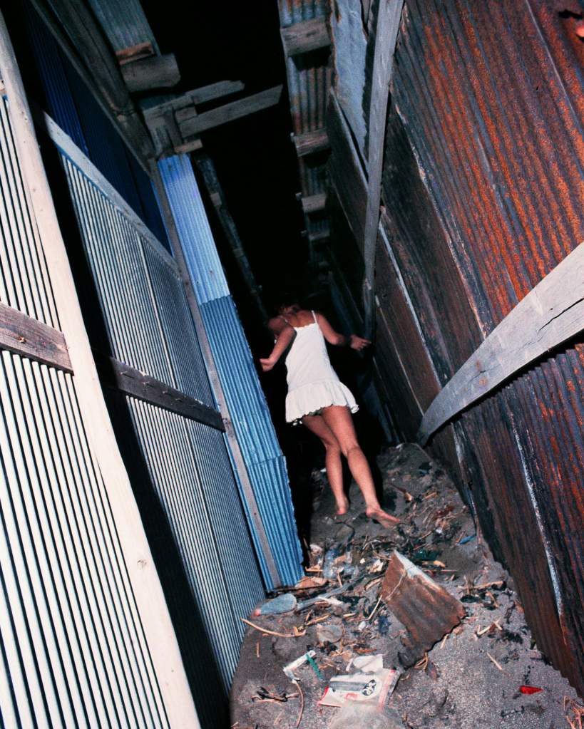
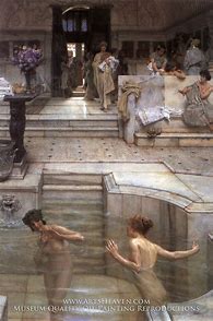
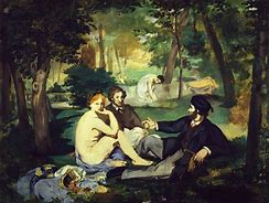
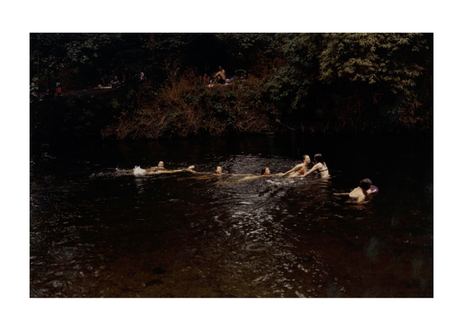
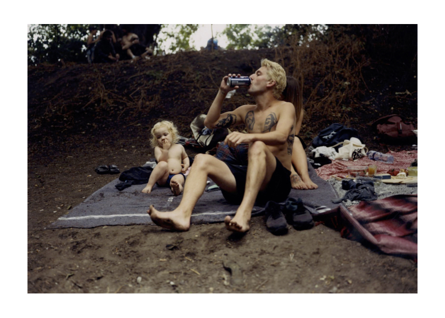
This is a bit of a random post but one that is nevertheless pertinent to my current thinking about landscape photography. I was not sure how to title it but have settled on this pun on the title of a recent work by a favourite artist/musician/writer, Richard Skelton – Landscapes with Absented Figures. This has been triggered by something I saw in The Observer newspaper this morning about a work by the photographer Nick Waplington, photographs of people swimming and generally just enjoying themselves by a river bank in Hackney.
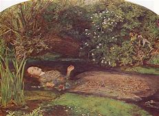
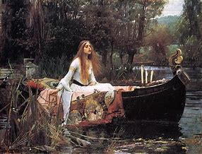
A couple of things really caught my eye and my imagination. First and foremost his pictures made me think of Victorian genre painting, in particular, that would not normally be associated with landscape – John Everett Millais’s Ophelia, Waterhouse’s Lady of Shallot, the coyly erotic confections of Alma Tadema (without the crystal clear, diaphanous water!) – and the likes of Manet’s Dejeuner sur l’herbe. What we have here is a photographer, of whom I confess I had not heard before, consciously playing with painterly conventions but nevertheless producing work that is wholly contemporary. Although not necessarily what one might call humanist photography it nevertheless strikes me as still socially concerned. Slightly to my surprise I like it so much I have just bought his book!
It is a far from profound notion but nevertheless an important one for me that this article got me thinking about the role of people in landscape photography. The title of this module is Landscape, Place, and Environment. Conventionally landscape painting has often included people, or at least references to their presence, their impact upon, and how they are affected by, the physical world. Ideas of place and environment are for me closely bound up with the same issues. From my own perspective, pretty views interest me little; how a physical place, the environment, is affected by people, how it in turn affects people, how they live there, is much more important. (Am I at heart a humanist, socially concerned photographer, or at least a would-be one? Quite probably.)
That in turn has brought me to reflect on some of the work that I have been looking at recently – ostensibly off-piste and not directly connected to the present curriculum – and to think about how in fact it is relevant to Landscape, Place, and Environment.
Two books particularly: Ragnar Axelsson’s Faces of The North (2019) (the recent re-issue of the 2004 original, which I unaccountably missed first time round) and Marketa Luskačova’s By the Sea (2019). (The same point though I can see applies equally to a lot of the work that attracts my attention and that I have focused on, buying the books, over the last few years.) The first is what at first glance appears to be just (!) a collection of portraits of people living in Greenland, the Faroes, and Iceland – places I have visited and love, environments that resonate deeply within me. The second, “street” photographs of people on the beach, mostly at Whitley Bay (the nearest bit of coast to where I live and somewhere I have visited a lot), in the late 1970s. (The same could be said of a lot of what I have been looking at throughout the year but these two are the ones that have landed on my desk within the last week or so and so are jostling more vigorously for attention.)
What both of these books do is portray people within particular environments. They are not simply pictures of the people, portraits, but images of people in particular places and give some indication of how those people relate to the places, how they live there, how the environments shape their lives, and to an extent how they in turn have an impact on those environments. I feel this is a particularly strong element in Axelsson’s work (who has spent a lot of time photographing the people of the Arctic and some of whose other books I have had for some years now) but I do not think it is fanciful to say the same of Luskačova’s work, though the environment she was concerned with is much less exotic, and notwithstanding that there is little in the physical appearance of the locations that would tell you where they in fact are.
Conclusion? People make the “landscape”? Needs more thought and no doubt I will continue to wrestle with this as I progress through the module.
Axelsson,R, (2019). Faces of the North. Reykjavik: Qerndu
Luskačova, M, (2019). By the Sea. Bristol: RRB Photobooks